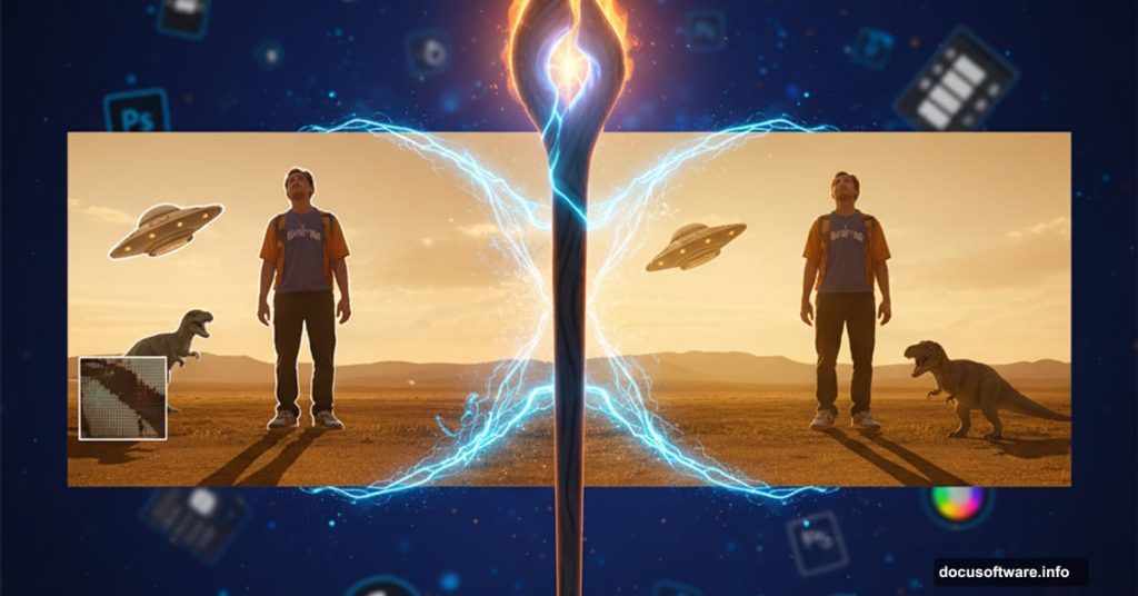
Creating convincing photo composites feels like dark magic. You drop an object into a new scene and suddenly it looks fake. The lighting feels off. The colors don’t match. Something just screams “Photoshop!”
But here’s the thing. Professional compositing isn’t about one miracle technique. It’s about layering small adjustments until your brain accepts the image as real.
Let’s break down the exact process that transforms obvious fakes into seamless composites.
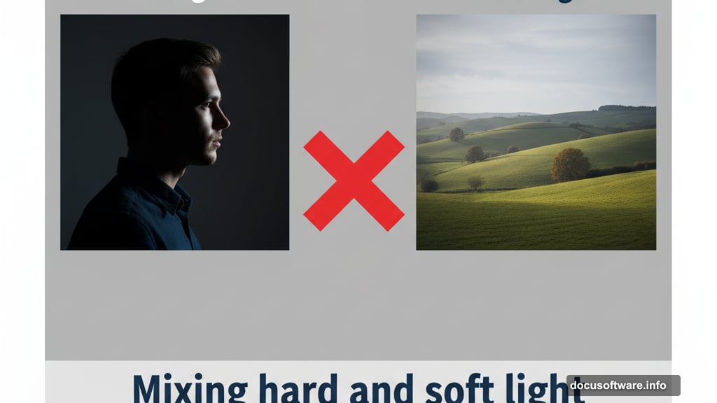
Start With Similar Lighting
Before you even open Photoshop, find images with compatible light sources. This step saves hours of frustration later.
Look at the shadows in both images. Are they hard-edged and defined? That’s direct, hard light like midday sun. Or are the shadows soft and diffused? That’s overcast sky or studio softbox lighting.
Mixing hard and soft light rarely works. Your composite will fight you at every step. So choose images where the light quality matches from the start.
Plus, check the direction. Shadows tell you where light comes from. If your background shows light from the left but your subject has right-side lighting, you’re in trouble.
Cut Out Your Subject Cleanly
Photoshop’s AI selection tools have gotten scary good. Select Subject often nails the selection in one click.
But don’t stop there. Open Select and Mask to refine the edges. Zoom in and check for stray pixels or harsh cutouts. These tiny details become obvious in the final composite.
Sometimes the AI fails completely. That’s when you grab the Pen tool for clean vector paths or carefully brush mask complex areas like hair. Each image demands different techniques. Use whatever works.
The goal is a clean extraction that doesn’t scream “I was cut out.” Soft, natural edges make all the difference.
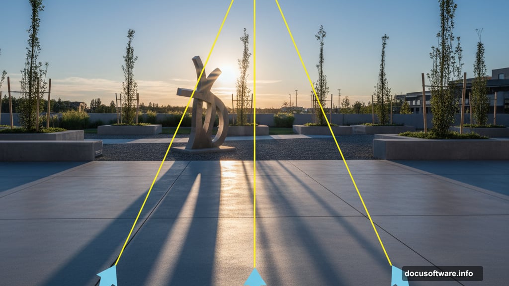
Find the Light Source
Create a new layer and literally draw lines along shadows in your image. Extend those lines backward to where they converge. That point is your light source.
This sounds tedious. But it’s crucial for placing shadows correctly later.
With soft, diffused light like an overcast day, imagine a curved dome dropping light from above. This eliminates harsh shadows and bounces ground color back onto your subject.
Also watch for artificial lights. Studio portraits might have multiple light sources affecting different parts of the subject. Map each one before proceeding.
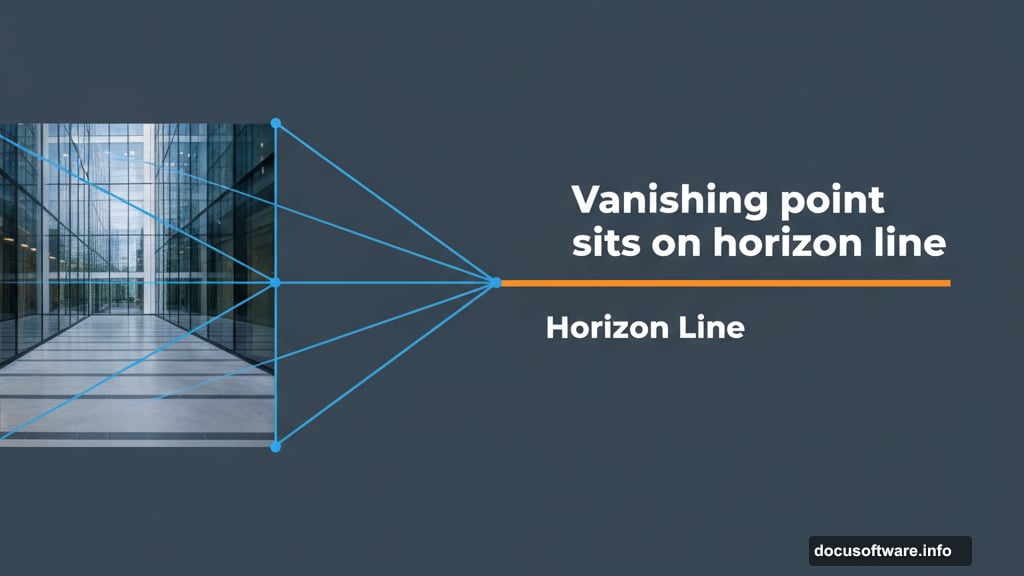
Match the Perspective
Finding the horizon line determines whether objects look grounded or floating. The horizon sits at eye level, at the camera’s height when the photo was taken.
If you see the actual horizon, draw a line across it in both images. These lines must align when you combine the images.
No visible horizon? Look for parallel lines on buildings, floors, or furniture. Draw lines along these edges toward where they converge. That vanishing point sits on the horizon line.
When you have zero parallel lines to work with, estimate the camera height and use that as your horizon. It’s not perfect but it beats guessing blindly.
This step separates amateur composites from professional ones. Get the perspective right and everything else becomes easier.
Fix the Brightness and Contrast
Strip all color from both images temporarily. Use a Black & White adjustment layer to focus purely on light values.
Create a Curves adjustment layer above your new object. Clip it so adjustments only affect that layer. Then drag the curve until brightness levels match the background.
Here’s a secret. Most people make their added objects too bright. Go slightly darker than feels right. Your eyes adjust and the composite looks more natural.
Delete the Black & White layer when you finish. Time to tackle color.
Balance the Saturation
Saturation mismatches kill composites. Objects that are too vivid or too dull pop out like sore thumbs.
Create a Selective Color adjustment layer and look at just the saturation. Darker areas in this mask show less saturation. Lighter areas show more.
Make a Hue/Saturation adjustment layer above your object. Clip it to the previous Curves layer. Now adjust until saturation levels match between your object and background.
This step feels subtle. But it makes a massive difference in how your brain processes the final image.
Match the Colors Precisely
Color matching takes multiple passes. This is just the first.
Create a Color Fill layer set to 50% gray. Change the blend mode to Luminosity. This removes all color so you can focus on hue differences.
Below that gray layer, add a Vibrance adjustment and crank it way up. This exaggerates color differences so they’re easier to spot and fix.
Now create another Curves adjustment above your object. Use the individual color channels to add or remove specific hues where needed. The exaggerated vibrance makes problem areas obvious.
Delete the gray layer when you’re done. Your colors should feel much closer now.
Paint Shadows and Highlights
Shadows ground objects in their environment. Without them, everything floats.
Create multiple Curves adjustment layers. Set some to Multiply blend mode for darkening. Set others to Screen for brightening. Fill all the masks with black to hide the effects.
Grab your Brush tool and set opacity to 10%. Use a large, soft brush to slowly paint shadows where light would be blocked. Paint highlights where light would hit directly.
Think back to your light source mapping. Shadows should fall away from the light. Hard light creates defined shadow edges. Soft light creates gentle, blurry shadows.
Also create a large, soft shadow directly beneath your object. This shadow anchors the object to the ground. Reduce opacity until it looks natural, not painted.
Beyond shadows, think about reflected color. Ground surfaces bounce light back up onto your object. Sky color reflects down from above. Create Color Fill layers of appropriate colors and gently paint them onto your object’s edges.
Add Edge Lighting
Edges reveal composites faster than anything else. Light wraps around forms and creates subtle highlights along edges facing the light source.
Create a Hue/Saturation or Color Fill layer set to Overlay blend mode. Zoom way in and carefully paint thin highlights along edges where light would catch.
This takes patience. Multiple layers. Adjusting opacity repeatedly. But those edge lights sell the illusion that your object actually sits in that environment.
Also paint darker tones on edges facing away from light. Real objects show form through these light and dark transitions. Flat, even lighting looks fake.
Final Polish and Grain
Now step back and look at the whole image. Create adjustment layers that affect everything, not just your composite object.
Add final touches of contrast. Adjust overall color temperature if needed. Make highlights brighter and shadows deeper to tie everything together.
Then add grain. Real photos have grain from the camera sensor. Use Camera RAW or add a grain layer to unify all elements. Match the grain size and intensity to your background image.
Finally, zoom out. Walk away. Close the file and look tomorrow with fresh eyes. You’ll spot obvious problems you completely missed while deep in the work.
Fix those issues. Then call it done. Perfection is impossible. Good enough to fool the eye is the goal.
The Real Secret Nobody Mentions
Professional composites aren’t about one perfect technique. They’re about dozens of small adjustments that add up.
Each step feels minor. Slightly darker here. A touch more saturation there. Gentle shadow painted carefully. But combined, these tiny changes transform fake into believable.
Most people quit too early. They make three adjustments and wonder why it still looks wrong. Push through. Keep refining. The magic happens in those final 20% of adjustments that take 80% of the time.
Enjoy the process. Compositing rewards patience and attention to detail. Take your time and watch your skills grow with each image you create.