
Creating realistic photo composites feels like magic when done right. But most tutorials skip the critical details that separate amateur blends from professional work.
I’ve spent years teaching Photoshop techniques. The biggest mistake? People rush to blend images without understanding light. That’s like trying to paint a portrait in the dark.
Let’s fix that. This guide walks through the exact process for creating convincing composites that don’t scream “fake.”
Start With Compatible Light Sources
Finding the right images matters more than your Photoshop skills. Seriously.
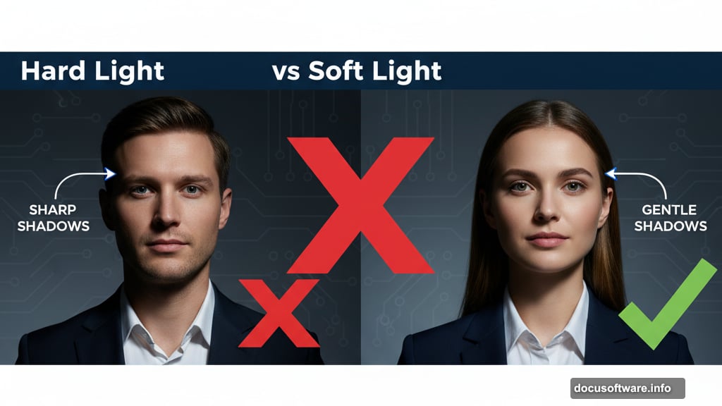
Look for photos with similar lighting conditions first. Hard light creates sharp, defined shadows. Soft light produces gentle, diffused shadows. Mixing these types rarely works well.
Pay attention to light direction too. If your background shows sunlight from the right, your subject needs the same directional lighting. Otherwise, you’re fighting an uphill battle from the start.
Cut Out Your Subject Cleanly
Photoshop offers several selection tools now. Which one works best? It depends on your image.
The AI-powered Select Subject button handles simple backgrounds remarkably well. Click it and Photoshop does about 80% of the work automatically. Then refine edges using Select and Mask for hair and fine details.
For complex images, the Pen tool gives you surgical precision. It’s slower but offers complete control. Plus, you can save paths and reuse them later.
Soft-edged subjects like hair or fur need the Brush tool with Select and Mask refinements. Take your time here because sloppy edges ruin composites instantly.
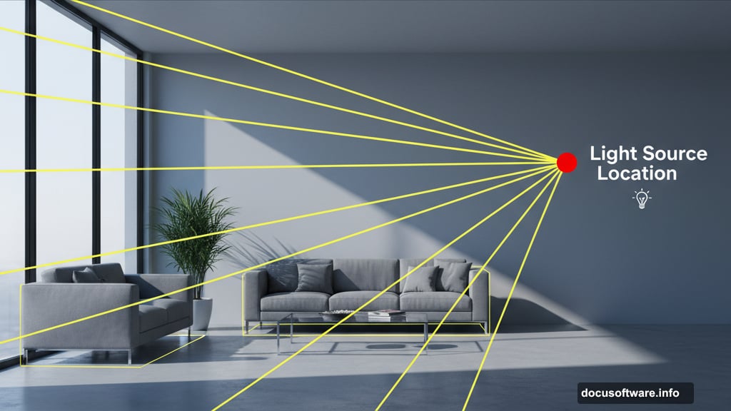
Find the Light Source Direction
This step separates beginners from pros. Every scene has a primary light source that creates the dominant shadows.
Create a new layer and draw lines along shadow edges. Extend those lines back to where they converge. That convergence point shows your light source location.
Overcast or evening scenes work differently. Light comes from everywhere, creating that soft, wraparound effect. Imagine a curved dome of light dropping down from all sides. Hard shadows disappear in these conditions.
Studio portraits add another layer of complexity. Look for artificial light sources like windows, lamps, or strobes that influence the lighting pattern.
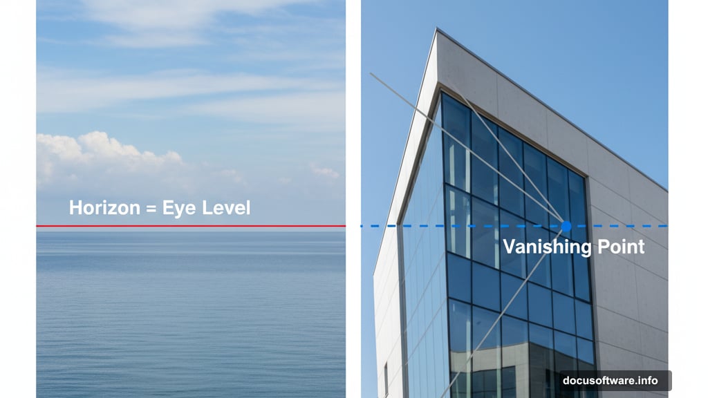
Determine the Horizon and Perspective
The horizon line equals eye level. It’s where your camera sits relative to the scene.
If you see the actual horizon, draw a line across it on a new layer. This becomes your reference point for placing objects realistically.
No visible horizon? Find parallel lines in the scene instead. Edges of buildings, tables, or roads all work. Draw lines extending from these parallels until they meet. That intersection point is your vanishing point, and the horizon runs through it.
When you’ve got nothing to work with, estimate the camera height. Hold your hand at roughly where the photographer’s eye would be. That’s your horizon.
Match Brightness and Contrast
Strip the color out temporarily using a Black and White adjustment layer. This lets you focus purely on tonal values without color distracting you.
Create a Curves adjustment layer above your added object. Clip it so adjustments only affect that layer. Then darken the object slightly more than you think necessary.
Why darker? Most people make added elements too bright. Our eyes forgive things being slightly too dark better than too light. It’s a weird psychological quirk that works in your favor.
Fix the Saturation Levels
Colors can match in hue but still look wrong because of saturation differences. This subtle problem destroys otherwise good composites.
Create a Selective Color adjustment layer. Switch it to show a saturation mask. Dark areas have less saturation. Light areas show more saturation. This mask reveals exactly where your object differs from the background.
Add a Hue/Saturation adjustment layer above your object and clip it. Adjust individual color ranges until the saturation matches the background. Small changes make huge differences here.
Correct Color Cast Differences
Now we’re getting into advanced territory. Color matching needs multiple passes to nail perfectly.
Create a Color Fill layer set to 50% gray. Change its blend mode to Luminosity. This removes all color temporarily.
Below that gray layer, add a Vibrance adjustment and crank it way up. This exaggerates color differences so you can see them clearly.
Add another Curves adjustment layer clipped to your object. Use the individual color channels to push colors around until they match. The red, green, and blue curves let you add or remove specific color casts.
Delete the gray layer when finished. The color should look much more natural now.
Paint Shadows and Highlights
Shadows sell the illusion that objects actually exist in the scene. Without them, everything floats awkwardly.
Create Curves adjustment layers set to Multiply for darkening and Screen for brightening. Fill their masks with black to hide the effects initially.
Grab the Brush tool at 10% opacity with a large, soft edge. Gently paint in shadows where they should fall based on your light source analysis. Build them up slowly through multiple strokes.
Add a new layer beneath your object for the main shadow. Use a large, soft brush with black at low opacity. Paint a shadow shape, then reduce the layer opacity until it looks natural.
Tight shadows need separate treatment. Create another layer and paint harder-edged shadows directly at the base where the object contacts the ground.
Add Edge Lighting Details
Light doesn’t just illuminate surfaces. It wraps around edges and creates subtle halos called rim lighting.
Create a Hue/Saturation or Color Fill layer set to Overlay blend mode. Paint along edges where light would catch them. This technique requires zooming in and working carefully around the entire perimeter.
Multiple layers work better than trying to do everything on one layer. Different edges need different intensities and colors based on surrounding light sources.
Don’t forget absorbed color either. Ground colors reflect up onto objects. Sky colors bounce down. Create Color Fill layers with appropriate colors and paint them gently onto surfaces at low opacity.
Apply Final Adjustments and Grain
Step back and evaluate the overall image now. Does anything still feel off?
Add final color and contrast adjustments using more Curves or Color Balance layers. Paint adjustments into masks at 10% opacity where needed. This is detective work finding the last few things that don’t quite match.
Camera RAW Filter works great for final polish. Adjust overall sharpness, add grain to match the background, and tweak color temperature. Film grain especially helps blend digital elements because it unifies the texture across everything.
Take a Break Before Finishing
This sounds weird but it’s crucial. Close the file and walk away for at least several hours. Come back tomorrow if possible.
Fresh eyes spot problems you’ve been staring past for hours. That floating shadow you missed. The edge that’s too bright. The color cast you got used to seeing.
Make those final tweaks with your fresh perspective. Clean up the obvious mistakes you somehow overlooked initially.
Compositing isn’t about rushing through steps. It’s about building up subtle layers of realism until your brain stops seeing two separate images and starts seeing one unified scene. That takes patience and attention to details most people ignore.
The best composites look so natural you forget they’re fake. That’s the goal we’re chasing.