Adobe Illustrator hides powerful features in plain sight. Most designers stick to the basics and miss shortcuts that could cut their work time in half.
I’ve tested hundreds of Illustrator tricks over the years. Some are gimmicks. But these 12 techniques genuinely speed up everyday design work. Plus, at least half of these will be completely new to most Illustrator users.
Let’s jump into the tools that separate efficient designers from everyone else.
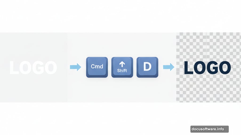
See Through White Artwork Instantly
Ever tried designing white text on a white canvas? It’s invisible until you add a background. Frustrating, right?
Hit Cmd/Ctrl + Shift + D to toggle the transparency grid. Now white artwork pops against the checkerboard pattern. You’ll instantly see what’s actually transparent versus what’s just white.
This simple toggle saves countless hours of confusion when working with logos, icons, or any design element that uses white space intentionally.
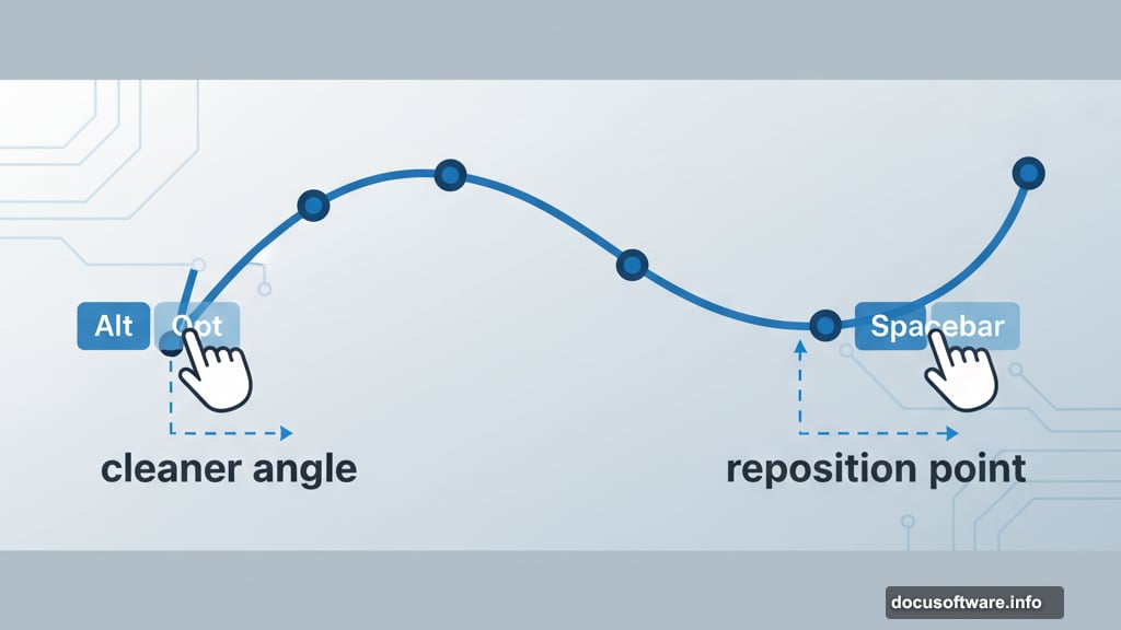
Control the Pen Tool Like a Pro
The Pen Tool feels clunky until you learn its hidden controls. Two keyboard shortcuts transform how it works.
First, hold Alt/Opt when dragging tangent handles. This sucks the leading handle back in, preparing a cleaner angle for your next point. Without this trick, you get unwanted curves where you want sharp transitions.
Second, hold Spacebar while placing a point to reposition it before releasing your mouse. This lets you correct mistakes instantly instead of backtracking with the Direct Selection tool.
These two moves alone cut path-drawing time by 30-40% once they become muscle memory.
Size Text by What Actually Matters
Illustrator’s default text sizing is technically correct but practically useless. A 72pt font might look wildly different depending on the typeface.
Open the Character panel, click the hamburger menu, and enable “Show Font Height Options.” Now switch from default sizing to X-height or Cap height.
This measures text based on actual letter height, not the font’s technical specifications. Suddenly, aligning logos to text becomes precise. You can match a graphic element to exactly 50pt of actual letter height, regardless of which font you’re using.
For logo design and brand work, this feature is absolutely essential.
Align to Actual Text Edges
Traditional alignment in Illustrator aligns to text boxes, not the text itself. This creates weird spacing that looks wrong optically.
Open the Align panel, hit the hamburger menu, and choose “Align to Glyph Bounds.” Also enable View > Snap to Glyph.
Now when you align objects to text, they snap to the actual letter edges. No more manually adjusting position because the text box added invisible padding.
This works brilliantly for button designs, badges, and any layout where text and graphics need pixel-perfect alignment.
Master Type on a Path
Creating text that follows a curve is easy. Controlling how it looks takes more finesse.
After placing text on a path, go to Type > Type on a Path > Type on a Path Options. This opens controls most designers never touch.
You can flip text to the other side of the path, adjust baseline position, and change how letters orient around curves. The preview updates live, so you see exactly what each setting does.
These options turn basic curved text into polished, professional typography in seconds.
Nudge Individual Letters Perfectly
Sometimes one letter in a word just looks optically wrong. The kerning is technically correct, but your eye says otherwise.
Press Shift + T to activate the Touch Type Tool (buried under the regular Type tool). Click any letter and move, rotate, or resize it independently.
This tool shines for optical adjustments where automatic spacing fails. A capital “A” next to a “V” might need manual tweaking to look balanced. The Touch Type Tool makes this adjustment take 5 seconds instead of 5 minutes of outline manipulation.
Plus, you can nudge letters with arrow keys for pixel-perfect precision.
Duplicate Grids in Seconds
Need multiple copies of an object in a grid pattern? Don’t copy and paste dozens of times.
Hold Alt/Opt and drag to create one copy. Hit Cmd/Ctrl + D to repeat that exact movement. Keep hitting D and Illustrator creates a perfect row.
Now select the entire row. Alt/Opt drag it down to create a second row. Hit Cmd/Ctrl + D again to duplicate that vertical movement.
This creates a grid of objects in about 10 seconds. I use this constantly for pattern mockups, icon sheets, and any project requiring repeated elements.
Align Without Moving Everything
Standard alignment moves all selected objects. But sometimes you want everything to align to one specific shape.
Select all your objects. Then click the object you want as your anchor point a second time. It gets a thicker blue outline indicating it’s now the “key object.”
Now use any alignment option. Everything moves to align with your key object, which stays perfectly still.
This saves enormous time when building complex layouts where one element needs to stay locked in position.
Smooth Paths Four Different Ways
Illustrator offers four separate smoothing methods. Most designers know only one or two.
The Smooth tool works on existing paths. Select your path, grab the Smooth tool, and draw along the rough areas. Illustrator automatically reduces anchor points and evens out curves.
The Pencil tool has smoothing built in. Open its options, enable “Alt/Opt as Smooth tool,” and tick “Keep Selected.” Now draw rough shapes and immediately smooth them before moving on.
The Brush tool also hides smoothing. Paint something, then hold Alt/Opt and draw along it to smooth the result.
Finally, select any path and go Object > Path > Simplify. This dialog gives precise control over anchor point reduction and smoothing strength.
Different situations call for different methods. But knowing all four means you’re never stuck with jaggy paths.
Change Colors Globally in One Click
Recoloring artwork traditionally means selecting every instance individually. Miss one and your color scheme looks broken.
Select all your artwork. Open the Swatches panel, hit the hamburger menu, and choose “New Color Group.” Enable the Global option.

Now every color in your artwork becomes a global swatch. Double-click any swatch to adjust it, and watch every instance update simultaneously.
This includes colors in strokes, fills, gradients, blend modes, patterns, and complex nested groups. Change your entire color palette in 30 seconds instead of 30 minutes.
For client work where they “want to see it in blue instead,” this feature is an absolute lifesaver.
Bend Complex Artwork Naturally
The Puppet Warp tool warps multiple paths at once while maintaining their relationships. It’s like having invisible joints in your artwork.
Select your shapes and activate Puppet Warp. Click to place pins where you want anchor points. Pin down areas that shouldn’t move, then drag other pins to bend, twist, and distort the artwork.
The warping happens in real-time with proper preview. You see exactly how the distortion affects your design before committing.
I use this constantly for logo adjustments, illustration tweaks, and any time I need to bend a group of shapes while keeping them connected naturally.
Transform with Full Visual Control
The Free Transform tool (hotkey E) shows you exactly what your transformation looks like before applying it.
Unlike the regular Transform panel, this tool lets you scale, skew, and distort with immediate visual feedback. Drag corners to scale. Cmd/Ctrl drag to distort perspective. The artwork updates live.
Here’s a pro tip: Create a grid behind your artwork and group them together. Now when you transform, the grid shows exactly how perspective and distortion affect your design. This makes it dead simple to place artwork onto surfaces or match existing perspective in a scene.
Always duplicate your artwork first, since this tool permanently alters paths. But for quick perspective adjustments or fitting designs to specific shapes, nothing beats it.
The Real Difference
These tricks matter because Illustrator workflow bottlenecks kill creative momentum. Spending 10 minutes manually aligning text or recoloring artwork means 10 fewer minutes actually designing.
Master these shortcuts and you’ll finish projects faster. More importantly, you’ll spend less time fighting the software and more time creating work that actually matters.
That’s the difference between knowing Illustrator and truly understanding how it works.