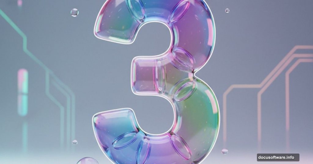
Want to create text that looks like blown glass? This effect works perfectly for logos, app icons, and social media graphics.
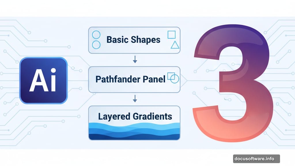
Adobe Illustrator makes this surprisingly straightforward. You’ll use basic shapes, the Pathfinder panel, and layered gradients to build depth. Plus, the technique works for any letter or number once you understand the workflow.
This tutorial focuses on creating a glassy number 3. But the same principles apply to entire alphabets. So once you nail this technique, you can apply it anywhere.
Setting Up Your Workspace
Start with a new document at 1920×1080 pixels. This gives you plenty of room to work and see fine details.
Create a background rectangle filled with #f2f1ed. Then align it to your artboard and lock that layer. You don’t want to accidentally move it while working on other elements.
Now make a new layer for your card background. This keeps everything organized as you build more complex shapes.
Building the Card Frame
Create a rectangle at 550×500 pixels with 25-pixel rounded corners. Align this to the center of your document. This becomes your main card shape.
Add a small text label to the top left corner. Use Proxima Nova Light at 12 points with 40% gray as the fill color. This adds a subtle detail that makes the design feel polished.
For the text, add a drop shadow at 10% opacity. Set it to 0 pixels on the X axis, 8 pixels on the Y axis, and 12 pixels of blur. This creates just enough separation from the background without being obvious.
Lock this layer and create another new layer. Now you’re ready to build the icon background.
Creating Gradient Icon Backgrounds
Make a 300×300 pixel rectangle with 60-pixel rounded corners. Align it to the center of your artboard. This becomes your icon background.
Fill this rectangle with a gradient going from #34073d to #ef745c. Set the angle to 90 degrees. Then grab the gradient tool and adjust the transition to make it smoother. You want a natural flow between colors.
Here’s where it gets fun. Duplicate that rounded rectangle a few times. Fill each copy with different gradients from Coolors.co/gradients. They offer excellent free gradient collections that work perfectly for this style.
Once you have several background options, lock all those layers. Time to build the actual glass number.
Constructing the Number 3 Shape
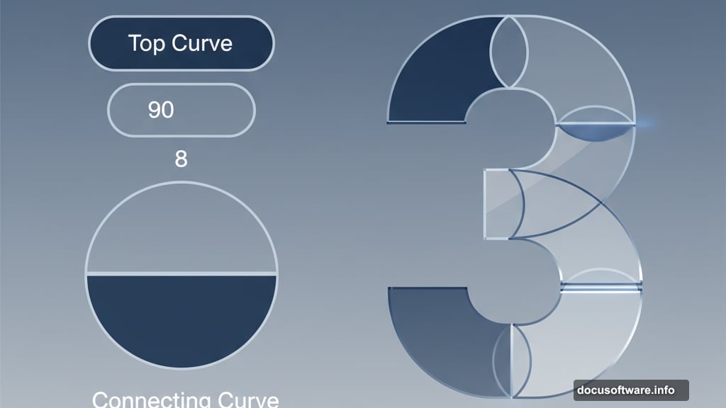
Create a new layer for your number shapes. Start with a rectangle at 110×60 pixels with 30-pixel rounded corners. This forms the top curve of your 3.
Duplicate this rectangle and move it down 8 pixels. Set its width to 90 pixels using the center-right anchor point. Adjust the rounded corners to maintain that pill shape if needed.
Now create a 128×128 pixel ellipse. Cut it perfectly in half by deleting the middle-left anchor point with the Direct Selection tool. This creates the curved connecting piece between your top and bottom rectangles.
Position this half-circle so it seamlessly joins your two rounded rectangles. The shapes should flow together naturally.
Refining the Inner Curves
Create a small 8×8 pixel ellipse. Use this to cut a rounded inside edge where your half-circle meets the rectangles. This removes the hard edge and makes the shape flow better.
Select all three shapes and group them together. Then reflect this group to create a flipped copy. Move the copy downward to form the bottom part of your number 3.
Here’s an important step. Select both groups and duplicate them to save a backup copy. Hide those duplicate groups. You don’t want to accidentally modify them while working on the glassy effect.
Merging Shapes for Glass Effects
Select the top part of the 3. Use the Pathfinder panel to merge these shapes into one unified shape. Do the same for the bottom part of the 3.
Now comes the magic. Select one shape at a time and fill it with a gradient. Create a white-to-white gradient. Set the opacity of the left gradient handle to 0%.
With the shape still selected, hit the letter “G” to activate the Gradient tool. Drag the gradient around to start building that glass look. You’re manipulating how light appears to move through the shape.
Don’t worry about perfection on the first pass. Building a convincing glass effect requires multiple gradient layers. Each layer adds depth and realism.
Adding Depth with Multiple Gradients
After you create your initial glass effect, it’s time to add complexity. Grab copies of both the top and bottom sections of your 3. Duplicate the groups one final time.
Select both groups and hit the Intersect Shape option in the Pathfinder panel. This saves only the middle portion of your 3 shape where both parts overlap.
Fill this middle section with pure white. Set the opacity to somewhere between 10-20%. This creates a highlight that makes the glass look more dimensional and realistic.
The subtle white overlay catches light differently than the gradient beneath it. That interaction is what sells the glass effect.
Final Assembly and Alignment
Grab all the shapes that make up your 3 and group them together. Then align this group to the center of your rounded rectangle background.
Step back and look at the overall effect. The gradients should flow naturally. The white highlight should catch your eye without overwhelming the design. And the whole thing should look like blown glass lit from different angles.
If something feels off, ungroup your shapes and adjust individual gradients. Small tweaks make a big difference with this technique.
Why This Technique Works
Glass effects rely on understanding how light behaves. Real glass bends light, creates highlights, and shows gradual color transitions. You’re simulating all of that with layered gradients and opacity changes.
The key is building multiple layers. One gradient creates a colored shape. Two gradients start suggesting depth. Three or more gradients with varying opacities create that convincing glass look.
Plus, the white highlight layer is crucial. It simulates light passing through and reflecting off glass surfaces. Without it, your shape looks more like colored plastic than glass.
This same approach works for any letter, number, or simple icon. Once you understand the workflow, you can apply it to entire font sets or logo designs. The technique scales beautifully from small icons to large display text.