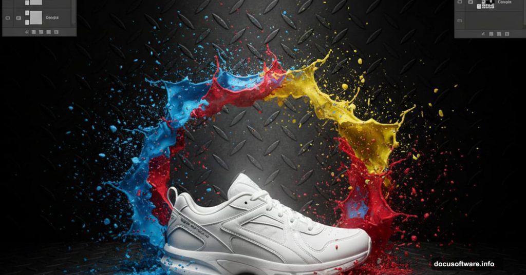
Want to make product photos that stop scrollers mid-scroll? This splashing sneaker technique turns ordinary product shots into eye-catching art.
You don’t need advanced Photoshop skills for this project. Just some patience, good stock images, and willingness to experiment. Plus, the same techniques work for any product – not just sneakers.
Let’s build something that looks complex but breaks down into simple, repeatable steps.
Gather Your Materials First
Before opening Photoshop, collect everything you need. This project requires three key elements.
You’ll need:
- Paint splash stock images (multiple angles work best)
- A clean product photo (sneakers in this case)
- A textured background (metal or concrete works great)
The paint splash pack makes or breaks this effect. Look for high-resolution images with transparent backgrounds. That saves hours of tedious selection work later.
Meanwhile, your product photo should have clean edges. Shoot against a white background if possible. That makes selection tools work much better.
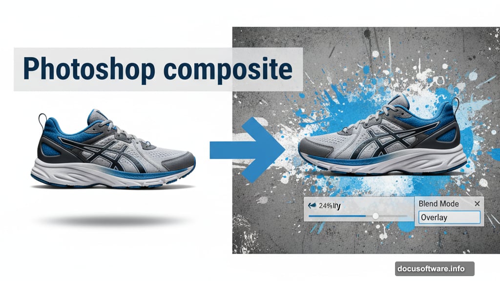
Set Up Your Canvas and Background
Start with a new document at 1289×1000 pixels. Fill the background with medium gray (#adadad).
Now add your texture layer. Metal textures create industrial vibes that complement the dynamic paint splashes. Paste your texture, then desaturate it completely (Ctrl + Shift + U).
Here’s the key part. Lower that texture’s opacity to 24% and change the blend mode to Overlay. This creates subtle depth without overwhelming your main subject.
But we’re not done with textures yet. Duplicate that layer and reset the blend mode to Normal. Then use Free Transform to create a floor perspective. The Eraser tool helps blend where floor meets background.
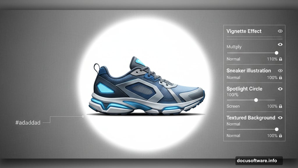
Build Dramatic Lighting
Lighting sells the realism here. Without it, everything looks flat and artificial.
Make a new layer at 11% opacity. Use a soft black brush to darken the outer edges. This technique – called vignetting – draws eyes toward the center.
Next, create another layer. Grab a soft white brush at 700px size. Click once in the middle where your shoe will sit. That creates a subtle spotlight effect.
These lighting layers seem simple. However, they transform the entire mood from flat to dimensional. Most beginners skip this step and wonder why their composites look fake.
Position Your Product
Drop in your sneaker photo. Place it directly over that white spotlight you created earlier.
The shoe should dominate the middle third of your composition. Too high looks awkward. Too low wastes that carefully crafted floor texture.
Use Free Transform (Ctrl + T) to adjust size and angle. Rotate slightly for dynamic energy. Products facing straight-on look static and boring.
Take time with placement. Everything else builds around this foundation. Get it right before moving forward.
Add Your First Paint Splash
Open your paint splash stock images. Find one with interesting flow and movement. The Magic Wand tool selects the background quickly. Then inverse your selection (Ctrl + Shift + I) to grab just the splash.
Copy and paste that splash into your document. Position it so paint appears to burst from the shoe. This creates cause-and-effect storytelling.
Here’s where patience pays off. Use the Eraser tool or layer mask to blend where splash meets shoe. Make it look like paint actually originates from the product.
Sloppy edges destroy believability instantly. So zoom in close and clean up every transition carefully.
Match Colors with Gradient Maps
Raw paint splashes rarely match your scene’s lighting. Gradient Map adjustment layers fix this fast.
Create a clipped Gradient Map adjustment layer above your splash. Sample colors from the shoe area – use the dark color in shadows, light color in highlights. This forces the splash to adopt your scene’s color palette.
Then add a Curves adjustment layer. Darken slightly to match ambient lighting. The splash should feel integrated, not pasted on top.
These color-matching steps separate amateur composites from professional work. Don’t skip them just because the splash looks “good enough” already.
Layer Additional Splashes
One splash looks interesting. Multiple splashes create dynamic energy.
Repeat the previous process with different splash images. Vary the angles and sizes to avoid repetition. Paint flying from multiple directions adds chaos and movement.
Each new splash needs its own Gradient Map and Curves adjustment. Match each element to your lighting conditions. Consistency matters more than you think.
Remember to vary splash intensity too. Some should dominate while others provide supporting action. Hierarchy creates visual flow.
Add Depth with Shadows
Floating objects look fake. Shadows anchor them to reality.
Create a new layer beneath your shoe. Use a soft black brush at low opacity (around 20%). Paint subtle shadows where shoe contacts floor.
The shadow should be darkest directly under the shoe. It fades gradually as distance increases. This mimics real-world physics.
For paint splashes, add tiny contact shadows where droplets might hit surfaces. These micro-details sell the illusion subconsciously. Viewers won’t notice them consciously but will sense something’s “right” about the image.
Enhance with Final Touches
Almost there. Now add polish that elevates good to great.
Final enhancement checklist:
- Sharpen the shoe using Unsharp Mask (just slightly)
- Add subtle color correction with selective Hue/Saturation
- Increase contrast on the shoe to make it pop
- Check that all edges blend smoothly
- Add noise to flat areas for texture consistency
These refinements seem minor individually. Combined, they create cohesive professional results.
Also, step back periodically. Look at your composition from across the room. Does the shoe dominate? Do splashes support rather than overwhelm? Make adjustments until balance feels right.
Common Mistakes to Avoid
After teaching this technique to hundreds of students, the same errors appear repeatedly.
Watch out for:
- Over-saturated paint colors that clash with scene lighting
- Hard edges where splashes meet the shoe
- Identical-looking splashes that feel copy-pasted
- Shadows pointing wrong directions
- Too many splashes competing for attention
The hardest part? Knowing when to stop adding elements. More doesn’t equal better. Sometimes restraint creates stronger impact.
Test your composition by showing it to someone unfamiliar with the project. If they immediately spot issues, trust their fresh perspective.
Apply This to Any Product
This tutorial used sneakers. But the same technique works for watches, phones, cosmetics, or beverages.
The key principle stays constant. Create dynamic movement around a static product. Use color matching to integrate elements seamlessly. Build depth through lighting and shadows.
Next time you see product ads with liquid splashes or dynamic elements, you’ll recognize these exact techniques. Now you can create them yourself.
Practice with different products. Experiment with various splash angles. Build a portfolio that demonstrates creative range beyond single shoe renders.
These skills translate directly to client work, personal projects, or social media content that actually gets engagement. Master the fundamentals here, then push boundaries with your own creative variations.