Want to create a majestic lion composite that looks like professional digital art? This tutorial walks you through building an epic nighttime scene with proper lighting, atmospheric effects, and seamless blending.
You’ll learn how to combine multiple images, create realistic shadows, paint clouds and stars, and use adjustment layers to unify everything. The techniques work for any fantasy composite, but we’re focusing on a powerful lion portrait under moonlight.
Let’s build something striking.
Set Up Your Canvas Right
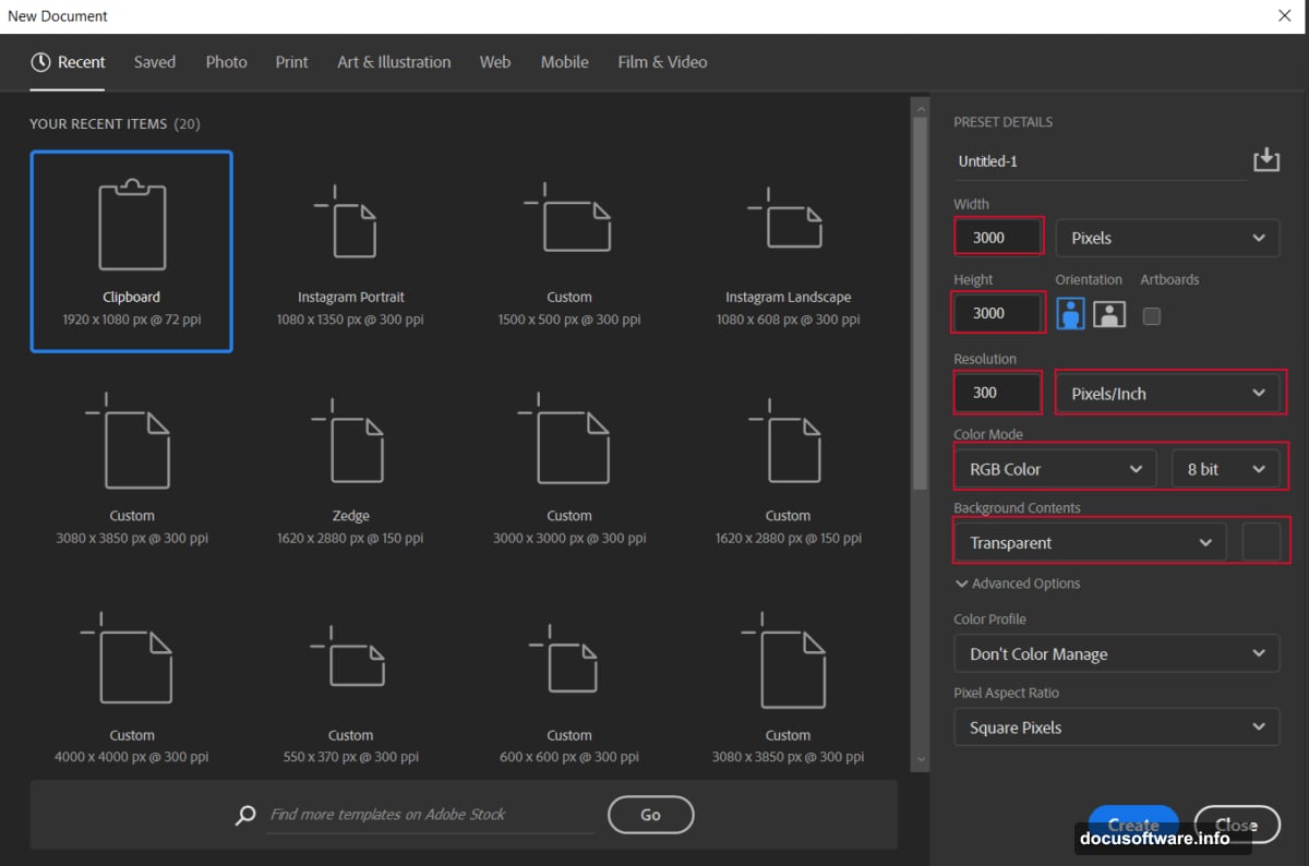
First, create a proper workspace. Go to File > New and use these settings:
Canvas Settings:
- Width: 3000px
- Height: 3000px
- Resolution: 300 DPI
- Color Mode: RGB Color, 8-bit
- Background: Transparent
Why these dimensions? They give you enough resolution for print quality while keeping file size manageable. Plus, the square format works great for social media.
However, adjust canvas size based on your final output needs. Web-only projects can use smaller dimensions.
Place Your Moon Base
Now bring in the moon image. Go to File > Place and select your moon photo.
Position it using the transform tool (Ctrl/Cmd + T). Hold Alt + Shift while dragging corners to scale proportionally. In Photoshop CC, just hold Alt to resize from the center.
Pro tip: Use “Place Embedded” instead of “Place Linked.” That way, your PSD won’t break if you move or delete the original JPG file. Smart layers are helpful, but embedded files are safer for complex composites.
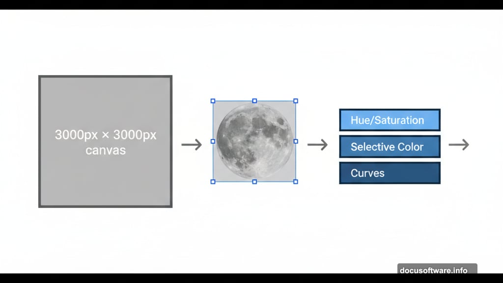
Color Correct the Moon
The moon needs to match your scene’s color palette. Start with three adjustment layers.
First adjustment: Hue/Saturation
- Create a Hue/Saturation adjustment layer
- Change blend mode to Hue
- Set Opacity to 30%
This subtle shift unifies the moon’s color with your overall tone.
Second adjustment: Selective Color
- Add a Selective Color adjustment layer
- Target specific color ranges
- Fine-tune yellows and whites in the moon
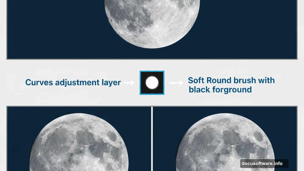
Third adjustment: Curves (highlights)
- Create a Curves adjustment layer
- Select a Soft Round brush
- Set foreground color to black
- Paint over bright areas of the moon
This technique reduces overexposed spots. The layer mask lets you control exactly where the darkening happens.
Fourth adjustment: Curves (overall tone)
- Add another Curves adjustment layer
- Again use the Soft Round brush with black
- Paint broader areas to balance the moon’s luminosity
Why two Curves layers? Separating adjustments gives you more control. One handles highlights, the other manages overall exposure.
Paint Atmospheric Clouds
Clouds add depth and atmosphere. But first, you need the right brushes.
Select the Brush Tool (B) and right-click on your canvas. Click the gear icon and choose Import Brushes. Select the cloud brushes you downloaded.
Create a new layer above the moon. Set your foreground color to white. Now paint soft, wispy clouds using the imported brushes.
Start with low opacity (around 30%) and build up gradually. Multiple light strokes look more natural than one heavy application.
Remember, clouds should look softer near the moon’s glow and denser toward the edges. Vary brush size and opacity as you paint.
Add Shadow Gradient
Composite scenes need directional lighting to look believable. Create a new layer and select the Soft Round brush again.
Set foreground color to black. Paint along the right side of your canvas. This creates a subtle shadow gradient that suggests the moon as your light source.
Reduce layer opacity to 90%. Full black looks too harsh. The slight transparency maintains atmosphere while adding depth.
This gradient grounds your entire composition. Everything should feel like it exists in the same lighting environment.
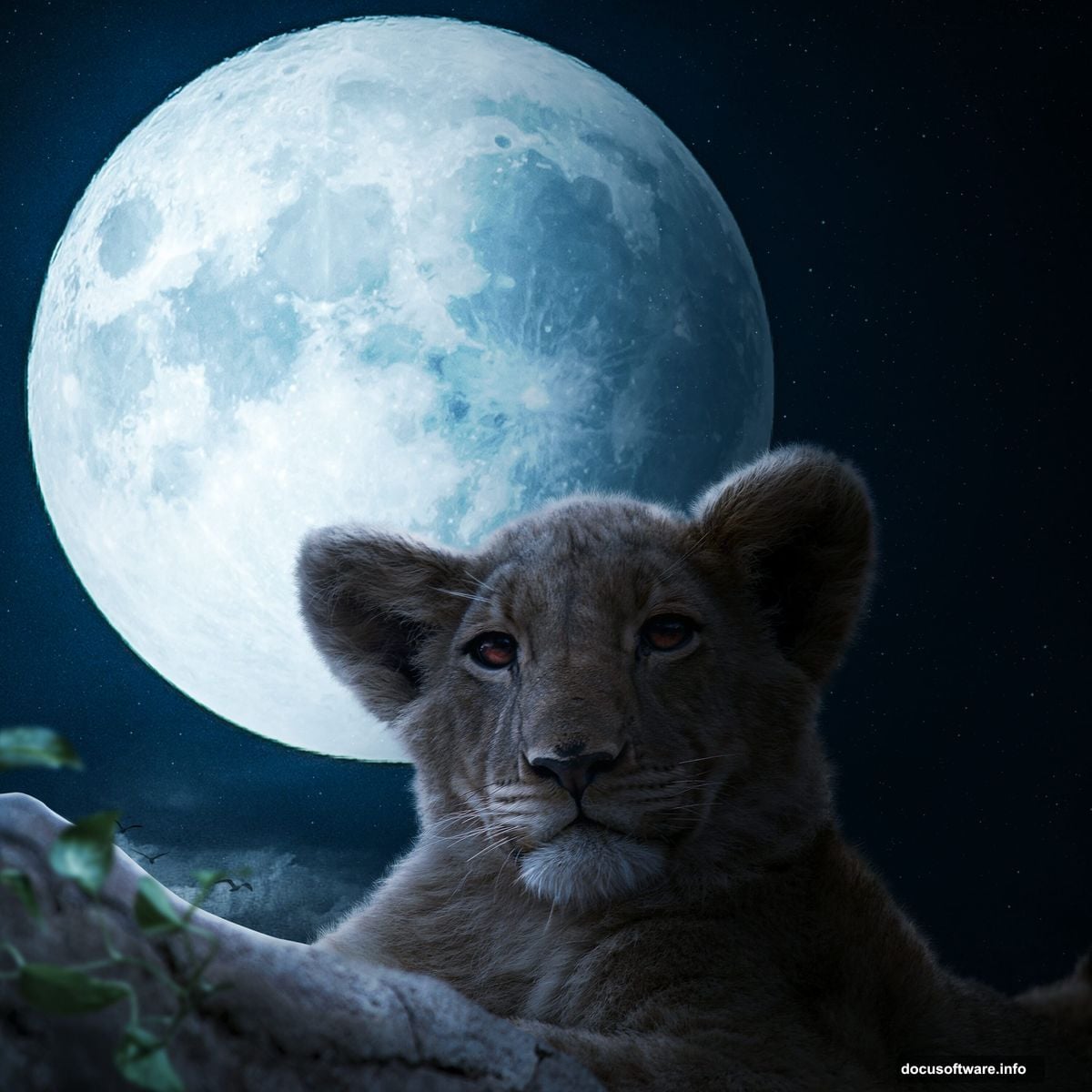
Bring in Supporting Elements
Now add the birds. Go to File > Open and select your birds image.
Hold Ctrl/Cmd and click the layer thumbnail. This creates a selection around the birds. Copy (Ctrl/Cmd + C) and paste (Ctrl/Cmd + V) into your main canvas.
Position the birds using the transform tool (Ctrl/Cmd + T). Scale them proportionally by holding Alt + Shift.
Birds add motion and scale reference. Place them where they enhance the composition without distracting from your main subject.
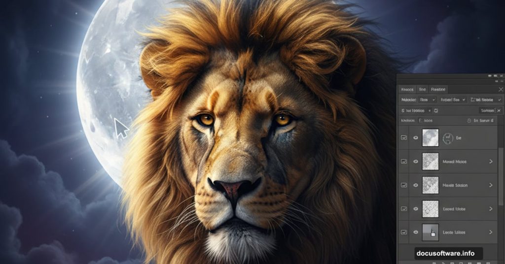
Import and Blend the Lion
Time for the star of your scene. Place your lion image the same way you placed the moon.
However, the lion needs more work to blend convincingly. You’ll need to:
Match the lighting direction
- Create shadows on the side opposite the moon
- Add rim lighting on the edges facing the light source
- Use Curves and Dodge/Burn tools for this
Blend the edges
- Use layer masks to soften harsh cutout edges
- Paint with a soft brush at low opacity
- Focus on fur edges and areas touching the background
Color match
- Apply adjustment layers to shift the lion’s color temperature
- Match the cool moonlight tones in your scene
- Use Hue/Saturation and Color Balance adjustments
The key is making the lion feel lit by the same moon that illuminates everything else. Consistent lighting sells the illusion.
Add Foreground Interest
Plant elements and grass create depth. Place them in the lower portion of your canvas.
These elements should be darker since they’re farther from the light source. Apply a darker color overlay or reduce their brightness significantly.
Use slight motion blur on some plants. This suggests wind and adds dynamism to a static image.

Paint Stars for Night Sky
Import your star brushes the same way you imported cloud brushes. Create a new layer and set foreground color to white.
Paint stars across your sky. Vary the brush size and opacity for natural-looking star fields.
Smaller, fainter stars should outnumber large bright ones. Cluster some stars together while leaving empty spaces for balance.
Add a few very bright stars using the Brush Tool at 100% opacity. These become focal points in your sky.
Apply Gradient Maps
Gradient maps unify your entire composition with consistent color grading.
Create a Gradient Map adjustment layer. Choose colors that match your desired mood. For this moonlit scene, cool blue to warm yellow works well.
Adjust the blend mode and opacity. Often Overlay or Soft Light at 40-60% opacity gives the best results.
Try different gradient combinations. Sometimes subtle adjustments make huge differences in the overall mood.
Final Touch: Camera Raw Filter
This step ties everything together. Flatten your image or create a stamp visible layer (Ctrl/Alt/Shift + E on PC or Cmd/Option/Shift + E on Mac).
Go to Filter > Camera Raw Filter. Here you can:
Global adjustments:
- Fine-tune overall exposure
- Adjust contrast and clarity
- Modify vibrance and saturation
Local adjustments:
- Use the adjustment brush for selective edits
- Enhance the moon’s glow
- Darken corners with vignetting
Color grading:
- Add split toning for shadows and highlights
- Enhance the cool blue moonlight
- Warm up the lion’s fur slightly
The Camera Raw Filter offers powerful controls in one interface. Experiment with different settings until your image feels polished and professional.
Common Mistakes to Avoid
Several issues trip up beginners with this type of composite:
Inconsistent lighting direction. Every element must be lit from the same angle. The moon establishes your light source. All shadows and highlights should respect that.
Over-sharpening. Composites need some softness to blend convincingly. Too much sharpening makes elements look pasted in.
Ignoring atmospheric perspective. Distant objects should be lighter, bluer, and lower contrast. This creates depth.
Matching color temperature poorly. If your background is cool-toned but your subject is warm, they won’t feel connected. Use adjustment layers to match color temperatures.
Why This Technique Works
This tutorial teaches core compositing principles through a specific project. But these same techniques apply to any photo manipulation.
You learned to:
- Build proper layer structure
- Use adjustment layers non-destructively
- Paint atmospheric effects
- Match lighting across elements
- Apply global color grading
Moreover, you can adapt this workflow to any fantasy scene. The principles remain the same whether you’re compositing portraits, landscapes, or creature designs.
Practice these techniques. Try different subjects and settings. The more you experiment, the more intuitive compositing becomes.
Your next project might feature a phoenix instead of a lion. Or perhaps an underwater kingdom instead of a moonlit sky. The methods stay consistent even as subjects change.
Start creating. The tools and knowledge are now yours.