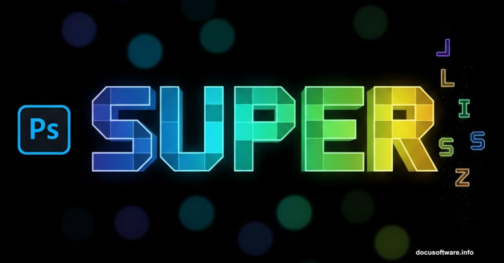
Want to create eye-catching text effects that look like colorful game tiles? This Photoshop technique transforms ordinary words into vibrant, dimensional typography that pops off the screen.
Designer Edmar Cisneros developed this method combining layer styles with strategic lighting effects. The result? Text that looks like it belongs in a retro video game but feels completely modern. Plus, you can adapt these techniques to any font or color scheme.
Let’s break down how to build this effect step by step.
What You’ll Need Before Starting
This tutorial requires a few specific resources. Don’t worry though. Most are free or already included in Photoshop.
First, grab the Tetra font from Font Fabric. Its geometric shapes work perfectly for this tile effect. However, any bold sans-serif font will do the job. Just look for clean edges and solid letterforms.
You’ll also want some bokeh texture overlays. These add depth and atmosphere to your final piece. Many free bokeh packs exist online if you search “free bokeh textures for Photoshop.”
Finally, make sure you’re running a recent version of Photoshop. This technique works in CS6 and newer versions including Creative Cloud.
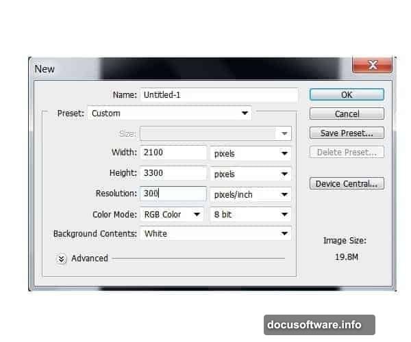
Set Up Your Canvas Right
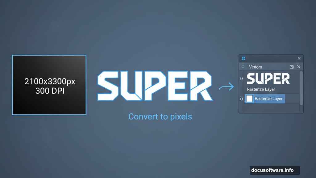
Start with a new document sized 2100 by 3300 pixels. Set the resolution to 300 DPI for print quality output. Even if you’re only posting online, starting with higher resolution gives you more flexibility later.
Fill the background layer with solid black using the Paint Bucket tool. Press G to select it quickly. This dark background makes the bright colors pop dramatically.
Now grab the Type tool by pressing T. Select your Tetra font at around 250 points. Type your word in the upper portion of the canvas. I used “Super” but choose whatever word you want.
Here’s the important part. Right-click your text layer and select “Rasterize Layer.” This converts your editable text into pixels so you can paint on it directly.
Build Your Color Foundation
Create a brand new layer above your rasterized text. This is where the magic happens.
Hold Ctrl and click your text layer thumbnail to select its shape. Now you’re ready to paint inside those letterforms without going outside the lines.
Select the Brush tool by pressing B. Start with your middle tone color. For blue-to-green gradients, begin with a medium blue shade. Fill the entire selection with this base color.
Switch to a soft brush with 0% hardness at about 250 pixels wide. Paint darker blue tones along the bottom edges of your letters. This creates instant depth and dimension.
Reduce your brush size to roughly 150 pixels. Pick your darkest green shade and start working the top portions of each letter. Don’t completely cover the blue underneath. Let some of that base color show through for richer blending.
Layer Your Colors Strategically
Continue building up your lighter green tones gradually. Think of it like painting with real oils. Each new layer should let hints of the previous color peek through.
Lower your brush opacity to around 40%. This makes blending much smoother and more natural. Work slowly and build up color intensity instead of slapping it on thick.
For the brightest highlights, switch to pure white. Use a smaller brush size now, maybe 75 to 100 pixels. Focus these white highlights on the very top edges where light would naturally hit your tiles.
Step back and evaluate your work. The color transition should flow smoothly from dark blue at the bottom through various greens to bright white highlights on top.
Not satisfied yet? Head to Image > Adjustments > Brightness and Contrast. Bump up both sliders slightly to make your colors really pop off the background.
Add Depth With Layer Styles
Your colored text looks pretty good now. But layer styles take it from good to great.
Double-click your colored text layer to open the Layer Style dialog. Start with a subtle Inner Glow. Set it to Screen blend mode with a soft white color. This adds luminosity from within.
Next, add a Drop Shadow for depth. Use a distance of about 20 pixels with a size around 30 pixels. Keep it soft and subtle. You want dimension without making it look like a cheap drop shadow effect.
Bevel and Emboss works wonders here too. Select Inner Bevel with a smooth technique. Set depth to around 150% and size to about 10 pixels. This creates those crisp tile edges.
Play with these settings until you achieve the dimensional look you want. Every font and color combo behaves differently so trust your eyes.

Light It Up With Bokeh Effects
Those bokeh textures you downloaded earlier? Time to put them to work.
Place a bokeh texture layer above everything else. Scale it to cover your entire canvas. Set the blend mode to Screen or Lighten. This makes the dark areas disappear while the bright spots add atmosphere.
Lower the opacity to taste. Usually somewhere between 30% and 60% works best. You want visible light spots without overwhelming your text.
Try multiple bokeh layers at different sizes and opacities. Stack them up and experiment with different blend modes. Overlay and Soft Light produce interesting results too.
Some designers add a slight Gaussian Blur to bokeh layers. This softens the light spots and makes them feel more atmospheric. Go to Filter > Blur > Gaussian Blur and apply 2 to 5 pixels of blur.
Refine and Polish Your Design
Step back and look at your composition as a whole. Does the text feel balanced? Are the colors working together or fighting each other?
Consider adding more words below your first one. Use different color palettes for each word to create variety. Purple-to-pink gradients look amazing. Orange-to-yellow creates warm energy.
Add subtle texture to your black background if it feels too flat. A very faint noise pattern or gradient can add sophistication without competing with your text.
Some designers add a subtle glow around the entire text using Outer Glow layer style. Set it to Screen mode with your brightest color at very low opacity. This creates a soft halo effect.
Finally, duplicate your entire composition onto a new layer. Go to Filter > Sharpen > Unsharp Mask and apply a subtle sharpening pass. This makes edges crisp and professional.
Why This Technique Works So Well
This Tetris tile effect succeeds because it combines multiple design principles simultaneously.
The bold geometric letterforms provide a strong foundation. The gradual color transitions add visual interest without chaos. Strategic lighting effects create the illusion of three-dimensional depth.
Plus, the technique is incredibly flexible. Change your color palette completely and get an entirely different mood. Use different fonts to match various design styles. Apply it to logos, headers, posters, or social media graphics.
Many designers adapt this effect for client work. Gaming companies love it obviously. But entertainment brands, tech startups, and youth-focused products all benefit from this energetic style.
The best part? Once you understand the core technique, you can complete this effect in under 30 minutes. Practice the color blending a few times and it becomes second nature.
This typography style brings immediate visual impact. Your text won’t just sit on the page. It’ll jump out and grab attention like those falling Tetris blocks we all know and love.