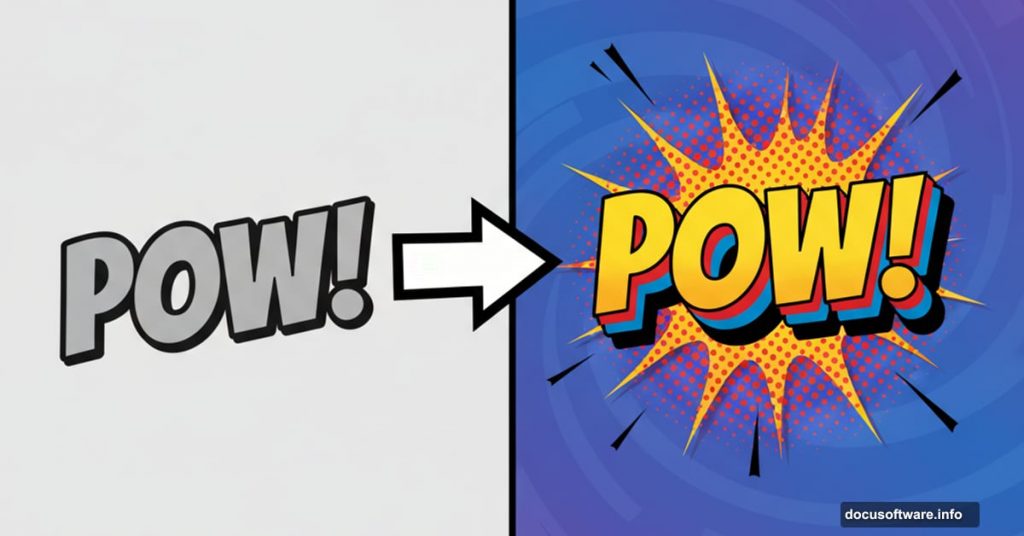
Comic book text should jump off the screen. Yet most Photoshop users settle for flat, boring typography that barely gets noticed.
The problem isn’t your skills. It’s that traditional text effects lack dimension. But there’s a solution that transforms ordinary text into eye-catching 3D comic book lettering that actually pops.
Let’s walk through creating this effect step-by-step. You’ll master layer styles, halftone patterns, and 3D depth techniques. Plus, the whole process takes about 30 minutes once you know the workflow.
What You’ll Need Before Starting
First, grab these free resources. You can’t create authentic comic book text without proper fonts and brushes.
Download halftone brushes from DeviantArt user Gregkmk. These create the classic comic dot pattern. Next, get the Komika Axis font from DaFont. It’s designed specifically for comic book lettering.
Make sure you’re using Photoshop CC or later. Earlier versions work but some features might differ slightly. Also, work with a large canvas size. I recommend 2000 x 2000 pixels minimum for crisp results.
Setting Up Your Comic Background
Create a new document in Photoshop. Go to File > New and set dimensions to 2000 x 2000 pixels. Resolution doesn’t matter much since we’re working in pixels, not print measurements.
Double-click your background layer. This opens the layer style window. Add a gradient overlay to create depth. Choose colors that complement your text but don’t compete with it.
Now create a new layer above the background. Fill it with any color and drop the fill to 0%. This seems counterintuitive but trust the process. Apply a pattern overlay using halftone dots. This gives your background that authentic comic book texture.
Adding Halftone Depth
Create another new layer. Select the Brush tool and set your brush size to around 1957 pixels. Pick your halftone brush from the ones you downloaded earlier.
Place a single halftone stamp in the center of your canvas. Change the layer blend mode to Luminosity and reduce fill to 16%. This creates subtle depth without overwhelming your composition.
The halftone pattern is crucial. Comics use these dots because of printing limitations. But they became iconic. So we’re recreating that vintage aesthetic digitally.
Creating the Main Shape
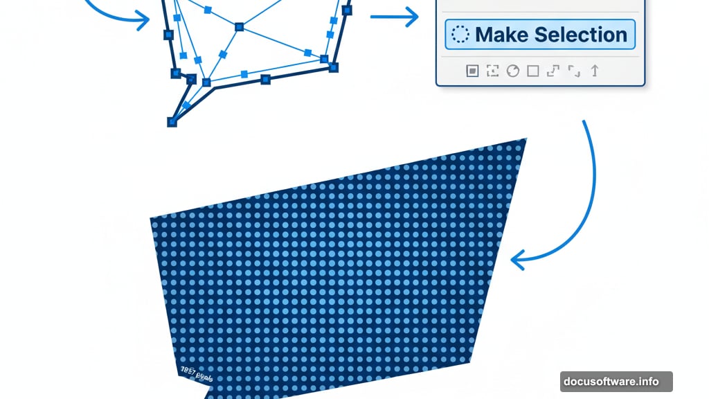
Grab your Pen tool. Draw a custom shape that will become your text container. Think bold, angular, dynamic. Comic book shapes aren’t timid rectangles.
Once you’ve drawn your path, right-click it in the Paths panel. Select “Make Selection” and click OK. Fill this selection with your chosen color.
Now double-click this layer to add effects. Apply a Color Overlay and Drop Shadow. The drop shadow creates initial depth. But we’re just getting started with the 3D effect.
Building the 3D Layers
Here’s where the magic happens. Create a new layer and make a selection from your shape layer. Hold Ctrl and click the layer thumbnail to load the selection.
Grab your halftone brush again. Stamp the pattern inside your selection using a complementary color. Then add a Gradient Overlay to this layer while keeping fill at 0%. This creates dimensional texture that catches light.
Next, create another layer below your shape. Use the Pen tool to outline your shape again, but slightly offset. Make a selection and fill it with black. This becomes your first shadow layer.
Duplicating for Depth
The real 3D effect comes from layer duplication. Select your main text layer and duplicate it multiple times. Each duplicate gets positioned slightly lower and to the right.
Start with small offsets of just a few pixels. As you move further back in the stack, increase the offset distance. This creates the illusion that your text extends into 3D space.
Change the color of each duplicate to slightly darker shades. The furthest layers should be nearly black. This mimics how light falls off with distance.
Adding the Bevel Effect
Now for the finishing touch that makes everything pop. Select your topmost text layer. Go to Layer Style and add a Bevel and Emboss effect.
Set the style to Inner Bevel with a smooth technique. Adjust the depth and size until you see crisp highlights and shadows forming on your letterforms. The bevel should be subtle but noticeable.
Add a Stroke effect on the same layer. Set it to 3-5 pixels depending on your text size. Use a bright color that contrasts with your text. This creates that classic comic book outline.
Fine-Tuning the Halftones
Go back and adjust your halftone layers. Try changing blend modes between Multiply, Overlay, and Luminosity. Each creates different effects with the underlying colors.
Also experiment with layer opacity. Sometimes 100% opacity looks too heavy. Dropping it to 70-80% often looks more natural.
Remember that comic books used halftones because of printing limitations. But you can control them precisely in Photoshop. So use that power to create exactly the look you want.
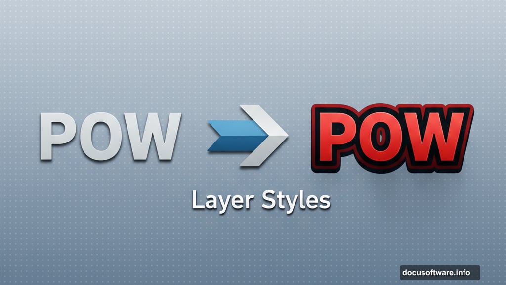
Saving Your Layer Styles
Here’s a time-saving tip nobody mentions enough. Once you’ve perfected your effects, save them as layer styles.
Right-click your finished layer and choose “Copy Layer Style.” Then you can paste it onto other text elements instantly. Or save it as a preset for future projects.
This matters because comic book text rarely appears alone. You’ll want multiple text elements with consistent styling. Saving styles prevents having to manually recreate effects every single time.
Common Mistakes to Avoid
Most people make the same errors when creating this effect. First mistake: not enough contrast between layers. If your 3D offset layers are too similar in color, the effect looks muddy.
Second mistake: over-rotating text. Comic book text should be dynamic but readable. Too much rotation makes it look chaotic rather than energetic.
Third mistake: ignoring the halftone scale. If your dots are too large, the effect looks chunky. Too small and they disappear. Test different brush sizes until they feel right for your resolution.
Making It Your Own
This technique gives you a foundation. But the best comic book text reflects your unique style. Try experimenting with different color schemes beyond the typical primary colors.
Consider adding texture overlays like paper grain or canvas weave. These add authenticity that pure digital effects can’t match. You can find free texture packs across the web.
Also play with the 3D offset direction. Most tutorials show offset toward the bottom right. But offsetting toward different directions creates entirely different moods and energy.
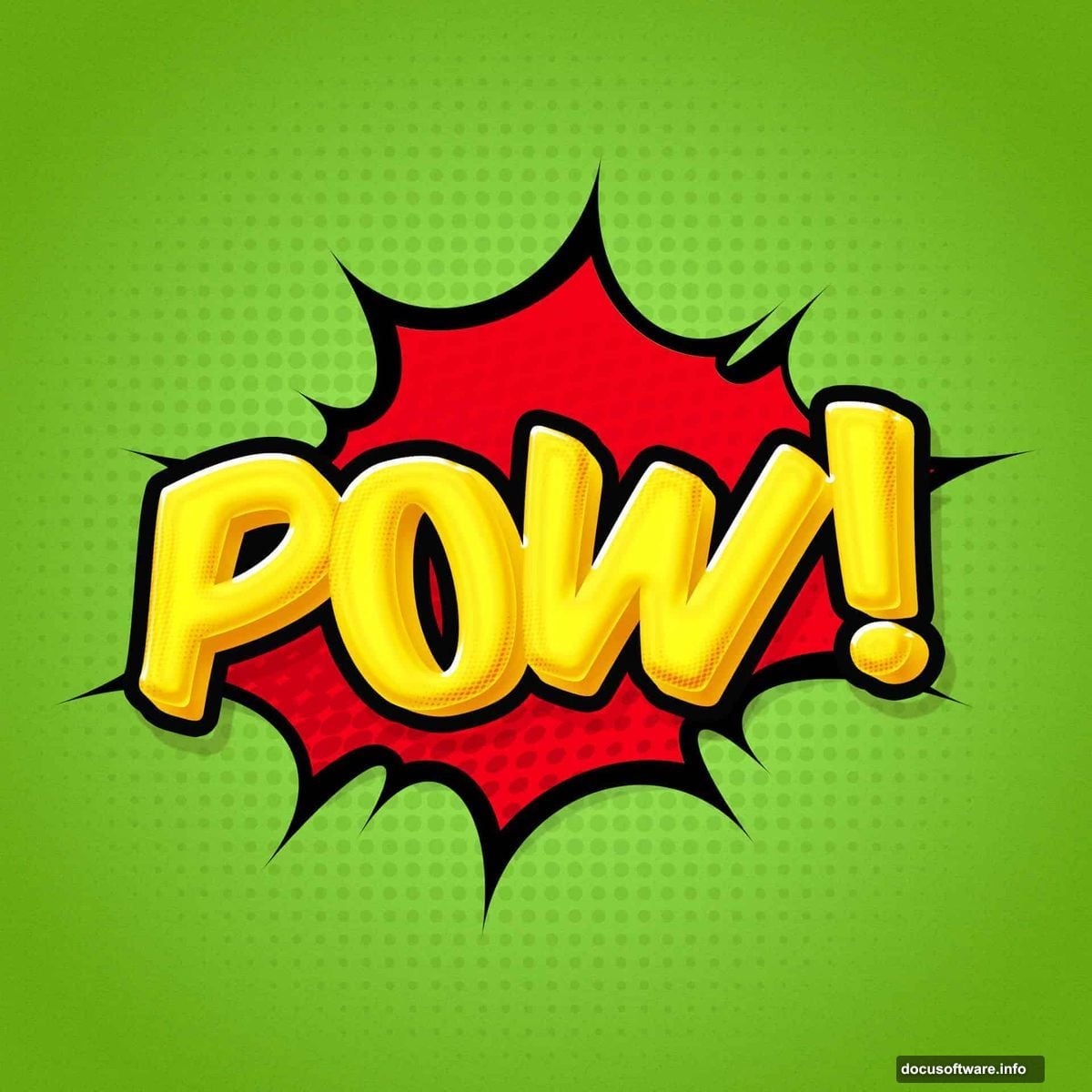
The beauty of this effect is its versatility. Once you understand the core principles, you can adapt it for movie posters, social media graphics, or whatever projects need that bold comic book punch.
Just remember the fundamentals: layered depth, strategic halftones, strong outlines, and dramatic color contrast. Master those elements and your text will always stand out.