Want to create a fantasy composite that looks professional? This detailed walkthrough shows you how to build a complete fairy tale scene in Photoshop.
You’ll learn how to blend disparate elements into a cohesive magical world. Plus, I’ll share the color correction tricks that make stock photos look like they belong together. By the end, you’ll have skills you can apply to any photo manipulation project.
What You’re Actually Building
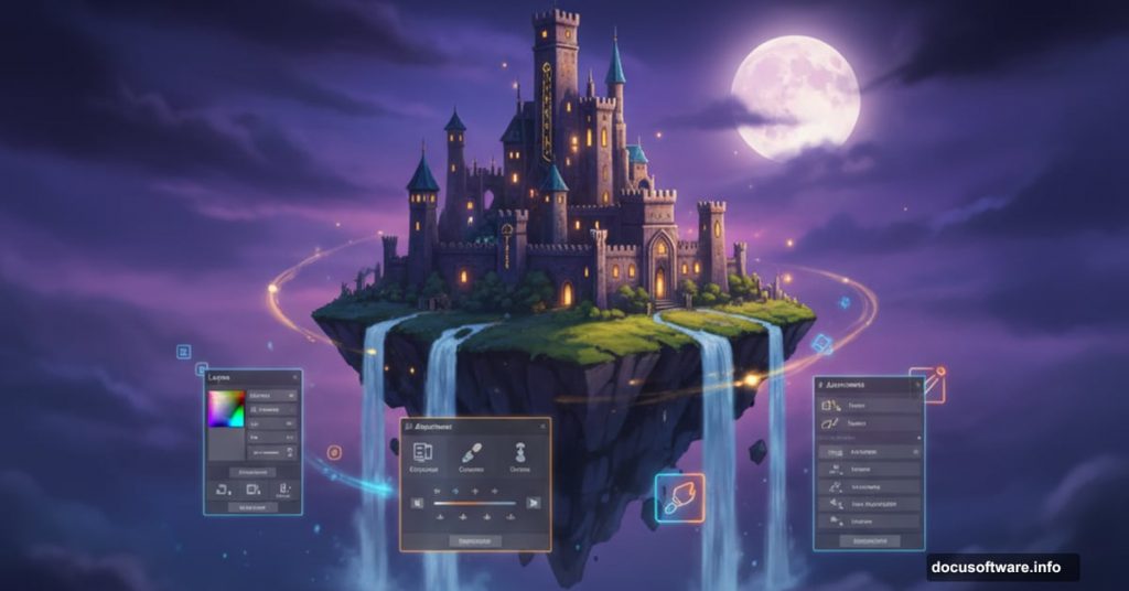
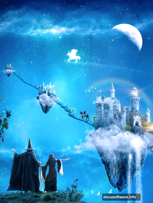
This isn’t just another generic fantasy scene. You’re creating a floating island at twilight with a wizard, castles, waterfalls, and magical lighting effects.
The scene combines roughly 20 different stock photos. Each needs color correction, perspective adjustments, and careful blending. So you’ll touch almost every major Photoshop tool during this process.
Required: Photoshop CS5 or newer. Smart objects and adjustment layers play a big role here.
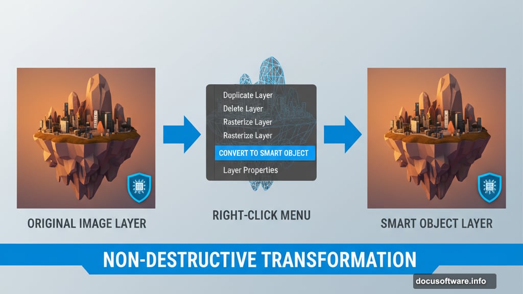
Why Smart Objects Matter From the Start
Here’s something most tutorials skip. Before you resize or filter anything, convert it to a smart object.
Right-click your layer. Choose “Convert to Smart Object.” That’s it.
Why bother? Smart objects preserve original pixel data no matter how much you resize or filter them. You can scale down, then scale back up without quality loss. Moreover, filters applied to smart objects become editable. You can adjust them later without starting over.
This saves hours of rework when clients change their minds.
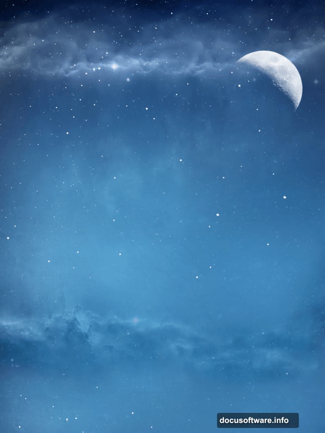
The Sky Foundation
Start by opening your sky stock photo. This establishes your color palette and lighting direction for everything else.
Import moon brushes. Create a new layer (Ctrl + Shift + Alt + N). Click once with a half-moon brush to place your moon where you want it.
That moon sets your scene’s time of day. Everything you add must match that twilight atmosphere.
Floating Islands Need Color Correction
Open your floating island stock. Copy it (Ctrl + A, then Ctrl + C). Paste into your scene (Ctrl + V).
But here’s the problem. Your island probably has warm orange tones. Your sky is cool blue. The island screams “I don’t belong here.”
Objects in real scenes pick up colors from their surroundings. Especially from the sky. So we need to push blue into that island.
The Fast Way to Match Sky Colors
Select your brush tool. Hold Alt and click somewhere in your sky to sample a blue color. Create a new layer above your island. Press Alt + Backspace to fill it with that sampled blue.
Now the whole canvas looks blue. Don’t worry. We’ll fix that next.
Change the blue layer’s blending mode to Color. Suddenly your island picks up blue tones that match the sky. It looks like it actually floats in that atmosphere instead of being pasted from another photo.
But the effect hits everything on screen. We need to limit it only to the island.
Clipping Masks Save the Day
Right-click your blue color layer. Choose “Create Clipping Mask.” The blue effect now only affects the layer directly below it—your island.
This technique works for any adjustment. Stack your color correction layers above an object. Clip them to that layer. The corrections only affect that one element.
You’ll use this constantly in photo manipulation work.
Building the Castle Architecture
Import your castle stock photo. Convert to smart object immediately. Resize to fit your floating island scale (Ctrl + T).
The castle probably has wrong lighting too. Create another color-filled layer using your sky’s blue. Set to Color blend mode. Clip it to your castle layer.
Notice the pattern? Sample sky color. Fill layer. Set to Color mode. Clip to target. This four-step process unifies disparate stock photos faster than any other method.
Adding the Wizard and Student
Open your character stock photos. Use the Pen Tool (P) to create precise selections around your subjects. For complex subjects like people with flowing robes, the Pen Tool beats any automatic selection method.
After creating your path, right-click and choose “Make Selection.” Copy your selection. Paste into your main scene.
Again, convert to smart object. Resize to match your scene’s perspective. Then apply the same color correction workflow—sample sky color, fill layer, clip to character.
Perspective Matters More Than You Think
Your wizard stands on a floating island. But does the perspective match? Look at the horizon line in your sky. Everything in your scene must respect that same eye level.
If your floating island sits above the horizon, you should see its underside. If it sits at eye level, you see it straight on. Get this wrong and your scene feels off even if viewers can’t explain why.
Use Free Transform (Ctrl + T) to adjust perspectives. Right-click while in Free Transform. Choose Perspective or Distort to match your elements to the scene’s viewing angle.
Trees and Foliage Integration
Import tree stock photos. Same workflow—smart object conversion, resizing, color correction through clipping masks.
But trees need extra work. Their edges often look too sharp against the sky. That creates an obvious cutout look.
Add a layer mask to your tree layer. Choose a soft brush with low opacity (20-30%). Gently brush the edges of your layer mask where tree meets sky. This subtle blending makes trees feel atmospheric instead of pasted.
Magical Lighting Effects Start Simple
Create a new layer above everything. Set its blend mode to Screen. Choose a soft white brush with low opacity (10-15%).
Paint gentle glows where you want magical light sources. Behind your wizard’s staff. Around floating crystals. Near lamp posts on your island.
Screen blend mode makes white paint look like actual light. The low opacity lets you build intensity gradually. Paint over the same spot multiple times for brighter glows.
This beats fancy filters every time for controllable, natural-looking magical lighting.
Water and Waterfalls Add Life
Import waterfall and water splash brushes. Create new layers for each water element. Position them flowing off your floating island’s edges.
But static water looks dead. Add motion blur (Filter > Blur > Motion Blur) to water elements. Set angle to match water’s flow direction. Start with 10-15 pixel distance.

Moreover, water catches light. Add subtle white highlights on a Screen blend mode layer where water surfaces face your moon or other light sources.
Grass and Ground Details
Your floating island needs grass, flowers, and ground texture. Import grass and flower stocks. Use the same color correction workflow you’ve learned.
Layer these elements carefully. Grass in front of rocks. Flowers on top of grass. Build depth through layering.
Use layer masks and soft brushes to blend edges. Nothing in nature has perfectly hard edges. Your grass shouldn’t either.
The Atmosphere Makes Everything Work
Create a new layer at the very top of your stack. Fill it with a gradient matching your sky—darker blue at top, lighter at bottom.
Set blend mode to Overlay or Soft Light. Reduce opacity to 20-30%. This subtle atmospheric layer ties everything together. It creates the impression that all elements exist in the same air, same lighting, same world.
Without this step, even perfectly color-corrected elements can feel disconnected.
Final Color Grading
Add a Curves adjustment layer at the top of your layer stack. Create an S-curve—raise highlights slightly, drop shadows slightly. This increases overall contrast and makes your scene pop.
Then add a Color Balance adjustment layer. Push midtones toward blue (to match your night sky). Add a touch of yellow to highlights (simulating warm moonlight). Deepen shadows toward blue.
These final adjustments unify your entire composition’s color palette.
Common Mistakes to Avoid
First, don’t skip smart object conversion. You’ll regret it when you need to resize something later. Second, resist the urge to over-sharpen. Magical scenes need some softness. Too much sharpening kills the dreamlike quality.
Third, watch your light directions. If your moon is on the left, shadows fall to the right. All shadows in your scene must respect this. Inconsistent lighting breaks immersion faster than anything else.
Why This Workflow Transfers to Other Projects
You just learned the core photo manipulation process. Import element. Convert to smart object. Match colors through clipping masks. Blend edges with layer masks. Add lighting effects on Screen mode. Finish with atmospheric layers and color grading.
These same steps work whether you’re creating fantasy scenes, product mockups, or social media composites. The techniques scale from simple two-image blends to complex 50-layer manipulations.
Master this workflow and you can tackle any photo composite with confidence.
The Resources Speed Up Everything

This tutorial lists specific stock photos for each element. Grab those if you want to follow along exactly. But the real value comes from understanding the process.
Once you understand how to color correct, blend, and light elements, you can substitute any stock photos you want. Build your own magical worlds using whatever resources you find.
That flexibility matters more than any specific stock image.
Time Investment Reality Check
This complete scene takes 4-6 hours for experienced users. Double that if you’re learning these techniques for the first time. Don’t rush.
Photo manipulation rewards patience. Take breaks. Step away and come back with fresh eyes. You’ll spot issues you missed while deep in the work.
Plus, sleeping on a project often reveals better solutions than grinding through in one marathon session.
Your Next Steps
Open Photoshop. Start with a simple sky and one floating element. Practice the color correction workflow until it feels natural. Add one element at a time.
Build complexity gradually. Don’t try to create the full 75-step scene on your first attempt. Master each technique individually. Then combine them into more elaborate compositions.
The skills you learn here unlock an entire creative field. Photo manipulation lets you build impossible worlds limited only by your imagination and stock photo budget.