
Photoshop manipulation tutorials usually promise magic but deliver mediocrity. This one actually works.
I tested this surreal sky portal technique myself. It transforms an ordinary photo of a man on a bench into something that looks professionally designed. Plus, the entire process relies on just two Photoshop features you already know.
Here’s what makes this tutorial different. No complex selections. No advanced blending modes. Just smart masking and adjustment layers. That simplicity matters when you’re learning photo manipulation.
What You’re Actually Creating
The final image shows a man sitting peacefully while watching what appears to be a portal to another dimension opening in the sky above him. Mountains blend into cosmic clouds. Stars scatter across an otherworldly atmosphere. An air balloon drifts through impossible space.
Sounds complicated? It’s surprisingly straightforward.
The technique works because it teaches proper layering fundamentals. You’ll understand why adjustment layers matter. You’ll learn when to use clipping masks. And you’ll see how simple masking creates seamless blends between disparate elements.
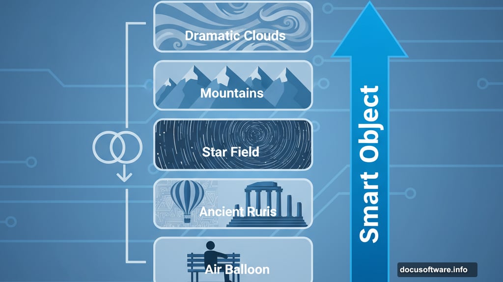
Stock Photos You’ll Need
This manipulation requires six separate images. All come from Unsplash, which means they’re free for commercial use.
First, grab a photo of a person sitting or standing in a landscape. The tutorial uses someone on a bench overlooking hills. But any contemplative pose works. Just make sure there’s visible sky to replace.
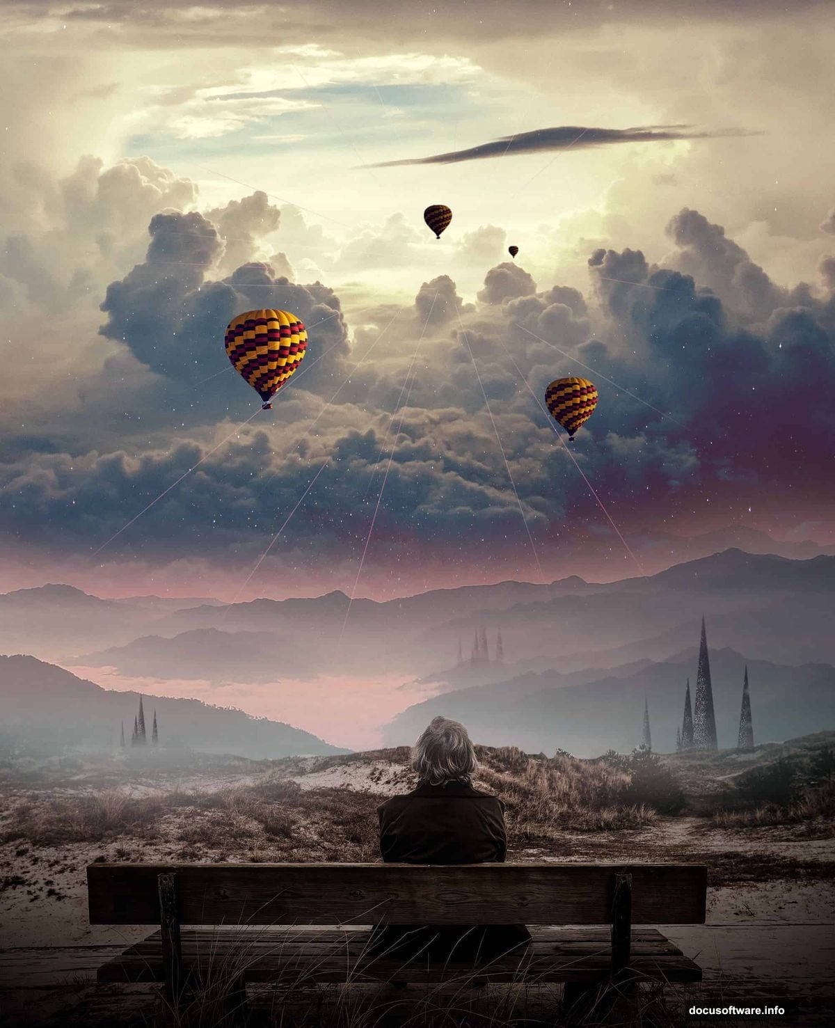
Next, find an air balloon image. This becomes your focal point in the magical sky. Look for side-view shots with clean backgrounds.
Then collect architectural structures. Floating buildings or monuments add that surreal dimension. Ancient ruins photograph particularly well for this effect.
After that, download high-resolution star field images. These create the cosmic atmosphere. Search for “night sky stars” or “milky way” shots.
Finally, get dramatic sky and mountain photos. Bold clouds and jagged peaks provide depth. The more contrast, the better.
Setting Up Your Canvas
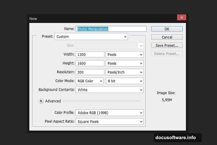
Start by creating a new Photoshop document. Use 3000 x 2000 pixels at 300 DPI. This gives you enough resolution for print-quality results. Fill the background layer with pure black.
Now place your person photo by going to File > Place. This automatically converts it to a Smart Object. That’s crucial because Smart Objects preserve image quality during transformations.
Hold Shift while resizing. This maintains proper proportions. Position your subject in the lower third of the canvas. Leave plenty of room above for your magical sky elements.
The Smart Object trick matters more than you’d think. It lets you scale, rotate, and transform without degrading quality. So if you need to adjust later, you won’t lose detail.
Masking Out Reality
Here’s where the magic starts. Select the Pen Tool and carefully outline your subject. Include the immediate foreground but exclude the original sky completely.
Once you’ve closed your path, convert it to a selection. Then click the Add Layer Mask button at the bottom of your Layers panel. This creates a mask that hides everything outside your selection.
But those edges look too sharp. Grab a soft round brush set to black. Lower the opacity to about 30%. Then gently paint along the mask edges where your subject meets the background.
This soft brushwork creates natural transitions. Hard edges scream “bad Photoshop job.” Soft edges whisper “maybe this could be real.” That subtlety separates amateur work from professional results.
Color Correction Fundamentals
Raw stock photos never match each other perfectly. Different lighting. Different color temperatures. Different exposure settings. So adjustment layers become essential.
Create a Hue/Saturation adjustment layer above your person layer. Right-click and select Create Clipping Mask. This applies the adjustment only to that specific layer.
Drop the saturation by about 15-20 points. This desaturates your subject slightly, which helps it blend with the darker, more mystical elements you’ll add later.
Next, add a Curves adjustment layer. Also clipped to your subject. Pull down the highlights slightly and lift the shadows. This reduces contrast and creates that dreamy, otherworldly quality.

Finally, apply a Levels adjustment. Push the middle input slider right to darken midtones. Your subject should now look like it exists in twilight rather than bright daylight.
Building Depth With Mountains
Place your mountain landscape photo beneath your subject layer. This creates immediate depth. The mountains form your middle ground between foreground subject and background sky.
Mask the top portion of the mountain layer using a large soft brush. You want a gradual fade into darkness. No hard lines. The peaks should disappear into the mystical atmosphere above.
Add the same three adjustment layers you used before. But this time, make the mountains darker and more desaturated. They should feel distant and mysterious. Background elements need less contrast than foreground subjects.
Here’s a pro tip. Duplicate your mountain layer. Set the duplicate to Multiply blend mode at 30% opacity. This adds richness to shadows without losing detail. It’s a subtle trick that adds polish.
Creating the Magical Portal Effect
Now comes the fun part. Place your sky photo above everything except your subject. This becomes your portal backdrop. Position it where you want the magical opening to appear.
Use the Elliptical Marquee Tool to create a circular selection. This defines your portal shape. Then invert the selection and delete. You’re left with a circular sky window.
Apply Gaussian Blur to this layer. Go to Filter > Blur > Gaussian Blur. Use a radius of about 15-20 pixels. This creates that ethereal, glowing quality around your portal edges.
Add an Outer Glow layer style. Set it to Screen mode with a light blue or purple color. Adjust the size until you get a subtle luminescence around the portal edges. This sells the illusion that energy emanates from the opening.
Floating Architecture Adds Surrealism
Place your structure images within the portal area. Rotate and scale them to create dynamic compositions. Floating at various angles looks more interesting than perfectly level buildings.
Mask away portions of each structure. You want them to look like they’re half-materialized or breaking apart into particles. Use a combination of hard and soft brushes for varied effects.
Reduce opacity on some structure layers to 60-70%. This makes them feel ghostly and not quite solid. Partially transparent architecture reads as magical rather than just copy-pasted.
Don’t forget to add the same color adjustments. Every element needs matching tones. Otherwise your composition looks like a collage instead of a cohesive scene.
Stars Make Everything Better
Place your star field images across the upper portions of your canvas. Set their blend mode to Screen. This makes the black disappear while keeping the bright stars visible.
Lower opacity to taste. Usually 30-50% works well. You want visible stars without overwhelming the composition. They should enhance atmosphere, not dominate it.
Add multiple star layers at different opacities and slightly different positions. This creates depth in your cosmic sky. Distant stars can be dimmer. Nearby stars brighter.
Consider adding a Gaussian Blur to some star layers. Slightly out-of-focus stars suggest atmospheric depth. Sharp stars mixed with soft ones create more realistic night skies.
The Air Balloon Focal Point
Your air balloon becomes the eye-catching element that draws viewers into the scene. Place it off-center according to the rule of thirds. Dead center feels static and boring.
Mask it carefully. Use the Pen Tool for precision. Air balloons have distinctive shapes that viewers recognize immediately. Sloppy masking destroys believability.
Add a shadow underneath the balloon using a black soft brush on a new layer. Set that shadow layer to Multiply at low opacity. This grounds the balloon in space and suggests light direction.
Apply the same adjustment layers again. But this time, make the balloon slightly more saturated than other elements. It should pop just enough to grab attention without looking out of place.
Final Polish That Matters
Create a new layer at the very top of your stack. Fill it with 50% gray. Set the blend mode to Overlay. This is your dodging and burning layer.
Paint with white at low opacity to brighten areas that should catch light. Paint with black to deepen shadows. This manual lighting control adds dimension that adjustment layers can’t achieve alone.
Add a subtle vignette. Create a Curves adjustment layer. Mask the center and paint black around the edges. This naturally draws eyes toward your main subject and portal.
Finally, consider adding a slight overall blue or purple color grade. Use a Color Balance adjustment layer. Push shadows toward blue and highlights toward a complementary warm tone. This unifies everything with cohesive color harmony.
Why This Technique Actually Works
Most Photoshop tutorials teach you to follow steps without understanding why. This approach forces you to think about layering logic. Background elements go behind foreground elements. That’s obvious but often ignored.
The adjustment layer workflow teaches non-destructive editing. You can change your mind later without starting over. That flexibility matters when you’re learning and experimenting.
Smart Objects preserve quality throughout your process. You’ll resize things multiple times while composing. Without Smart Objects, you’d degrade image quality with each transformation.
The masking techniques transfer to every other photo manipulation you’ll ever do. Soft edges, careful selections, and gradual transitions form the foundation of believable compositing.
Common Mistakes to Avoid
Don’t skip the adjustment layers. Matching colors between stock photos matters more than you think. Mismatched tones instantly reveal manipulation.
Avoid over-sharpening. Beginners often apply heavy sharpening filters thinking it adds detail. Instead, it creates obvious halos and fake-looking results. Let subtle blur create atmosphere.
Don’t make everything the same brightness. Real scenes have variation. Foreground elements should have more contrast than background elements. Distant objects naturally appear hazier.
Resist adding too many elements. More doesn’t mean better. This composition works because it’s relatively simple. Three or four main elements plus atmosphere beats cramming in everything you found on Unsplash.
Taking It Further
Once you’ve mastered this basic composition, experiment with variations. Replace the air balloon with a spaceship. Swap mountains for ocean waves. Change the time of day from twilight to dawn.
Try different portal shapes. Squares, triangles, or irregular organic forms all work. The technique stays the same regardless of shape.
Add particle effects by scattering small dots around your portal edges. Use the Brush Tool with Scatter settings enabled. This suggests energy or magic emanating from the opening.
Consider adding a figure inside the portal. A silhouette or distant person creates narrative. It suggests this portal leads somewhere specific rather than just abstract space.
This isn’t just about following steps. It’s about understanding how light, color, and composition work together to sell an impossible scene as believable. Master these fundamentals and you’ll create manipulations that make people stop scrolling.
The real magic isn’t in Photoshop’s tools. It’s in knowing when and how to use them. This tutorial teaches both. Now go create something that looks like it shouldn’t be possible.