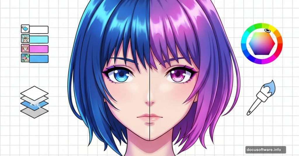
Digital anime painting intimidates most artists. The process seems complex with its layers, blend modes, and color theory.
But here’s the truth. Once you understand the core techniques, creating professional anime artwork becomes straightforward. This guide breaks down the exact process from outline to final lighting effects.
Let’s transform your sketches into polished digital paintings.
Start With a Clean Outline
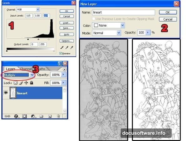
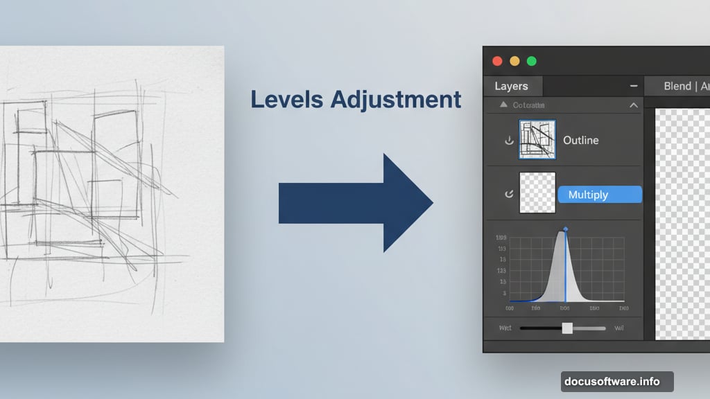
Most artists scan hand-drawn sketches then clean them digitally. Open your scanned outline in Photoshop first.
Use the Levels adjustment (Image > Adjustments > Levels) to sharpen contrast. Move the black and white input sliders toward the histogram center. Your goal is pure white background with 100% black lines and smooth edges.
Next, unlock the Background layer. Double-click it in the Layers palette and click OK. Change the blending mode to Multiply. This makes white areas transparent while preserving black lines.
Check for broken lines before moving forward. You’ll use the Magic Wand tool extensively and gaps will slow you down significantly.
Separate Outline and Background Layers
This technique creates thinner, cleaner outlines without jagged edges. Most artists skip this step then wonder why their work looks rough.
In the Channels palette (Window > Channels), click the dotted circle icon. This creates a selection using tonal information from your layer. Press Delete to remove the white background.
Add a new layer below your outline. Fill it with white then change the blending mode to Multiply.
Why does this matter? The Load Selection from Layer command produces smoother outlines than the Magic Wand tool. Your edges will blend properly with colored backgrounds instead of showing harsh pixels.
Apply Base Colors Efficiently
Create a new layer below your white background layer. Select the Magic Wand tool and set Tolerance to 50 in the option bar.
Checkmark both Contiguous and Sample All Layers options. Click where you want to add color. Expand the selection by 3 pixels using Select > Modify > Expand.
Fill your selection with the Paint Bucket tool. Repeat this process across the entire image.
Windows users can press Alt, S, M, E to quickly access the Expand command. This small shortcut saves considerable time on complex illustrations.
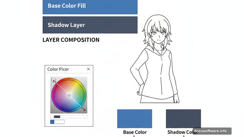
Add Shadows With Proper Color Theory
Shadows make or break anime artwork. Most beginners choose shadow colors randomly and wonder why their art looks flat.
Create a new layer between the white layer and base color layer. Select the Magic Wand tool with Tolerance set to 1. Uncheck Contiguous and Sample All Layers.
Select the Brush tool with 100% hardness for sharp edges. Click the foreground color to open the Color Picker.
Here’s the crucial part. Select your base color first to capture the hue. Then move the selector slightly down and right to adjust saturation and brightness. This creates shadows that harmonize with your base colors naturally.
Paint shadows while considering your light source direction. Consistent lighting creates believable depth.
Use Dodge and Burn for Gradient Effects
Solid colors look amateur. Professional anime art uses subtle gradients to create dimension.
Duplicate your base color and shadow layers. Position the duplicates above the originals. You’ll use new layers for dodging and burning while old layers help load selections.
Select your base color layer then use the Magic Wand to select an area. Turn on “Other Dynamics” in the Brushes palette (Window > Brushes). Set the Dodge or Burn tool Range option to Midtones.
Set brush hardness to 0% for smooth transitions. Select your top shadow layer. Use the Burn tool on lower shadow areas with smooth motions. Switch to the Dodge tool for upper shadow areas.
Repeat this process on your base color layer. Dodge the upper areas and burn the lower sections. This creates natural-looking volume.
Add Reflected Light for Realism
Ambient light reflects onto subjects from surrounding surfaces. Ignoring this makes characters look cut-and-pasted.
Keep the same Magic Wand settings. Turn on “Other Dynamics” in the Brush palette with 0% hardness.
For images with left-side lighting, use dark purple to shade right-facing areas. Use light yellow for areas facing the ambient light source.
This technique adds subtle environmental lighting that dramatically improves realism. The effect seems small but viewers notice the difference immediately.
Color Your Outlines for Professional Polish
Black outlines look harsh against colored artwork. Professional artists color their linework to match surrounding hues.
Select your outline layer then lock transparent pixels by clicking the checkerboard lock icon. Use the Brush tool to paint outlines with colors close to adjacent areas.
Use the Eye Dropper tool constantly to sample colors beside each outline section. This creates seamless integration between lines and fills.
The difference seems minor until you compare before and after versions. Colored outlines elevate artwork from amateur to professional instantly.
Create Dynamic Smoke Effects
Swirling smoke adds motion and atmosphere to static illustrations. The process combines basic brushwork with strategic smudging.

Create a new layer for clouds. Use the Brush tool at 100% hardness and paint zigzag shapes. Select the Smudge tool and drag in circular motions to create wispy tendrils.
Use Dodge and Burn tools to add 3D volume. Load your smoke layer selection (Select > Load Selection). Choose Select > Modify > Contract and enter a value that makes the selection half its original size.
Create a new layer for highlights. Paint inside the smoke with yellow-orange. Select the Move tool and nudge the layer up using your keyboard’s up arrow. This creates dimensional glow effects.
Build Cloudy Skies Layer by Layer
Sky backgrounds require similar techniques to smoke but with broader strokes. Create a new layer named “sky” then use the Gradient Tool for base atmospheric color.
Add another layer named “clouds” above. Paint loose cloud shapes with the Brush tool. Smudge these shapes to create natural-looking formations.
Load the clouds layer selection then contract it to about half size. Create a layer called “clouds 2” above your clouds layer.
Select a slightly darker color with the same hue and saturation. Paint the contracted selection with this color. Use Dodge and Burn tools to add volume.
Duplicate your clouds layer. Enlarge the duplicate with Free Transform (Edit > Free Transform). Set opacity to 75%. This creates atmospheric depth.
Paint Light Sources Strategically
Lighting transforms good artwork into exceptional pieces. Create a new layer named “light” at the very top of your layer stack.
Select the Brush tool with Other Dynamics checked in the Brushes palette. Set hardness to 0% for soft edges. Paint with white where light naturally hits surfaces.
Focus on areas closest to your main light source. Layer multiple passes for brighter highlights. This technique creates natural-looking illumination without harsh edges.
The key is subtlety. Multiple light passes look better than one strong application.
Apply Gradient Tinting for Temperature
Warm colors near light sources and cool colors in shadows create realistic atmospheric perspective. This final step unifies your entire composition.
Create a new layer above all others. Load the selection of your characters. Use the Gradient Tool to create an orange-to-blue gradient from your light source direction.
Change the blending mode to Color. Lower opacity to 10-20%.
This subtle effect makes left-side areas warmer and right-side areas cooler. The color temperature shift adds depth that flat coloring cannot achieve.
Professional anime artists use this technique consistently because it mimics how light behaves in reality. Your viewers won’t consciously notice it but they’ll feel the improvement.
Practice Makes Professional
These techniques work for any anime illustration style. The process becomes intuitive with repetition.
Start with simple characters before attempting complex compositions. Master each technique individually then combine them. Your early attempts won’t match professional work immediately and that’s expected.
Focus on understanding why each step matters rather than just following instructions. Once you grasp the principles behind outline separation, color theory, and lighting, you can adapt these techniques to your unique style.
Digital anime painting rewards patience and consistent practice. The tools are powerful but your artistic eye determines the final quality.