Creating anime artwork digitally sounds intimidating. But once you break down the process into clear steps, it becomes manageable.
This guide walks through transforming a pencil sketch into polished anime art. You’ll learn lighting techniques, color selection methods, and finishing touches that make characters pop off the screen.
Start With a Clean Outline
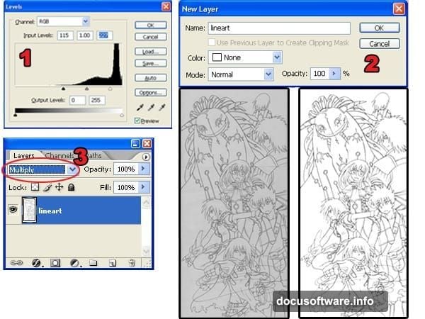
First, scan your pencil drawing into Photoshop. The outline needs to be crisp and clear before anything else.
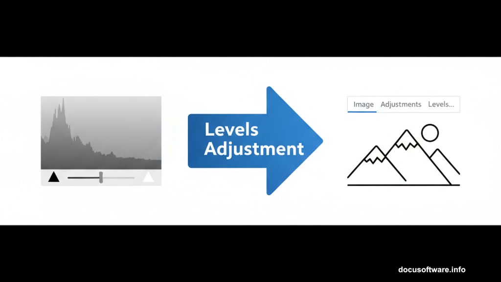
Open your scanned image. Then go to Image > Adjustments > Levels. Move the black and white input sliders toward the histogram center. This creates pure white backgrounds and solid black lines.
Next, unlock the Background layer. Double-click it in the Layers palette and hit OK. Change the blending mode to Multiply. The white background turns transparent instantly.
Check for broken lines before moving forward. Gaps in your outline cause problems later when selecting areas to color. Fix any breaks now to save headaches.
Separate Outline From Background
This step creates smoother edges than basic selection tools provide. The difference shows up when colors go down.
In the Channels palette, click the load selection button. This selects based on tonal information. Press Delete to remove the white background.
Add a new layer below your outline. Fill it with white. Set the blending mode to Multiply.
Why does this matter? Regular selection tools create jagged edges. This method produces clean lines that blend naturally with any background color.
Apply Base Colors
Now the fun part starts. Adding color brings your character to life.
Create a new layer below the white background layer. Select the Magic Wand tool. Set Tolerance to 50 in the options bar. Check Contiguous and Sample All Layers.
Click areas you want to color. Then go to Select > Modify > Expand. Expand the selection by 3 pixels. This prevents white gaps between outlines and colors.
Use the Paint Bucket tool to fill selections. Pick colors that match your character design. Repeat this process across the entire image.
Add Shadow Layers
Shadows create depth and dimension. But choosing the right shadow color makes the difference between flat and professional.
Create a new layer between the white layer and base colors. Select the Magic Wand with Tolerance set to 1. Uncheck Contiguous and Sample All Layers.
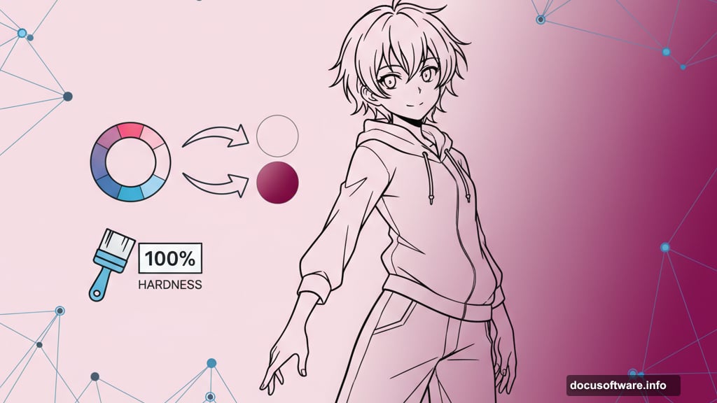
Pick the Brush tool. Set hardness to 100% for sharp edges. Click the foreground color to open the Color Picker.
Here’s the key technique. Select your base color first to get the correct hue. Then move the color picker slightly off-center. This adjusts saturation and brightness for natural-looking shadows.
Paint shadows carefully. Consider where light hits your character. Shadows fall opposite the light source.
Create Gradient Effects
Solid colors look amateur. Gradients add professional polish.
Duplicate your base color and shadow layers. Position copies above the originals. The new layers are for editing. Old layers remain for selection purposes.
Select areas with the Magic Wand. Then open the Brushes palette and turn on Other Dynamics. Set hardness to 0% for the Dodge and Burn tools.
Use the Burn tool on shadow layers. Darken lower areas with smooth strokes. Switch to the Dodge tool. Lighten upper shadow areas.
On base color layers, dodge upper areas. Burn lower sections. This creates natural color transitions that mimic real lighting.
Paint Reflected Light
Ambient light bounces off surfaces. Adding this reflection makes artwork believable.
Keep Other Dynamics enabled in the Brushes palette. Set brush hardness to 0%.
For this technique, paint areas away from the light source with dark purple. Surfaces facing the light get painted with light yellow. The light source in the example comes from the left, so right sides receive darker tones.
Color Your Outlines
Black outlines look harsh. Colored outlines add subtle detail that elevates the final result.
Select the outline layer. Click the lock transparent pixels button in the Layers palette. This prevents painting outside existing lines.
Use the Brush tool with colors similar to nearby areas. Keep picking colors with the Eye Dropper tool. Match outline colors to adjacent elements for natural blending.
Build Atmospheric Smoke
Smoke and atmospheric effects add drama. Creating them takes just a few steps.

Create a new layer. Use a 100% hardness brush to paint zigzag shapes. These form the smoke base.
Select the Smudge tool. Smudge shapes following natural smoke movement patterns. Then use Dodge and Burn tools to add volume. This makes smoke appear three-dimensional.
Load the smoke layer selection. Go to Select > Modify > Contract. Contract the selection to roughly half its original size. You might need several attempts to find the right amount.
Create another layer for highlights. Paint inside with yellow-orange. Select the Move tool and nudge the layer upward using the arrow key.
Design Cloudy Skies
Sky backgrounds use techniques similar to smoke creation.
Make a new layer called “sky”. Use the Gradient Tool for a base gradient. Create another layer above it named “clouds”.
Paint cloud shapes with the Brush tool. Smudge them to create natural formations. Load the clouds layer selection and contract it like you did with smoke.
Create a “clouds 2” layer above the first cloud layer. Pick a slightly darker color with the same hue. Paint the selected area.
Use Dodge and Burn to add dimension. Duplicate the clouds layer. Enlarge it with Free Transform and set opacity to 75%. Finally, dodge and burn the sky layer to establish the light source.
Add Light Sources
Light makes everything come together. This step brightens key areas naturally.
Create a new layer called “light” at the very top. Select the Brush tool and enable Other Dynamics. Set hardness to 0%.
Choose white as your foreground color. Paint where light should appear brightest. Focus on areas closest to your light source. Build up brightness gradually with multiple strokes.
Apply Color Tinting
Final color adjustment adds realism. Warm tones near light sources, cool tones away from them.
Create a top layer. Load the character selection. Use the Gradient tool to create an orange-to-blue gradient from light source to shadow areas.
Change the layer blending mode to Color. Lower opacity to 10-20%. This subtle tint unifies the color palette while enhancing the lighting effect.
The gradient should match your light direction. Left-side lighting means orange on the left, blue on the right.
Results Worth the Effort
This process takes practice. But each technique builds on the last.
The key difference between amateur and professional anime art comes down to lighting and color choices. Dodge and Burn tools create depth. Reflected light adds realism. Colored outlines remove harsh edges.
Start with one character. Master these techniques through repetition. Soon you’ll develop intuition for color relationships and lighting that makes your work stand out.