Creating web layouts shouldn’t feel like solving a puzzle. Yet many designers struggle with the fundamentals.
Good web design starts in Photoshop, not in code. Before writing HTML or CSS, you need a solid visual blueprint. This guide walks through building a professional 960-pixel layout from scratch. Plus, you’ll learn practical techniques that work for any web project.
Plan First, Design Second
Skipping the mockup phase kills good design. Most failed layouts trace back to jumping straight into Photoshop without a plan.
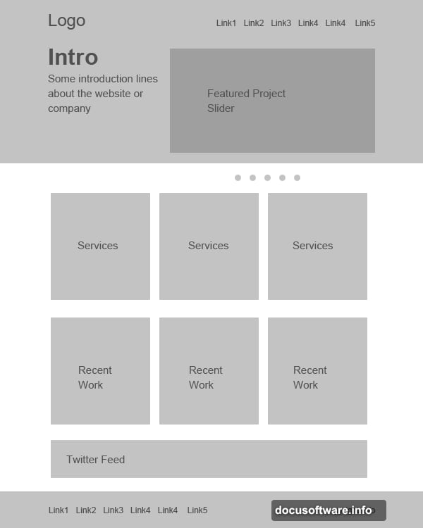
Start with a simple wireframe. Use only gray tones at this stage. That forces you to focus on structure instead of getting distracted by colors. Think about navigation placement, content hierarchy, and white space distribution.
A basic mockup takes 15 minutes. But it saves hours of redesign later. Sketch where the header goes, how content sections flow, and where calls-to-action live. No need for pixel-perfect precision yet.
Set Up Your Canvas Right
Canvas setup determines everything that follows. Get this wrong and you’ll fight Photoshop the entire project.
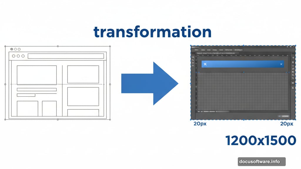
Create a new document at 1200 x 1500 pixels. The extra width provides breathing room around your 960-pixel layout. Now define the work area with guides.
Press Ctrl+A to select everything. Go to Select > Transform Selection. Shrink the selection to exactly 960 pixels wide. Add guidelines to mark this boundary.
Next, create padding. With the selection still active, transform it again to 920 pixels wide. That builds 20 pixels of padding on each side. Add guides here too. This padding prevents content from cramming against edges.
Build Headers That Pop
Headers anchor your entire layout. They set the tone and establish visual hierarchy immediately.
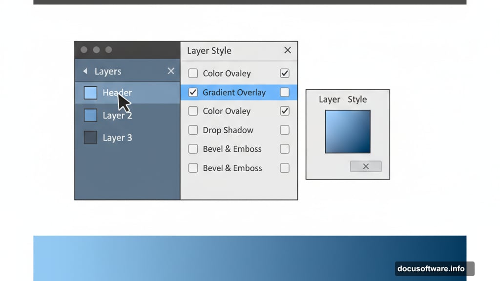
Make a selection 465 pixels tall. Fill it with gray first. Then apply gradients and colors through Layer Styles. This workflow maintains flexibility since you can adjust colors without redrawing shapes.
Double-click the layer thumbnail. Select Gradient Overlay. Create a two-color gradient from light to dark. The gradient adds depth that flat colors can’t match.
For the highlight line, draw a thin rectangle across the header bottom. Apply a gradient that fades from white to transparent. This subtle touch separates the header from content below.
Patterns Add Texture Without Clutter
Flat designs look amateur. Subtle texture makes layouts feel crafted instead of generated.
Pick the Pencil Tool. Set brush size to 2 pixels. Draw two dots touching at their corners. That’s your pattern tile. Turn off the background layer and select both dots.
Choose Edit > Define Pattern. Name it something memorable like “checker-small.” Apply this pattern to your header with reduced opacity. Around 5-10% works well.
Add a layer mask to the pattern layer. Paint with a soft white brush at 60% opacity. This blends the pattern smoothly into the header. Too much pattern overwhelms. Too little does nothing. Find the balance.
Navigation Needs Breathing Room
Cramped navigation menus frustrate users. Give your nav items space to breathe.
Create text for each menu item: Home, About, Services, Portfolio, Contact. Use a clean sans-serif font like Bebas or Helvetica. Size them around 14-16 pixels depending on your font choice.
Space menu items evenly. Use guides to ensure consistent gaps between items. Typically 40-60 pixels between items works well. Too close feels cluttered. Too far breaks the visual connection.
Add hover states by duplicating text layers. Apply subtle color shifts or underlines. Even in a static mockup, showing hover states helps developers understand your intent.
Content Sections Need Structure
Random content placement creates chaos. Organized sections create clarity.
Divide your layout into clear zones. A three-column layout works for many sites. Mark these columns with guides at 300 pixels wide each with 20-pixel gutters.
Create sample content blocks. Use placeholder text and images. Lorem ipsum works fine for mockups. The goal is showing how real content will fit and flow.
Add background colors or borders to distinguish sections. Subtle gray backgrounds (#f5f5f5) separate sections without harsh dividers. Too much contrast between sections creates a choppy experience.

Icons Clarify Without Words
Good icons communicate instantly. Bad icons confuse users.
Download a consistent icon set like Function Icons. Don’t mix icon styles. Stick with one visual style throughout your layout.
Place icons next to relevant content. A phone icon near contact info. A gear icon for settings. Keep icon sizes consistent, typically 32-48 pixels for web layouts.
Add slight shadows or glows to icons. This separates them from backgrounds. But go easy. Heavy effects look dated. A 1-pixel drop shadow at 20% opacity often suffices.
Footers Ground Your Design
Footers shouldn’t be afterthoughts. They complete the visual flow and provide important functionality.
Create a footer section 200-300 pixels tall. Use a darker background color than your header. This anchors the page visually.
Include essential footer elements: copyright info, secondary navigation, social media links. Organize these into columns for scanability.
Add social icons that match your design style. Space them evenly. Link graphics from sites like IconEden provide professional options. Size social icons smaller than content icons, around 24-32 pixels.
Layer Organization Saves Sanity
Messy layers make edits nightmarish. Organize now to save hours later.
Group related layers into folders. Name folders clearly: “Header,” “Navigation,” “Content,” “Footer.” This structure mirrors your HTML later.
Name every layer. “Layer 47 copy 3” tells you nothing. “nav-button-home” explains everything. Future you will thank present you.
Delete unused layers regularly. Hidden layers clutter your palette. If you’re not using it, trash it. Save milestone versions as separate files if you want to preserve options.
Colors Create Mood, Not Decoration
Color choices communicate brand personality before users read a single word.
Stick to 3-5 main colors maximum. More colors create visual noise. Choose one primary brand color, one or two accent colors, plus neutral grays.
Use color purposefully. Primary actions get the primary color. Secondary actions use gray. Danger actions use red. This consistency helps users navigate intuitively.
Test color contrast for readability. Text needs sufficient contrast against backgrounds. Tools like WebAIM’s contrast checker ensure accessibility. Failing accessibility guidelines excludes users and hurts SEO.
Export Smart, Not Just Pretty
Beautiful designs fail if they don’t export properly for development.
Save your original PSD with all layers intact. Developers need this to extract assets and measurements.
Create a flattened JPEG preview at 100% scale. This shows the complete design vision in one glance. Email-friendly and perfect for client presentations.
Export individual assets developers need: logos, icons, buttons. Save these as PNG files with transparency. Name files clearly: “logo-header.png” not “image1.png.”
Document your design decisions. Note font sizes, colors, and spacing measurements. A simple text file prevents endless “what size is that?” questions later.
From Pixels to Production
This Photoshop layout is your blueprint, not your final product. Converting designs to working websites requires HTML and CSS skills. But starting with a solid visual foundation makes development smoother.
Practice these techniques on multiple projects. Each layout you create builds muscle memory. Soon you’ll set up canvases and organize layers without thinking.
The best web designs balance beauty with function. They guide users naturally to important content. Plus, they load fast and work on all devices. Master the design phase first. Then worry about responsive breakpoints and performance optimization.
Your layouts will never feel random again.