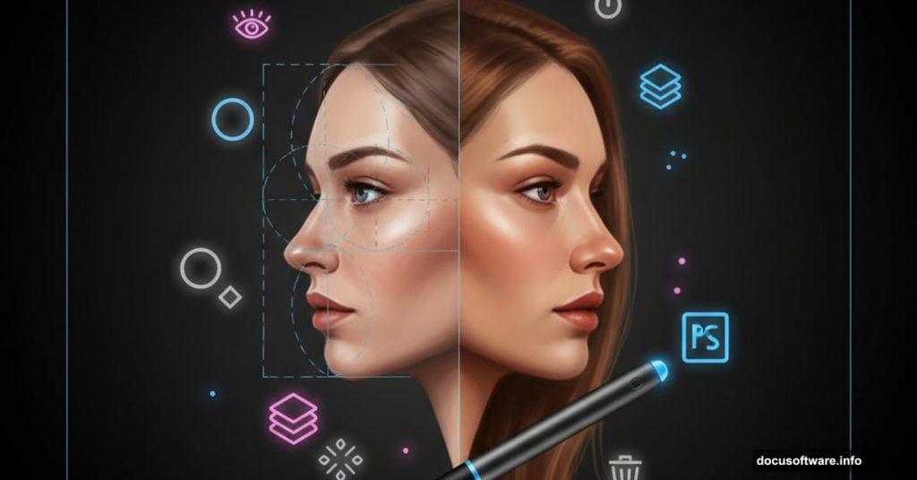
Want to paint realistic portraits in Photoshop but don’t know where to start? You’re not alone.
Most beginners struggle with facial proportions and digital painting techniques. But once you understand the fundamentals, portrait painting becomes surprisingly manageable. This guide breaks down the process into clear steps anyone can follow.
You’ll learn proper facial anatomy, brush techniques, and layer management. Plus, we’ll cover common mistakes that make portraits look “off” and how to avoid them.
Before You Start: Tools and Setup
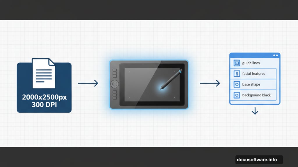
First, grab a graphics tablet. Yes, you can use a mouse. But a tablet makes painting exponentially easier and more precise.
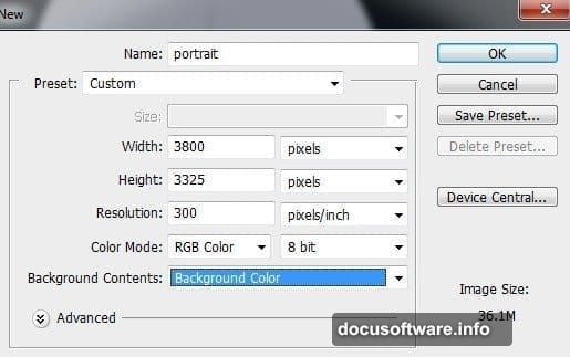
Create a new document with these settings:
- Width: 2000 pixels
- Height: 2500 pixels
- Resolution: 300 DPI
- Background: Black
Why so large? Detail work requires space. You can always scale down later. But you can’t add detail that wasn’t there from the start.
Set your background to black. Dark backgrounds help you judge colors and values more accurately as you paint.
Female Face Anatomy: The Foundation
Skip this section and your portrait will look wrong. Trust me.
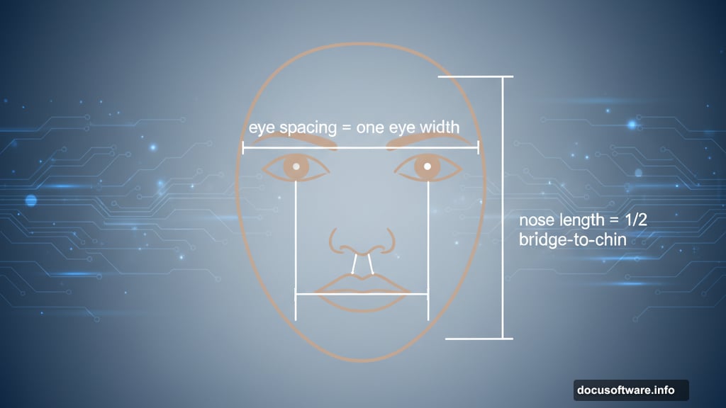
Here are the golden rules for frontal portraits with neutral expressions:
Nose positioning matters. The nose length should equal half the distance from the nose bridge to the chin. Sounds complicated? Just measure it. The nostril edges line up vertically with the inner eye corners.
Mouth placement is critical. The corners of the mouth align horizontally with the jaw. Vertically, they match up with the iris edges. The mouth always extends wider than the nostril width unless you’re painting a child.
Eye spacing follows a pattern. The distance between eyes equals one eye width. The pupils sit directly below the eyebrow arches.
These rules change for different angles and expressions. But master the basics first. Then break the rules intentionally, not accidentally.
Step-by-Step: Building the Portrait
Create the Base Shape
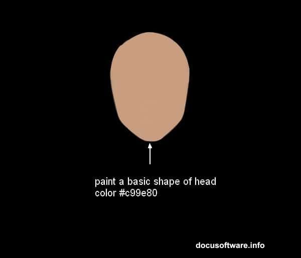
Start with a hard round brush. Set the color to #c99e80. Paint a basic head shape on your black canvas.

Draw guide lines for the eyes, nose, mouth, and chin. Reference those anatomy rules above. Get the proportions right now. It’s much harder to fix them later.
Place this layer above all others. We’ll keep it visible as a guide throughout the painting process.
Define Facial Features
Switch to a soft round brush with 0% hardness. This becomes your main painting tool.
Paint the eye sockets first. Use darker tones around the eyes to create depth. Eyes sit in recessed areas of the skull. Show that recession through shadow.
Add the nose structure. Remember that nose length rule? Apply it here. Paint the bridge, tip, and nostrils. Keep edges soft at this stage.
Block in the mouth area. Don’t paint individual lips yet. Just establish where the mouth sits and its basic shape.
Build Form with Light and Shadow
Here’s where portraits come alive. Or die horribly.
Imagine a light source. Decide where it’s coming from. Mine usually comes from the upper left at a 45-degree angle. Stick with one light source. Multiple light sources confuse beginners.
Add highlights to raised areas:
- Forehead center
- Nose bridge and tip
- Cheekbones
- Chin
- Upper lip bow
Deepen shadows in recessed areas:
- Eye sockets
- Under the nose
- Under the lower lip
- Jaw line
- Neck
Use the Smudge tool to blend transitions. But don’t over-blend. Some edge definition keeps faces from looking muddy.
Eyes: The Portrait’s Soul
Most portraits fail at the eyes. So let’s get them right.

Paint the eyeball first. Yes, the entire sphere. Even though most of it hides under eyelids. This helps you understand the eye’s three-dimensional form.
Add the iris and pupil. Make them circular. Sounds obvious. But tilted or oval eyes look alien. For this tutorial, we’re using sea green (#4a7a72).
Paint the eyelids. They wrap around the eyeball. Show that curvature. The upper lid casts a shadow on the eyeball itself.
Add catchlights. Those bright reflections in the eyes bring them to life. Place them consistently in both eyes. Usually upper left if your light source comes from that direction.
Don’t forget eyelashes. Paint them in clumps, not individual hairs. They grow from the eyelid edge, not the eyeball.
Hair: Texture and Volume
Beginners paint hair strand by strand. Don’t do this.
Start with large masses of color. Block in the overall hair shape. Define where it parts. Show which direction it flows.
Add mid-tones next. Paint in the direction hair grows. Use long, smooth strokes. Vary your pressure to create natural-looking strands.
Layer highlights on top. Hair reflects light intensely on the highest curves. Paint these highlights using a small brush with low flow settings.
Finally, add a few individual strands around the hairline and edges. Just a few. This suggests detail without requiring you to paint every single hair.
Body and Clothing Details
The dress uses a floral pattern. Import your pattern texture. Transform it to fit the body contours. Use Warp transform to make it drape naturally.
Set the pattern layer to Overlay or Soft Light blending mode. Reduce opacity to around 60-70%. This integrates it with your painted base.
Add fabric folds. Light fabric bunches at stress points:
- Shoulders
- Elbows
- Waist
- Anywhere the fabric pulls or compresses
Paint darker values in the fold creases. Add highlights on the raised portions between creases.
Color Adjustments: Making It Pop
Create a Curves adjustment layer. Boost contrast slightly. Be subtle here. Too much contrast makes skin look plastic.
Add a Color Balance layer. Warm up the highlights. Cool down the shadows. This creates dimensional, realistic skin tones.
Consider a Selective Color adjustment. Target the reds and yellows. These control skin tones specifically. Small adjustments here significantly impact the overall portrait.
Final Details and Refinements
Zoom in to 100% view. Now’s the time for pixel-level perfectionism.
Sharpen eye details. Add individual eyelashes. Refine the catchlights. Make sure both eyes look equally sharp and detailed.
Check your edges. Some should be soft and blended. Others should be crisp and defined. Vary edge quality to create interest.
Add final highlights. Thin, bright strokes on the nose tip, cupid’s bow, and lower lip center. These small touches add convincing realism.
Review the overall composition. Does anything feel off? Fix it now. Once you flatten or save, major changes become much harder.
Common Mistakes to Avoid
Over-smoothing kills portraits. Skin has texture. Pores exist. Some variation in tone and color looks more realistic than perfectly smooth gradients.
Symmetry isn’t your friend. Human faces aren’t perfectly symmetrical. One eye sits slightly higher. One eyebrow arches differently. These asymmetries create character.
Don’t neglect the neck and shoulders. Beginners spend hours on faces then rush the body. Viewers notice. Give the entire portrait consistent attention and detail.
Color variety matters. Skin isn’t one flat color. It contains reds, yellows, blues, and greens. Layer these subtly for realistic results.
Your Next Steps
Start simple. Don’t expect masterpieces immediately. Digital painting requires practice and patience.
Paint regularly. Even 30 minutes daily builds skills faster than occasional marathon sessions. Muscle memory and color judgment improve through repetition.
Study real faces. Notice how light behaves. Where do shadows fall? How do different features connect? Reference photos teach you more than any tutorial can.
Save your work at different stages. You can always return to earlier versions if something goes wrong. Plus, reviewing your progress helps you learn faster.
Most importantly, enjoy the process. Digital painting should be fun, not frustrating. If you’re not having fun, take a break. Come back with fresh eyes.