
Want to create stunning surreal photo manipulations? This step-by-step guide shows you how to build a complete Alice in Wonderland scene from scratch.
Most Photoshop tutorials promise magic but deliver confusion. Not this one. You’ll learn practical techniques for blending elements, controlling light, and creating atmosphere that actually looks believable.
Plus, these skills transfer to any matte painting or photo manipulation project. Let’s dive in.
What You’ll Actually Learn
This tutorial walks you through building a complete fantasy scene. You’ll combine clouds, playing cards, teacups, and a model into one cohesive image.
But here’s the real value. You’ll master fundamental techniques that work for any composite image. Realistic shadows. Believable lighting. Color harmony that ties everything together.
The project takes about 2-3 hours for beginners. Experienced users can finish faster. Either way, you’ll have a portfolio piece worth sharing.
Gathering Your Resources First
Before opening Photoshop, download all your source images. You’ll need clouds, playing cards, umbrellas, a model photo, teacups, sunset skies, and a tea kettle.
Why gather everything first? Interrupting your workflow to hunt for images kills momentum. Plus, you can preview how elements might work together before committing.
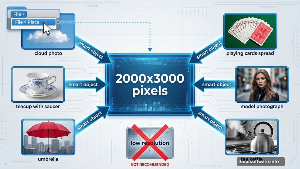
Make sure your images are high resolution. Low-quality sources create pixelated messes when you transform or scale them. Save yourself the frustration.

Setting Up Your Canvas
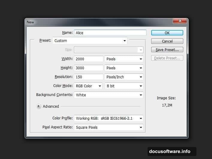
Start with a new document at 2000×3000 pixels. That’s portrait orientation with plenty of room for vertical composition.
Go to File > New or hit Ctrl+N. Name your file something memorable. I use “Alice” to stay organized.
This size works great for social media and prints. You can always scale down later. But starting small means losing quality if you need to go bigger.
Building the Sky Background
Your sky sets the entire mood. So choose carefully.
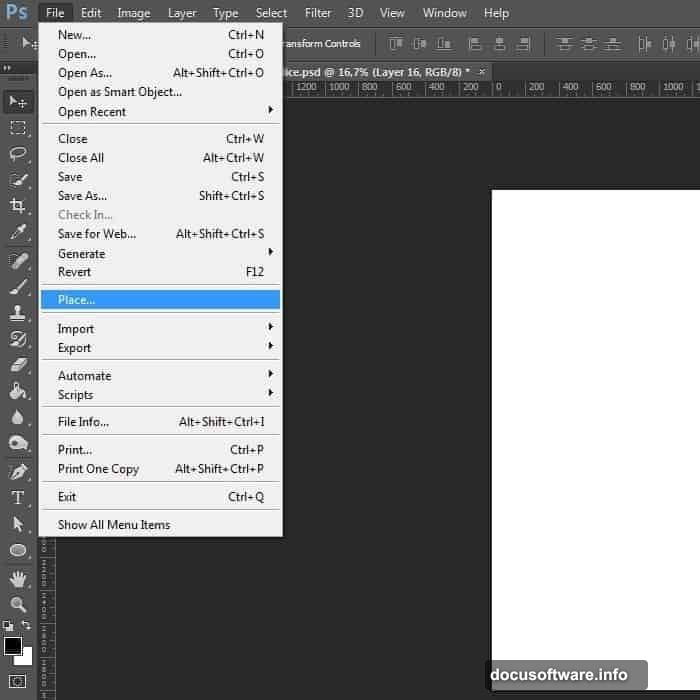
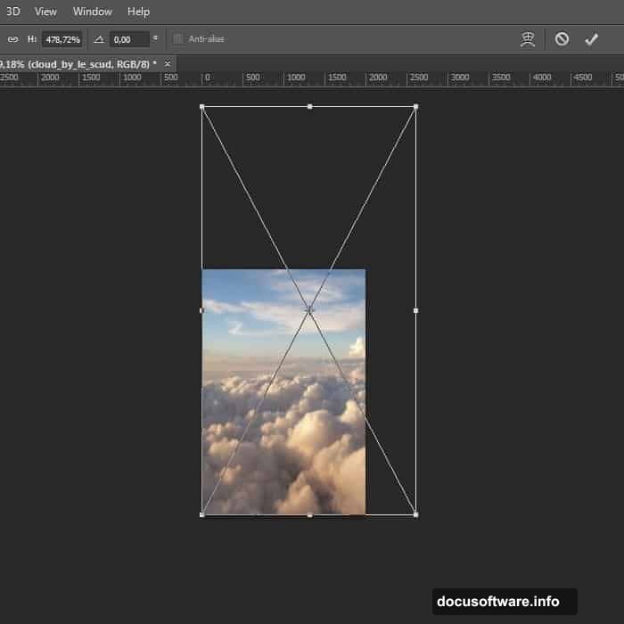
Go to File > Place and select your sky image. This imports it as a smart object, which preserves quality when you transform it.
Hit Ctrl+T to transform. Stretch the sky to fill your canvas. Drag those corner handles until the clouds look dramatic.
Here’s the trick most tutorials skip. Your sky probably looks flat right out of the camera. Let’s fix that.
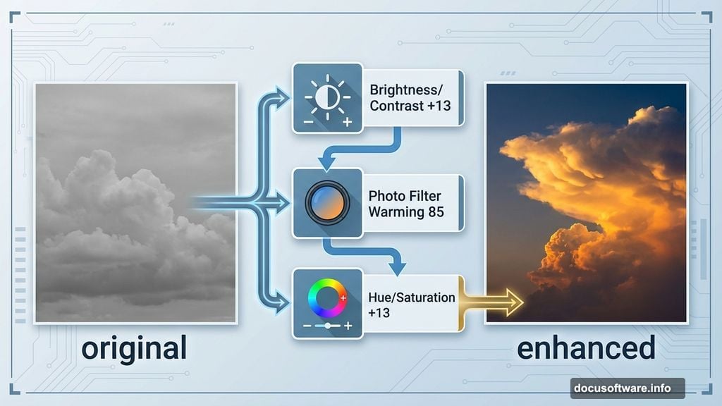
Making Clouds Pop with Adjustments
Add a Brightness/Contrast adjustment layer. Go to Layer > New Adjustment Layer > Brightness/Contrast. Set Brightness to +13 and Contrast to +13.
Notice how the cloud edges suddenly have definition? That’s what we’re after.
Next, add a Photo Filter adjustment layer. Choose Warming Filter (85) at 17% density. This creates that golden sunset glow.
Finally, bump up the color with Hue/Saturation. Set Saturation to +13 and Lightness to +1. Now your sky looks like an actual sunset instead of a washed-out photo.
Why Adjustment Layers Matter
Here’s something beginners miss. Adjustment layers are non-destructive.
That means you can change settings later without starting over. Plus, you can toggle them on and off to compare before and after.
Always use adjustment layers instead of applying effects directly to images. Your future self will thank you.
Adding the Road and Ground Elements
Now you need somewhere for Alice to stand. Import your road texture using File > Place.
Position it in the lower half of your canvas. The road should lead toward the horizon, creating depth.
Use the same transform technique as before. Ctrl+T, then drag and rotate until the perspective looks natural.
But wait. The road probably doesn’t match your sky’s lighting yet. We’ll fix that next.
Matching Light Between Elements
This step separates amateur composites from professional work. Every element needs consistent lighting.
Look at your sky. Is the light warm or cool? Coming from which direction? Now look at your road.
If they don’t match, add adjustment layers to the road. Usually a Photo Filter and Brightness/Contrast do the trick.
The goal? Someone viewing your image shouldn’t be able to tell where one element ends and another begins.
Placing Alice in the Scene
Import your model photo. Place her on the road where you want her to stand.
Here’s the critical part. Her lighting must match the environment. If the sky is warm sunset light, she needs warm light too.
Add shadows beneath her feet. Use a soft black brush at low opacity on a new layer. Paint where her feet touch the ground.
Shadows anchor your subject to the environment. Without them, she’ll look pasted on.
Adding Props and Details
Now comes the fun part. Import teacups, playing cards, and other props.
Scatter them around Alice. Some should be in the foreground, others in the background. This creates depth.
But don’t just drop them in. Each prop needs proper lighting and shadows. Use the same adjustment layer technique.
For cards floating in the air, add subtle shadows on nearby objects. Light doesn’t lie. Your props need to interact with the environment.
Creating Atmospheric Depth
Real scenes have atmospheric perspective. Distant objects look hazier and less saturated.
To fake this in Photoshop, add a slight blur to background elements. Go to Filter > Blur > Gaussian Blur. Use a small radius, maybe 1-2 pixels.
Also desaturate distant props slightly. This makes them recede into the background naturally.
Your eye should travel through the scene in layers. Foreground sharp and vibrant. Background softer and muted.
Final Color Grading
Your composite probably looks decent now. But color grading makes it magical.
Add a Curves adjustment layer. Pull the curve slightly to create an S-shape. This adds contrast and richness.
Then add a Color Lookup adjustment layer. These are presets that create specific moods. Try “Moonlight” or “Late Sunset.”
Adjust the layer opacity until it looks right. Usually 40-60% works better than full strength.
The Details That Sell It
Professional composites have tiny details that amateur work misses. Light glow around bright objects. Subtle color spill from one element onto another.
Add a soft light layer above everything. Paint with a soft brush using colors sampled from your sky. This unifies all elements.
Also check edges. If any element has a hard cutout edge, soften it with a small blur or feather.
These micro-adjustments take an extra 30 minutes. But they’re what separate “pretty good” from “how did you do that?”
Common Mistakes to Avoid
Most beginners overdo effects. Your image shouldn’t look over-processed.
If adjustment layers are too strong, reduce their opacity. Subtlety usually wins.
Also watch your shadows. They should all point in the same direction based on your light source. Inconsistent shadows destroy believability instantly.
Finally, step away from your work periodically. Fresh eyes catch mistakes you’ve been staring past.
Why This Tutorial Works
Unlike other guides that skip crucial steps, this one shows you the complete process. Every adjustment layer. Every shadow technique.
You’re not just following instructions. You’re learning principles you can apply to any photo manipulation project.
The Alice in Wonderland theme is just the vehicle. The real lesson is how to blend disparate elements into one cohesive, believable image.
Take Your Time and Experiment
Don’t rush through this. The best learning happens when you experiment with each technique.
Try different adjustment layer settings. See how far you can push effects before they break. That experimentation builds intuition.
Your first attempt might not be perfect. That’s fine. Save your PSD file and come back to it later with fresh perspective.
The skills you’re building here apply to commercial work, personal projects, and creative expression. They’re worth mastering properly.