Wait, wrong article! Let me actually read what this is about…
Ah, this is about creating curved text in Photoshop without distortion. Let me write about that properly.
# Stop Warping Your Text. Here’s How Photoshop Curves Really Work
That retro badge looked perfect until you added the text. Now the letters bulge weirdly at the top.
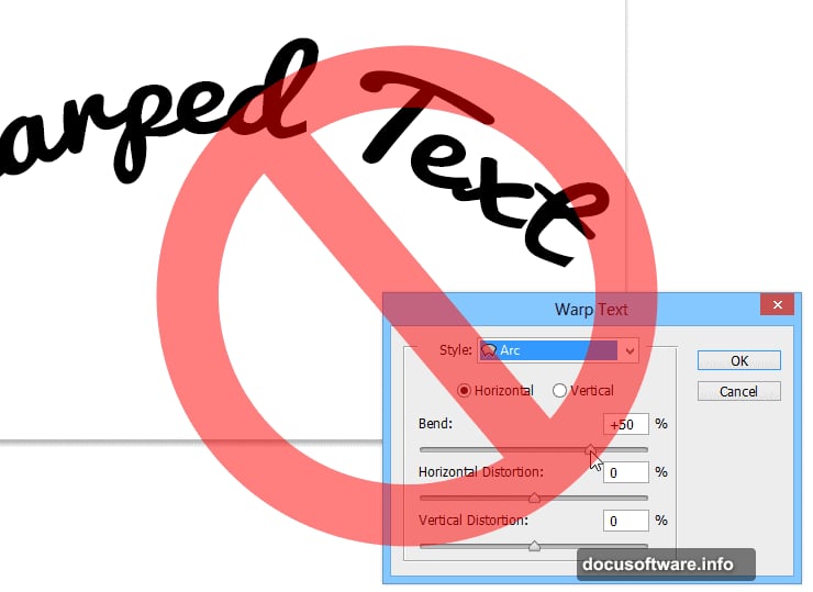
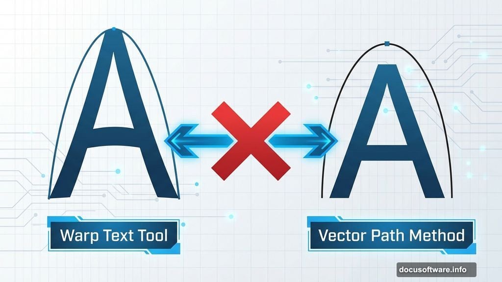
You used the Warp Text tool. Everyone does. But it deforms letters in ways that scream “amateur hour.” There’s a better method that keeps text crisp and professional—and it takes the same amount of time once you know the trick.
Why Your Curved Text Looks Wrong
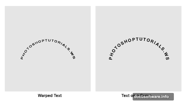
The Warp Text tool stretches pixels. That’s fine for creating bulge effects or pinched text. But for clean curves? It enlarges the upper half of letters while shrinking the bottom half.
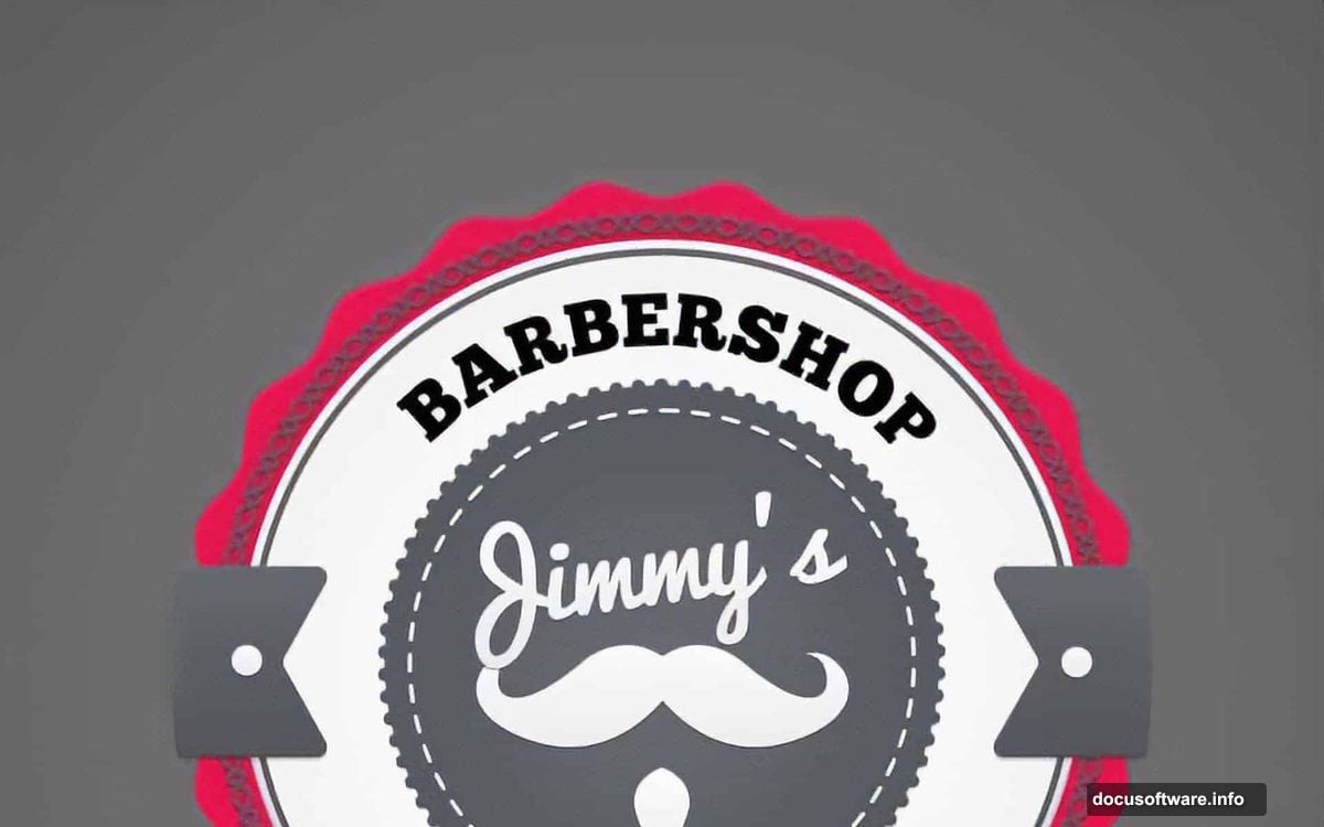
Look at any professional logo with curved text. The letters maintain consistent proportions all the way around. That’s because designers use vector paths, not warping tools.
Plus, warped text becomes harder to edit later. Change the font? You’ll need to reapply and readjust the warp. Path-based text stays flexible.
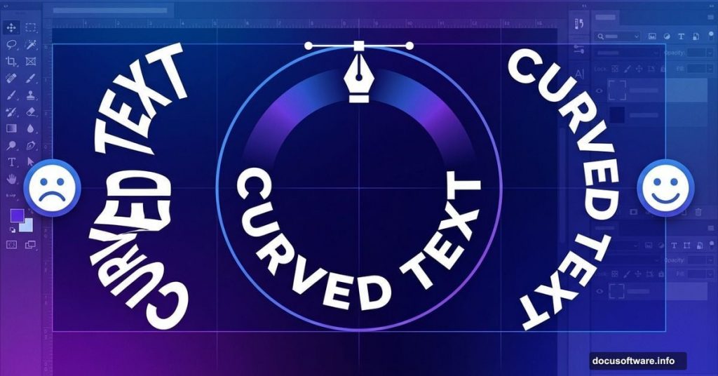
The Vector Path Method Works Better
Photoshop lets you type directly onto any vector path. This keeps letter shapes intact while following your curve perfectly.
Here’s the process. It takes about 30 seconds once you’ve done it twice.
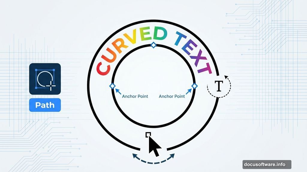
First, create your path. Select the Ellipse tool from your toolbar. In the options bar below your menu, switch the dropdown from “Shape” to “Path.” Then draw your circle while holding Shift for perfect proportions.
Next, add text to the path. Switch to the Type tool. Hover over the path until your cursor changes to show a curved line across it. Click anywhere on the path and start typing.
Your text now follows the curve without any distortion. The letters maintain their original proportions.
How to Position Text Correctly
Text usually appears in the wrong spot initially. But repositioning takes two seconds.
Switch to the Path Selection tool. You’ll see two tiny points on your path—these control where text starts and stops.
Drag these points to reposition your text. Hold Shift while dragging to snap them to perfect center positions. Your cursor should change to show two arrows when hovering over these points.
Want text on the bottom of your circle instead? Drag one of those points toward the circle’s center. The text flips to the inside of the path.
Fixing Common Problems
Text appears upside down on the bottom curve? Use the Path Selection tool to drag the adjustment point toward the circle center. This flips the text orientation.
Only seeing two letters? Your path might be too small for all the text. Either enlarge the path or reduce text size first.
Can’t find the adjustment points? Make sure you selected the Path Selection tool, not the regular Selection tool. They look similar but behave differently.
Text won’t center properly? Set your text alignment to center in the options bar before typing. You can also manually adjust spacing with the Character panel.
When Warp Text Actually Works
The Warp Text tool has legitimate uses. Just not for clean curved text.
Use it when you want creative distortions—bulging superhero text, flag waves, or fish-eye effects. These intentionally distort letter shapes for stylistic effect.
But for logos, badges, and professional curved text? Vector paths win every time. The difference becomes obvious when clients zoom in or when designs get printed large.
The Spacing Challenge
Path-based text can create awkward letter spacing on tight curves. Photoshop tries to maintain even spacing, but curved paths challenge this.
For subtle curves, automatic spacing works fine. But tight circles might need manual kerning adjustments. Open the Character panel and adjust spacing between specific letter pairs as needed.
Alternatively, use wider curves. The gentler the arc, the more natural your spacing looks without manual tweaking.
Professional badge designers often create two separate paths—one gentle arc for the top text, another for the bottom. This prevents the spacing issues that come from wrapping text completely around a circle.
Practice Makes This Second Nature
The first time feels clunky. By the third attempt, you’ll create curved text faster than opening the Warp Text dialog.
The key insight? Photoshop has tools designed for different jobs. Warp manipulates pixels. Paths guide placement. Using each tool for its intended purpose produces cleaner results with less frustration.
Next time you need curved text, skip the warp tool entirely. Draw a path, click with the Type tool, and admire text that maintains proper proportions all the way around your curve.
Your clients might not consciously notice the difference. But the overall impression shifts from “homemade” to “professional.” That subtle quality boost comes entirely from choosing the right technique.