Everyone tries to recreate epic Star Wars scenes in Photoshop. Most fail miserably.
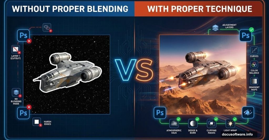
The problem isn’t your skills. It’s that tutorials skip the crucial blending steps that make space scenes believable. Plus, they assume you already know what “adjustment layers” actually do. So you follow along blindly, wondering why your result looks flat and fake.
This tutorial fixes that. I’ll show you how to build a convincing Star Wars attack scene from scratch. Plus, I’ll explain why each step matters. No more copying settings without understanding the effect.
What Makes Space Scenes Look Real
Good space composites need three things most beginners ignore.
First, consistent lighting across all elements. Your spaceship can’t have bright sunlight while your background sits in shadow. Second, atmospheric perspective. Distant objects need haze and reduced contrast. Third, color harmony. Everything must share similar color tones, or the scene falls apart.
Most tutorials throw elements together and call it done. That’s why they look like bad collages instead of cohesive scenes. We’ll avoid that mistake.
Build Your Foundation Right
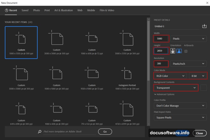
Start by creating a new document at 5080 x 2859 pixels, 300 DPI, RGB mode. That resolution gives you room to crop and adjust without losing quality.
Next, place your mountain landscape background. Hit File > Place and select your mountain image. Then press Ctrl/Cmd + T to transform it. Hold Alt + Shift (or just Alt in newer Photoshop versions) while dragging corners to scale proportionally.
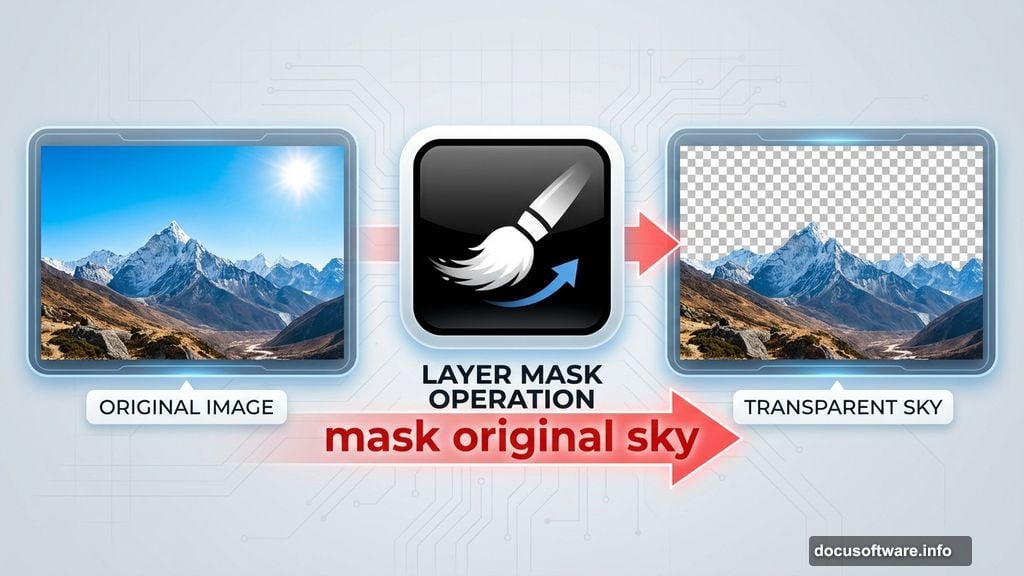
Here’s where most people mess up. They leave the sky as-is. Instead, create a layer mask and use a soft brush with black foreground color to paint away the original sky and sun. This gives you clean space to add your custom sky elements later.
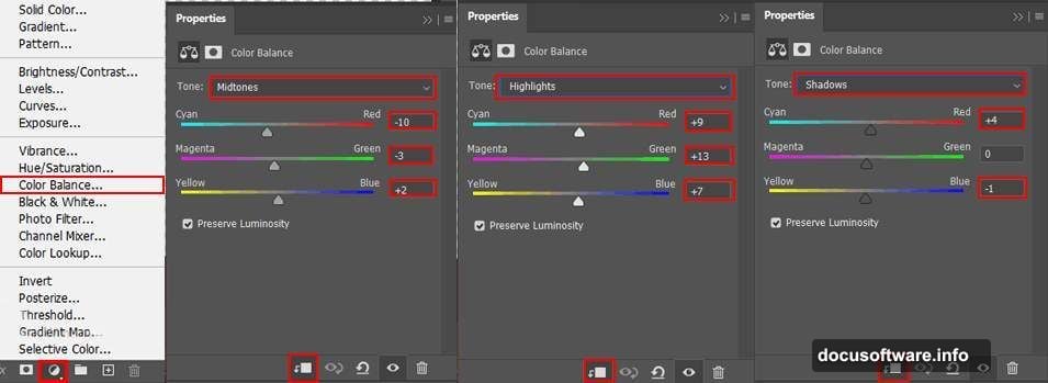
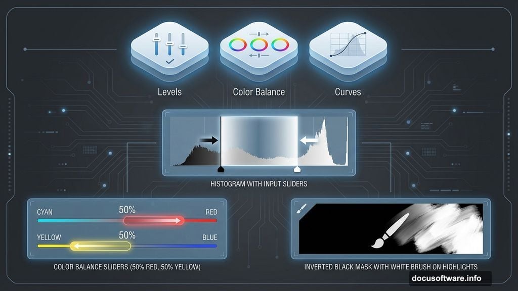
Color Balance Changes Everything
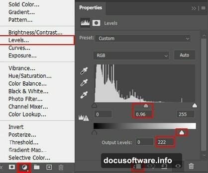
Now add a Levels adjustment layer. This controls your overall tonal range. Drag the black and white input sliders toward the center of the histogram. That increases contrast and makes the scene more dramatic.
Then add a Color Balance adjustment layer. Set its opacity to 50%. This prevents the color shift from looking too intense. Push sliders toward red and yellow to create that warm, dusty atmosphere typical of desert planets.
Finally, add a Curves adjustment layer. Press Ctrl/Cmd + I to invert the mask to black. Then paint with white on the mask using a soft brush. Focus on areas that should catch light. This technique lets you selectively brighten highlights without blowing out your entire image.
Place Your Planet Correctly
Open your planet stock photo. Use the Rectangular Marquee Tool (M) to select the planet portion you want. Hold Shift while dragging to maintain square proportions.
Copy (Ctrl/Cmd + C) and paste (Ctrl/Cmd + V) the planet below your mountain layer. Transform it to appropriate size using Ctrl/Cmd + T. The planet should sit on the horizon, partially visible above the mountains.
Here’s a trick tutorials rarely mention. Add a slight Gaussian Blur to the planet. Go to Filter > Blur > Gaussian Blur and apply 2-3 pixels. This creates atmospheric haze that makes the planet look naturally distant. Without this step, sharp planets look pasted on.
Add Mechanical Elements That Belong
Place your robot images using the same File > Place method. Position them in the foreground for proper scale. Robots should appear closest to the viewer, establishing depth.
Then add adjustment layers clipped to each robot. Right-click the adjustment layer and choose Create Clipping Mask. This applies color corrections only to that specific robot. Match the robot’s colors to your scene’s warm color palette using Color Balance.
Also add shadows beneath each robot. Create a new layer, use a soft black brush, and paint shadow shapes. Set the layer blend mode to Multiply and reduce opacity to 30-40%. Shadows anchor objects to the ground instead of floating weirdly.
Spaceship Integration Makes or Breaks It
Place your spaceship images in the sky. Transform them to appropriate sizes. Smaller ships should appear more distant, larger ones closer.
Here’s what separates good composites from bad ones. Add motion blur to your spaceships. Go to Filter > Blur > Motion Blur. Set angle to match your ship’s direction and distance to 15-20 pixels. This creates movement and energy.
Then add glow effects. Create a new layer above each ship. Use a soft white brush to paint glowing engine trails. Set blend mode to Linear Dodge (Add) and reduce opacity until it looks natural, not blown out.

Atmosphere Sells the Illusion
Download cloud brushes or create your own. Add a new layer and paint fog in the foreground using large, soft cloud brushes. Set layer opacity to 30-50%. This atmospheric haze creates depth by obscuring distant elements slightly.
Also add dust particles. Create a new layer, fill it with black, and go to Filter > Noise > Add Noise. Set amount to 15%, Gaussian distribution, Monochromatic checked. Then change blend mode to Screen. This adds subtle texture that mimics dust in the air.
Gradient Map Unifies Colors
Add a Gradient Map adjustment layer at the top of your layer stack. Choose a gradient that goes from dark red-brown to bright orange-yellow. Set blend mode to Color and reduce opacity to 20-25%.
This technique forces every element to share similar color tones. It’s like an Instagram filter but way more controllable. Suddenly all your pasted elements look like they belong in the same scene.
Camera Raw Filter for Final Polish
Merge all your layers into a new layer by pressing Ctrl+Alt+Shift+E (Cmd+Option+Shift+E on Mac). Then go to Filter > Camera Raw Filter.
Increase Clarity by 10-15 to enhance midtone contrast. This makes details pop without looking oversharpened. Add slight vignetting by reducing Exposure in the Post Crop Vignetting section. Darken corners by -15 to -20. This draws viewer attention to the center action.
Finally, boost Vibrance by 10-15 instead of Saturation. Vibrance intelligently increases color intensity without making skin tones or already-saturated areas look unnatural.
Why Most Attempts Fall Flat
People download tutorials expecting magic formulas. They copy settings without understanding why those numbers matter for that specific image.
But here’s the truth. Your source images differ from tutorial examples. Your mountain might be cooler-toned, requiring different Color Balance adjustments. Your spaceship might need more or less blur depending on its implied speed.
So treat tutorials as frameworks, not recipes. Learn the principles behind each technique. Then adapt them to your unique combination of stock images.
The difference between amateur composites and professional-looking work isn’t expensive plugins or secret techniques. It’s understanding light, atmosphere, and color theory well enough to make intelligent adjustments.
Practice that. Your space scenes will improve dramatically.