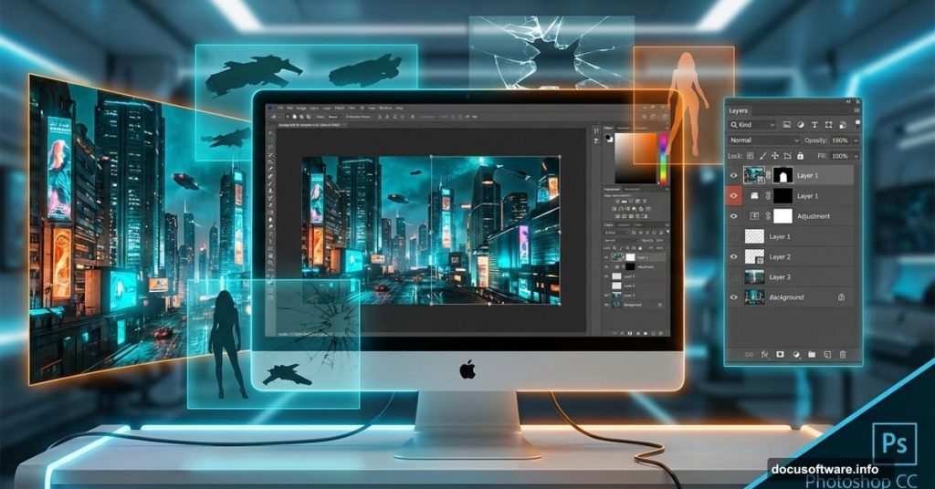
Creating cinematic photo manipulations feels impossible until you break down the process. This Blade Runner-inspired tutorial teaches real techniques professionals use for matte paintings and sci-fi compositions.
You’ll learn to transform a simple building interior into an intense action scene. Plus, the skills transfer to any photo manipulation project you tackle later.
Grab Photoshop, your favorite playlist, and let’s build something dramatic.
What You’re Actually Building
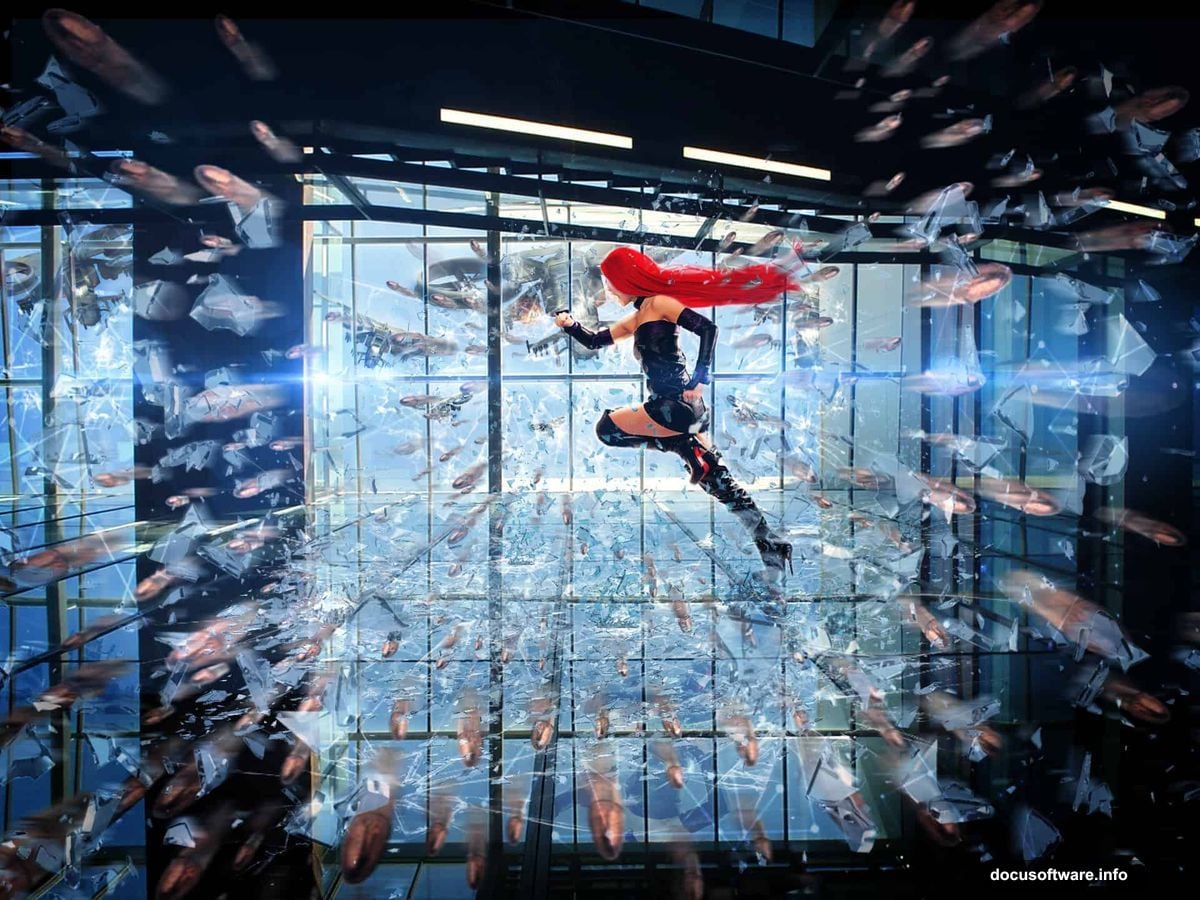
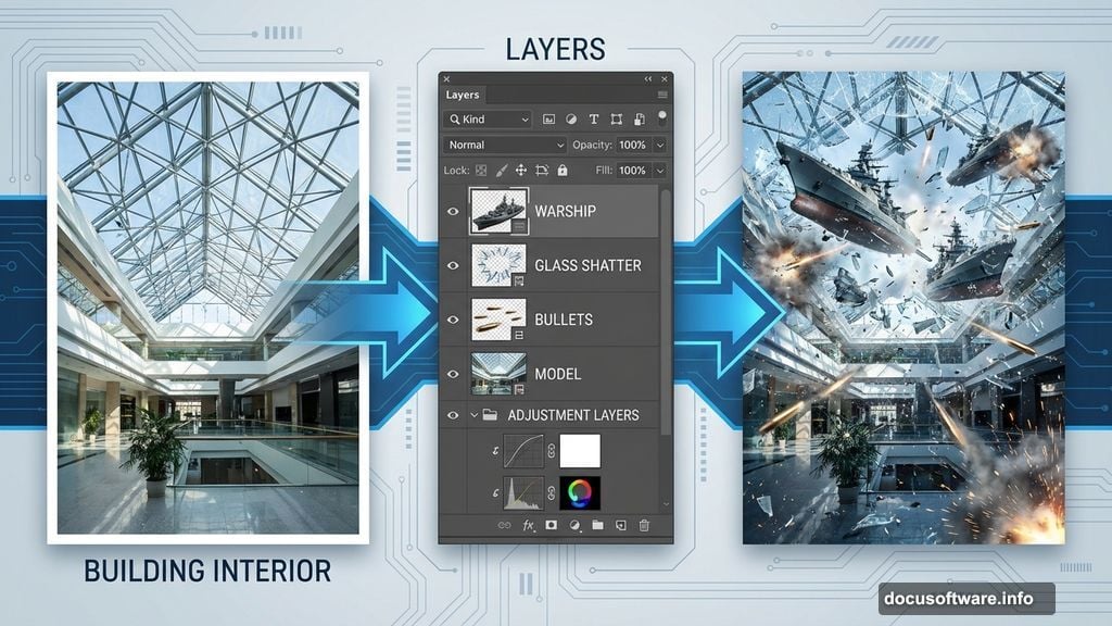
This isn’t just slapping images together. You’re constructing a complete scene with multiple layers of depth and realism.
Start with flying warships positioned strategically around a model. Then add destruction effects with shattered glass and flying bullets. Finally, adjustment layers and special effects bring everything together into one cohesive image.
The finished piece looks like a movie still. But you’ll create it from scratch using stock photos and Photoshop techniques.
Gather Your Materials First
Before touching Photoshop, download all your source images to one folder. This saves frustration later when you’re deep in the creative flow.
You’ll need:
- Glass shatter images
- Broken glass brushes
- Model photo
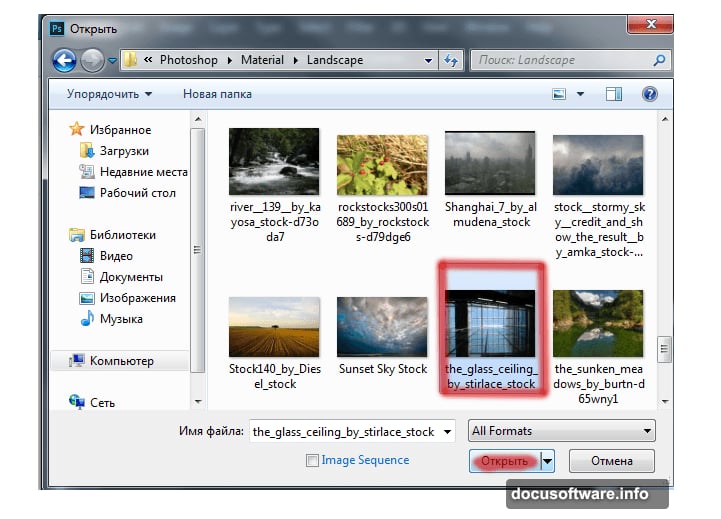
- Building interior with glass ceiling
- Bullet storm effects
- Lens flare and optical effects
- Spaceship or warship images
- Triangle textures
Most resources come from stock photo sites. Search DeviantArt or similar platforms if links don’t work. Having alternatives ready prevents workflow interruptions.
Set Up Your Canvas
Open Photoshop and load your building interior image. Press Cmd/Ctrl+O or navigate through File > Open to select it.
This becomes your base layer. Everything else builds on top of this foundation.
Make sure the image resolution works for your final output. Lower resolution limits print quality later. However, higher resolution slows your computer during editing. Find the balance that works for your machine.
Position the First Warship
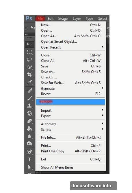
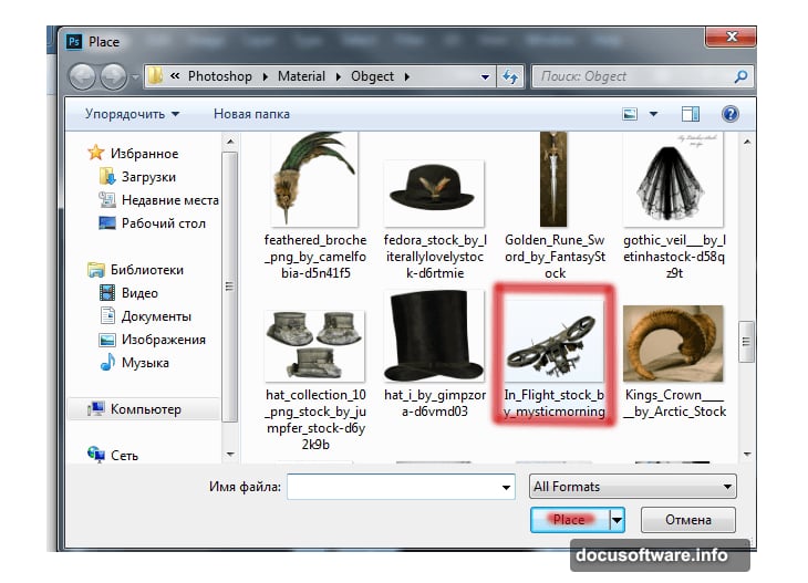
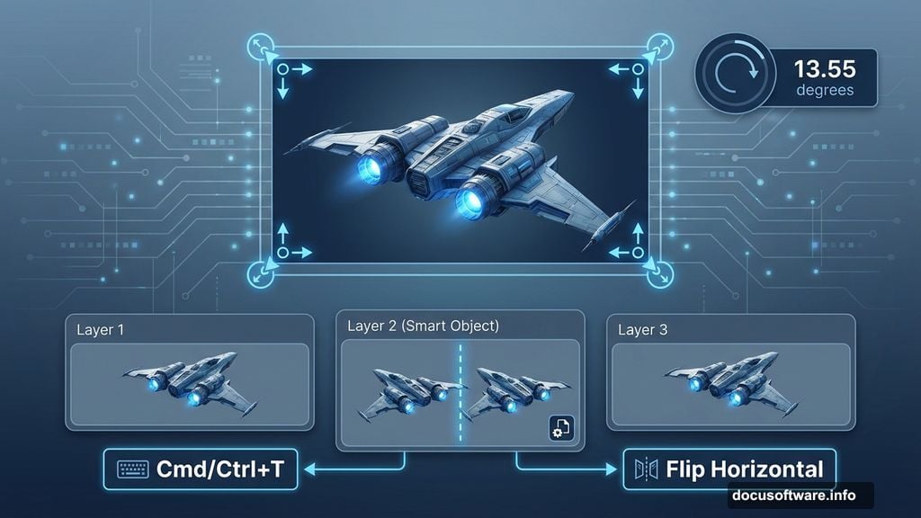
Add your first spaceship using File > Place. This imports it as a Smart Object, which lets you resize without quality loss.
Press Cmd/Ctrl+T to transform the ship. Hold Shift while dragging corners to resize proportionally. Make it slightly smaller than the window frames in your background.
Rotate it to angle 13.55 degrees. This creates dynamic tension instead of boring horizontal alignment. The slight tilt suggests movement and action.
Press Enter when you’re satisfied with the placement. Don’t worry about making it perfect yet. You’ll refine positioning as other elements come together.
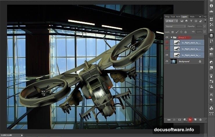
Add Multiple Ships for Depth
Duplicate your ship layer twice by pressing Cmd/Ctrl+J. Merge all three ship layers into one group with Cmd/Ctrl+G.
Now work on the second ship. Transform it with Cmd/Ctrl+T, then right-click and select Flip Horizontal from the menu. This prevents your ships from looking like identical copies.
Rotate this one to -12.26 degrees. The opposite angle from your first ship creates visual balance. Plus, it reinforces the sense of multiple objects moving through 3D space.
Reduce its size slightly more than the first ship. Objects farther away should appear smaller. This simple trick adds convincing depth to your composition.
Hide Layers While You Work
Click the eye icon next to layers you’re not actively editing. This makes them temporarily invisible without deleting anything.
Why bother? Your canvas stays cleaner and Photoshop runs faster with fewer visible layers. Plus, you can focus on one element without visual distraction from others.
Toggle layers back on when you need to check how everything fits together. This workflow habit saves mental energy during complex projects.
Position Your Third Ship
The final ship needs different treatment again. Don’t flip or rotate it the same as the others.
Experiment with placement until it feels right. Maybe position it deeper in the scene, smaller and slightly obscured by building elements. Or bring it closer to the foreground, larger and more prominent.
There’s no single correct answer. Composition depends on where you want viewers’ eyes to focus. Just make sure all three ships feel like they exist in the same physical space.
Add the Model
Import your model photo using File > Place. Position her in the foreground where the action centers.
She needs to look like she’s actually inside this building, not pasted on top. Pay attention to perspective and scale. Her feet should align with the floor plane. Her height should match the building’s proportions.
Use Transform (Cmd/Ctrl+T) to adjust size and angle until it feels natural. Sometimes rotating just a degree or two makes the difference between “obviously fake” and “surprisingly real.”
Blend the Model Naturally
Now comes the crucial part. Your model needs to match the scene’s lighting and atmosphere.
Create a new adjustment layer clipped to your model layer. Use Curves or Levels to match her brightness to the background. If the building interior is dark and moody, she can’t be brightly lit.
Add subtle shadows where her body would block light. Paint these on a new layer set to Multiply blend mode. Keep shadows soft unless you’re showing harsh directional light.
Color matching matters too. Sample colors from your background and apply them subtly to your model using Color Balance or Hue/Saturation adjustments.
Start Adding Glass Shatter
Import your glass shatter images as new layers. Position them near your model and the ships as if explosions just happened.
These elements sell the action. Without them, your scene looks static. With them, viewers feel the chaos and danger.
Use Free Transform to rotate and resize glass pieces. Vary the angles so they don’t all break identically. Real glass shatters in random patterns, not uniform ones.
Erase edges where glass overlaps other elements awkwardly. Soft brushes work better than hard-edged erasers for this. You want gradual transitions, not obvious cutouts.
Layer Multiple Glass Effects
Don’t stop at one glass shatter. Stack several layers at different depths.
Some pieces should be sharp and prominent in the foreground. Others blur into the background, suggesting distance and motion. This layering creates dimensionality.
Adjust opacity on background glass pieces. Making them semi-transparent helps them recede visually. Foreground pieces stay at 100% opacity for maximum impact.
Change blend modes on some layers. Try Screen, Lighten, or Linear Dodge for glass that catches light. These modes make glass look luminous and dangerous.
Add Bullet Effects
Import your bullet storm images or create streaks using Motion Blur on small ellipse shapes.
Bullets should travel toward or away from your model, creating clear trajectories. Random directions look messy, not cinematic.
Use white or yellow for bullet tracers. These colors suggest heat and speed. Slight orange glows around them enhance the effect.
Keep bullets thin and long. Fat bullets look slow. Thin stretched ones convey velocity. Experiment with Gaussian Blur to add motion trails behind them.
Apply Broken Glass Brushes
Load your broken glass brushes into Photoshop. Create a new layer and paint glass fragments around impact points.
Vary brush size and opacity as you paint. Smaller fragments scatter farther from impacts. Larger pieces stay near the source.
Use low opacity and build up density gradually. One strong brushstroke looks fake. Ten lighter strokes look random and real.
Paint glass on multiple layers so you can adjust individual sections later. This flexibility helps when you’re fine-tuning the final composition.
Create Atmospheric Haze
Add subtle fog or haze to unify all elements. This is the secret professionals use to make composites look cohesive instead of pasted together.
Create a new layer filled with 50% gray. Set it to Overlay blend mode. Paint white with a huge soft brush at very low opacity (5-10%) over areas you want to glow or lighten.
Paint black in the same way to darken and create depth. This technique lets you control atmosphere without permanently changing any layers below.
Focus haze around light sources and in the background. Keep the foreground relatively clear so viewers can see your main subject clearly.
Add Light Sources
Identify where light comes from in your scene. Ships probably have engines glowing. Explosions create bright flashes. Even the building interior has ambient light.
Create new layers for each light source. Use soft white or yellow brushes to paint glows. Set these layers to Screen or Linear Dodge blend mode.
Light affects nearby objects. Paint subtle color casts on surfaces near your light sources. If a ship has blue engine lights, paint faint blue on the building wall behind it.
This attention to light interaction separates amateur composites from professional-looking work.
Apply Color Grading
Now step back and evaluate your overall color scheme. Does it feel cohesive or chaotic?
Add a Color Lookup adjustment layer. Try “Moonlight” or “Futuristic Bleak” presets for Blade Runner vibes. These instantly unify colors across all elements.
Create a Curves adjustment layer. Lift the shadows slightly in the RGB curve for a faded film look. Or crush them darker for higher contrast drama.
Add a Hue/Saturation layer. Reduce overall saturation by 10-15%. This prevents colors from looking too vibrant and digital.
Enhance Contrast Selectively
Not everything needs maximum contrast. But your focal points should pop.
Create a Curves adjustment layer. Steepen the curve to increase contrast. Then mask it so it only affects your model and nearest ships.
Background elements can stay lower in contrast. This creates depth through atmospheric perspective. Distant objects naturally have less contrast than close ones.
Use your brush on the layer mask to control exactly where contrast increases. Paint white to reveal effect, black to hide it.
Add Lens Flares Carefully
Import your optical flare images. Position them over light sources like ship engines or explosions.
Set them to Screen or Lighten blend mode. Reduce opacity until they enhance rather than dominate the scene.
Lens flares add cinematic polish when used subtly. But too many make your image look overdone. One or two strategic flares usually suffice.
Rotate flares to match the angle of your light sources. This small detail maintains realism.
Create Motion Blur Strategically
Some elements should show motion blur to enhance the action feeling. But blur everything and your image turns muddy.
Duplicate layers you want to blur. Apply Motion Blur from Filter menu. Angle the blur to match the direction of movement.
Reduce opacity on blurred layers and position them slightly offset from the sharp originals. This creates convincing motion trails without losing detail entirely.
Keep your main subject relatively sharp. Blur supporting elements more aggressively. This directs viewer attention where you want it.
Add Texture Overlays
Import your triangle textures or similar geometric patterns. Place them over your entire composition.
Set these layers to Overlay or Soft Light at low opacity (10-20%). They add subtle visual interest and technical aesthetic.
Mask textures away from important focal points. You want them visible but not distracting. They should enhance atmosphere, not obscure your main elements.
Experiment with different blend modes. Sometimes Multiply creates interesting shadows, or Screen adds highlights.
Refine Edge Quality
Zoom in and examine edges where different elements meet. Obvious cutout edges destroy immersion.
Use a soft eraser or layer mask with a brush at 50% hardness. Gently remove harsh transitions between elements and background.
Add slight colored glows around bright objects to simulate light scatter. This makes them feel embedded in the environment rather than floating on top.
For complex edges like hair, try Select and Mask feature. Refine Edge Brush helps capture fine details that regular selections miss.
Balance Your Composition
Step back and view your whole image at reduced zoom. Does your eye know where to look?
Adjust layer positions if the composition feels off-balance. Sometimes moving an element just 10 pixels makes everything click into place.
Use curves or brightness adjustments to subtly darken areas you want viewers to ignore. Brighten your main focal point slightly.
The rule of thirds helps here. Position key elements along those invisible gridlines rather than dead center.
Add Final Sharpening
Create a merged copy of all visible layers. Press Cmd/Ctrl+Shift+Alt+E. This creates a new layer with everything combined.
Apply Unsharp Mask or Smart Sharpen to this merged layer. Amount depends on your image resolution. Start conservative around 80-100%.
Mask the sharpening away from blurred areas. You don’t want to sharpen motion blur effects.
Reduce opacity if sharpening looks too aggressive. 70-80% opacity often works better than 100%.
Save Multiple Versions
Don’t just save one final version. Export several options to compare later with fresh eyes.
Save your master PSD file with all layers intact. This lets you make changes later without starting over.
Export a high-resolution JPEG or PNG for portfolio use. Also create a web-optimized version at smaller dimensions for faster loading online.
Try different color grades by toggling adjustment layers on and off. Save variations to see which resonates most with viewers.
Common Mistakes to Avoid
The biggest error beginners make is inconsistent lighting. Each element has its own light direction, making the composite obviously fake.
Another mistake is matching resolution poorly. High-res backgrounds with low-res foreground elements look terrible. Or vice versa.
Overusing effects kills realism too. Every filter and brush in existence doesn’t need to appear in one image. Restraint creates stronger work than excess.
Finally, ignoring atmosphere ruins depth. Without haze, fog, or color atmosphere, elements feel pasted rather than integrated.
Why These Techniques Matter Beyond This Project
You’re not just learning to recreate one specific image. These skills apply to any photo manipulation or matte painting project.
Blending elements naturally transfers to product photography, where you composite items onto different backgrounds. Understanding light and shadow helps with portrait retouching. Composition principles work across all visual mediums.
Plus, breaking down complex projects into manageable steps makes overwhelming creative work feel achievable. That mindset shift matters as much as technical skills.