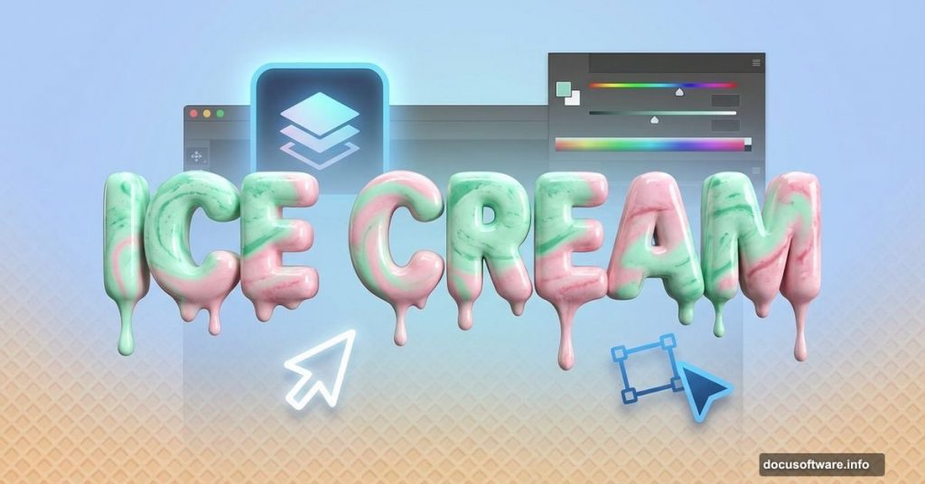
Want to create drool-worthy ice cream text effects that pop off the screen? This tutorial breaks down the entire process into simple, manageable steps.
You don’t need advanced Photoshop skills. Just follow along with basic tools and layer effects. In about 45 minutes, you’ll have a professional-looking design that works for posters, social media graphics, or product mockups.
Let’s dive into the sweet details.
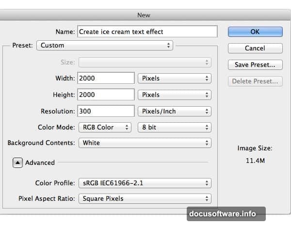
Set Up Your Photoshop Canvas
First, create a new document in Photoshop. Go to File > New and set your canvas dimensions based on your project needs. Most designers start with 1920×1080 pixels for web graphics or 3000×2000 pixels for print-quality work.
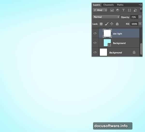
Next, fill your background with a light cyan color. Use hex code #aff8fd for that cool, refreshing ice cream parlor vibe. This color choice makes your text stand out while maintaining the frozen treat aesthetic.
Now grab the soft brush tool. Set it to white (#ffffff) and paint a gentle glow in the center of your canvas. This creates depth and draws the eye to your text. Lower the opacity to 72% so the effect stays subtle and professional.
Build the Striped Background Pattern
Time to create those classic waffle cone stripes. Select the Rectangle Tool and draw a thin vertical stripe. Fill it with white (#ffffff).
Duplicate this stripe multiple times using Cmd+J (or Ctrl+J on Windows). Space them evenly across your canvas. Think of those crispy waffle cone patterns you see at ice cream shops.
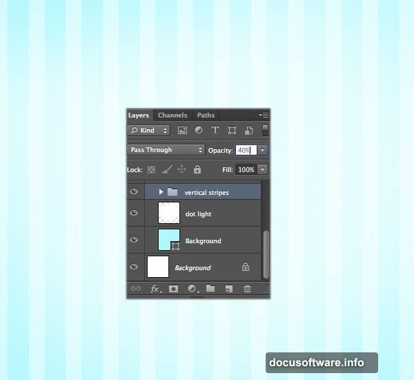
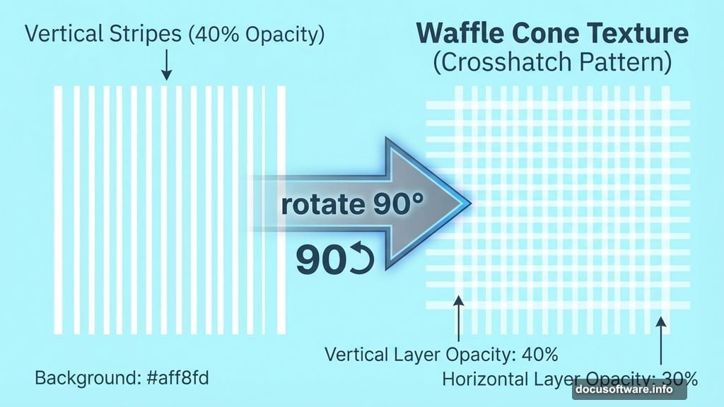
Group all vertical stripes into a folder. Name it “vertical stripe” for easy organization. Then lower the opacity to 40%. This keeps the pattern visible without overwhelming your main text.
Here’s the clever part. Duplicate the entire “vertical stripe” folder. Rename the copy “horizontal stripe” and rotate it 90 degrees. Lower this layer’s opacity to 30%. Now you’ve got that crosshatch waffle pattern that screams ice cream cone.
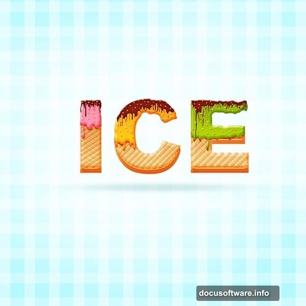
Create Your Ice Cream Text
Switch to the Type Tool and choose Arial Black font. Type your text. This font works great because it’s bold and chunky, perfect for that frozen dessert look.
Right-click your text layer and choose Rasterize Type. This converts your text into pixels so you can apply more advanced effects. Place this layer in a new folder named “Cone.”
Before moving forward, duplicate your text layer and drag the copy off to the side. You’ll need this backup later for additional effects.
Apply Layer Styles for Depth
Double-click your text layer to open the Layer Style dialog. Start with Bevel & Emboss to give your letters three-dimensional depth. This makes them look like actual scoops of ice cream.

Add Inner Shadow next. This creates subtle darkness in the recessed areas, mimicking how light hits rounded ice cream surfaces. Play with the angle and distance until it looks natural.
Now add two Inner Glow effects. The first should be a warm color to simulate light passing through creamy ice cream. The second can be cooler to add complexity. These glows make your text look translucent and delicious.
Finally, apply Gradient Overlay. Choose colors that match real ice cream flavors. Strawberry pink, mint green, or vanilla cream all work beautifully. The gradient adds realism by showing how light travels through frozen desserts.
Add Melting Details
Select your text layer and add a layer mask. Grab a hard brush and carefully erase the bottom edges of your letters. Create irregular drips and runs. Ice cream melts, right? This detail transforms static text into something dynamic and fun.
Duplicate your text layer again. Move the copy slightly down and behind the original. Keep all the layer styles except Gradient Overlay. Change that gradient to a darker shade. This creates the illusion of melted ice cream pooling beneath the main text.
Repeat this process one more time for extra depth. Each layer should get progressively darker and smaller. Stack them carefully to build that melting effect.
Build the Waffle Cone Texture
Now for the cone texture itself. Use the Rectangle Tool to draw thin diagonal lines across your text. Alternate the direction to create that woven waffle pattern.
Space these lines consistently. Real waffle cones have regular patterns, so keep your spacing even. This attention to detail separates amateur work from professional designs.
Select all your stripe layers while holding Shift. Right-click and choose Merge Layers. This combines everything into a single image layer. Now you can apply effects to the entire cone pattern at once.
Double-click the merged layer and add Bevel & Emboss. Set it to create subtle ridges that mimic actual waffle texture. The key word here is subtle. Overdoing this effect makes the cone look plastic instead of crispy.
Refine the Cone Structure
Your cone needs definition where it meets the ice cream text. Add shadows under the text using a soft brush with dark brown color. Lower the opacity so shadows blend naturally.
Next, add highlights to the raised parts of the waffle pattern. Use a light tan color and a small, soft brush. Dab highlights along the top edges of each ridge. This simulates how light catches on crispy waffle surfaces.
Don’t forget the cone’s edges. They should be slightly darker to show depth. Use the Burn Tool set to Midtones, around 15% exposure. Gently darken the outer edges of your cone shape.
Add Final Touches
Ice cream always has those little imperfections that make it real. Add tiny specks and variations in color using a small brush. Vanilla has dark flecks, strawberry has seeds, chocolate has slight variations in darkness.
Create a new layer above everything. Set the blend mode to Overlay. Use a soft white brush at low opacity to add gentle highlights where light would hit your ice cream text. Usually this means the top and front faces of letters.
Similarly, add subtle shadows in crevices between letters. Use a soft black brush at very low opacity. Build up the darkness gradually. This gives your text sculptural quality.
Polish Your Composition
Step back and evaluate your work. Does the ice cream look cold and appetizing? Do the colors work together harmoniously?
Adjust the overall brightness using a Curves adjustment layer. Lift the shadows slightly if your design looks too dark. Pull down the highlights if it looks washed out.
Add a slight vignette around the edges. Create a new layer, fill it with black, then add a layer mask. Use a large, soft brush to reveal the center while keeping edges darker. Set this layer to Multiply at low opacity.
Finally, sharpen your design using Filter > Sharpen > Smart Sharpen. Use a small radius (0.5-1.0 pixels) at around 80% strength. This makes edges crisp without creating halos.

Export for Different Uses
Your ice cream text effect works great for various projects. Save it as a high-resolution PNG with transparency for maximum flexibility.
For social media graphics, export at platform-specific sizes. Instagram posts look best at 1080×1080 pixels. Facebook covers need 820×312 pixels. Twitter headers want 1500×500 pixels.
Print projects demand higher resolution. Export at 300 DPI minimum. Keep your layers intact in the original PSD file so you can make changes later.
This technique adapts easily to other text effects too. Try it with frozen yogurt pastels, gelato brights, or sorbet neons. The fundamentals stay the same while the colors change everything.
Creating realistic ice cream text in Photoshop comes down to careful layering and attention to detail. Build your effects gradually instead of trying to nail everything in one step. The drips, textures, and highlights all work together to sell the illusion. Practice this technique a few times and you’ll develop an intuition for what looks natural versus what looks fake. Plus, you’ll have a versatile skill that clients love for summer campaigns and food-related designs.