Want to create surreal fantasy scenes that look professional? This Alice in Wonderland tutorial breaks down every step.
You’ll learn realistic lighting, atmospheric depth, and photo blending techniques that work for any fantasy manipulation. Plus, these skills transfer directly to matte painting and composite work.
No advanced skills required. Just Photoshop, patience, and creativity.
What You’re Actually Building
This isn’t just about copying an Alice image. You’re learning fundamental manipulation techniques.
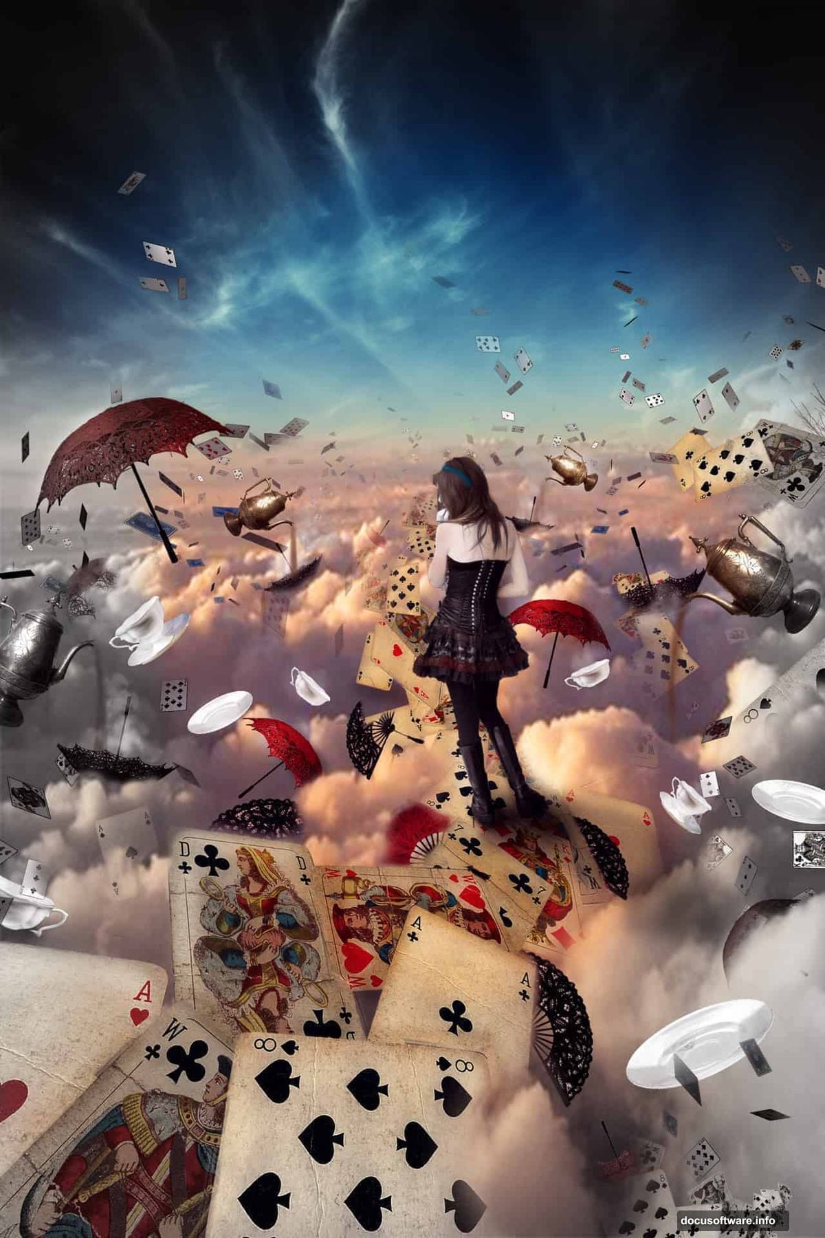
The final piece features a model suspended in clouds, surrounded by floating teacups, playing cards, and other Wonderland elements. Everything blends seamlessly with realistic shadows and atmospheric perspective.
More importantly, you’ll understand why each adjustment works. That knowledge applies to any photo manipulation project.
Resources You’ll Need
Before starting, download these stock images:
- Cloud backgrounds and sunset sky
- Playing cards (static and flying)
- Umbrellas and vintage fans
- Female model in dress
- Teacups and saucers
- Ornate tea kettle
Most stock sites offer these. Search “vintage teacup” or “playing cards isolated” for best results.
Got everything? Time to build.
Setting Up Your Canvas
Start with proper dimensions. Poor canvas size causes quality issues later.
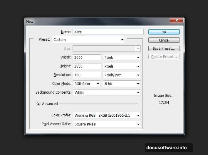
Create a new document at 2000×3000 pixels. That’s portrait orientation with room for vertical composition. Name it something you’ll remember.
Higher resolution means better print quality. But it also means larger file sizes. This size balances both needs perfectly.
Building the Sky Base
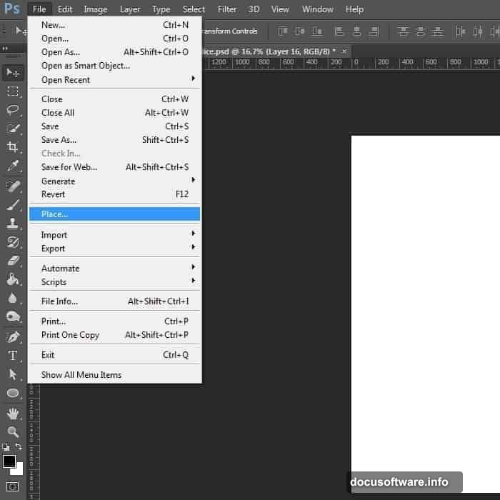
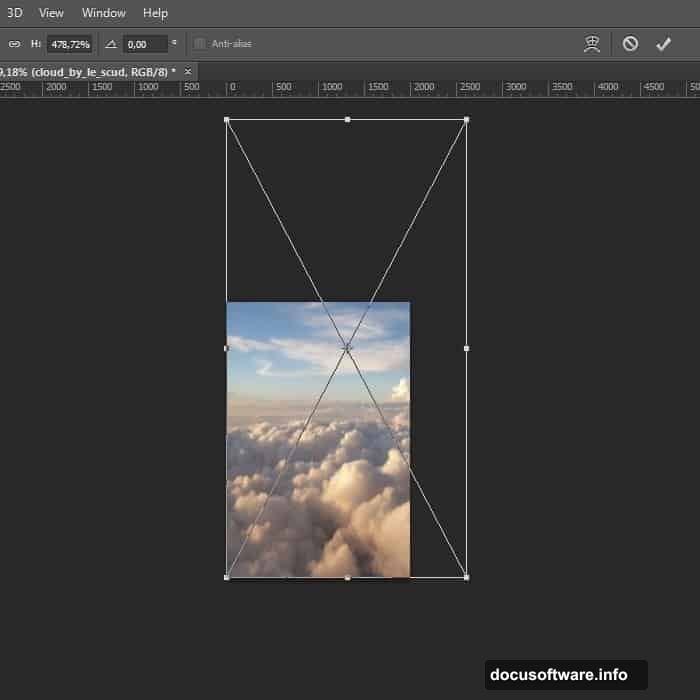
First, place your sky image. Go to File > Place and select your cloud photo.
The placed image appears with transform handles. Stretch it to fill your canvas completely. Press Ctrl+T (Windows) or Cmd+T (Mac) to adjust size and position.
Don’t worry about slight pixelation yet. We’ll enhance the sky next.
Brightening the Atmosphere
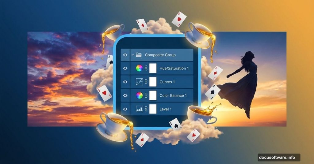
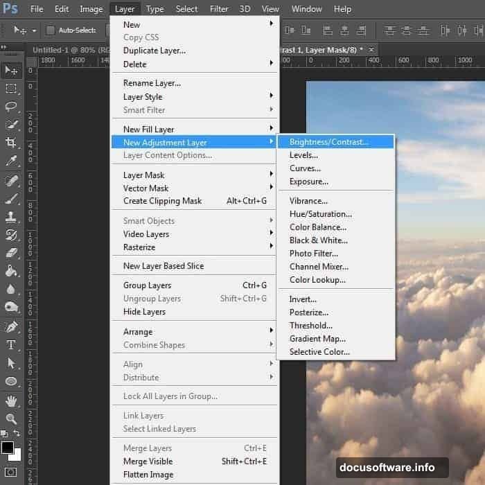
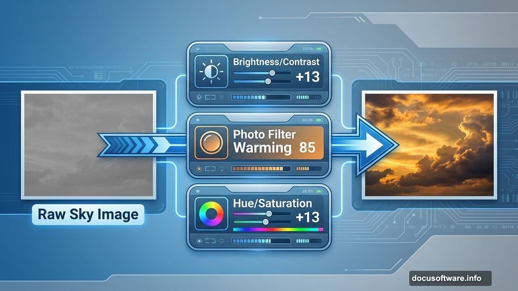
Raw sky images usually look flat. Three adjustment layers fix that instantly.
Add a Brightness/Contrast layer through Layer > New Adjustment Layer. Set Brightness to +13 and Contrast to +13. Suddenly, cloud edges pop.
Next, add a Photo Filter adjustment. Choose Warming Filter (85) with 17% density. This creates that golden sunset glow.
Finally, boost saturation. Add a Hue/Saturation layer with Saturation at +13 and Lightness at +1.
See the difference? The sky now has depth and drama.
Why Multiple Adjustments Work Better
You might wonder why three layers instead of one strong adjustment.
Multiple subtle adjustments preserve image quality. One extreme adjustment destroys color information and creates banding. Several small changes maintain smooth gradients.
Plus, you can adjust each layer independently later. That flexibility matters when you’re tweaking final colors.
Adding the Main Subject
Time to bring in your model. Place the image and position her in the lower third of the canvas.
Use the Pen Tool (P) to create a precise selection around the figure. This takes patience but produces clean edges. Click around the outline, then right-click and choose “Make Selection.”
Once selected, add a layer mask. Now she’s isolated from her original background.
Matching the Model to the Sky
Right now, your model probably looks pasted in. Her lighting doesn’t match the sky yet.
Add a Curves adjustment layer clipped to the model layer. Drag the curve slightly to match the sky’s warm tones. Small adjustments matter more than dramatic changes.
Then add shadows where the model meets other elements. Use a soft brush on a new layer set to Multiply blend mode. Paint subtle shadows with low opacity.
Floating Elements Create Depth
Now for the fun part. Start adding teacups, cards, and other objects.
Place each item on its own layer. Vary their sizes to create depth perception. Larger objects appear closer, smaller ones farther away.
Rotate elements at different angles. Perfectly aligned objects look unnatural. Real floating items tumble and turn.
Getting the Perspective Right
Perspective matters enormously in fantasy scenes. Wrong perspective breaks the illusion instantly.
Objects closer to the viewer need more detail and contrast. Distant objects should be slightly blurred and less saturated.
Use Gaussian Blur (Filter > Blur > Gaussian Blur) on distant elements. Even 1-2 pixels of blur creates atmospheric depth.
Shadows Make or Break Realism
Every floating object needs a shadow. Otherwise, nothing feels grounded in the scene.
Create shadows using a soft brush on layers set to Multiply mode. Paint with dark blue or purple, never pure black. Match shadow direction to your main light source.
Keep shadow opacity low. Start at 20-30% and build up gradually. Too-dark shadows look heavy and fake.
Blending the Cards with Clouds
Here’s where the magic happens. Some playing cards should appear behind clouds.
Add a layer mask to your cards layer. Use a soft brush to paint away portions of cards where clouds overlap. This creates realistic depth and integration.
Take your time here. The better this blending, the more believable your final image.
Color Harmony Across the Scene
Right now, you probably have elements in different color tones. That breaks cohesion.
Add a Color Lookup adjustment layer at the top of your layer stack. Try different presets until you find one that unifies everything.
Alternatively, add a Hue/Saturation adjustment affecting all layers. Shift the hue slightly toward warm or cool tones. This creates instant harmony.
The Teapot Trick
Metallic objects like teapots need special attention. They reflect surrounding colors.
Use the Eyedropper tool to sample colors from your sky. Then paint those colors onto teapot highlights using a soft brush set to Color or Overlay blend mode.
This technique makes metal look like it belongs in the scene, not pasted from elsewhere.
Adding Atmospheric Haze
Professional manipulations always include atmospheric perspective. It’s the difference between good and great.
Create a new layer filled with light blue or warm orange. Set blend mode to Screen at 10-15% opacity. Use a layer mask to remove haze from the foreground, keeping it only in the distance.
This mimics how atmosphere affects vision. Distant objects appear hazier and less saturated.
Final Color Grading
Almost done. Now unify everything with color grading.
Add a Selective Color adjustment layer. Tweak individual color channels until the mood feels right. Boost yellows and reds for warm fantasy vibes. Increase blues and cyans for cooler, dreamier atmosphere.
Don’t overdo it. Subtle adjustments maintain realism while adding stylistic flair.
Sharpening Your Final Image
Before saving, add a slight sharpening pass. This makes details pop without looking overprocessed.
Flatten a copy of all visible layers (Ctrl+Alt+Shift+E). Apply Smart Sharpen (Filter > Sharpen > Smart Sharpen) at 80-120% strength with a 0.5-1.0 pixel radius.
Then reduce layer opacity to 50-70%. This gives you controlled sharpening that doesn’t create halos.
Common Mistakes to Avoid
Several pitfalls catch beginners every time.
First, inconsistent lighting. If your sky shows sunset from the right, all shadows must fall left. Mixed lighting destroys believability.
Second, wrong shadow colors. Pure black shadows look painted on. Use dark versions of your scene’s color palette instead.
Third, neglecting atmospheric perspective. Everything can’t be equally sharp and saturated. Distance reduces both.
Fix these three issues and your manipulations improve dramatically.
Why This Tutorial Builds Real Skills
You didn’t just make an Alice image. You learned fundamental manipulation techniques.
Layer masking for precise selections. Adjustment layers for non-destructive editing. Blend modes for realistic shadows and highlights. Color theory for unified palettes.
These skills transfer to any photo manipulation project. Product photography, conceptual art, matte paintings—same techniques, different subjects.

Taking It Further
Ready to level up? Try these variations:
Replace the model with your own photos. Shoot against a plain background for easier masking.
Change the theme entirely. Use the same techniques for sci-fi scenes, underwater fantasies, or historical recreations.
Add motion blur to some elements. This suggests movement and adds energy to static compositions.
The techniques work regardless of subject matter. That’s what makes them valuable.
The Real Lesson Here
Photo manipulation isn’t about following steps mechanically. It’s about understanding principles.
Why do shadows use multiply mode? Because it mimics how light absorption works physically.
Why add atmospheric haze? Because our eyes expect distance to reduce contrast and saturation.
Why use multiple adjustment layers? Because non-destructive editing preserves flexibility.
Understanding the “why” behind each technique makes you a better artist. You’ll know when to apply these tools and when to try something else.
That understanding matters more than any single tutorial result. Build that foundation and you’ll create professional manipulations for any project.