Want to make text that actually glows? This space flare effect transforms boring typography into eye-catching designs that pop off the screen.
You’ll learn practical layer style techniques that work for posters, social media graphics, and digital art. Plus, this method adapts to any font or color scheme. Let’s dive into creating professional glowing text effects.
What You’ll Need Before Starting
First, grab these essentials. You need Photoshop CS2 or newer (any recent version works fine). Download the Big John font by Ion Lucin for that bold space vibe. Also, you’ll need a space background image to set the mood.
The technique works best with thick, bold fonts. Thin letters don’t catch light as dramatically. So choose something chunky that can hold all those glowing effects we’re adding.
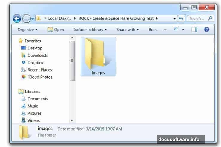
Create a project folder called “Space Flare Text”. Inside, make an “images” subfolder for your background. This keeps everything organized when you’re working with multiple files.
Setting Up Your Canvas and Background
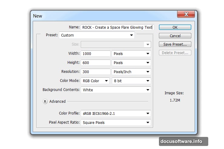
Open Photoshop and create a new document. Standard web dimensions work great (1920×1080 pixels gives you flexibility). Name your file something you’ll remember later.
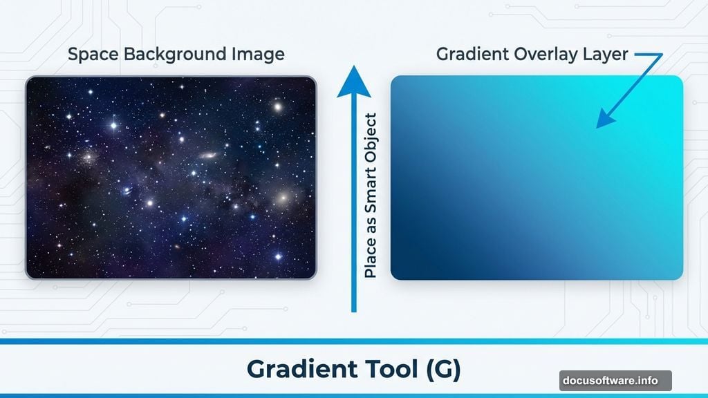
Go to File > Place and drop in your space background image. This creates a smart object layer automatically. Smart objects let you resize without losing quality, which matters when you’re tweaking compositions.
Now add a gradient overlay to enhance the space atmosphere. Create a new layer above your background. Press G to activate the Gradient Tool. Set your gradient from deep blue (#063964) to bright cyan (#2cc1e6).
Drag the gradient from bottom to top. This creates depth and gives your text something interesting to contrast against. The darker bottom anchors the design while the lighter top draws eyes to your text.
Building Your Base Text Layer
Type your text using the Text Tool (press T). Choose Big John font or another bold typeface. Size matters here – make it big enough to see all the glow effects clearly.
Set your text color to white for now. We’ll add color through layer styles instead of base color. This approach gives you more control over the final glow effect.
Position your text in the center of the canvas. Leave breathing room around the edges. Cramped text loses impact even with great effects applied.
Applying Layer Styles for the Glow
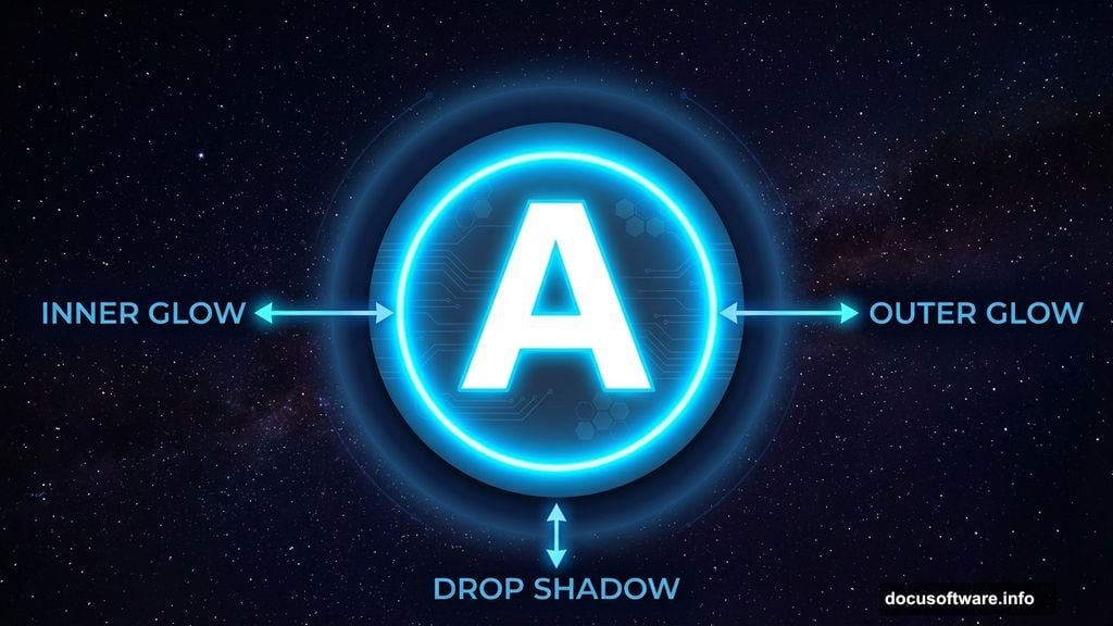
Right-click your text layer and select Blending Options. This opens the Layer Style dialog where the magic happens.
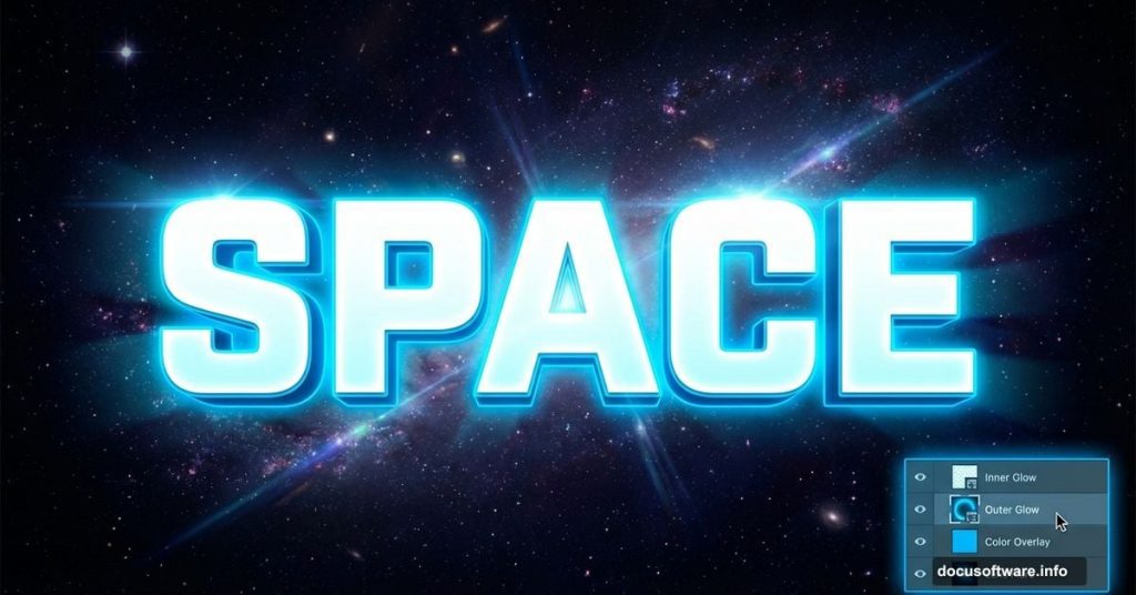
Start with Outer Glow. Set the blend mode to Screen for maximum brightness. Choose a bright blue color (#00d4ff works well). Increase the size until you see a nice halo around your letters.
Next, add Inner Glow using similar settings. This creates depth inside the letters themselves. The combination of inner and outer glow makes text appear genuinely luminous.
Don’t skip the Drop Shadow. Set it to a dark blue with low opacity. Position it slightly offset to ground your text in the space scene. Without shadow, glowing text floats awkwardly.
Creating Streak Highlights
This step separates amateur effects from professional ones. Create a new layer above your text. Name it “Streaks”.
Use the Pen Tool or Rectangle Tool to draw thin lines radiating from key points on your letters. Think about where light would naturally flare from bright sources.
Fill these shapes with white. Then apply Gaussian Blur (Filter > Blur > Gaussian Blur). Set the radius between 10-20 pixels depending on how soft you want the streaks.
Change the blending mode to Screen and reduce opacity to taste. These streaks add movement and energy to static text. They suggest light scattering in space.
Duplicating for Extra Intensity
Want more punch? Duplicate your text layer. Right-click the original text layer and select Duplicate Layer.
Change the blending mode of the duplicate to Linear Dodge (Add). This intensifies the glow effect dramatically. But be careful – too much looks overcooked.
Reduce the opacity of the duplicate layer to around 40-60%. This lets you control intensity precisely. The combination of both layers creates richer, more complex lighting.
Adding Final Visual Effects
Create a new layer at the top of your layer stack. Fill it with black. Go to Filter > Render > Lens Flare. Position the flare near your text for extra drama.
Change this layer’s blending mode to Screen. The black disappears, leaving only the flare effect. Move it around until you find the perfect spot.
Consider adding a subtle Vignette. Create another new layer, fill with white, then add a black layer mask. Use a large soft brush to paint black around the edges. This focuses attention on your glowing text.
Fine-Tuning Colors and Contrast
Now step back and evaluate. Does your text pop enough? If not, add a Curves adjustment layer above everything.
Pull up the highlights slightly in the RGB curve. This brightens the glow without washing out your background. Small adjustments make huge differences here.
Try adjusting individual color channels too. Boost the blue channel for cooler space vibes. Add a touch of red for warmer, more energetic glows.
Variations You Can Try
The beauty of this technique lies in its flexibility. Swap the blue gradient for purple or green for completely different moods. Sci-fi works great with green, while purple feels more mystical.
Change your font for different personalities. Geometric fonts look futuristic. Script fonts become elegant and flowing. The same effects transform any typeface.
Experiment with background images too. This technique works on cityscapes, underwater scenes, or abstract patterns. Just adjust your glow colors to match the environment.
Common Mistakes to Avoid
Don’t overdo the glow. More isn’t always better. If you can’t read your text clearly, pull back on the effects. Readability beats flashiness every time.
Watch your color choices. Glow colors should contrast with your background. Blue on blue gets muddy. Yellow on blue pops beautifully. Test different combinations.
Remember to save often. Complex layer styles can crash older systems. Save your work before applying heavy filters like Gaussian Blur.
When This Effect Actually Works
Space flare text shines (literally) for specific projects. It’s perfect for gaming graphics, electronic music posters, and sci-fi branding. The dramatic glow commands attention.
But skip this effect for professional corporate work or elegant designs. It’s too flashy for law firms or luxury brands. Know your audience before going full neon.
Social media loves glowing text. It stands out in crowded feeds and screenshots beautifully. Just make sure your text remains readable at thumbnail sizes.
Taking It Further
Once you master the basics, push the technique further. Add particles using custom brushes scattered around your text. Create depth by placing some letters closer than others.
Animate this effect in After Effects for motion graphics. The glowing text translates beautifully to video. Export layers separately and animate them over time.
Build a library of layer styles you can apply with one click. Save your favorite glow combinations as styles. This speeds up future projects dramatically.
This technique opens doors to professional-looking text effects without expensive plugins. The principles apply to countless design scenarios beyond space themes. Master the fundamentals here, then adapt them to your unique vision.