
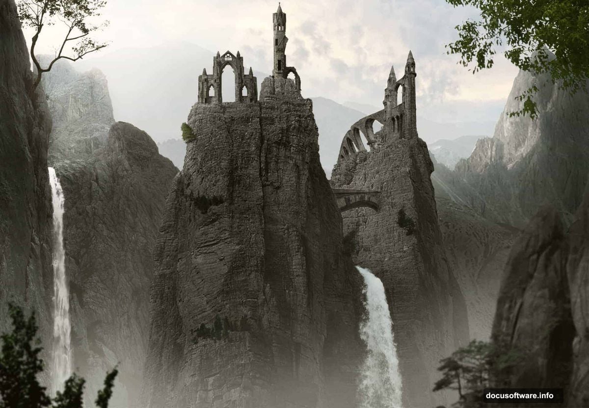
Want to create stunning fantasy landscapes in Photoshop? This matte painting tutorial shows you exactly how to blend multiple photos into one dramatic mountain scene.
You’ll learn practical techniques for compositing stock images, masking layers seamlessly, and adding realistic atmospheric effects like mist and waterfalls. Plus, I’ll walk you through the adjustment layers that make everything look cohesive.
No advanced skills required. Just patience and attention to detail.
What You’ll Need Before Starting
Grab these free stock images first. You’ll need mountains, rocks, trees, waterfalls, and architectural elements. The tutorial links to specific sources, but feel free to substitute similar images.
Also download mist brushes. They’re essential for creating atmospheric depth later.
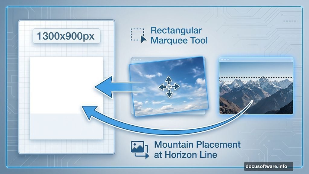
Set up a new Photoshop document at 1300×900 pixels. Fill it with white or any light color as your base.
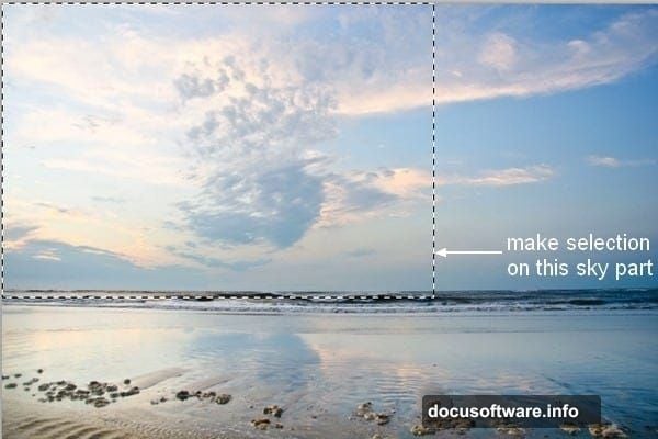
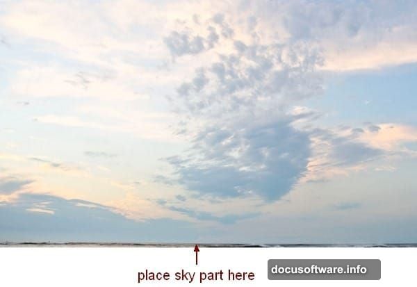
Building the Sky Foundation
Start with your sky image. Use the Rectangular Marquee Tool to select just the sky portion. Then drag it onto your canvas with the Move Tool.
This establishes your lighting direction and color palette. Everything else will need to match this sky’s mood and brightness.
Keep the original sky layer intact. You’ll blend other elements into it gradually.
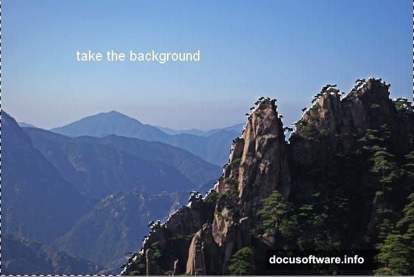
Layering Distant Mountains
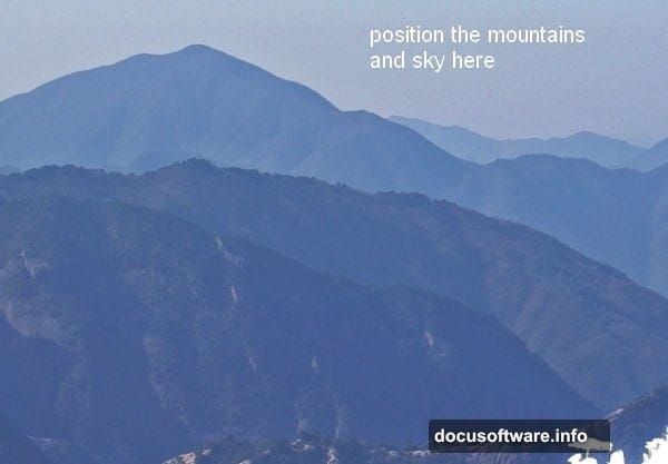
Next comes the background mountain layer. Extract only the misty mountain section from your stock photo. Place it where sky meets horizon.
Now here’s the key trick. Add a layer mask and paint with a soft black brush along the top edge. This gradually reveals the sky underneath, creating a natural blend instead of a hard edge.
The brush size matters. Use 250-260 pixels with soft edges and low hardness. Paint gently to fade the mountains into the sky.
Adjusting Mountain Colors
Mountains rarely look right straight from stock photos. So apply adjustment layers with Clipping Mask to fix colors and brightness.
First, add a Hue/Saturation adjustment. Reduce saturation slightly to match the atmospheric haze in your sky.
Then add a Curves adjustment. Lift the highlights and midtones to increase overall brightness. Mountains in the distance should feel lighter and less contrasted than foreground elements.
These adjustments only affect the mountain layer because you’re using Clipping Masks. That keeps your sky untouched.
Placing Midground Rocks
Open your mid-ground rock stock. Extract the rocks you want and position them in the middle section of your composition.
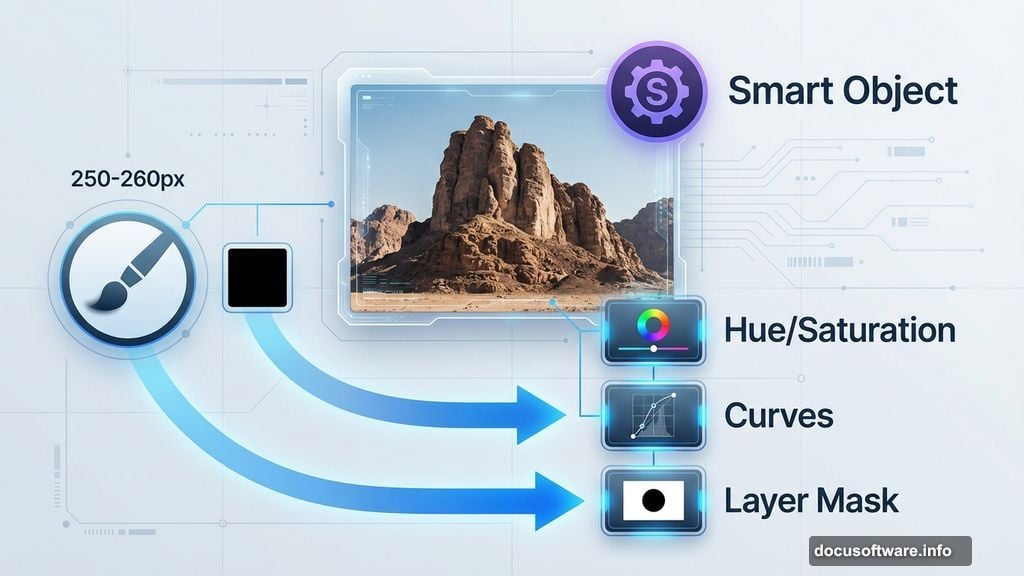
Right-click the layer and convert it to a Smart Object. This lets you resize without losing quality. Scale the rocks to fit your scene using Cmd/Ctrl+T.
Sometimes stock images include unwanted elements. Use the Polygonal Lasso Tool to select areas you want to remove. Then paint those selections black on the layer mask.
This selective masking gives you control over which rocks appear in your final image.
Color Correcting the Rocks
Raw stock photos never match lighting from other images. So stack multiple adjustment layers to fix this.
Add Hue/Saturation to shift color tones. Then Curves to darken the rocks appropriately. Finally, Color Balance to warm or cool the overall hue.
But here’s where it gets nuanced. The tops of rocks receive more skylight, so they should stay brighter. Use a soft black brush at 40% opacity on the Curves mask to reduce darkening at the top edges.
This simulates realistic lighting direction. Bottom and front faces stay darker while tops catch more light.
Adding Shadow Depth
Create a new layer with Clipping Mask above your rocks. Set it to Multiply blend mode at 80% opacity.
Use a soft brush with gray color (#7a7e7e) to paint shadows on the front-facing surfaces. Avoid the tops and middle sections.
This technique adds dimensional depth. Rocks feel more three-dimensional when their front faces show shadow while tops remain lit.
The Multiply blend mode makes your gray paint darken whatever’s underneath naturally.
Compositing Foreground Elements
Now work forward in your scene. Add larger rocks, trees, and architectural ruins to the foreground.
Each element follows the same process. Extract from stock, position in scene, convert to Smart Object, then add adjustment layers.
Pay attention to scale relationships. Foreground objects should appear significantly larger than background elements to create proper depth perspective.
Use layer masks aggressively. Every stock photo will have edges or backgrounds that need hiding.
Creating Realistic Waterfalls
Waterfalls add drama but require careful blending. Extract waterfall sections from stock photos and position them cascading down your rocks.
Set waterfall layers to Screen or Lighten blend mode. This makes the water glow naturally while letting underlying rock texture show through.
Then reduce opacity to taste. Real waterfalls have some transparency, especially in mist areas.
Add a soft layer mask to fade waterfall edges into the rock surface. Hard edges ruin the illusion.
Atmospheric Mist Techniques
Mist creates depth and atmosphere. Load your mist brushes and create a new layer above your entire composition.
Paint with white or very light gray using low opacity (15-20%). Build up mist gradually in multiple passes.
Focus mist in valleys between rock formations and around waterfall bases. These areas naturally collect moisture and fog.
Also add subtle mist layers between foreground and background elements. This atmospheric perspective makes distant objects feel farther away.
The key is subtlety. Too much mist looks fake and muddy.
Refining Architectural Details
Ruins and archways add storytelling elements. Extract them carefully from stock photos, preserving fine details.
Position architectural elements to suggest ancient civilizations. Partially hide structures behind rocks or vegetation for a discovered, overgrown look.
Apply the same color correction workflow. Hue/Saturation, Curves, and Color Balance until ruins match your overall lighting.
Then add subtle moss or vegetation textures to make structures feel weathered and aged.
Final Color Grading
Once all elements are placed, add global adjustment layers at the top of your layer stack. These affect the entire composition.
Start with a Curves adjustment to fine-tune overall contrast. Usually you want to lift shadows slightly while keeping highlights controlled.
Then add a Color Lookup Table (LUT) if you want a specific color mood. Or manually adjust with Color Balance to warm or cool the entire scene.
Finally, add a subtle Vibrance adjustment. This boosts muted colors without oversaturating bright areas.
Light and Shadow Refinement
Create two new layers at the top. One set to Screen mode for adding light, another set to Multiply for adding shadows.
Paint white on the Screen layer where light should intensify. Focus on rock tops, waterfall mist, and sky-facing surfaces.
Paint black on the Multiply layer to deepen shadows in crevices, under overhangs, and on ground-facing surfaces.
Keep opacity low on both layers (20-30%). These effects should enhance existing lighting, not create new light sources.
This manual dodging and burning makes the biggest difference in believability.
Edge Refinement and Detail Work
Zoom in and check every edge where elements meet. Look for telltale halos, color fringing, or obvious cuts.
Use small soft brushes on layer masks to refine transitions. Sometimes you need to paint tiny adjustments to make seams disappear.
Also check for perspective consistency. All elements should follow the same vanishing point and horizon line.
If something feels off but you can’t identify why, it’s usually a perspective or scale problem.
Sharpening and Final Output
Flatten a copy of your entire composition. Then apply selective sharpening.
Use Unsharp Mask or Smart Sharpen on foreground elements to add crispness. But keep background elements soft for atmospheric depth.
You can also add a High Pass filter layer set to Overlay mode for subtle sharpening across the entire image.
Finally, resize and save your finished matte painting at appropriate resolution for your intended use.
Common Mistakes to Avoid
The biggest error is inconsistent lighting direction. Every element must show light coming from the same angle.
Also watch for color temperature mismatches. Warm sunlight shouldn’t illuminate cool blue rocks unless you intentionally add color variation.
Another issue is flat, unconvincing depth. Layer atmospheric effects between depth planes and vary detail levels from sharp foreground to soft background.
Finally, don’t oversaturate. Real landscapes have subtle, muted colors. Pumping saturation makes composites look fake.
Why This Technique Works
Matte painting combines photography with digital painting techniques. You get photorealistic textures from stock images while maintaining artistic control over composition.
The adjustment layer workflow is non-destructive. You can tweak colors and lighting at any point without starting over.
Plus, learning to blend multiple images trains your eye for lighting, color, and atmospheric perspective. These skills transfer to all digital art projects.
Practice this technique with different stock collections. Each composition teaches you something new about creating believable fantasy landscapes.