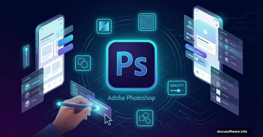
Creating sleek app interfaces sounds intimidating. Most designers think they need years of experience or expensive plugins to build professional-looking screens.
Wrong. Photoshop‘s built-in tools can create stunning user interfaces that rival anything from top design studios. Plus, once you learn a few key techniques, you’ll design faster and better than ever before.
This guide breaks down exactly how to build a beautiful audio app interface from scratch. No fluff. Just practical steps that work.
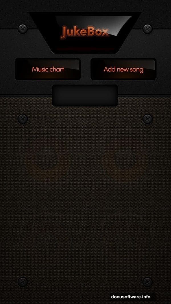
Start With the Right Canvas Setup
Canvas size matters more than you think. Too small and your design looks pixelated. Too large and files become unwieldy.
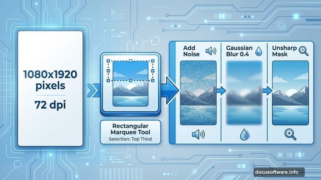
For mobile app interfaces, start with 1080×1920 pixels at 72 dpi. This resolution works perfectly for most modern phones. Plus, it gives you enough detail without creating massive file sizes.
Set your background to black initially. Why? Dark backgrounds make it easier to see lighter design elements as you build. You can always adjust later.
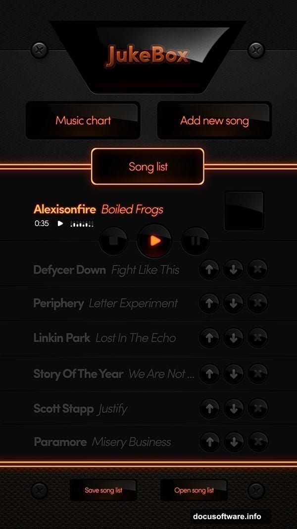
Create Professional Background Texture
Generic solid backgrounds look amateurish. Adding subtle texture instantly elevates your design.
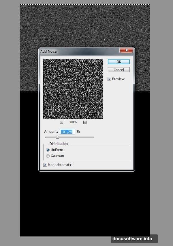
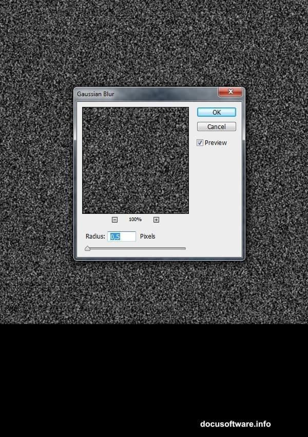
Here’s the quick method. Select the top third of your canvas using the Rectangular Marquee Tool. Fill it with black. Then head to Filter > Noise > Add Noise.
But here’s the trick most tutorials skip. Raw noise looks too harsh. So blur it slightly using Gaussian Blur with a 0.4 radius. Then sharpen it back up with Unsharp Mask. This smooths the texture while keeping definition.
The result? Professional-looking grain that doesn’t distract from your interface elements.
Control Texture Visibility
Too much texture overwhelms. Too little looks flat. Finding the sweet spot separates amateur designs from professional work.
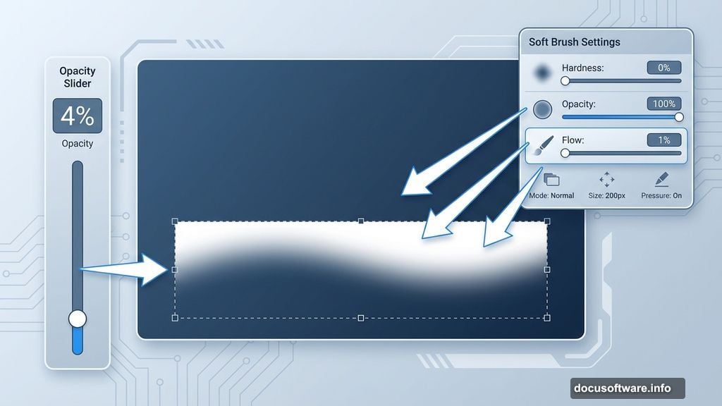
Lower your noise layer’s opacity to around 4%. Sounds subtle? That’s the point. Background texture should enhance depth without demanding attention.
Moreover, you can duplicate this textured layer to create seamless patterns. Stack copies vertically and align them perfectly. This technique lets you extend backgrounds to any length while maintaining consistency.
Add Depth With Strategic Highlights
Flat interfaces feel lifeless. Strategic lighting creates dimension and guides user attention.
Create a new layer above your background. Select the bottom portion of your canvas. Then grab a soft brush with 0% hardness, 100% opacity, and 1% flow.

Paint white highlights gently along the top edge of your selection. This creates a subtle glow effect that mimics real-world lighting. The low flow setting gives you precise control over intensity.
Remember, subtlety wins here. Strong highlights look cartoony. Gentle gradients feel premium.
Build Modular Design Elements
Professional interfaces reuse components consistently. This approach speeds up your workflow while maintaining visual harmony.
Design one perfect button, icon, or card element. Then duplicate and modify it throughout your interface. Same shadows, same corner radius, same spacing.
Why does this matter? Users recognize patterns instantly. Consistent elements make your interface feel intuitive and polished. Plus, you’ll finish projects faster when you’re not reinventing every component from scratch.
Use Proper Text Hierarchy
Typography makes or breaks interface design. Random font sizes create visual chaos. Strategic hierarchy guides users naturally through your content.
Start with three text sizes maximum. Large headlines for screen titles, medium text for primary content, small text for supporting details. That’s it.
Furthermore, stick to one or two font families throughout your entire interface. More fonts equal more confusion. Limited choices force better design decisions.
Leverage Layer Organization
Messy layer panels slow you down and create errors. Proper organization saves hours on complex projects.
Name every layer descriptively. Group related elements together. Use color labels to mark different screen sections.
This seems tedious initially. But when you need to revise something later, you’ll find it instantly instead of hunting through “Layer 47 copy 3.”
Apply Realistic Shadows and Lighting
Flat design is dead. Modern interfaces use subtle depth cues to create visual hierarchy and improve usability.
Add soft drop shadows to floating elements like buttons and cards. Keep shadow blur high and opacity low (usually 10-30%). This creates separation without harsh edges.
Also, consider adding subtle inner shadows to input fields. This makes them feel recessed, signaling to users where to interact.
Design for Multiple Screen States
Amateur designers create one perfect screen. Professionals design complete user flows.
Your loading screen should transition smoothly to your main interface. Active states should look different from inactive ones. Error messages need clear visual differentiation.
Plan these variations before you start pixel-pushing. Otherwise you’ll repaint yourself into corners that require complete redesigns.
Test Your Design at Actual Size
Zoomed-in Photoshop work looks different at actual screen size. Always preview your designs at 100%.
Create mockups on real devices when possible. Colors, contrast, and text legibility often surprise you on physical screens. What looked perfect on your 27-inch monitor might fail on a 5-inch phone.
Therefore, export your designs frequently and check them on target devices. Adjust as needed. This saves embarrassment and revision cycles later.
Export Smart for Development
Beautiful designs mean nothing if developers can’t implement them properly. Prepare assets correctly to avoid implementation disasters.
Export icons and graphics as individual files at multiple resolutions (@1x, @2x, @3x for iOS). Use PNG for elements requiring transparency. Document exact colors using hex codes.
Furthermore, create a style guide documenting fonts, sizes, colors, and spacing. Developers shouldn’t guess these details from screenshots.
Your design process matters more than individual techniques. Great interfaces emerge from disciplined workflow, not random inspiration.
Start with solid fundamentals like proper canvas setup and background textures. Build depth through strategic lighting and shadows. Maintain consistency with modular components and clear typography. Test religiously at actual size.
Master these essentials and you’ll create professional interfaces faster than you ever thought possible. Your designs will look polished, feel intuitive, and make developers happy.