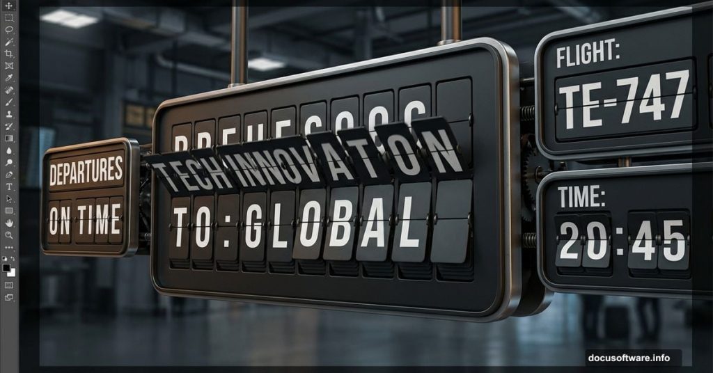
Remember those flip-style airport displays? Each letter clicks into place as boards rotate to show your gate number. Now you can build one yourself.
This tutorial walks through every step. You’ll create the metal base, add realistic lighting, and design those iconic split characters. Plus, we’re doing it all in Photoshop without any special plugins.
Set Up Your Canvas
Start with a new document at 1200 px × 800 px. This gives you plenty of room to work.
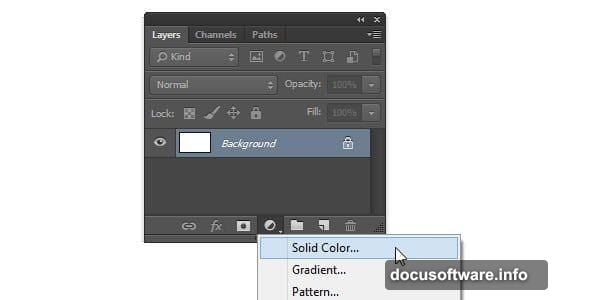
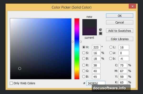
Next, add a Solid Color adjustment layer. Set it to #26282d for that dark airport terminal vibe. This becomes your background.
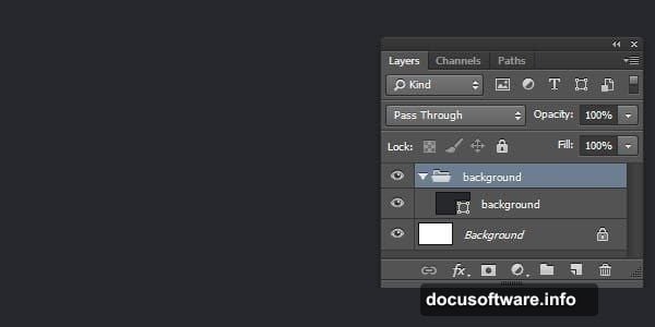
Hit Ctrl + G to group this layer. Name it “Background.” Keeping things organized now saves headaches later.
Build the Character Base
Create another group called “First Digit.” All your character elements live here.
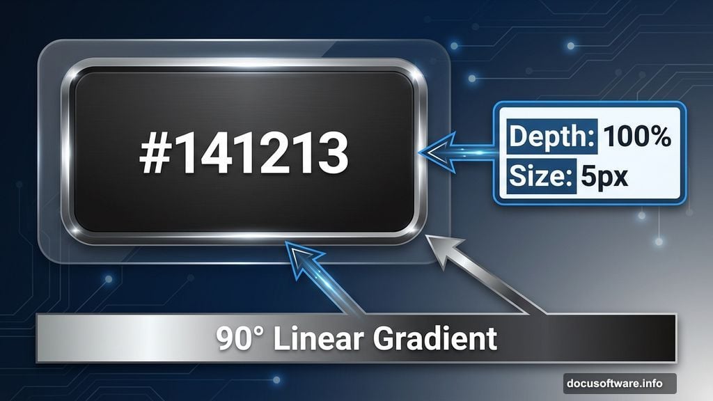
Draw a rounded rectangle with color #141213. This forms the metal backing behind each character board.
Now comes the fun part. Double-click your shape layer to open Layer Style. Apply these effects:
Bevel & Emboss settings:
- Style: Inner Bevel
- Depth: 100%
- Size: 5 px
- Soften: 0 px
Gradient Overlay settings:
- Blend Mode: Normal
- Opacity: 100%
- Style: Linear
- Angle: 90°
Your base now has depth and metallic sheen. But we’re not done yet.
Add the Split Line Detail
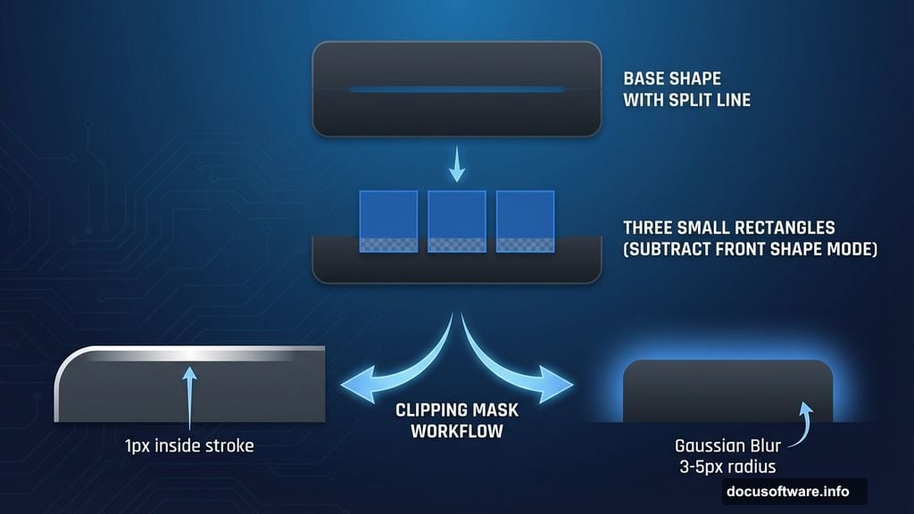
Draw two small rounded rectangles and one regular rectangle on top of your base shape. Set these to Subtract Front Shape mode. This creates the gap where character boards meet.
Ctrl-click your shape layer to select it. Then create a new layer above it.
Go to Edit > Stroke. Use these settings:
- Width: 1 px
- Color: White (#ffffff)
- Location: Inside
Hit Ctrl + D to deselect. You now have a crisp edge highlight.
Create Realistic Lighting
Convert your stroke layer to a Clipping Mask with Ctrl + Alt + G. This keeps highlights contained within the base shape.
Add a layer mask by clicking the mask icon. Fill it with black (press D, then Ctrl + Delete).
Grab your Brush tool. Paint white on the mask where light would naturally hit. Focus on top edges and corners.
But hard highlights alone look artificial. So make another layer and repeat the stroke process.
This time, apply Gaussian Blur from Filter > Blur > Gaussian Blur. Use a radius around 3-5 px.
Add a layer mask filled with black. Paint white to reveal softer glows. This mimics how light diffuses across metal surfaces.
Design the Character Boards
Now for those flip boards themselves. Create a new rounded rectangle slightly smaller than your base.
Use a dark gray like #2a2a2a for the board color. These sit on top of the metal backing.
Add another rounded rectangle for the bottom half. Make it slightly darker to show the shadow where boards separate.
Apply subtle gradients to both boards. Light at top, darker at bottom. This adds dimension.
Add Character Slots
Draw thin rectangles along the board edges. These represent the slots where boards flip through.
Use very dark colors (#0a0a0a) with low opacity Inner Shadow effects. Make them recede into the metal base.
Create the Split Shadow
The gap between top and bottom boards needs depth. Draw a thin rectangle exactly where boards meet.
Fill it with black. Lower opacity to 60-70%. Apply a slight Gaussian Blur.
This shadow makes boards feel physically separated rather than painted on.
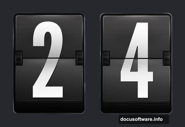
Build the Character Text
Time to add your letter or number. Use a bold, sans-serif font. Soleto or DIN work perfectly.
Split your character in half. Top portion goes on the upper board, bottom on the lower board.
Make each half slightly different in brightness. Top pieces catch more light naturally.
Apply subtle perspective transforms. Board tops tilt slightly back. Bottoms tilt forward. This matches real mechanical displays where boards rotate.
Add Wear and Tear
New displays look sterile. Real ones show use.
Create a new layer set to Overlay blend mode. Use a grunge brush at low opacity (10-15%). Add random marks across the metal base.
Focus on edges and corners where hands might touch or dirt accumulates.
Add tiny scratches with a 1-2 px brush. Make them random but not excessive. Three to five scratches per board feels authentic.
Polish the Metal Surface
Duplicate your base shape. Apply a light Gaussian Blur (around 2 px).
Set blend mode to Screen at 5-10% opacity. This creates a subtle metallic sheen.
Add noise via Filter > Noise > Add Noise. Use about 2% with Gaussian distribution. This mimics the grain in brushed metal.
Final Lighting Touches
Create a new layer above everything. Use a large, soft white brush at 5% opacity.
Paint broad highlights where overhead lighting would hit. Usually top-center of each character unit.
Then make another layer set to Multiply mode. Use a soft black brush at similar low opacity. Add subtle shadows below each unit.
These final lighting adjustments tie everything together. They make individual elements feel like parts of one cohesive display board.
The Details Matter
Look at your creation. Does it feel mechanical? Physical? Like something you could reach out and touch?
If not, refine your lighting. Real objects have both hard and soft shadows. Mix crisp edge highlights with diffused glows.
Also check your colors. Airport displays use very specific grays and blacks. Too much contrast looks digital. Too little looks muddy.
Finding that sweet spot takes experimentation. But that’s where the magic happens.
You’ve just built a mechanical airport display from scratch. No photos. No pre-made textures. Just Photoshop fundamentals and careful observation.
These same techniques work for any mechanical interface design. Train station boards. Stadium scoreboards. Vintage industrial equipment. Master this process and you unlock an entire aesthetic.
The real secret? Patient layering. Each small detail compounds. Highlights plus shadows plus texture plus color equals realism. Skip steps and everything falls flat.
So take your time. Refine each element. Make something that looks like it belongs in a real airport terminal.