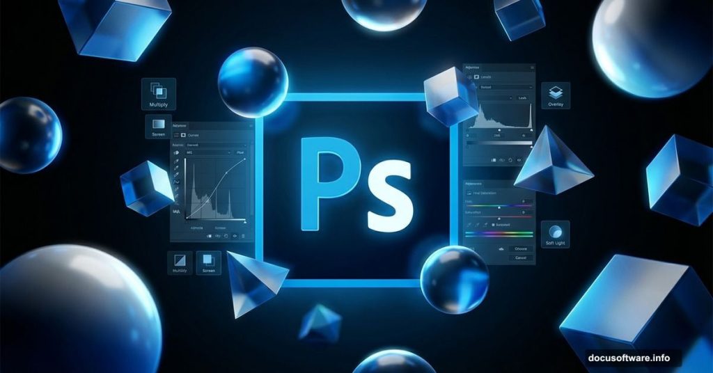
Want to create stunning abstract photo manipulations that look professionally rendered? This complete guide walks you through building a sophisticated 3D-style artwork from scratch.
Most Photoshop tutorials skip the hard parts. Not this one. I’ll show you exactly how to create dramatic lighting effects, work with adjustment layers efficiently, and build complex visual elements that make viewers stop scrolling.
Plus, you’ll learn techniques that work for any photo manipulation project, not just this specific design.
Start With Smart Document Setup
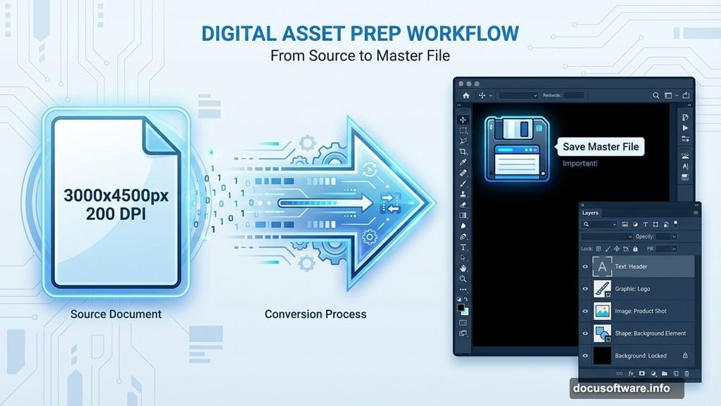
Creating professional work begins before you touch any tools. Your canvas dimensions and resolution determine how much detail you can add later.
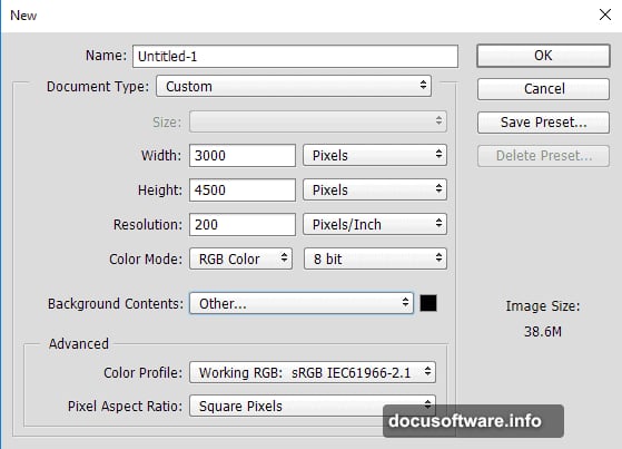
Open Photoshop and create a new document. Set your canvas to 3000 by 4500 pixels at 200 DPI. That gives you plenty of room to work with high-resolution details without slowing down your computer.
Choose black for your background color. Dark backgrounds make light effects pop dramatically. You can always adjust this later, but starting dark gives you better control over luminosity.
Save this as your master file immediately. Trust me on this. Nothing hurts worse than losing hours of work because you forgot to save early.
Build Dramatic Lighting With Gradient Fills
Professional photo manipulations rely heavily on lighting. The secret? Layer your light sources strategically from the start.
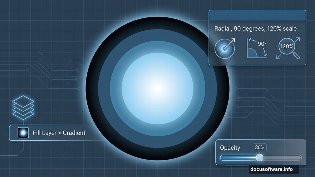
Go to Layer > New Fill Layer > Gravity. This creates a non-destructive gradient you can edit anytime. Set the style to Radial, angle to 90 degrees, and scale to 120 percent.
Now comes the critical part. Build your gradient with these colors in sequence: pure black, then blue-green tones (#315a7a, #4e8eb2, #92ccf0), finishing with pure white at the center.
Drop the layer fill to 30 percent. This creates subtle atmospheric lighting that feels three-dimensional. Too many beginners blast gradients at 100 percent opacity and wonder why their work looks flat.
Master Non-Destructive Retouching Techniques
Here’s where most tutorials fail you. They tell you to paint directly on your model layer. Don’t do that.
Instead, create a new blank layer above your model. Set it to Normal blending mode. Now use the Clone Stamp tool with “Sample All Layers” enabled in the options bar.
Sample skin tones from nearby areas using Alt-click. Then paint over blemishes, uneven tones, or distracting elements. The beauty of this method? You can delete the retouching layer anytime and start fresh.
For color correction, use Curves adjustment layers with layer masks. Paint black on the mask to hide corrections where you don’t need them. Paint white to reveal corrections where you do.
This approach keeps your original model untouched. You’ll thank yourself later when you need to make changes.
Create Complex Textures Through Blending Modes
Blending modes transform ordinary layers into sophisticated visual effects. But most people just click through them randomly hoping something looks good.
Try this systematic approach instead. Add your texture layer above the area you want to enhance. Start with Multiply for darkening effects or Screen for lightening effects.
Then cycle through these modes specifically: Overlay, Soft Light, Hard Light, and Color Dodge. Each creates distinctly different interactions with underlying layers.
Lower the opacity to 30-50 percent initially. Strong textures at full opacity look amateurish. Subtle layering creates depth that feels professionally rendered.
For dress textures or fabric details, use layer masks to control exactly where textures appear. Paint black to hide texture in areas that should remain smooth.
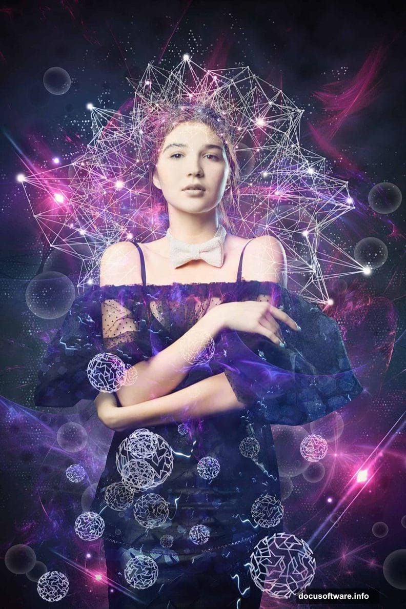
Build Abstract Elements From Basic Shapes
Those impressive abstract spheres and geometric elements? They’re simpler than they look.
Create a new layer and use the Ellipse tool to draw a perfect circle. Hold Shift while dragging to constrain proportions. Fill it with white or a light color.
Now apply Layer Styles. Try these combinations: Inner Glow with white color at 50 percent opacity, plus Outer Glow with blue tones at 30 percent opacity.
Add Gradient Overlay using similar colors to your main lighting. Set it to Radial style. This creates dimension that makes flat shapes look three-dimensional.
Duplicate these spheres multiple times. Vary their sizes, opacity levels, and positions. Overlapping abstract elements at different opacity levels creates complex depth.
Generate Dotted Grid Effects Efficiently
That sophisticated grid of small dots effect looks complex. Actually, you can create it in about two minutes.
First, create a merged copy of all visible layers. Press Cmd/Ctrl + Option/Alt + Shift + E. This creates a flattened copy while preserving your layer structure underneath.
Go to Filter > Pixelate > Color Halftone. Set the maximum radius to around 8-12 pixels depending on your document size. Larger documents need larger radius values.
The filter converts your image into dots automatically. But it looks harsh initially. Lower the layer opacity to 20-30 percent. Suddenly those dots become a subtle overlay effect instead of overwhelming your image.
Change the blending mode to Screen or Overlay. Screen works better over dark areas. Overlay works better over mixed tones.
Add Realistic Lens Flares and Light Streaks
Nothing screams “amateur work” louder than poorly placed lens flares. Here’s how to add them correctly.
Create a new layer filled with black. Go to Filter > Render > Lens Flare. Choose the 105mm Prime lens type for the most realistic effect.
Position the flare where your main light source logically exists. Usually that’s in the same general area as your brightest gradient tones.
Change the blending mode to Screen. The black disappears, leaving only the flare. Lower opacity to 40-60 percent so it enhances rather than dominates your lighting.
For additional light streaks, use the Pen tool to draw curved paths. Stroke these paths with a soft white brush. Then apply Gaussian Blur at 20-30 pixel radius. Instant light streaks.
Apply Professional Color Grading Techniques
Color grading transforms good manipulations into portfolio-worthy pieces. Yet most people stop at basic color adjustments.
Add a Color Balance adjustment layer near the top of your layer stack. Increase cyan and blue in the shadows. Add yellow and red to the highlights. This creates cinematic color separation.
Then add a Curves adjustment layer. Create an S-curve by pulling the highlights slightly up and shadows slightly down. This increases contrast without crushing blacks or blowing out whites.
For that final polish, add a Selective Color adjustment layer. Target the blacks and add cyan plus blue. This removes muddy tones and creates rich, saturated shadows.
Create Soft Focus Glow Effects
Professional photo manipulations often feature that dreamy, soft glow. Here’s the exact technique.
Create another merged copy of all visible layers (Cmd/Ctrl + Option/Alt + Shift + E). Duplicate this layer twice so you have three copies.
On the middle layer, apply Gaussian Blur at 25-30 pixels. Change blending mode to Screen at 30 percent opacity.
On the top layer, apply Gaussian Blur at 60-80 pixels. Keep it at Normal blending mode but lower opacity to 15 percent.
These two blur layers at different radii create sophisticated depth-of-field effects. The result looks like expensive camera lens bokeh.
Optimize Layer Organization Throughout Your Process
Nothing kills creativity faster than searching through 50 unnamed layers trying to find the right one.
Name every layer immediately after creating it. Use clear, descriptive names like “Model Retouching” or “Blue Glow Sphere” instead of “Layer 47.”
Group related layers together. Press Cmd/Ctrl + G after selecting multiple layers. Name the group. Collapse groups you’re not actively working on.
Color-code your layers. Right-click layer thumbnails and choose colors. I use red for elements needing work, green for finished elements, and blue for adjustment layers.
This seems tedious initially. But on complex manipulations with 100-plus layers, organization becomes absolutely critical.
Final Polish Through Strategic Sharpening
Sharpening should always happen last. Sharpening earlier in your process amplifies noise and artifacts you’ll later regret.
Create a final merged copy of everything. Apply Filter > Sharpen > Unsharp Mask. Use Amount at 80-120 percent, Radius at 1-1.5 pixels, and Threshold at 0.
For even better results, use the High Pass sharpening technique instead. Duplicate your merged layer. Go to Filter > Other > High Pass. Set radius to 1-2 pixels. Change blending mode to Overlay.
This adds crisp detail to edges without creating halos or artifacts. Lower opacity if the effect feels too strong.
Then zoom out and evaluate your full composition. Your eye catches different issues at different zoom levels. Make final tweaks to lighting, color balance, or positioning.
The Real Secret Behind Professional Work
Creating sophisticated photo manipulations isn’t about knowing obscure filters or secret techniques. It’s about methodical layering of simple effects.
Every professional manipulation you admire uses the same basic tools you have access to. The difference? Patience to build complexity gradually through dozens of subtle adjustments.
Start with solid fundamentals like proper canvas setup and non-destructive editing. Add lighting strategically. Layer textures carefully. Polish with color grading and sharpening.
Most importantly, save versions frequently throughout your process. Nothing replaces the ability to step backward when an effect doesn’t work as expected.
Your first attempts won’t look perfect. Mine certainly didn’t. But each project teaches techniques you’ll use forever. So start experimenting, make mistakes, and keep refining your approach.