
Want to transform ordinary portraits into striking digital art? This technique combines geometric shapes with gradient lighting to create modern, eye-catching compositions.
I’ll walk you through building abstract portrait art from scratch. You’ll learn gradient manipulation, shape layering, and lighting effects that make portraits pop. Plus, these techniques work for any style—from minimalist to bold and colorful.
Let’s start with the foundation and build up to those stunning geometric overlays.
Set Up Your Canvas and Background Gradient
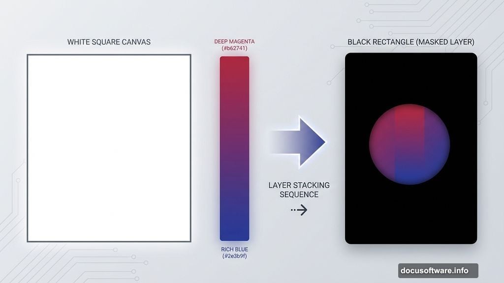
First, create a 1300×1300 px document in Photoshop. Fill it with white to start fresh.
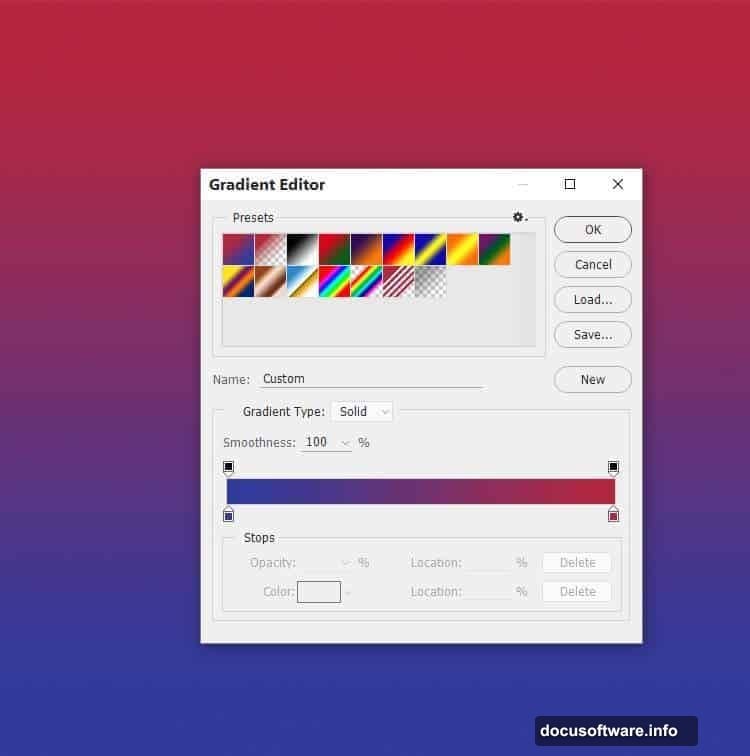
Hit Ctrl+Shift+N for a new layer. Then press G to activate the Gradient Tool. Select Linear Gradient mode.
Pick two colors that contrast well. For this effect, use #b62741 (deep magenta) and #2e3b9f (rich blue). Drag a line from top to bottom across your canvas.
This creates your base gradient. The color transition sets the mood for your entire piece. So choose colors that complement your portrait subject.
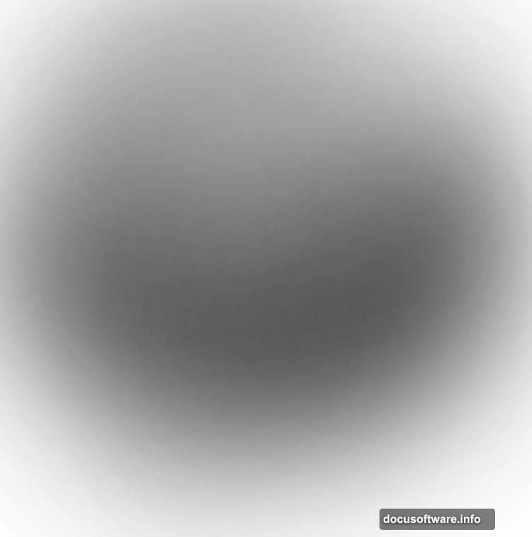
Build Depth with Black Overlay
Create another new layer and fill it with pure black. Now here’s where it gets interesting.
Click the mask icon at the bottom of your Layers panel. This adds a layer mask without hiding anything yet.
Grab a soft round brush. Set it to black with 10% opacity. Paint gently on the middle section of your canvas.
This technique creates subtle depth. The edges stay darker while the center gradually lightens. It’s like adding a natural vignette that draws eyes to your focal point.
Add Atmospheric Color Layers
Make a new layer above your black overlay. Select a soft brush again.
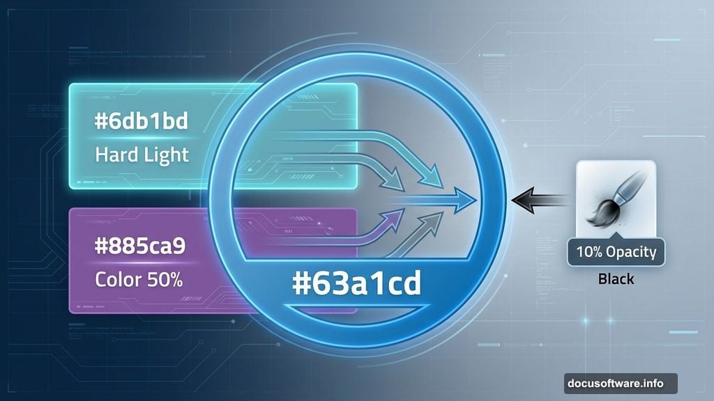
Choose color #6db1bd (soft cyan). Paint loosely in the middle area. Don’t worry about being precise here.
Change this layer’s blend mode to Hard Light at 100%. The cyan tint blends with your gradient underneath. It creates an atmospheric glow that feels three-dimensional.
Layer Secondary Color Effects
Add another layer for more color complexity. Use soft brush with #885ca9 (muted purple) this time.
Paint around the canvas edges. Focus on corners and outer areas. This adds richness to your color palette.
Switch this layer to Color blend mode at 50%. But we’re not done yet. Add a layer mask to this purple layer.
Use a soft black brush at 10-15% opacity. Gently erase the color effect around your center area. This preserves your focal point while enriching the periphery.
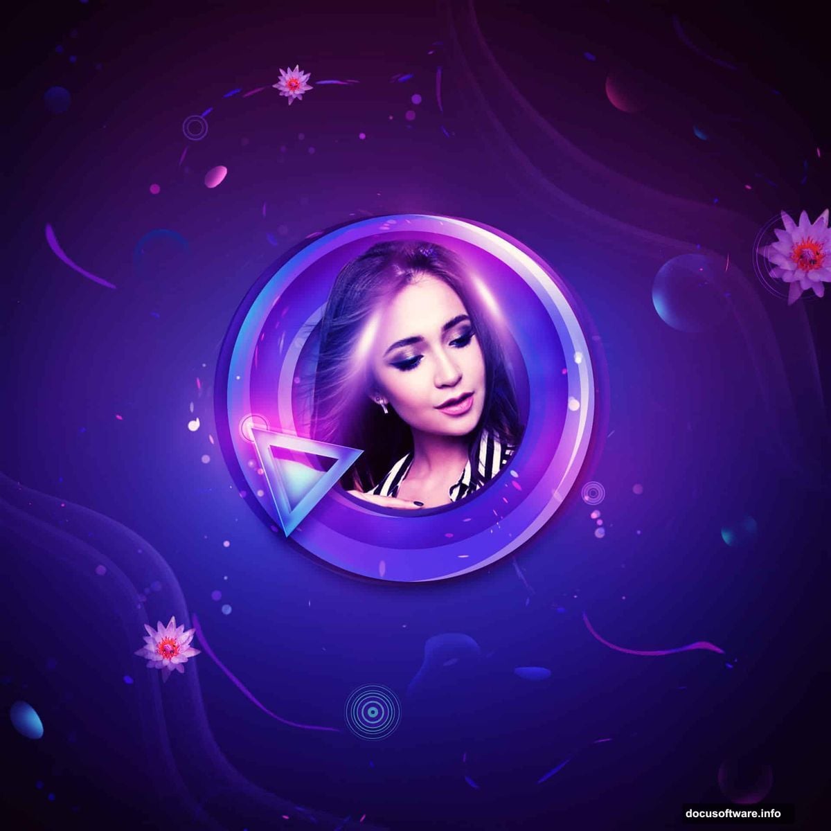
Create Your First Geometric Shape
Now for the fun geometric elements. Create a new layer and press U to activate the Custom Shape Tool.
Select Circle Frame from the shape options. Pick color #63a1cd (bright blue). Draw a circle shape in your canvas center.
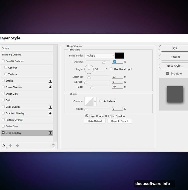
Double-click this shape layer to open Layer Styles. Choose Drop Shadow and set the shadow color to black. This gives your circle dimension and makes it float above the background.
The circle becomes your primary geometric anchor. Everything else will build around this foundation.
Duplicate and Shift for Depth
Duplicate your circle layer. Change the shape color to #360955 (deep purple).
Right-click the duplicated layer and choose Clear Layer Style. This removes the drop shadow we added before.
Press V for the Move Tool. Shift this purple circle slightly to the left. Change its blend mode to Overlay at 50%.
This creates a subtle shadow effect. The overlapping circles add dimension without looking heavy-handed.
Add Contrasting Color Accents
Duplicate the shape layer again. This time, change the color to #ec63bd (vibrant pink).

Move this pink circle to the right of your first blue circle. Set its blend mode to Overlay at 30%.
Add a layer mask to this pink shape. Use a soft black brush at 20% opacity. Gently erase the left edge of the pink circle where it overlaps the others.
This gradual transition makes the shapes feel integrated rather than stacked. The colors blend naturally while maintaining distinct presence.
Build Final Geometric Layer
Duplicate your pink circle one more time. Move it slightly left of where it currently sits.
Change this shape’s color to #ec6663 (coral red). The blend mode stays at Overlay for consistency.
Now you have multiple overlapping circles. Each one contributes different color tones. Together they create a complex, dimensional effect that elevates simple portraits into art.
The geometric shapes frame your subject without overwhelming them. Plus, the overlay blend modes let portrait details show through beautifully.
Bring in Your Portrait Subject
Time to add your main portrait. Open your model or portrait image. Use the selection tool of your choice to isolate your subject.
Copy and paste the portrait onto your geometric composition. Position it within your circle frames. The portrait should sit in the center where your lighting effects converge.
Scale the portrait to fit your composition. Make sure key features like eyes and face align with your visual focal points.
Add a layer mask to your portrait layer. Use a soft brush to blend the edges. This helps the portrait integrate seamlessly with your abstract background.
Enhance Portrait Lighting
Create a new layer above your portrait. Change its blend mode to Overlay.
Select a soft brush with white color. Paint gently on areas where light should hit your subject. Focus on cheekbones, nose bridge, and forehead.
This simulates natural light hitting your subject. It makes the portrait feel like it belongs in this colorful, geometric space.
Create another layer, still in Overlay mode. This time use a soft black brush. Paint subtle shadows in areas like under the chin, beneath the nose, and in the eye sockets.
These lighting tweaks bridge the gap between your portrait and the abstract elements around it.
Add Decorative Vector Elements
Now for extra visual interest. Import decorative vector elements like the circular vectors and waterlily shapes mentioned in your resources.
Place these elements around your portrait. Don’t cluster them all in one spot. Distribute them to create visual flow around your composition.
Resize and rotate these elements. Make some larger, some smaller. Vary their opacity between 30-80% for depth.
Apply blend modes like Screen, Overlay, or Soft Light to these decorative elements. This helps them integrate rather than sit on top of your artwork.
Create Light Ray Effects
Import your light ray resource or create light streaks using the Pen Tool with a soft brush stroke.
Place light rays emanating from behind your subject. This adds drama and draws focus to your portrait.
Set these light rays to Screen blend mode. Reduce opacity to 40-60% so they feel subtle and atmospheric rather than harsh.
Add a layer mask to your light rays. Use a soft black brush to fade the edges. This creates a gradual, natural-looking glow.
The light rays should feel like they’re coming from behind or beside your subject. They add dimension without distracting from the portrait itself.
Fine-Tune Color Balance
Create a Color Balance adjustment layer above all your elements. Adjust the midtones to enhance your color palette.
Add more cyan and blue to cool down the overall tone. Or push toward magenta and red for warmth. This depends on the mood you want.
Create a Curves adjustment layer. Lift the shadows slightly to reduce heavy blacks. Pull down highlights a bit to avoid blown-out whites.
These adjustments unify all your layers. They make sure your portrait, geometric shapes, and background feel cohesive rather than separate.
Boost Contrast Selectively
Add a new layer and set it to Overlay blend mode. Fill it with 50% gray by going to Edit > Fill > 50% Gray.
Select the Dodge Tool (O). Set it to Highlights with 10-15% exposure. Paint over areas you want to emphasize—face features, bright geometric shapes, light effects.
Switch to the Burn Tool (O). Set it to Shadows with similar exposure. Darken areas that should recede—background corners, shadow areas on the portrait, edges of geometric shapes.
This dodge-and-burn technique adds polish. It gives your artwork that professional, carefully lit appearance.
Sharpen Strategic Areas
Create a merged copy of all visible layers by pressing Ctrl+Alt+Shift+E. This gives you a flattened version while preserving your layer stack.
Go to Filter > Sharpen > Unsharp Mask. Set Amount to 80-120%, Radius to 1-1.5 pixels, Threshold to 0.
Add a layer mask to this sharpened layer. Fill the mask with black to hide the sharpening completely.
Use a white brush on the mask to reveal sharpening only on your portrait’s key features. Focus on eyes, lips, hair texture, and sharp geometric edges.
Selective sharpening makes important elements pop without making your entire image look over-processed.
Final Color Grading
Add a Gradient Map adjustment layer at the very top of your layer stack. Choose a gradient that matches your color scheme.
Set this Gradient Map to Color blend mode at 20-30% opacity. This adds a subtle color wash that ties everything together.
Create a Hue/Saturation adjustment layer. Increase saturation by 5-10 points for vibrance. Or decrease it for a muted, sophisticated look.
Add a final Curves adjustment to fine-tune overall brightness and contrast. Make subtle adjustments here—small changes have big impact at this stage.
Save and Export Your Artwork
Save your working file as a PSD to preserve all layers. This lets you make changes later without starting over.
For sharing online, create a flattened version. Go to File > Export > Export As. Choose JPEG at 90-100% quality for social media.
For print projects, export as TIFF or high-quality PNG. Make sure your resolution is at least 300 DPI if you’re printing.
Consider creating variations with different geometric colors or lighting effects. The beauty of this technique is how easily you can experiment once your base is built.
This abstract portrait style works for any subject. Try it with different poses, expressions, or even multiple subjects. The geometric elements adapt beautifully to various compositions.
The key is balancing your portrait with the abstract elements. Neither should overpower the other. When done right, they work together to create something more striking than either element alone