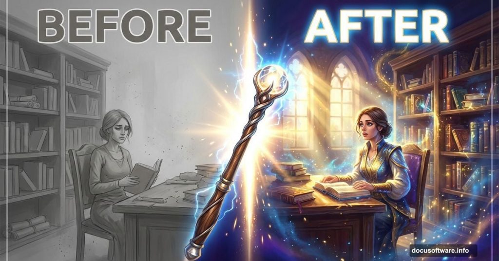
Adding dramatic light transforms bland photo manipulations into stunning fantasy artwork. But most tutorials skip the tricky parts like blending semi-transparent fabric or creating realistic light rays.
This guide shows you exactly how to nail those challenging effects. Plus, you’ll learn practical techniques that work across different fantasy scenes, not just this specific project.
Let’s make your fantasy manipulations actually look professional.
What You’ll Need First
Before diving in, grab these free resources. They’ll save you hours of manual work.
Required stock images:
- Library interior shot (atmospheric setting works best)
- Woman in flowing dress (movement adds drama)
- Mist and dust textures (for atmosphere)
- Sun ray brushes (creates light beams fast)
Software requirements:
- Adobe Photoshop (any recent version works)
- Basic knowledge of layers and masks
- Patience for detailed blending work
Most resources are available free. However, some premium brushes deliver better results if you’re serious about fantasy manipulation.
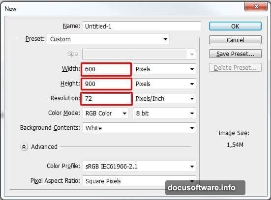
Setting Up Your Canvas
Start with proper document dimensions. Fantasy scenes need vertical space to feel epic.
Create a new document at 600×900 pixels with 72 DPI resolution. That’s perfect for web display without massive file sizes. For print work, bump resolution to 300 DPI minimum.
Fill your background layer with dark blue (#2b2b32). This creates depth immediately. Plus, it’s easier to add light elements against dark backgrounds than the reverse.
Pro tip: Save this as a template. You’ll reuse these settings constantly for fantasy work.
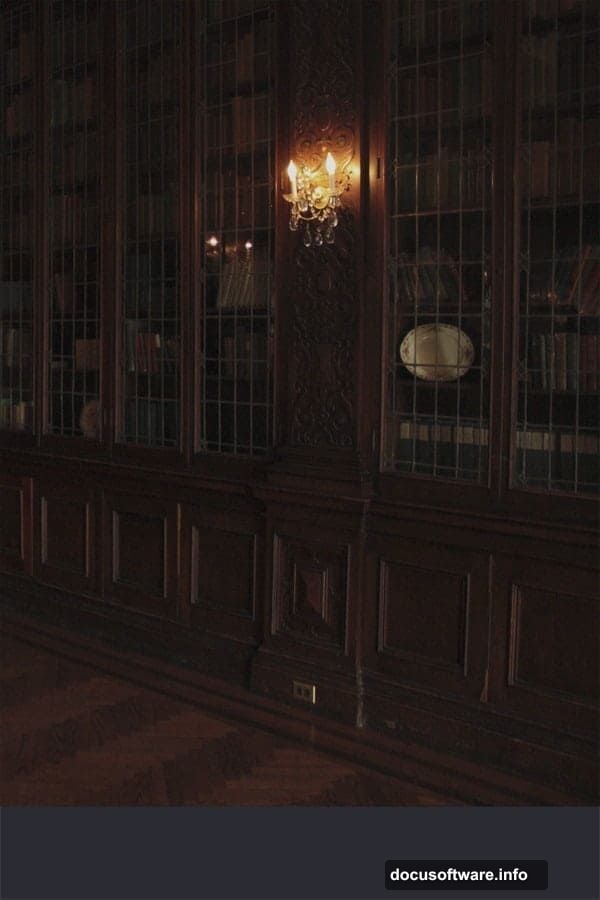
Building the Library Foundation
Drag your library stock photo onto the canvas. Press Ctrl+T to activate Free Transform. Scale it to fill your document completely.
Critical step: Hold Shift while scaling. This maintains aspect ratio and prevents weird stretching. Nothing screams amateur faster than distorted architecture.
Name this layer “LIBRARY” in all caps. Seems minor. But clear naming saves confusion when you’re managing 30+ layers later.
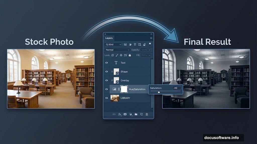
Desaturating for Mood
Fantasy scenes rarely need vibrant, realistic colors. Instead, muted tones create atmosphere and mystery.
Add a Hue/Saturation adjustment layer. Set Saturation to -40. But here’s the trick most tutorials miss: create a clipping mask by clicking the small square icon at the bottom of the adjustment panel.
Why? This affects only your library layer, not future elements. You’ll thank yourself later when adding colorful light effects that shouldn’t get desaturated.
Your library should now look moody and subdued. Perfect foundation for dramatic lighting.
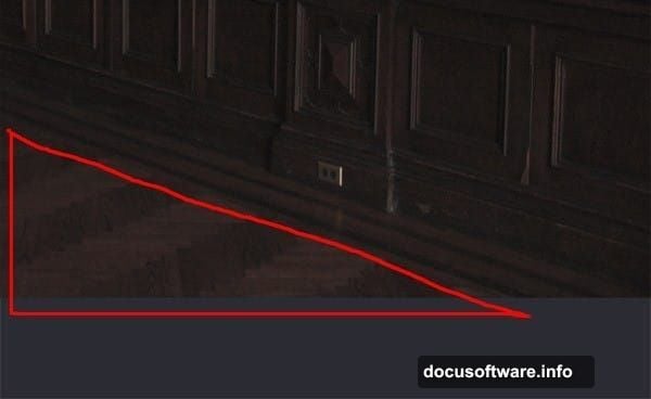
Fixing the Floor Problem
Here’s where planning ahead matters. You’ll place a woman in the bottom left corner. That means you don’t need floor there. But the bottom right corner would show empty space.
Click your LIBRARY layer. Grab the Lasso Tool (L) and select just the floor area. Press Ctrl+J to duplicate that selection onto a new layer.
Name this layer “FLOOR” and move it to cover the empty bottom right area. Use the Move Tool (V) to position it perfectly.
Why this works: You’re maintaining consistent perspective and texture. Creating floor from scratch would take forever and probably look fake.
Matching Floor Saturation
Your new floor piece needs the same desaturation as the library. Otherwise, it’ll stick out like a sore thumb.
Add another Hue/Saturation adjustment layer. Set Saturation to -40 again. Create a clipping mask to affect only the FLOOR layer.
Now your entire background has cohesive, moody tones. Every element looks like it belongs in the same scene.
Creating Semi-Transparent Fabric
This separates amateur from professional work. Blending translucent fabric convincingly requires specific techniques.
Place your woman stock photo. Start with a standard layer mask to remove the background. But here’s the secret: don’t use 100% opacity brushes on fabric edges.
Instead, lower your brush opacity to 30-40% on flowing dress areas. Build up transparency gradually with multiple brush strokes. This creates realistic see-through effects.
Common mistake: Using hard-edged masks on soft fabric. Always match your mask hardness to the material you’re blending.
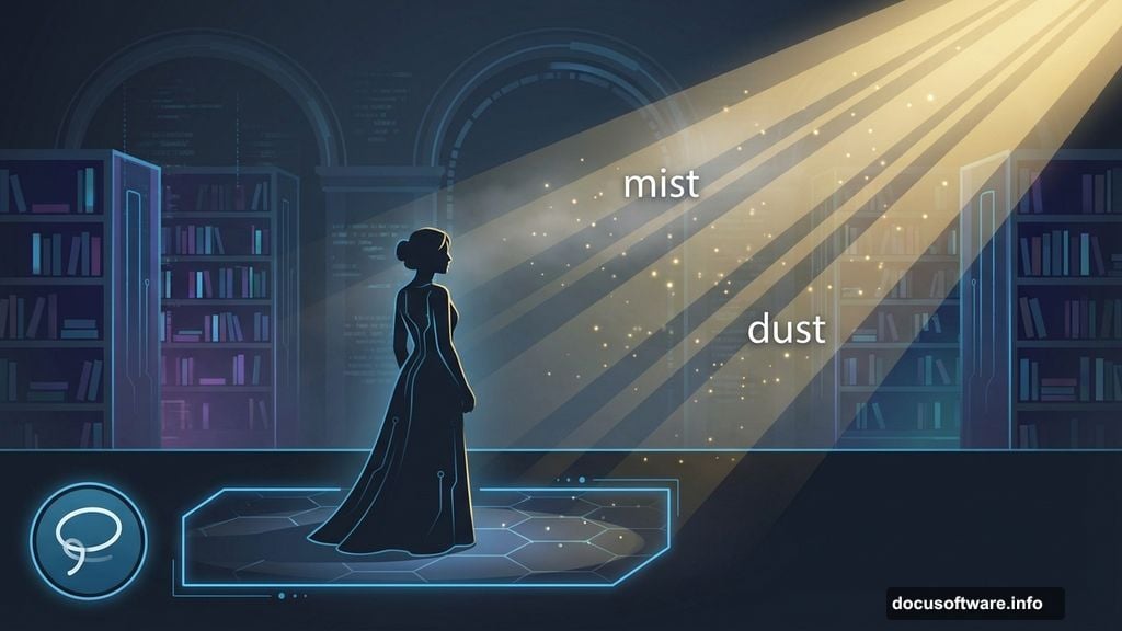
Adding Atmospheric Mist
Mist creates depth and separates foreground from background. Plus, it catches and scatters light beautifully.
Import your mist texture. Set the blend mode to Screen. This makes dark areas transparent while keeping light areas visible.
Lower opacity to 20-30% initially. You can always add more mist layers for stronger effects. Too much mist looks foggy and fake. Subtle layering looks magical.
Pro placement: Add denser mist in background areas, lighter mist in foreground. This enhances depth perception naturally.
Building Dramatic Light Rays
Now for the fun part. Light rays transform ordinary scenes into dramatic fantasy moments.
Load your sun ray brushes. Create a new layer above all others. Choose a soft yellow-white color (#fff7e6 works great).
Paint light rays from a specific direction. Consistency matters here. All rays should originate from the same light source or the effect falls apart.
Set this layer to Screen blend mode. Adjust opacity until rays look integrated, not pasted on. Usually 40-60% opacity hits the sweet spot.
Adding Dust Particles
Light rays look better when they illuminate floating particles. This adds realism and atmosphere.
Import your dust texture. Set blend mode to Screen again. Position it where light rays would naturally illuminate particles.
Critical detail: Blur the dust slightly using Filter > Blur > Gaussian Blur. Set radius to 1-2 pixels. This prevents harsh, obvious texture edges.
Lower opacity to 15-25%. Dust should be barely visible, creating subtle texture in light beams.
Color Grading the Light
Your light elements probably look too white and clinical. Fantasy scenes need warmth and mood.
Add a Color Balance adjustment layer. Clip it to your light ray layer. Add yellow and red tones to highlights. This creates golden, magical light instead of harsh white beams.
Experiment with values. Fantasy light often leans warm (yellows, oranges) rather than cool (blues, whites). Warm light feels more inviting and mysterious.
Enhancing Contrast Strategically
Flat lighting kills drama. Strategic contrast makes elements pop.
Add a Curves adjustment layer above your woman layer. Create an S-curve by pulling highlights up slightly and shadows down slightly. This enhances contrast without looking oversaturated.
Important: Don’t apply the same contrast everywhere. Foreground elements need more contrast than background elements to create depth.
Blending Everything Together
Your scene probably looks good but slightly disconnected. Final blending unifies all elements.
Add a Gradient Map adjustment layer at the very top. Choose a gradient from deep blue to warm yellow. Set blend mode to Soft Light and lower opacity to 10-15%.
This subtle color wash ties everything together. It’s the difference between “nice photo manipulation” and “cohesive fantasy scene.”
Final Light Refinement
Almost done. But dramatic light needs final polish.
Create a new layer set to Overlay blend mode. Grab a soft brush with white color. Paint subtle highlights on the woman’s face and dress where light would naturally hit.
Lower opacity to 20-30%. These painted highlights make your subject glow from within. It’s a subtle effect that makes huge impact.
Similarly, paint soft shadows with black on an Overlay layer at 15-20% opacity. This defines form and creates three-dimensional depth.
Common Mistakes to Avoid
Over-sharpening: Fantasy scenes need softness. Too much sharpening looks harsh and computer-generated. Use minimal sharpening only on key focal points.
Inconsistent light direction: All shadows and highlights must match your main light source. Mixed lighting destroys believability instantly.
Too much saturation: Beginners often crank saturation thinking it adds drama. Instead, it looks cartoonish. Muted tones with selective color pops work better.
Ignoring edge quality: Harsh, visible cutouts scream amateur work. Spend time on clean, soft-edged masks. This matters more than fancy effects.
Forgetting atmosphere: Clear, sharp backgrounds fight with foreground elements. Always add subtle blur, mist, or haze to distant elements.
Taking It Further
This technique works beyond library scenes. Apply the same principles to forests, castles, underwater scenes, or otherworldly landscapes.
Key takeaway: Dramatic light comes from layering subtle effects, not one magic filter. Build atmosphere gradually through mist, dust, rays, and strategic color grading.
The semi-transparent fabric technique applies to capes, wings, veils, and magical effects. Master this once and you’ll use it constantly.
Experiment with different blend modes beyond Screen and Overlay. Soft Light, Linear Dodge, and Color Dodge all create unique light effects worth exploring.
Your Turn
Fantasy photo manipulation demands patience and attention to detail. But the dramatic light techniques you just learned separate professional-looking work from amateur attempts.
Start simple. Focus on getting clean masks and consistent light direction before adding complex effects. Build your skill gradually rather than trying everything at once.
Most importantly, save your work in layers. You’ll want to adjust and refine elements later. Flattened images can’t be fixed when you spot problems.
Now grab those stock images and create something magical. Your fantasy scenes deserve dramatic light that makes viewers stop scrolling.