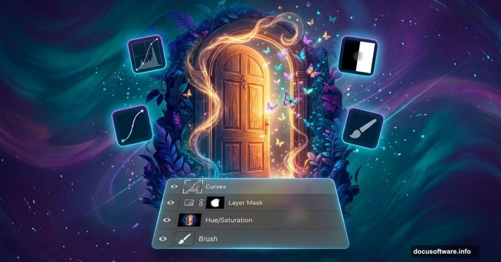
Creating fantasy photo manipulations feels intimidating. But it’s actually a series of simple techniques stacked together.
This step-by-step guide shows you how to build a magical butterfly scene in Photoshop. You’ll learn practical masking, lighting effects, and color grading that work for any fantasy artwork. Plus, every technique applies to other projects beyond this tutorial.
No advanced skills required. Just patience and willingness to experiment.
Prep Your Photoshop Canvas
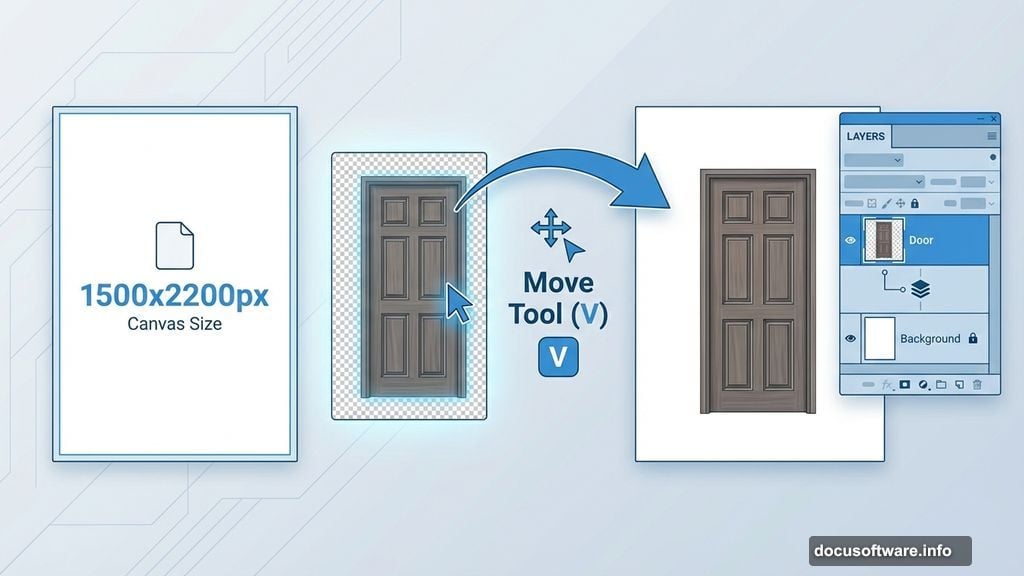
First, create a new document in Photoshop. Set dimensions to 1500×2200 pixels. Then fill the background with white.
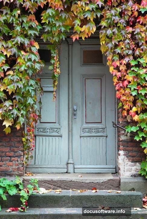
Open your first door image. Grab the Move Tool (press V) and drag the door onto your white canvas. This becomes your base layer.
Position it where you want. Don’t worry about perfection yet. You’ll adjust everything as you build.
Clean Up Unwanted Elements
See that iron fixture on the wall beside the door? It’s gotta go.
Create a new layer by pressing Ctrl+Shift+N. Then activate the Clone Tool (press S). This tool copies nearby pixels to cover unwanted areas.
Sample clean wall sections by Alt-clicking. Then paint over the iron fixture. Work slowly. Clone from multiple angles to avoid obvious patterns.
The goal is seamless removal. Take your time here. Rushed cloning always shows in the final result.
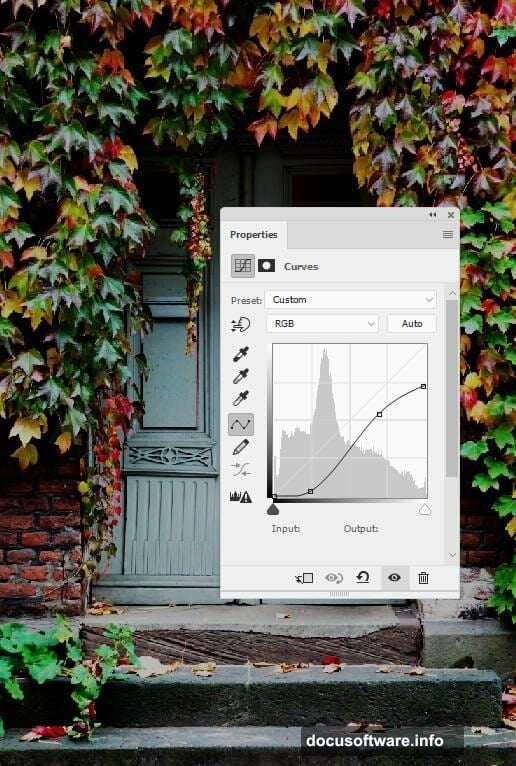
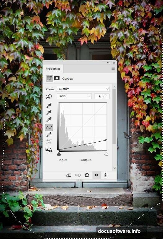
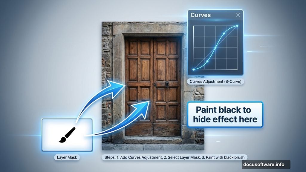
Add Depth with Curves Adjustments
Now comes the magic. Go to Layer > New Adjustment Layer > Curves. Increase the contrast by creating an S-curve.
But here’s the trick. You don’t want this effect everywhere.
Click the layer mask (the white thumbnail). Grab a soft round brush. Set the color to black. Paint over the middle section and steps of the door.
Black on a layer mask hides effects. So you’re selectively removing the dramatic contrast from areas that should stay brighter. This creates natural-looking depth.
Darken Corners for Drama
Make another Curves adjustment layer. This time, drag the curve down to darken everything.
Again, use the layer mask. Paint with a soft black brush over the center. Leave the sides and corners dark.
Why? Human eyes naturally focus on brighter areas. By darkening the edges, you guide viewers straight to the door. Classic vignette technique that works every time.
Blend Your Second Door Image
Open your second door image. Drag it onto the canvas using the Move Tool.
Press Ctrl+T to activate Free Transform. Resize and position this door to match your existing door perfectly. The alignment matters here.
Now comes careful masking. Click the layer mask icon at the bottom of the Layers panel. Switch between hard and soft black brushes.
Paint away parts that don’t fit. Blend the new door with the steps below. Most importantly, carefully preserve the ivy details on the door itself.
Hard brushes for precise edges. Soft brushes for natural transitions. Master this combo and your composites will look professional.
Match the Lighting on Door Two
Create a Curves adjustment layer above your second door. Right-click and choose “Create Clipping Mask.”
Clipping masks only affect the layer directly below. So this Curves layer only impacts your second door.
Darken it to match the first door’s lighting. Then grab your brush again. Use the layer mask to reduce darkness on the lower section and ivy sides.
Matching light direction makes composites believable. Mismatched lighting screams “fake” instantly.
Apply Color Grading
Time for atmosphere. Create a Gradient Map adjustment layer at the top of your layer stack.
Pick two colors: #e10019 (red) and #00601b (dark green). This creates a subtle fantasy color palette.
But full strength looks too intense. Lower the opacity to 20%. Subtle color shifts feel more natural than aggressive grading.
Fantasy doesn’t mean garish. Restraint creates better results.
Fine-Tune Color Balance
Add a Color Balance adjustment layer. Adjust the Midtones and Highlights sliders.
Push Midtones slightly toward warmer tones. Adjust Highlights to complement your gradient map colors.
This step is about harmony. Your door colors should feel cohesive, not like random images slapped together. Small adjustments make huge differences.
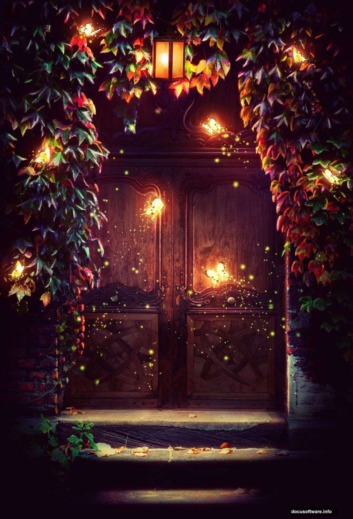
Add the Magical Lamp
Open your lamp image. Drag it into the scene using the Move Tool.
Position it where light should emanate from. Usually near the door or in the center works best.
Use Free Transform (Ctrl+T) to resize appropriately. Then add a layer mask. Remove any harsh edges or backgrounds that don’t fit.
The lamp becomes your light source. Everything you do next should reinforce that this object is glowing.
Paint Glowing Light Effects
Create a new layer. Set the blend mode to Screen or Overlay.
Grab a soft brush. Pick a warm yellow or white color. Lower the opacity to around 30%.
Paint gentle glows around your lamp. Build up the effect gradually with multiple brush strokes. Never go full opacity. That looks cartoonish.
The light should fade naturally as it moves away from the source. Think about how real light behaves. It doesn’t have hard edges.
Position Your Butterflies
Open your butterfly images. Separate each butterfly onto its own layer.
Use the Move Tool to position them around your scene. Vary the sizes using Free Transform. Some close and large. Others distant and small.
This creates depth. Everything the same size looks flat and fake.
Layer butterflies at different positions. Some in front of the light. Others behind it. This dimensional placement makes the scene feel alive.
Add Butterfly Glow Effects
Here’s where magic happens. Create a new layer for each butterfly’s glow.
Set the blend mode to Screen. Use a soft brush with your light color. Paint a subtle glow around each butterfly.
Butterflies closer to the lamp get brighter glows. Distant ones get fainter effects. Always match light intensity to distance from the source.
This consistency sells the illusion. Random glowing objects look amateur. Logically-placed light looks professional.
Paint Magical Light Particles
Create another new layer. Set blend mode to Screen.
Pick a small, soft brush. White or pale yellow works great. Click randomly around your lamp and butterflies.
These tiny dots suggest magical energy. Vary the size and opacity. Some bright. Others barely visible.
Don’t overdo it. A few well-placed particles beat hundreds of random dots. Less is more with magical effects.
Refine Overall Lighting
Step back and evaluate your scene. Does the light make sense?
Add more Curves or Levels adjustment layers where needed. Darken areas that should be in shadow. Brighten spots where light hits directly.
Use layer masks to apply these adjustments selectively. Global changes rarely work. Targeted adjustments create realism.
Pay special attention to where light hits surfaces. Subtle highlights on the door, steps, and walls sell the effect.
Final Color and Contrast Tweaks
Almost done. Create a final Curves adjustment layer at the very top.
Make subtle S-curve adjustments to boost overall contrast. Not too much. Just enough to make colors pop.
Add a Vibrance or Saturation adjustment if colors feel dull. But keep it under 10-15%. Oversaturated fantasy art looks cheap.
The goal is a polished, cohesive image. Everything should feel like it belongs in the same magical world.
Polish and Export
Zoom in to 100%. Check for masking mistakes, harsh edges, or lighting inconsistencies.
Fix anything that breaks the illusion. Clean masks. Smooth transitions. Logical light behavior.
When satisfied, save your PSD file. Keep all layers intact for future edits.
Then flatten the image and export as high-quality JPEG or PNG. Your magical butterfly scene is complete.
What Makes Fantasy Composites Work
This tutorial teaches more than butterfly scenes. You learned fundamental compositing techniques.
Layer masking lets you blend images seamlessly. Adjustment layers with masks give selective control over color and light. Blend modes create realistic lighting effects. Brushwork adds finishing touches that bring scenes alive.
These skills transfer to any photo manipulation. Portrait composites. Surreal landscapes. Product mockups. The techniques stay the same.
Master these basics and you can build any fantasy scene you imagine. The only limit is your creativity and patience.
Start simple. Build complexity gradually. Most importantly, study how real light behaves. That knowledge separates amateur composites from professional work.
Now grab Photoshop and start creating your own magical worlds.