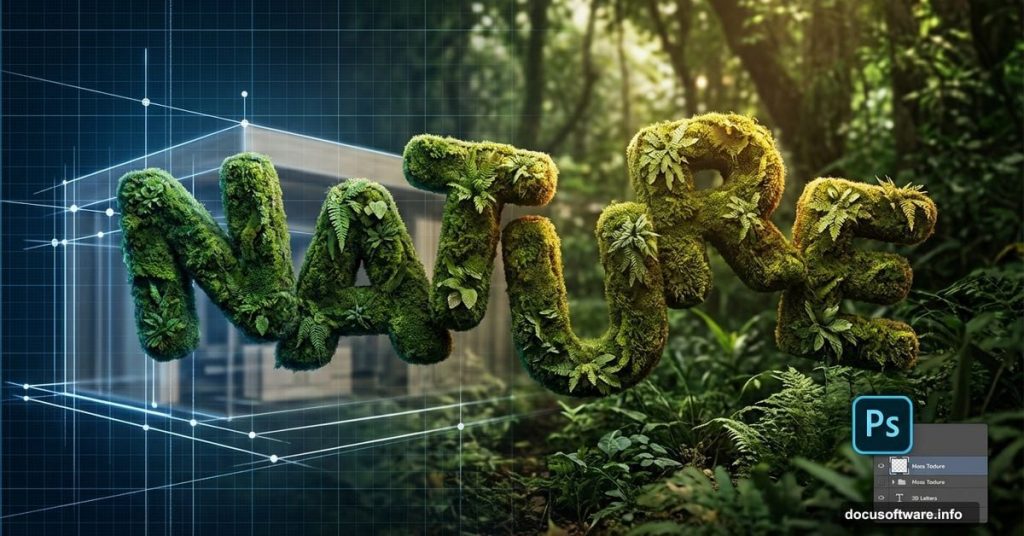
Creating eye-catching environmental posters doesn’t require expensive software or years of experience. With free tools and some smart layering techniques, you can build striking 3D nature typography that rivals professional WWF campaigns.
This tutorial walks through blending organic textures with dimensional text. You’ll learn practical layer management tricks while creating a poster that actually looks professional. Plus, the entire process uses accessible tools most designers already have.
Building Your 3D Base With SketchUp
Before touching Photoshop, you need dimensional letters. SketchUp does this job perfectly and costs nothing.
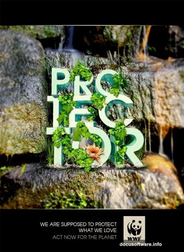
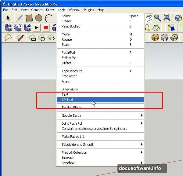
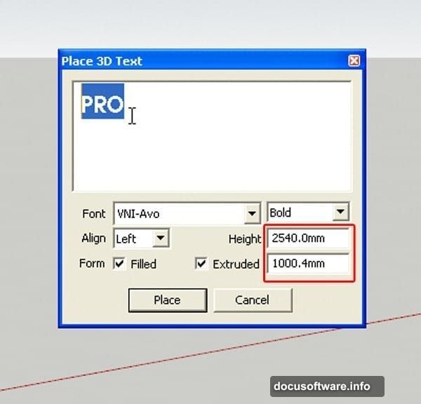
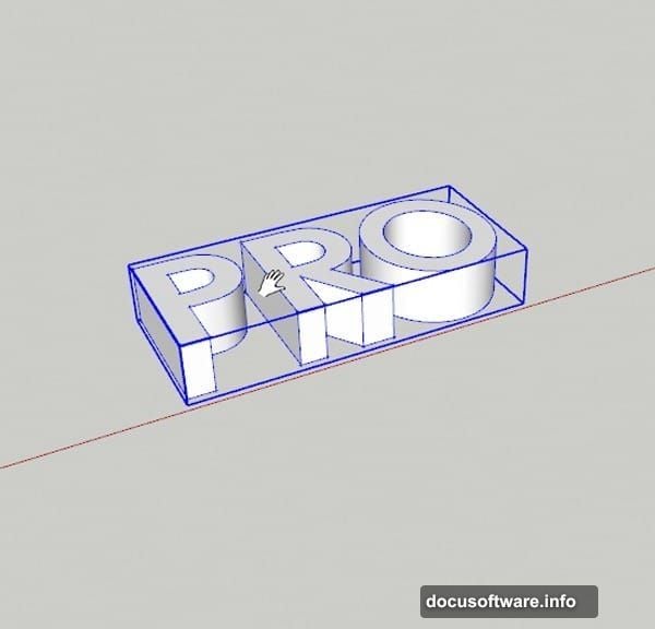
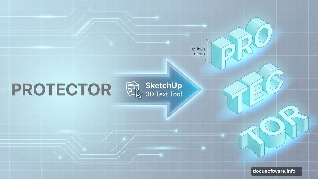
Open SketchUp and navigate to Tools > 3D Text. A dialog box pops up where you type your message. The example uses “PROTECTOR” split across three words for visual interest.
Set your extrusion depth around 12 inches. Height depends on your design, but 24-36 inches works for most projects. Pick a bold, clean font. Thin letterforms get lost when covered with nature textures.
Creating Dynamic Letter Positioning
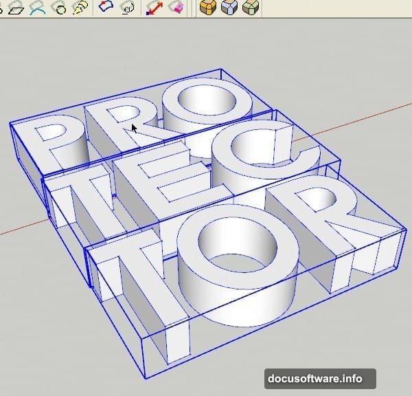
Flat, aligned text looks boring. So rotate and scale individual words to add depth.
Press ‘M’ to activate the Move tool. Click any word and drag it into position. Then hit ‘R’ for Rotate. Click the text edge and drag along the blue axis until letters “stand up” at interesting angles.
The Scale tool (‘S’ key) lets you thicken letters. Click and drag to make some words wider than others. This creates visual hierarchy and makes your design feel less mechanical.
Moreover, stagger the baseline of each word. “PRO” might sit higher than “TEC,” which sits higher than “TOR.” Your eye naturally follows this descending pattern.
Rounding Corners for Organic Feel
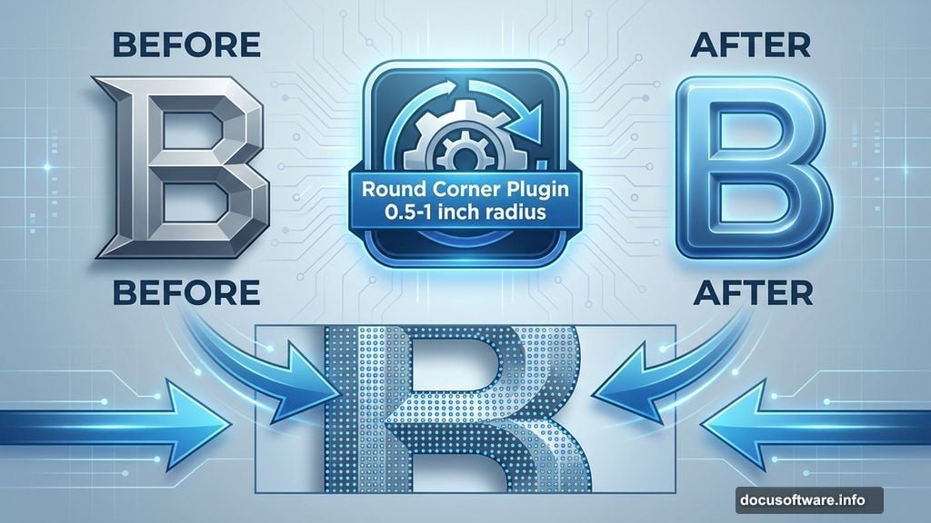
Sharp corners clash with nature imagery. SketchUp’s Round Corner plugin fixes this instantly.
Double-click a word until blue dots cover every surface. That means full selection. Open the Round Corner plugin and set radius to 0.5-1 inch depending on letter size.
Hit Enter and wait. The plugin smooths every edge into gentle curves. Repeat for remaining words. This subtle change makes huge difference when you add organic textures later.
Apply a light cyan or white material before rendering. You just need enough color to see letter definition in your final render. Pure white sometimes causes exposure issues.
Rendering Your 3D Typography
Export your view as a high-resolution PNG. Position your camera to capture the entire composition with slight perspective. Don’t go perfectly orthogonal—a bit of angle adds realism.
Render at 300 DPI minimum if you’re printing. For web-only work, 150 DPI saves processing time. Make sure your background is transparent or solid white for easy masking in Photoshop.
Save this file. You’ll import it as your base layer in the next phase.
Setting Up Your Photoshop Document
Open Photoshop and create a new document. Standard poster size works (24×36 inches) but web dimensions (1920×1080 pixels) are fine for digital-only projects.
Import your rendered 3D text. Place it on its own layer and name it “Base Text.” This stays at the bottom of your layer stack as reference.
Now gather your nature images. You need grass textures, water elements, flowers, and maybe some wildlife. Free stock sites like Pixabay or Unsplash offer plenty of options. Just verify licensing for commercial use if needed.
Masking Text With Grass Texture
Open your grass image. Select All (Ctrl+A), Copy (Ctrl+C), then paste into your poster document. A new layer appears.
Right-click this grass layer and choose “Create Clipping Mask.” The grass instantly conforms to your text shape. Magic.
But it probably looks flat. So grab the Move tool and reposition the grass until interesting details fill letter faces. Maybe you want flowers on “PRO” and darker grass on “TOR.”
Next, adjust Levels (Ctrl+L) to boost contrast. Nature textures often need punchier blacks and brighter highlights to read clearly on dimensional forms.
Adding Water Elements for Depth
Water adds movement and draws the eye. Import your waterfall or splash image on a new layer above the grass.
Set blending mode to Screen or Lighten. This makes dark areas transparent while keeping white water visible. Then use a soft eraser (30-40% opacity) to fade edges where water meets grass.
Position water flowing “down” letter faces. Follow the 3D perspective from your SketchUp render. Water should appear to cascade from top surfaces toward bottom edges.
Lower opacity to 60-70% if water overwhelms other elements. Subtlety works better than obvious compositing.
Blending Floral Elements
Flowers add color pops and organic detail. But too many flowers make your design look busy.
Place 2-3 flower images strategically. Maybe one large lotus bloom on “PRO” and smaller flowers tucked into “TEC” corners. Use Free Transform (Ctrl+T) to resize and rotate flowers naturally.
Apply layer masks instead of erasing. Masks let you refine edges non-destructively. Paint with black to hide areas, white to reveal them. Gray creates partial transparency.
Adjust Hue/Saturation (Ctrl+U) so flower colors complement your overall palette. Nature has diverse colors but your poster needs cohesion.
Creating Realistic Lighting
Your 3D render came with basic lighting. Now enhance it in Photoshop.
Create a new layer set to Overlay mode. Paint with white (#FFFFFF) where light hits letter tops and edges. Use a soft brush at 20% opacity and build gradually.
Then make another layer set to Multiply. Paint shadows with dark brown (#3D2817) in crevices and underneath overhanging elements. Again, keep opacity low and layer multiple passes.
This manual lighting pass makes textures feel wrapped around three-dimensional forms instead of flat stickers.
Refining Layer Transitions
Zoom to 100% and examine texture boundaries. You’ll spot hard edges where grass meets water or flowers end abruptly.
Fix these with soft erasers and layer masks. Blend edges until transitions feel natural. Real nature doesn’t have perfectly sharp divisions between elements.
Use the Smudge tool carefully on texture edges. This pushes pixels to create subtle gradients between layers. But don’t overdo it—too much smudging looks muddy.
Adding Background Context
Your text probably floats on white space. That’s fine, but a subtle background adds polish.
Import a soft-focus nature image—maybe a bokeh forest or blurred sky. Place it below your text layers and reduce opacity to 30-40%. You just want atmospheric color, not competing detail.
Alternatively, use a gradient. Earthy tones like olive green fading to sandy brown work beautifully with nature typography.
Keep backgrounds subtle. Your dimensional text should dominate.
Final Color Adjustments
Add a Color Balance adjustment layer above everything. Tweak shadows toward cyan and highlights toward yellow for natural warmth.
Then add Curves. Create a gentle S-curve to boost contrast without crushing blacks or blowing highlights. This makes the entire composition pop.
Finally, consider a Photo Filter adjustment layer in Warming Filter (85) at 15-20% density. This adds golden-hour warmth that ties organic elements together.
Exporting Your Poster
Flatten your image only after saving a layered copy. You might need to adjust elements later.
For print, export as TIFF or high-quality JPEG at 300 DPI. For web, PNG at 72 DPI keeps file sizes reasonable while maintaining quality.
If you’re posting to social media, export at platform-specific sizes. Instagram prefers 1080×1080 pixels. Facebook covers need 820×312 pixels. Save yourself cropping headaches by planning ahead.
Why This Technique Works
This approach succeeds because you’re building dimensionality through multiple stages. SketchUp creates geometric depth. Textures add organic detail. Lighting emphasizes form.
Too many designers skip the 3D modeling step and just apply effects to flat text. That produces shallow results. Real dimensionality comes from actually modeling three-dimensional forms first.
Plus, breaking work into distinct phases—modeling, texturing, lighting, color—keeps you organized. You’re not trying to solve everything simultaneously.
The clipping mask technique particularly shines here. Instead of manually cutting grass to fit letters, Photoshop does geometric masking automatically. You just position textures until they look right.
Common Mistakes to Avoid
Don’t use too many nature elements. Three to four texture types maximum. More creates visual chaos.
Avoid harsh shadows. Nature has soft, diffused lighting most of the time. Your shadows should reflect that.
Don’t forget about color harmony. Just because you’re using “natural” elements doesn’t mean any green goes with any brown. Limit your palette to 3-4 dominant hues.
Skip the urge to add excessive filters or effects. Your textures already provide visual interest. Overdone layer styles make designs look amateurish.
Practice Makes Better Results
Your first attempt might not match professional WWF posters. That’s expected.
The technique itself is straightforward. But good texture selection and subtle blending take practice. You’ll develop an eye for which grass images work best, how much water is too much, where flowers should land.
So experiment freely. Try different 3D text arrangements. Test various nature combinations. Save your favorite techniques for future projects.
This poster style works for environmental causes, outdoor brands, or any project needing organic aesthetics. Master these fundamentals and you’ll use them repeatedly.