Digital painting feels intimidating at first. You stare at that blank canvas wondering where to start. Plus, all those brush settings look overwhelming.
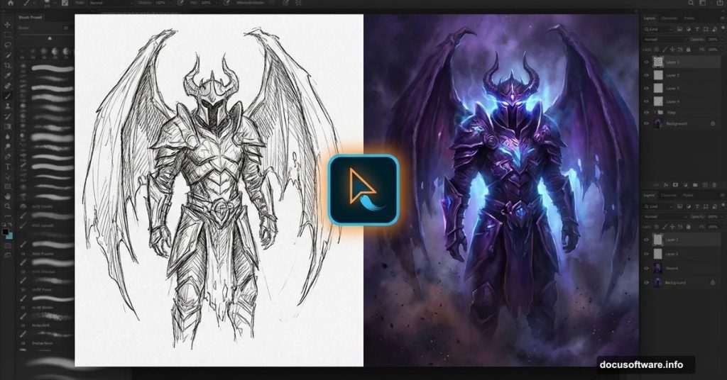
But here’s the thing. You don’t need fancy techniques or expensive tools. Just Photoshop, a basic sketch, and the right process. Let me show you how artist Hatice Bayramoglu transformed a simple sketch into a haunting nightmare scene.
This tutorial breaks down her exact workflow. You’ll learn sketch preparation, brush configuration, and layering techniques that bring dark fantasy concepts to life. No complicated theory. Just practical steps you can follow right now.
Start With Your Concept Sketch
Every great painting begins with a rough idea. Hatice draws dozens of simple sketches first. Some for storybooks. Others just explorations. Most never get used.
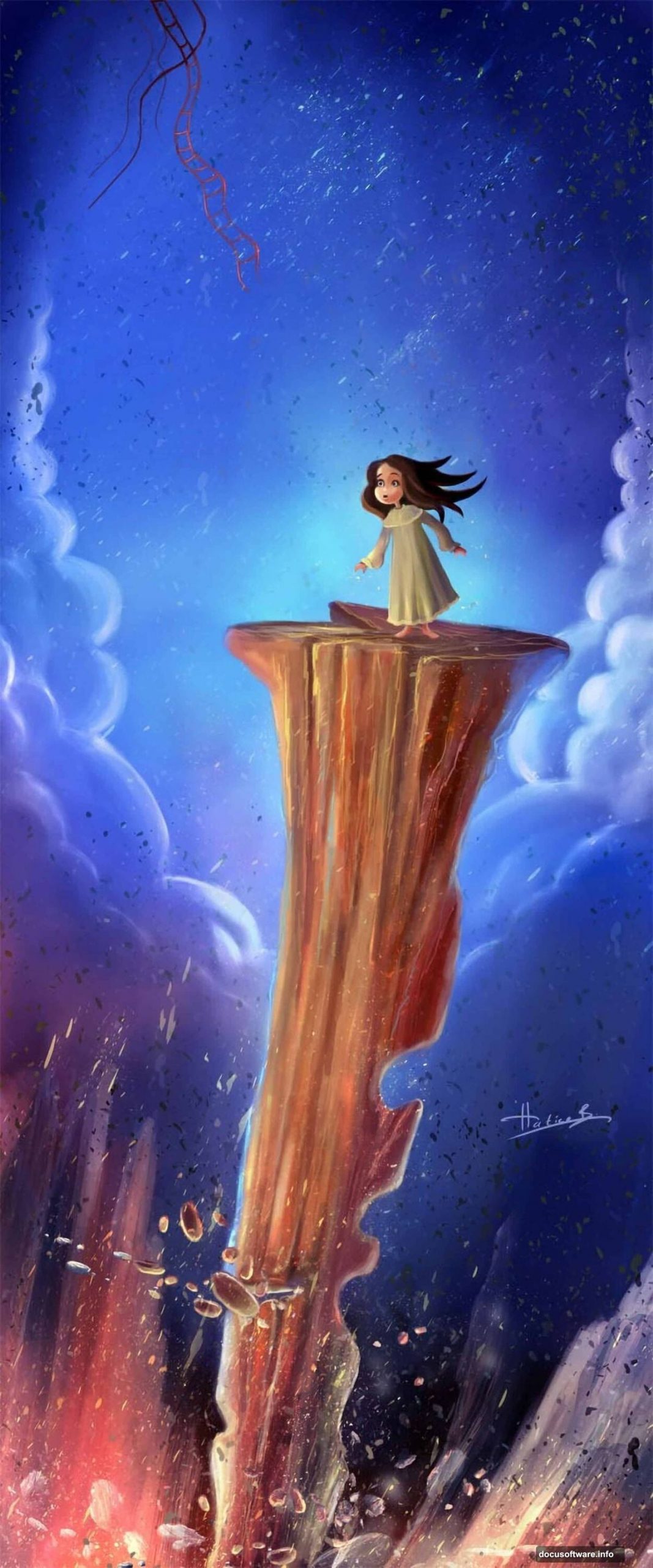
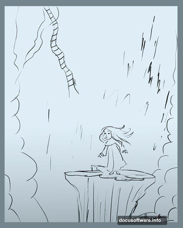
This particular sketch sat unused in her files. Originally intended for a children’s book illustration. But the dark, moody atmosphere suggested something different. So she repurposed it for this nightmare scene instead.
You can do the same thing. Dig through your old sketches. Look for concepts with potential. Don’t worry if they weren’t perfect for their original purpose. Sometimes your best work comes from reimagining older ideas.
The beauty of digital art? You can experiment without wasting materials. Try different approaches. See what works. Delete what doesn’t.
Set Up Your Canvas Properly
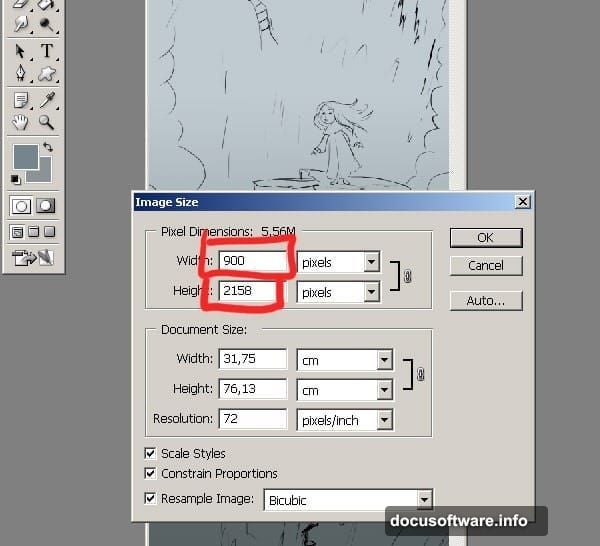
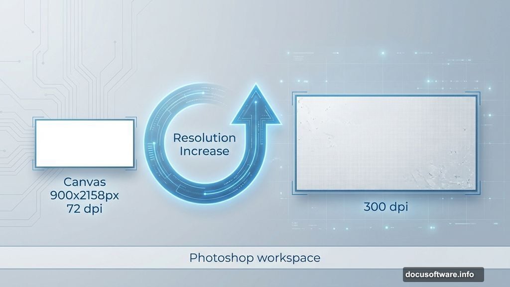
Canvas size matters more than you think. Start too large and your computer struggles. Start too small and you can’t add fine details later.
Hatice uses these exact settings for the initial work:
- Width: 900 pixels
- Height: 2158 pixels
- Resolution: 72 dpi
Why start at 72 dpi? Speed. Lower resolution means faster brushstrokes and less lag. You’re not adding final details yet anyway. Just blocking out composition and values.
Later, you’ll increase the resolution for detail work. But not during the sketching phase. That’s crucial. Many beginners start at 300 dpi immediately and wonder why Photoshop feels sluggish.
Keep your reference sketch on a separate layer. You’ll hide or delete it eventually. But having the full sketch visible helps maintain proportions while you paint.
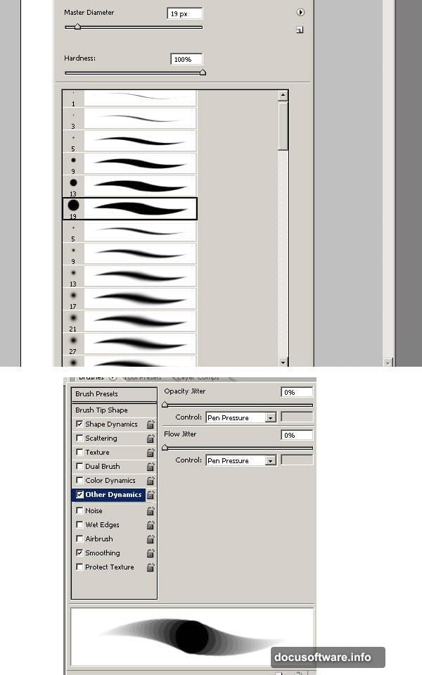
Configure Your Brushes Right
Brush settings separate amateur work from professional results. Hatice keeps it simple though. She only uses Photoshop’s standard brushes with custom pressure settings.
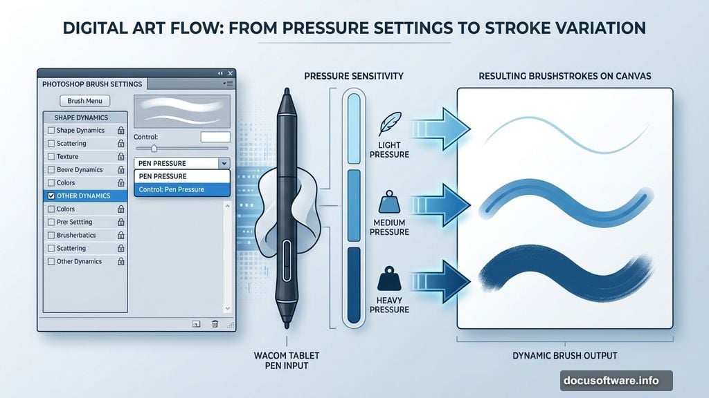
Open your Brushes palette (Window > Brushes). Navigate to Other Dynamics. Set the control to Pen Pressure. This single change transforms how your strokes behave.
What does this do? It makes your Wacom tablet pressure-sensitive. Press harder for thicker, darker strokes. Lighten up for thin, delicate lines. That variation creates natural-looking brushwork.
Don’t own a tablet? Consider getting one. Even basic Wacom tablets cost less than $70 and completely change digital painting. Mouse painting never achieves the same fluidity or control.
Some tablets also detect stroke angle. Hatice doesn’t use that feature here. But it’s worth exploring once you master pressure sensitivity.
Pick Your Color Scheme Early
Colors define mood faster than any other element. Hatice chose her palette before painting a single stroke. Dark blues. Browns mixed with green. Lighter shades of purple and blue.
Why these colors? She wanted a nightmare atmosphere with strange, threatening clouds. Cool navy blue backgrounds create unease. Browns and greens add decay and wrongness. Purple highlights suggest something supernatural.
Load your chosen colors into the Swatches palette (Window > Swatches). This keeps them accessible throughout your painting session. No hunting for that perfect shade you used three hours ago.
Here’s a pro tip though. Don’t stress over getting colors perfect immediately. Digital painting lets you adjust hues later using Adjustment Layers. Start with colors that feel roughly right. Refine them as your painting develops.
Cold color schemes work brilliantly for nightmare scenes. Warm colors create comfort and safety. Since Hatice wanted viewers feeling unsettled, she avoided warm oranges and reds almost entirely.
Build Your Painting in Layers
This is where digital painting shines over traditional media. Layers let you work non-destructively. Make mistakes without ruining your base work.
Start with your darkest values on the bottom layer. Gradually add lighter tones on layers above. This mimics how traditional painters work from dark to light. But with digital painting, you can always go back and adjust that bottom layer later.
Keep your sketch layer visible but set to low opacity. Maybe 20-30%. Enough to see your composition guide but not so dark it interferes with your painting layers.
As you paint, resist the urge to merge layers too quickly. Sure, having 50+ layers feels messy. But that flexibility saves you when you need to adjust something specific without redoing everything else.
Name your layers too. “Background sky,” “main character shadows,” “highlight details.” Takes an extra second but saves minutes of confusion later when you’re hunting for the right layer.
Work From Dark to Light
Traditional oil painters often work dark to light. Digital painting benefits from the same approach. Establish your darkest shadows first. Then gradually build up to your brightest highlights.
Why this order? Your eye judges values relatively. If you place a mid-tone next to white, it looks dark. Place that same mid-tone next to black and it looks light. By establishing your darkest values first, you create a baseline for judging everything else.
Hatice started with the deep navy blue background. That set the darkest value in her painting. Everything else needed to be lighter than that baseline. This prevented her from making the common mistake of not pushing values dark enough.
Plus, working dark to light feels more forgiving. You can always add lighter values on top. But removing dark values after they’ve been placed? Much trickier and time-consuming.
Add Atmospheric Perspective
Distant objects appear lighter, bluer, and less detailed than close objects. This is atmospheric perspective. Mastering this makes your paintings feel three-dimensional instead of flat.
Notice how Hatice’s background clouds fade into lighter, cooler tones. The foreground elements stay darker and more saturated. That depth separation happened intentionally through careful value control.
You can enhance this effect using Gaussian Blur on distant elements. Just a touch. Maybe 1-2 pixels. Enough to soften edges slightly compared to foreground sharpness. This mimics how our eyes perceive depth in real environments.
Another trick? Reduce saturation on background elements. Distant objects lose color intensity in real life. Replicating this in your painting strengthens the depth illusion dramatically.
My Take on This Workflow
Digital painting seems complex at first glance. All those tools and options overwhelm newcomers. But Hatice’s approach proves simplicity works better.
She used standard brushes. Basic pressure settings. Straightforward layering. No fancy filters or effects. Yet the final result looks hauntingly professional. That’s the power of solid fundamentals over technical gimmicks.
What impressed me most? Her willingness to repurpose old sketches. Too many artists abandon rough ideas permanently. But going back through your archives often reveals hidden gems. Concepts that didn’t work for one project might be perfect for another.
Start small with 72 dpi canvas sizes. Build your painting gradually. Increase resolution only when adding final details. This workflow keeps Photoshop responsive and your creative flow uninterrupted. Work smart, not hard.