Digital painting transforms blank canvases into stunning character art. But most tutorials skip the fundamentals that make or break your work.
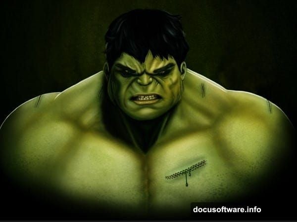
This guide walks through creating a CG illustration of The Incredible Hulk in Photoshop. More importantly, it covers the core techniques that apply to any digital painting project. So you’ll learn principles that work beyond just this one character.
Let’s dive into what actually matters when painting digitally.
What You Need Before Starting
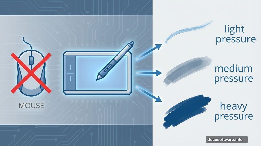
First, grab these resources. You’ll need Blur’s Good Brush 4.0 Pro from Yang Xueguo. Plus, a graphics tablet makes this process dramatically easier.
Can you use a mouse? Technically yes. But you’ll spend three times longer and get worse results. Tablets let you control pressure sensitivity, which is crucial for natural-looking brush strokes.
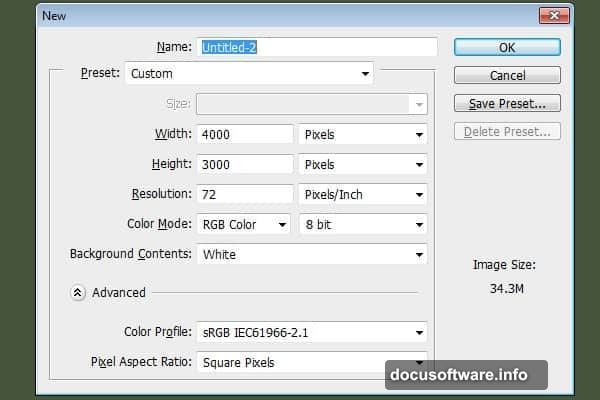
Also, start with a large canvas. Create a new document at 3000 x 4000 pixels. Why so big? You’ll thank yourself later when you want to print or use the artwork at full size. Shrinking images works fine. Enlarging them looks terrible.
Master These Three Fundamentals First
Digital painting success hinges on three core concepts. Get these right and everything else falls into place.
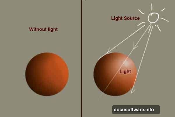
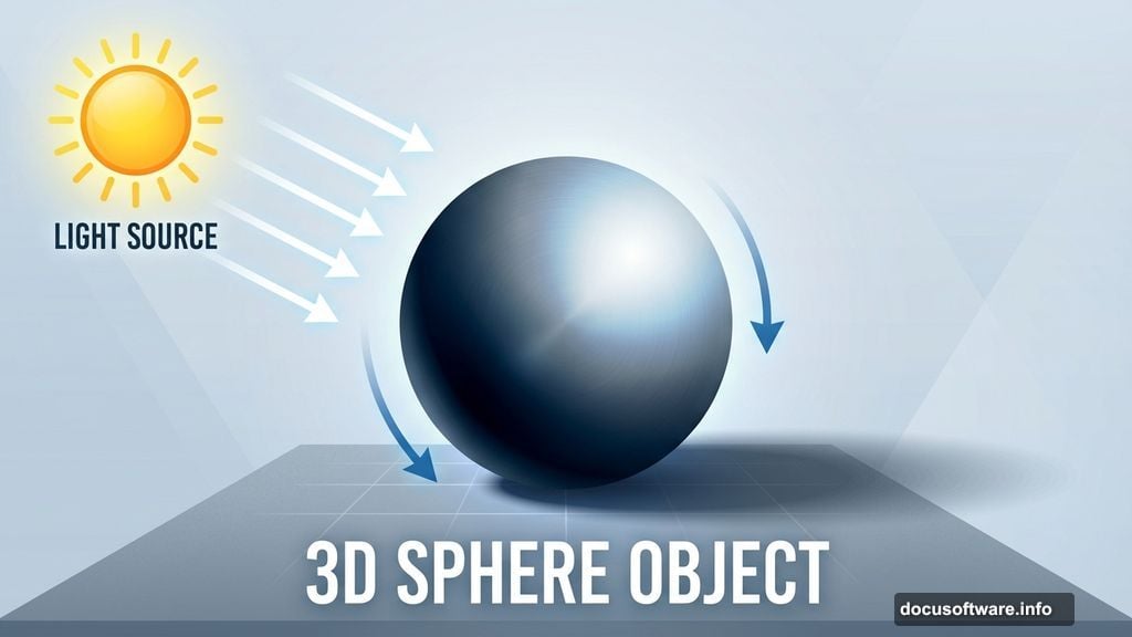
Light determines everything else. Your light source affects shadows, colors, highlights, and mood. So decide where light comes from before you paint too far. Otherwise you’ll waste hours fixing inconsistent lighting across your scene.
Think about it. Real objects react to light in predictable ways. Digital paintings need that same consistency. Place your light source early, then stick with it.
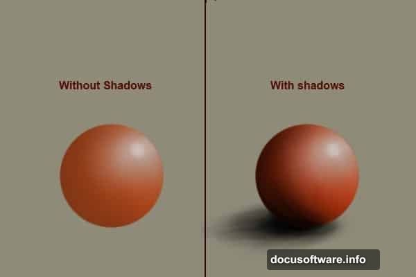
Shadows create realism. Poor shadows make objects look fake and floating. Good shadows ground your subject and add depth.
Study how shadows form in real life. They’re not just dark blobs. Shadows have edges that soften with distance. They pick up reflected light from surroundings. Plus, they change shape based on the surface they fall on.
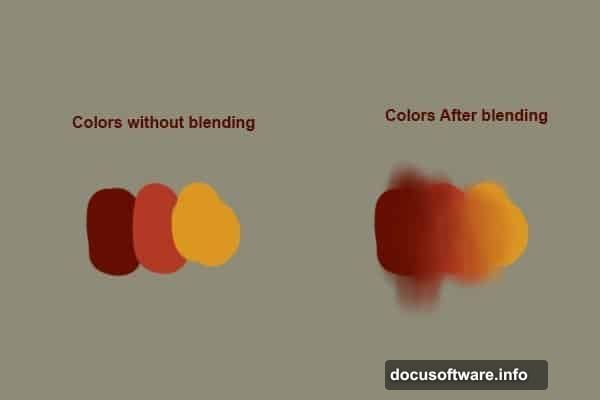
Blending makes it look finished. Rough brush strokes everywhere? That screams amateur work.
Smooth color transitions separate professional paintings from beginner attempts. Use soft brushes with a color picker to blend naturally. Or grab the smudge tool for quick blending. Either way, those harsh edges need to disappear.
Set Up Your Brush Correctly
Photoshop’s default brush won’t cut it for detailed character work. You need proper settings to get natural-looking strokes.
Hit “B” to select the brush tool. Then press F5 to open the brush panel. Now here’s the critical part: set Flow Jitter to pen pressure. Also check the Smoothing option.
These settings let your tablet pressure control paint flow. Light pressure creates thin, transparent strokes. Heavy pressure lays down thick, opaque paint. That control is essential for realistic painting.
Next, set your brush size to 4 pixels for the initial sketch. Yes, that’s tiny. But you want precision for the outline, not broad strokes.
Start With a Rough Sketch
Don’t obsess over perfect lines at this stage. Rough strokes work fine because you’ll paint over them anyway.
Think of this sketch as a roadmap. You’re blocking out where major elements go. The Hulk’s head goes here. His shoulders there. The massive arms extend this way.
Spend maybe 10-15 minutes on this step. Any longer and you’re wasting time on details that won’t show in the final piece. Just get the basic proportions and pose down.
Keep your strokes loose and gestural. You’re not drawing a finished illustration yet. You’re planning where paint will go later.
Build Up Forms With Value
Once your sketch is solid, start thinking about light and shadow. This is where your painting takes shape.
Create a new layer above your sketch. Pick a mid-tone gray and start blocking in the basic forms. Don’t worry about color yet. Focus purely on where light hits and where shadows form.
This grayscale foundation is crucial. It establishes the three-dimensional structure before color complicates things. Many beginners skip this step and wonder why their paintings look flat.
Press “B” for the brush tool again. Increase your brush size to around 30-50 pixels. Use soft, gradual strokes to build up darker values in shadow areas. Then switch to lighter grays for highlights.
Add Color Without Losing Form
Here’s where it gets tricky. Adding color can destroy all your careful value work if you’re not careful.
Create a new layer set to Color blend mode. This lets you add hues while preserving the underlying light and shadow structure. Genius, right?
Pick your base colors for the Hulk. Green skin obviously. Purple pants. Maybe some darker greens for shadow areas. Use a large, soft brush to lay down these color washes.
The Color blend mode means your grayscale values still control the lighting. You’re just tinting them with appropriate colors. This technique keeps paintings cohesive and realistic.
Refine Details Gradually
Now comes the time-consuming part. You’ll spend hours refining forms, adding texture, and polishing details.
Zoom in to work on specific areas. Maybe add muscle definition to the arms. Or texture to the skin. Stitches on those purple pants. Each detail adds character and realism.
But here’s the key: work across the entire image gradually. Don’t finish one section completely while leaving others rough. That creates uneven quality.
Instead, bring the whole painting forward together. Spend 20 minutes on the face. Then 20 minutes on the torso. Then the arms. Keep rotating your focus so everything develops at the same pace.
Common Mistakes to Avoid
Digital painting is unforgiving for certain errors. Watch out for these pitfalls.
Muddy colors from over-blending. Yes, smooth transitions matter. But blend too much and everything turns to gray mush. Know when to stop.
Inconsistent lighting. If light comes from the left, every single element needs to reflect that. No exceptions. Check your work constantly for lighting mistakes.
Skipping the sketch. Jumping straight to painting without planning creates compositional problems you can’t fix later. Always sketch first.
Working too small. That 800 x 600 pixel canvas might run faster, but you can’t print it or use it professionally. Start big.
Why This Technique Works
This method breaks complex character illustration into manageable steps. Sketch provides structure. Values create form. Color adds life. Details finish it off.
Each stage builds on the previous one. Miss a step and the whole painting suffers. But follow the process and you’ll create professional-looking work even as a beginner.
Plus, these techniques apply to any subject. Not just the Hulk. Want to paint a landscape? Same principles. A portrait? Identical approach. You’re learning a system, not just copying a tutorial.
The real skill comes from practice. This first attempt might take 20 hours. Your tenth attempt? Maybe 8 hours. Eventually these techniques become instinctive. You’ll paint without thinking about the individual steps.
That’s when digital painting gets really fun. When technique fades into the background and creativity takes over.