Creating surreal photo manipulations separates casual Photoshop users from true artists. Today you’ll learn professional techniques that transform ordinary stock photos into magical scenes.
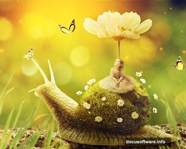
This tutorial walks through building a fantasy world where a child rides a giant snail with grass growing from its shell. Sounds complex? It’s actually a series of simple steps combined strategically.
You’ll master essential photo manipulation skills. Blending multiple images seamlessly. Creating realistic shadows and lighting. Adding atmospheric depth. These techniques apply to any fantasy scene you dream up.
What You’ll Learn
This tutorial covers core manipulation techniques professional artists use daily. You’ll combine stock photos using advanced masking. Create custom textures from unexpected sources. Build convincing lighting that sells the fantasy.
Plus, you’ll learn how adjustment layers control mood and atmosphere. How depth of field directs viewer attention. And how small details like shadows and highlights make impossible scenes feel real.
Prerequisites: Photoshop CS5 or newer recommended. Basic familiarity with layers and masks helps. But I’ll explain each step clearly.
Gather Your Assets First
Smart photo manipulation starts with collecting resources before touching Photoshop. You need a blurred nature background. A snail image with clean edges. A meadow photo for grass texture. Child portrait on neutral background. Various flower images. Grass blade cutouts. Light texture overlay. Butterfly images. Bokeh texture for atmosphere.
Finding quality stock photos saves hours of frustration later. Look for images with similar lighting angles. Consistent color tones help too. Mismatched lighting screams “fake composite” instantly.
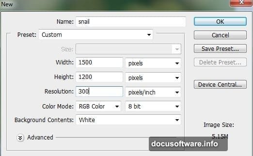
Build Your Canvas Foundation
Create a new Photoshop document at 2000×1333 pixels. Set resolution to 300 DPI for print quality. RGB color mode works best for digital manipulation.
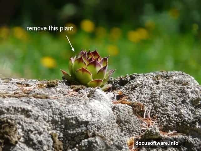
Start with your background image. But first, clean up distractions using the Clone Stamp Tool. Remove unwanted elements that draw attention from your main subject.
Here’s the trick professional retouchers use. Create a new layer above your background. Active the Clone Stamp Tool with “Sample All Layers” enabled. Then clone texture from clean areas over problems. This keeps your original intact while building corrections on a separate layer.
Adjust Background Colors and Mood
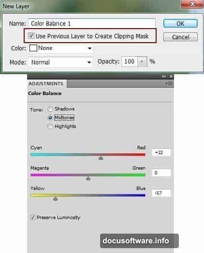
Color Balance adjustment layers change the entire scene’s atmosphere. Go to Layer > New Adjustment Layer > Color Balance. Right-click and choose “Create Clipping Mask” to affect only the background layer.
Push midtones toward cooler blues and greens. This creates that dreamy, otherworldly feeling fantasy scenes need. Adjust shadows slightly toward blue as well. Highlights can stay neutral or shift slightly warm.
Next, add a Curves adjustment layer to darken the background. Darker backgrounds make foreground subjects pop. Plus, it simulates the shallow depth of field cameras create naturally.
But here’s where manual control matters. Grab a soft black brush at 40% opacity. Paint on the Curves layer mask to protect bright areas. Let bokeh highlights stay luminous while rocks and foliage go darker.
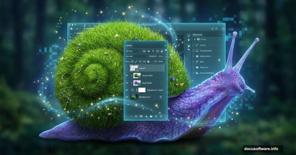
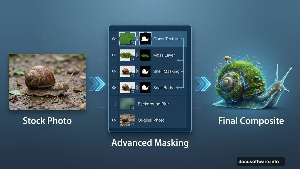
Extract Your Snail Subject Cleanly
Add your snail image to the main document. Position it roughly where you want the final placement. Don’t worry about perfection yet.
Remove the white background using a layer mask. Never delete pixels permanently. Masks let you refine edges later if needed. Use the Quick Selection Tool for the rough shape. Then switch to a small, hard brush to clean up edges manually.
Zoom in close around the shell edges. Paint with white to reveal. Paint with black to hide. Take your time here. Clean edges separate amateur work from professional results.
Create Convincing Cast Shadows
Shadows sell the illusion that your composite elements occupy the same space. Without proper shadows, images float awkwardly no matter how perfect the color matching.
Make a new layer under your snail layer. Name it “shadow 1”. Use a soft black brush at 40% opacity to paint directly under the snail’s body. Build shadow gradually with multiple strokes. Shadows should be darker directly under the subject and fade outward.
But snails need a second shadow cast backward. Create another layer under “shadow 1”. This shadow shows where light from the left blocks and creates darkness on the right side.
Here’s a pro technique for shaped shadows. Cmd/Ctrl-click the snail layer’s mask thumbnail. This loads the exact snail shape as a selection. Fill this selection with black on your new shadow layer. Then use Free Transform (Cmd/Ctrl+T) to skew it backward. Lower opacity to 30-40%. Add Gaussian Blur to soften it naturally.
Build the Grassy Shell Texture
This is where the magic happens. Open your meadow image. Select a section with lush, green grass. Copy this section and paste it into your main document above the snail layer.
Use Free Transform to scale and position the grass over the snail’s shell. Lower the layer opacity temporarily to see the shell underneath. This helps align the grass to follow the shell’s curves.
Now create a layer mask. Right-click the snail layer and choose “Load Selection”. With the grass layer selected, click the mask button. You now have grass perfectly confined to the shell shape.
But flat grass looks wrong on a curved shell. Add dimension using the Warp Tool. Go to Edit > Transform > Warp. Drag control points to bend grass along the shell’s contours. Take your time. Make grass appear to grow naturally along the curves.
Blend Grass Seamlessly with Adjustment Layers
Raw pasted grass rarely matches the base lighting perfectly. Use adjustment layers with clipping masks to fix this. Create Curves, Hue/Saturation, and Color Balance layers clipped only to the grass.
Curves adjust brightness to match the snail’s existing values. Slightly brighten the left side where light hits. Darken the right side in shadow. Paint on the Curves mask with black and white to control where adjustments apply.
Hue/Saturation tweaks the grass color to harmonize with your scene. Shift hue slightly if needed. Increase saturation for more vibrant grass. Or decrease it for a moodier feel.
Color Balance pushes grass tones toward your scene’s overall color palette. If your background leans cool blue, add blue to grass midtones. This creates color harmony that ties everything together.
Position Your Child Subject Naturally
Extract your child subject from the original image using careful masking. Hair requires extra attention. Use the Refine Edge tool to capture wispy strands convincingly.
Position the child on the snail’s back. Scale appropriately so proportions make sense. A child riding a giant snail means the snail should be huge relative to the child.
Pay attention to where the child sits. She should appear to rest naturally on the shell’s curve. Not float above it. Not sink into it. Add a subtle shadow under her to ground her on the shell surface.
Create this shadow the same way you made snail shadows earlier. Soft black brush at low opacity on a layer beneath the child. Build gradually until it looks natural.
Add Environmental Details That Sell the Scene
Fantasy scenes need supporting details to feel complete. Add flowers scattered on the snail’s grassy shell. Vary flower types, sizes, and positions for natural randomness.
Paste flower images and transform them to fit the shell’s curves. Use layer masks to blend them into the grass. Lower opacity slightly so they don’t look pasted on top.
Add grass blades sticking up from the shell at various angles. This breaks up the uniform meadow texture. Makes grass appear three-dimensional instead of flat.
Place butterflies near the child or flowers. Scale them appropriately. Tiny butterflies look more realistic than oversized ones. Add subtle motion blur to butterfly wings using Filter > Blur > Motion Blur. This suggests movement and life.
Enhance Atmospheric Depth with Light Textures
Light textures transform good composites into magical ones. Add your light texture layer above all other elements. Set blend mode to Screen. This allows bright areas to show through while dark areas disappear.
Lower opacity to 40-60% depending on how subtle you want the effect. Too much looks fake. Just enough adds dimension and atmosphere.
Position the light texture so bright areas align with your intended light source direction. If light comes from upper left, bright texture areas should concentrate there.
Add a bokeh texture layer next. Set to Screen blend mode again. Position bokeh highlights in the background behind your main subject. This simulates out-of-focus light spots cameras create naturally with shallow depth of field.
Create Final Depth of Field Effect
Real cameras can’t keep everything in sharp focus simultaneously. Apply this natural effect to your composite for instant realism boost.
Duplicate your background layer. Apply Gaussian Blur at 8-12 pixels. Add a layer mask filled with black. Paint with a soft white brush where you want blur to appear. Typically this means far background areas.
Leave the middle ground sharp where your snail sits. Blur can slightly increase in the extreme foreground too if you have elements there. This sandwich of blur-sharp-blur mimics real camera behavior.
Adjust blur intensity by changing layer opacity or applying more Gaussian Blur. Every scene needs different amounts depending on the depth you want to convey.
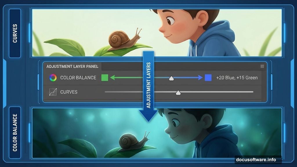
Polish with Final Color Grading
Color grading unifies all elements into a cohesive whole. Add a Curves adjustment layer at the very top affecting everything below.
Create an S-curve by lifting highlights slightly and dropping shadows a bit. This adds contrast and richness. Adjust individual color channels too. Lift blue in shadows for a cool tone. Add yellow/red to highlights for warmth contrast.
Add a Vibrance adjustment layer to boost saturation subtly. Vibrance increases dull colors more than already-saturated ones. This prevents oversaturation while making the scene more vivid.
Finally, add a Photo Filter adjustment layer. Choose a warming filter at 10-15% density. This adds a subtle color cast that ties everything together. Creates that signature fantasy scene glow.
Common Mistakes to Avoid
Mismatched lighting angles ruin composites instantly. Always check where light comes from in each source image. Adjust with dodge and burn tools if needed.
Oversharp edges scream “cut and paste.” Feather layer masks slightly. Add subtle blur to edges that would naturally have it.
Ignoring color temperature differences between sources creates discord. Use Color Balance and Hue/Saturation to harmonize all elements.
Forgetting shadows makes subjects float unnaturally. Every object casts shadows. Add them even if they’re subtle.
Overdoing effects looks amateurish. Subtlety wins in professional work. Less is often more with blend modes, textures, and adjustments.
Why This Technique Matters
Photo manipulation skills transfer across all creative work. Product visualization. Album covers. Book illustrations. Concept art. Advertising composites. The techniques you learned here apply universally.
Understanding how light, shadow, color, and depth work together makes you a better digital artist. These fundamentals matter more than knowing which buttons to click.
Plus, creating fantasy scenes exercises creative problem-solving. How do you make impossible scenes feel believable? That challenge improves your artistic eye dramatically.
Master these core techniques and you’ll composite anything convincingly. The only limit becomes your imagination.