Photoshop gets labeled as a photo editor. But that undersells its real power.
You can build complete character designs from scratch. No reference images. No stock photos. Just your imagination, some basic shapes, and smart layering techniques.
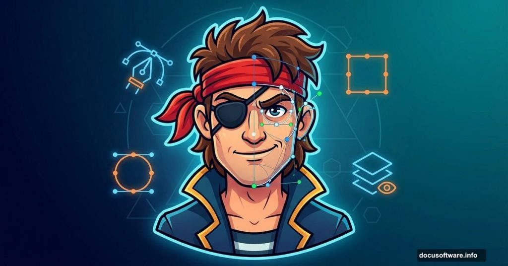
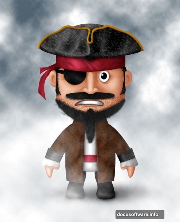
This pirate tutorial proves it. You’ll start with a blank canvas and end with a polished character design. Plus, you’ll learn techniques that apply to any character you want to create.
Why Character Design in Photoshop Works
Most artists assume Illustrator handles character work better. That’s only half true.
Photoshop excels at texture, lighting, and painterly effects. Those elements bring characters to life. Meanwhile, vector tools create clean lines but lack organic feel.
So the smart approach combines both strengths. Use shapes for structure. Then add manual painting for personality. This tutorial focuses on the Photoshop workflow, which works surprisingly well on its own.
Start Simple: Build the Face Structure
Character design intimidates beginners. But every complex design starts with basic shapes.
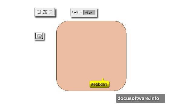
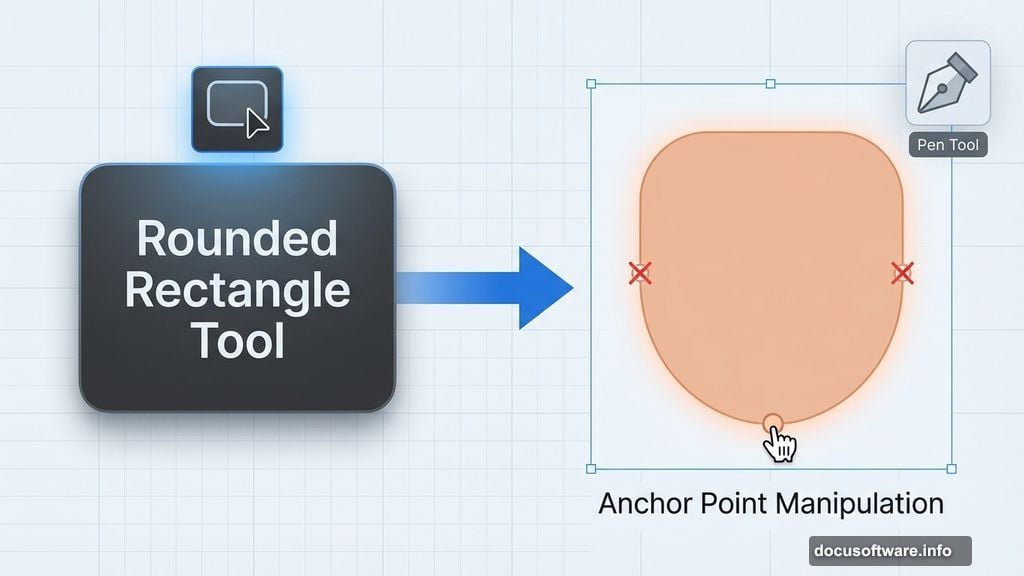
Grab the Rounded Rectangle Tool and set radius to 40px. Pick a skin tone like #ebbda1. Hold Shift while drawing to create a perfect square with rounded corners. That’s your pirate’s face.
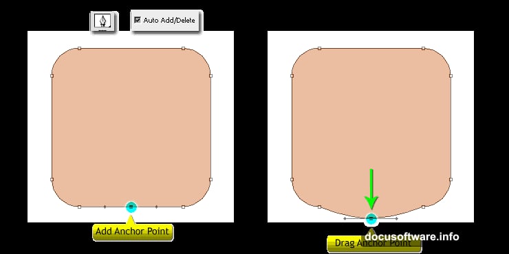
Now activate the Pen Tool and enable “Auto Add/Delete” in the options bar. Click the bottom center of your rounded rectangle to add an anchor point. Hold Cmd (Mac) or Ctrl (Windows) to temporarily switch to Direct Selection Tool. Drag that new point downward to create a chin.
Delete the two anchor points on either side of the chin. The Pen Tool automatically converts to Delete Anchor Point Tool when you hover over existing points. This gives your face a more natural shape instead of a perfect rectangle.
Add Ears Without New Layers
Here’s a time-saving trick most tutorials skip. You can add multiple shapes to one layer.
Switch to Ellipse Tool and hold Shift while drawing. This constrains your shape to a circle and adds it to the existing face layer. Create one ear, rotate it slightly, then duplicate it for the other side.
Why does this matter? Fewer layers means easier management later. Plus, all face elements stay grouped logically. You can move or transform the entire head as one unit.
Create the Headband Structure
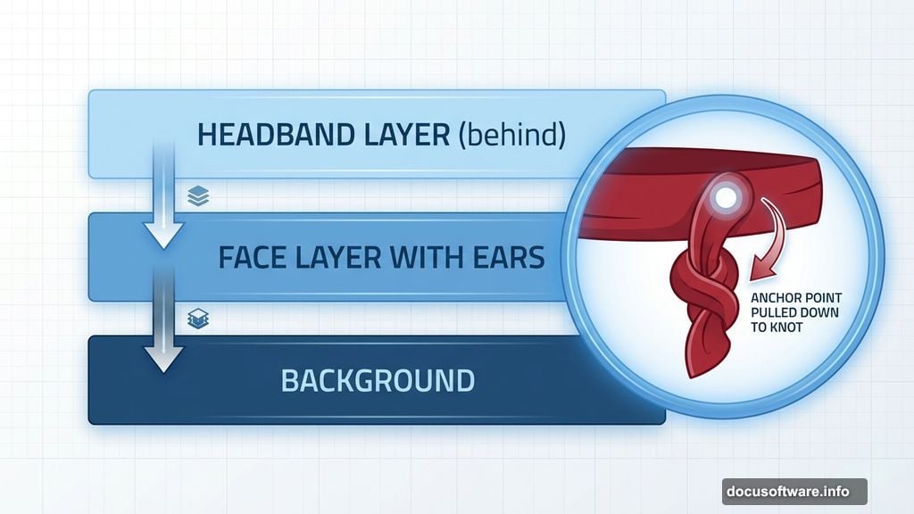
Pirates need headbands. So switch to Rectangle Tool and pick a deep red like #a42335.
Draw a horizontal rectangle across the forehead area. Then use the same anchor point technique from earlier. Add a point at the bottom center and pull it down. This creates the tied knot shape.
For the dangling fabric, switch back to Pen Tool. Draw the hanging portion freehand. Make sure this layer sits behind the face layer in your layer stack. Otherwise the fabric appears to float in front of the pirate’s head.
Build Expressive Eyes
Eyes bring characters to life. Start with a white ellipse for the iris using Ellipse Tool.
Add a smaller black ellipse in the center for the pupil. Group these two layers and name the group “Left Eye.” This organizational step prevents layer palette chaos later.
But here’s where beginners mess up. They create identical eyes and wonder why their character looks lifeless. Real faces show asymmetry. So when you duplicate this eye group for the right side, adjust its position slightly. Shift it up or down by a few pixels. This tiny change adds personality.
Master the Hat Shadow Technique
The pirate hat requires multiple layers. Create the main hat shape first. Then add the front brim as a separate layer.
Now comes the texture trick. Activate your brim layer. Press Cmd+Shift+N (Mac) or Ctrl+Shift+N (Windows) to create a new layer. Fill it with black. Then press Cmd+Alt+G (Mac) or Ctrl+Alt+G (Windows) to create a clipping mask.
Go to Filter > Sketch > Chalk & Charcoal. Adjust the settings until you see a subtle fabric texture. This clipping mask technique keeps the texture constrained to your hat shape. The texture won’t bleed onto other elements.
Moreover, you can adjust the texture layer’s opacity independently. This gives you precise control over how prominent the texture appears.
Paint Manual Highlights and Shadows
Automated effects only take you so far. Manual painting adds the final polish.
Create a new layer above your face layer. Set its blending mode to Overlay. Pick a soft round brush at low opacity (around 20%). Sample your base skin color and paint lighter areas on cheeks, nose, and forehead. These become highlights.
Then sample a darker shade and paint shadows under the chin, around the ears, and beneath the headband. Build up the shading gradually. Multiple light passes create more natural results than one heavy stroke.
This technique applies to every element. Paint highlights on the hat’s fabric. Add shadows where the eye sockets indent. Each subtle adjustment increases realism.
Use Layer Groups Strategically
Your layer count will explode quickly. Without organization, you’ll waste time hunting for specific elements.
Group related elements immediately. All face components go in one group. Hat elements in another. Name every group clearly. “Left Eye” beats “Group 1” every time.
Plus, grouped layers let you apply adjustments to multiple elements simultaneously. Need to shift the entire face position? Just move the group instead of selecting individual layers.
Common Mistakes to Avoid
New character designers make predictable errors. Here are the big ones:
Overusing the Pen Tool early on. Basic shapes handle most structure work. Save the Pen Tool for details and refinements. Otherwise you’ll spend hours fighting with anchor points.
Ignoring layer order. Photoshop stacks layers like paper. Bottom layers appear behind top layers. Plan your stacking order logically. Background elements go on bottom. Foreground details go on top.
Using pure black for shadows. Real shadows contain color. Sample your base color and shift it toward darker, slightly cooler tones. Pure black (#000000) looks flat and artificial.
Skipping the texture step. Flat colors look digital and boring. Even subtle textures add significant depth. Don’t skip this step just because it seems optional.
Beyond This Pirate
The specific pirate design doesn’t matter much. What matters are the techniques you practice.
These same methods work for any character design. Fantasy creatures. Modern portraits. Cartoon animals. The workflow stays consistent: basic shapes first, then refinement, then manual painting for polish.
So think of this tutorial as technique practice, not just pirate creation. Once you understand shape layer manipulation, clipping masks, and manual painting, you can design anything your imagination produces.
Start simple. Build complexity gradually. Don’t rush the shading step. And remember that even professional character artists started with basic shapes and lots of patience.