Photoshop’s layer styles hide incredible potential. Most designers barely scratch the surface of what’s possible with gradients, masks, and blending modes.
This tutorial reveals how to transform plain text into mouth-watering ice cream typography. You’ll master techniques that work for any food-themed design project. Plus, these same methods apply to countless other creative effects.
The best part? You don’t need advanced skills. Just Photoshop CS5 or newer and willingness to experiment.
What You’ll Need Before Starting
Three essential resources make this project work smoothly. First, download the VAL font for your base typography. Second, grab bokeh stock images from koko-stock for background texture. Third, visit CGtextures for food reference images.
These resources are free or low-cost. Moreover, they’re reusable for future projects. So consider them investments in your design toolkit.
Building the Perfect Background Foundation

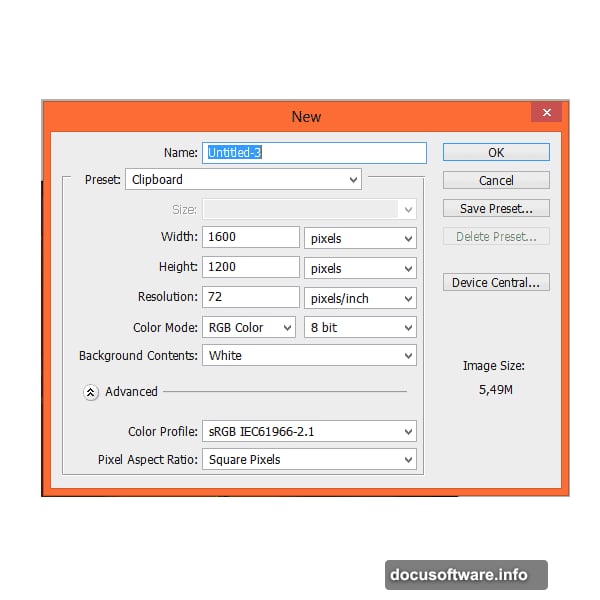
Start with a 1600×1200 pixel canvas. This size works great for web graphics and social media posts.
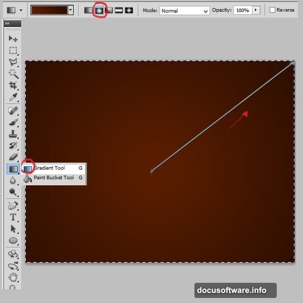
Next, create your color foundation. Pick the gradient tool and set it to radial mode. Use rich brown tones – specifically #591d00 and #2d0e00. These colors mimic chocolate and create depth immediately.
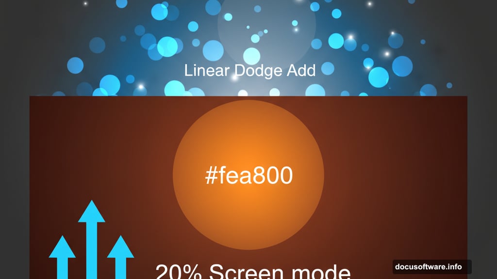
Then add a subtle glow effect. Create a new layer and paint a soft orange dot (#fea800) in the center. Make your brush 1242 pixels wide for maximum softness. Finally, change the blending mode to Screen at 20% opacity.
This technique creates natural lighting that makes your text pop later.
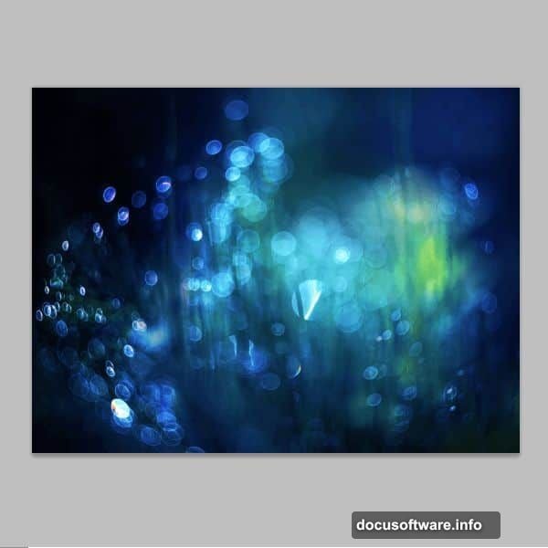
Adding Realistic Texture With Bokeh
Bokeh effects add professional polish fast. Place your bokeh stock image into the canvas. However, don’t just drop it in raw.
Instead, apply a layer mask with a radial gradient. Paint black in the center and white at the edges. This creates a natural vignette effect that focuses attention on your text area.
Now change the blending mode to Linear Dodge (Add). This makes the bokeh blend naturally with your background colors.
Adjusting Colors for Visual Harmony
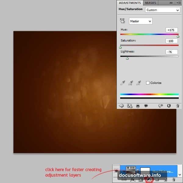
Color harmony separates amateur designs from professional work. Add a Hue/Saturation adjustment layer with these exact settings:
- Hue: +175
- Saturation: -100
- Lightness: -76
Remember to create a clipping mask. Right-click the adjustment layer and select “Create clipping mask.” This applies the effect only to the bokeh layer below, not your entire image.
Then add one more subtle gradient. Create a new layer and apply a linear gradient using #612200. Set this layer to Soft Light mode at 45% opacity. This adds depth without overwhelming your design.
Creating the Ice Cream Text Foundation
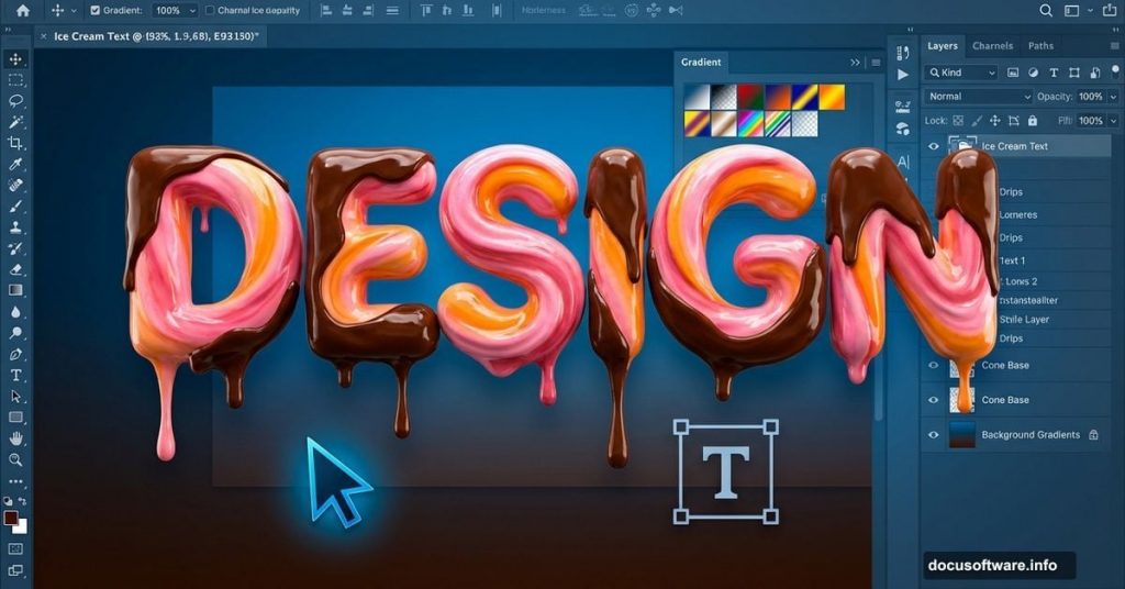
Time for the main event. Select the Type tool and choose VAL font at 250 points. Set your text color to #5b1e00 – a rich chocolate brown.
Type your desired text. Keep it short and bold. Single words or brief phrases work best for this effect.
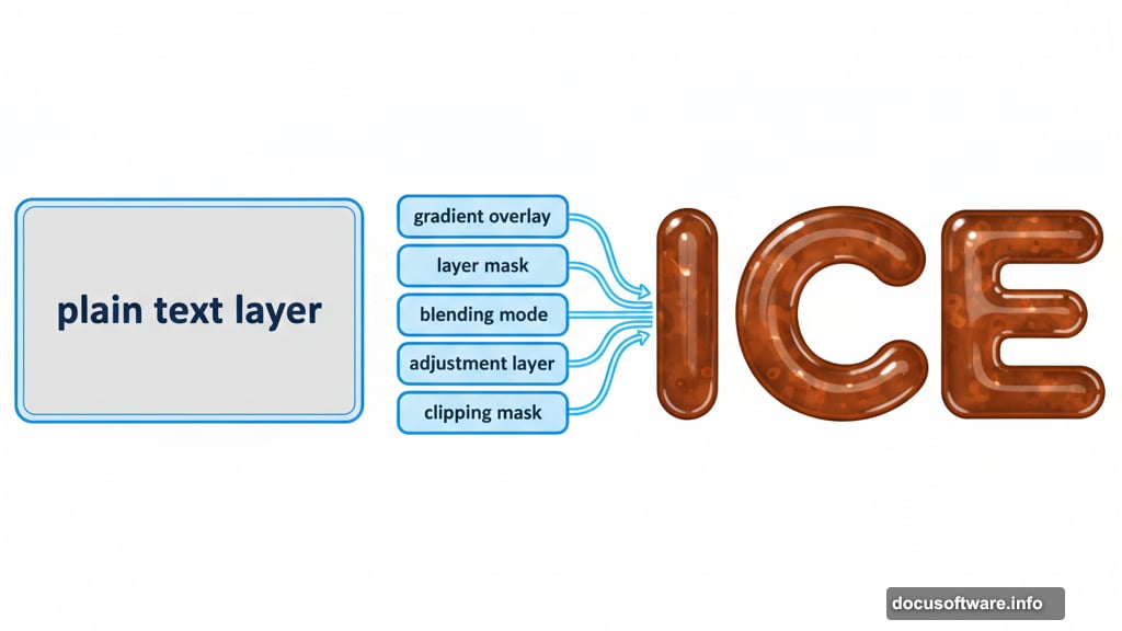
Applying Layer Styles That Bring Text to Life
Layer styles transform flat text into dimensional objects. Click the layer and select Blending Options. You’ll apply five specific styles in sequence.
Inner Shadow creates depth inside letters. Set it to Multiply mode with black color at 75% opacity. This subtle shadow makes letters feel carved or pressed.
Inner Glow adds warmth. Use Screen mode with #612200 color at just 5% opacity. Too much looks fake, so keep it minimal.
Bevel and Emboss provides three-dimensional form. Choose Inner Bevel with Smooth technique. Set size to 6 pixels with zero softening. For highlights, use Screen mode with #fb9838 at 75%. For shadows, use Multiply mode with #2b0c03 at 75%.
These exact settings mimic how light hits creamy ice cream surfaces. The highlight color especially captures that golden-brown caramel tone.
Making It Look Authentically Bitten
Perfect edges look too digital. Real ice cream gets eaten, melted, and messy.
Add a layer mask to your text layer. Yes, masks work on text layers too. Pick a hard round brush at 24 pixels. Then carefully erase random chunks from your letters.
Think about how someone actually bites ice cream. Irregular curves work better than straight cuts. Moreover, vary the depth – some bites shallow, others deeper.
This imperfection makes your design feel tangible and appetizing.
Advanced Techniques for Professional Results
Professional designers know these bonus tricks. First, duplicate your text layer and apply a slight Gaussian blur. This creates a soft halo effect that mimics ice cream’s frozen surface.
Second, add tiny highlights using a small white brush on a new layer. Paint little dots where light would catch melted drops. Set this layer to Overlay mode at 30% opacity.
Third, consider adding condensation effects. Small water droplets on cold ice cream look incredibly realistic. Use circular selections with soft edges and subtle gradients.
Common Mistakes to Avoid
Several pitfalls trap beginners with this technique. First, don’t over-saturate your colors. Ice cream has muted, creamy tones – not neon brightness.
Second, avoid making your bevel too large. Anything over 6-8 pixels looks cartoonish rather than realistic. Subtlety wins with layer styles.
Third, don’t forget to adjust your lighting direction. All highlights and shadows should agree on where light comes from. Inconsistent lighting destroys believability instantly.
Adapting This Effect for Other Designs
This technique works for more than ice cream. The same layer style approach creates realistic chocolate, caramel, or frosting text. Just adjust your color palette accordingly.
For chocolate, use deeper browns with less saturation. For caramel, shift toward golden yellows. For frosting, go lighter and add more white highlights.
Moreover, these methods work on shapes beyond text. Apply them to custom objects, logos, or illustrations. The possibilities expand once you understand the underlying principles.
Why These Specific Settings Matter
Every value in this tutorial exists for a reason. The gradient colors mimic real chocolate tones found in actual ice cream. The bevel size matches the scale where cream texture becomes visible to the human eye.
The opacity percentages prevent effects from overwhelming each other. Too much of any single effect looks fake. These balanced settings create believability.
Professional food photographers use similar lighting setups. Your digital recreation follows the same principles they use with real products and studio lights.
Taking Your Skills Further
This tutorial teaches more than ice cream text. You’ve learned fundamental Photoshop techniques that apply everywhere: layer masking, blending modes, adjustment layers, and layer styles.
Practice these skills on different projects. Try creating other food effects – maybe melted cheese, dripping honey, or fresh fruit. Each variation teaches you more about how light, color, and texture work together.
The designers who master these basics create the eye-catching graphics you see across social media, advertising, and web design. You’ve just taken a major step in that direction.