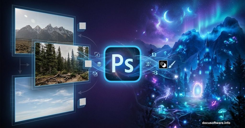
Ever wanted to create those epic fantasy landscapes you see on book covers? The ones with moody skies, dramatic lighting, and mystical elements perfectly blended together?
Good news. You don’t need years of experience. In fact, this tutorial breaks down a complex fantasy scene into manageable steps anyone can follow. Plus, you’ll learn compositing techniques that work for any photo manipulation project.
Let’s build something magical.
What You’ll Actually Learn
This isn’t just about following steps blindly. You’ll understand the core techniques professional digital artists use every day.
By the end, you’ll know how to blend multiple landscape photos seamlessly. Moreover, you’ll master adjustment layers, masking, and lighting effects that make or break fantasy scenes. These skills transfer to any composite work you tackle next.
The project combines seven different source images into one cohesive landscape. So you’ll get plenty of practice with color matching and perspective.
Setting Up Your Canvas
Start with a 2500×1000 pixel document in Photoshop. Fill the background layer with white.
Why these dimensions? The wide format works perfectly for landscape compositions. Plus, it gives you room to adjust your composition without cramping elements together.
Now open your base landscape image and drag it onto the canvas using the Move Tool. Hit the Smart Object button in the Layers panel. This keeps your original image data intact for non-destructive editing later.
Building Your Background Seamlessly
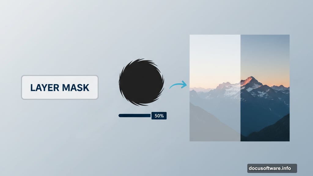
The magic happens in the masking. Add a layer mask to your landscape layer using the second icon at the bottom of the Layers panel.
Grab the Brush Tool and select a soft round brush with black color. Paint over the left side of the midground and foreground areas. This erases them smoothly, preparing space for other landscape elements you’ll add.
Next, create a new layer and set it as a Clipping Mask. Use the Clone Stamp Tool to remove unwanted shadows in the middle section. This cleans up the composition before you start color grading.
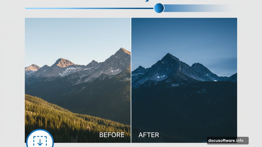
Color Grading Brings Everything Together
Here’s where your scene starts looking professional. Add a Color Balance adjustment layer and set it as a Clipping Mask.
Adjust the Midtones slider to shift colors toward blue. This creates that stormy, dramatic atmosphere fantasy scenes need. Don’t go overboard though. Subtle shifts look more realistic than extreme color changes.
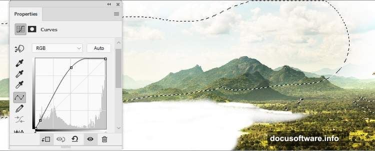
Then add a Curves adjustment layer to boost contrast. But here’s the trick most beginners miss. Use a soft brush on the layer mask to paint away the effect from the mountain tops. This prevents them from looking too dark and muddy.
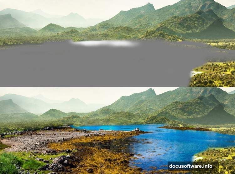
Layering Multiple Landscapes
Now bring in your second landscape image and place it below the first layer. Convert it to a Smart Object just like before.
Create a new layer and change the blend mode to Overlay at 100% opacity. Fill this layer with 50% gray using Edit > Fill. This prepares it for dodging and burning.
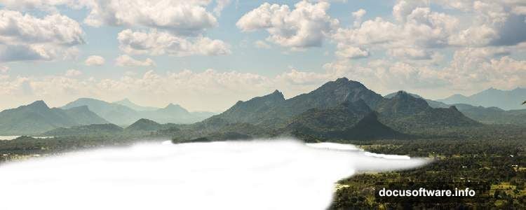
Switch to the Dodge and Burn Tool with Midtones Range selected. Set Exposure to about 20%. Carefully brighten parts of the lakeside that should catch light. This adds depth and dimension to flat areas.
Matching Colors Between Images
Different photos have different color temperatures. So you need to harmonize them or your composite looks fake.
Add a Hue/Saturation adjustment layer clipped to your second landscape. Adjust the Yellows slider to reduce warmth. Then tweak the Blues slider to match the cool tones of your base image.
Follow up with a Color Balance layer. Again, focus on the Midtones. Push the slider toward Cyan and Blue to maintain that stormy atmosphere throughout the scene.
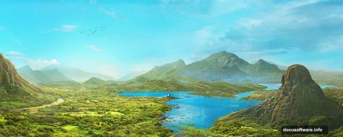
Creating Atmospheric Depth
Mountains in the distance should look hazier than foreground elements. This mimics atmospheric perspective in real landscapes.
Add a Curves adjustment layer to increase overall lightness and reduce contrast slightly. On the layer mask, use a soft black brush to remove the effect from certain areas. This keeps your foreground sharp while pushing the background elements back.
The key here? Less contrast equals more distance. So distant mountains get lighter and hazier while foreground elements stay crisp and detailed.
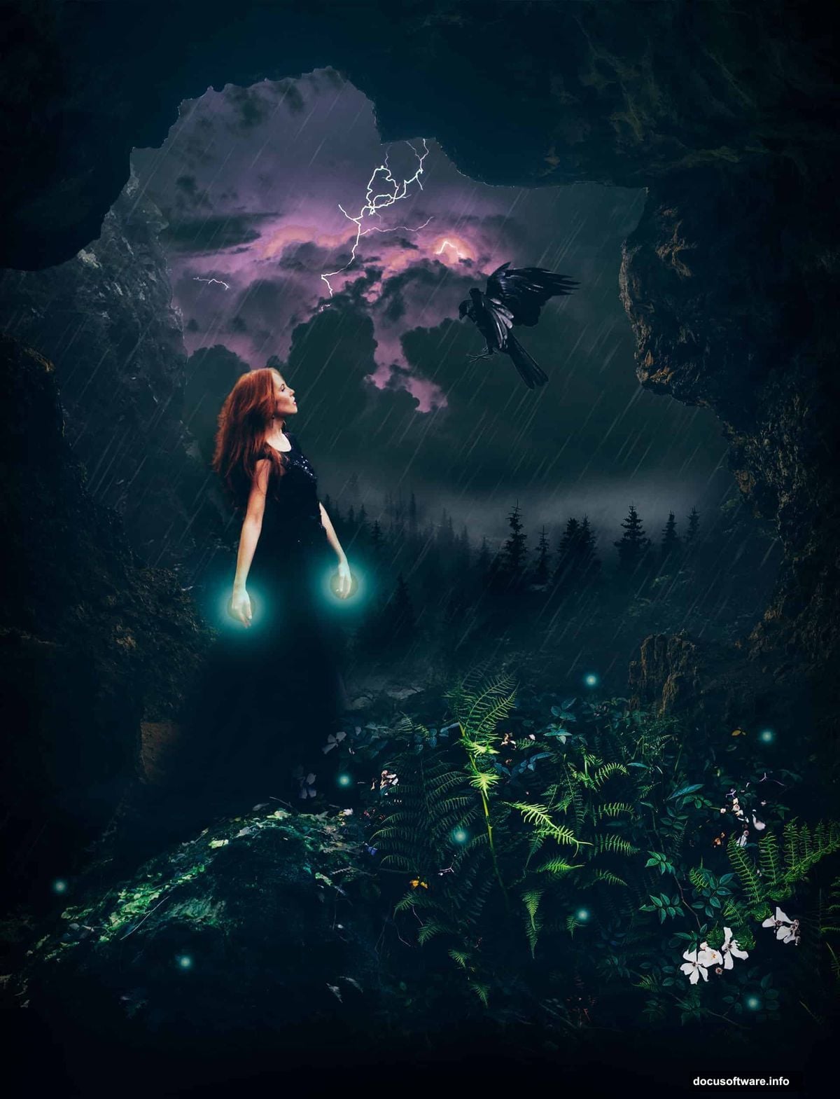
Adding Drama With Sky Elements
Import your sky image and position it at the top of your layer stack. Use a large soft brush to mask out the bottom portion, blending it naturally with your landscape horizon.
Stormy skies need proper color matching too. Add a Color Balance layer clipped to the sky. Shift toward blue and cyan to match your scene’s overall color temperature.
Then use a Curves adjustment to darken the sky slightly. This increases drama and draws attention to lighter elements you’ll add later.
Integrating Mountain Elements
Bring in your mountain images one at a time. Place them in logical positions within your scene, considering how real landscapes layer from background to foreground.
Each mountain needs its own masking and color adjustments. Use soft brushes on layer masks to blend the bases seamlessly. Then clip Hue/Saturation and Color Balance layers to match each mountain’s colors to your scene.
Remember perspective. Distant mountains should be cooler in tone and lower in contrast. Mountains closer to the viewer need warmer tones and sharper details.
Painting Light and Atmosphere
Create a new layer set to Screen blend mode. Use a soft white brush at low opacity to paint light effects. Focus on areas where light would naturally break through clouds.
Build the light gradually with multiple brush strokes at 10-20% opacity. This looks more natural than one heavy application. Plus, it gives you more control over the intensity.
Add another layer set to Overlay mode. Paint subtle mist effects near the water and around mountain bases using a soft white brush. Keep opacity low for realistic fog that doesn’t overpower the scene.
Birds Add Scale and Movement
Import your bird silhouettes and scale them appropriately. Larger birds go in the foreground, smaller ones in the distance. This reinforces depth perception.
Place them flying in a natural pattern, not in a straight line. Real birds fly in loose groups with varied spacing. So scatter them organically across the sky.
Add a subtle Gaussian Blur to distant birds. This mimics how our eyes perceive distant objects as slightly softer. Foreground birds stay sharp.
Final Color Grading Magic
Add a final Color Balance adjustment layer affecting all layers below. Make subtle tweaks to unify everything. Push slightly toward blue and cyan for that stormy mood.
Then add a Curves adjustment layer as your last touch. Create a subtle S-curve to boost overall contrast. But keep the adjustments gentle. You want to enhance, not overpower all the work you’ve done.
Use the layer mask on this final Curves layer to protect highlights from blowing out. Paint with black at low opacity over the brightest sky areas.
Why This Technique Works Everywhere
These compositing principles apply to any photo manipulation project. Master them once, use them forever.
The core skills? Proper masking, color matching, and understanding atmospheric perspective. Plus, building effects gradually through multiple subtle layers beats one heavy adjustment every time.
Most failed composites share the same problems. Colors don’t match. Lighting feels wrong. Elements don’t respect atmospheric depth. This tutorial addresses all three systematically.
Your Fantasy Scene Is Complete
You’ve combined seven different images into one cohesive fantasy landscape. More importantly, you’ve learned professional compositing techniques that work for any project.
The key takeaway? Break complex scenes into simple steps. Handle one element at a time. Use adjustment layers and masks instead of destructive edits. Build effects gradually with low opacity.
Now you can create book covers, concept art, or any fantasy scene you imagine. The techniques stay the same. Only the source images change.