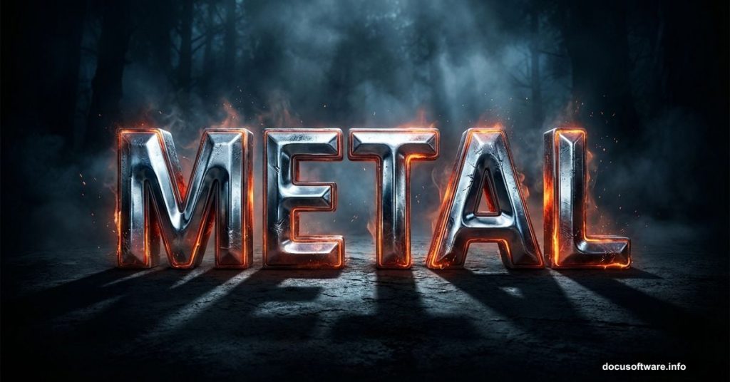
Ever stare at a game poster or movie title and wonder how designers make those jaw-dropping metallic letters? The kind that look like they were forged in fire and carved from steel? That effect is way more approachable than you’d think, and this tutorial walks you through building one completely from scratch.
You’ll start with a moody atmospheric background, add glowing forest elements, and finish with bold metal typography that looks right at home on a game cover, concert flyer, or dramatic poster. Best of all, you just need Photoshop CS5.5 or newer to follow along.
Before jumping in, grab these free resources:
- Germanica family font from Dafont
- Snow Texture V by emilyemilybeth
- Forest Stock 40 by sed-rah-stock
- Debris Brush Set by zigabooooo
Building Your Dark, Moody Background
Start by opening Photoshop and creating a new file. Go to File > New and set your canvas dimensions. This is your blank stage.
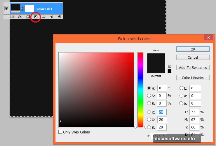
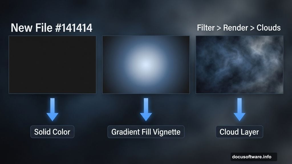
Next, add an Adjustment Layer with Solid Color. This becomes the base of your background. The tutorial uses #141414, which is an extremely dark near-black. You can experiment with other dark tones, but deep and shadowy works best for the metal aesthetic.
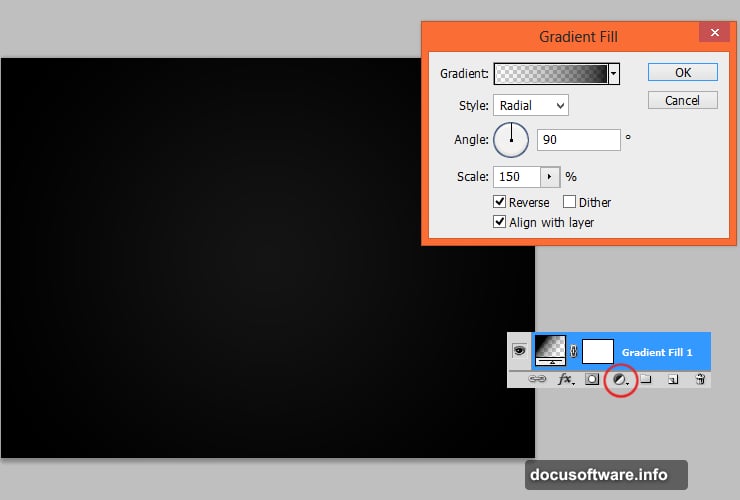
Now pile on a second Adjustment Layer using Gradient Fill. This creates a vignette — that classic darkened-edges effect that makes photos feel cinematic. Think of vignettes as the Photoshop equivalent of dimming the lights in a movie theater. Everything focuses toward the center.
Adding Depth With the Cloud Filter
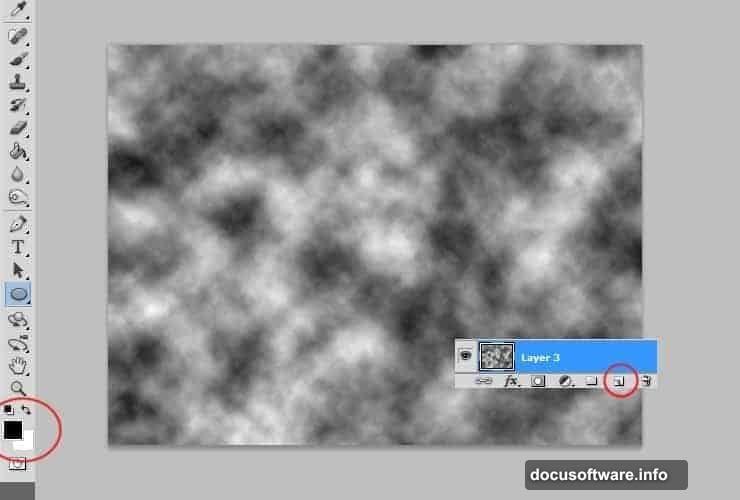
Here’s where things get interesting. Add a new empty layer, then set your foreground and background colors to black and white. Go to Filter > Render > Clouds.
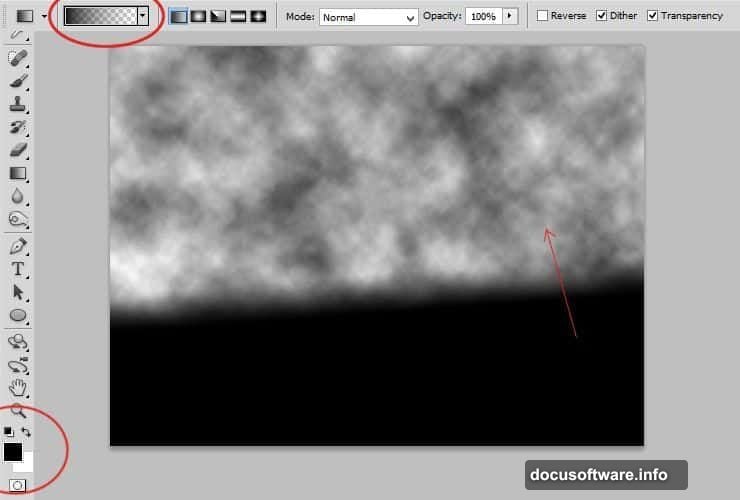
Photoshop generates a soft, organic cloud texture across the whole layer. Then grab the Gradient Tool and paint a black-to-transparent gradient on that cloud layer. This pushes the texture toward the edges and clears the center.
Then add a Layer Mask to that same layer. Use the Gradient Tool again — this time with a black-to-white radial gradient at a small radius. This technique is the secret sauce for creating that rich, dimensional depth that separates flat-looking backgrounds from ones that feel like they have atmosphere.
Placing the Forest and Cooling the Colors
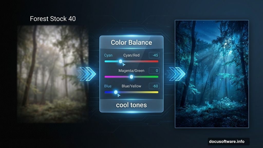
Place the Forest Stock 40 image into your file. Once it’s positioned, apply Filter > Blur > Gaussian Blur to soften it slightly. Then switch your color picker to black and gray, click the canvas next to the layer thumbnail to activate its mask, and paint a radial gradient. This fades the forest softly into your background rather than cutting it in sharply.
Add a Color Balance Adjustment Layer over everything. Push the sliders toward cooler tones — more blue and cyan. This gives the whole composition that cold, dramatic night-time feel that metal text effects absolutely love.
Repeat the cloud layer trick one more time. New layer, black and white colors, Filter > Render > Clouds, then Filter > Blur > Gaussian Blur to soften the result. Change the blending mode to Overlay and drop opacity to 55%. This subtly adds contrast and texture to your background without overwhelming the forest image underneath.
Painting That Signature Glow Effect
This step is what makes the whole thing feel alive. Pick a blue color and select a soft brush with opacity dropped to around 50%. Paint loose strokes along the tree edges and scatter some dots across the grass. Don’t overthink it — randomness actually looks better here.
Then apply Filter > Blur > Gaussian Blur to soften the glow strokes. Finally, lower the layer opacity to 25%. The result is a subtle, ethereal light that feels like it’s emanating from deep inside the forest. It adds magic without screaming “I painted this.”
Typography and Layer Styles
With your background built, bring in the Germanica font and type your text in the center of the composition. This font family has that ancient, runic quality that sells the metal aesthetic immediately.
Layer styles are where the metal comes to life. Double-click your text layer to open Layer Style options. Stack combinations of Bevel and Emboss, Inner Shadow, Gradient Overlay, and Drop Shadow. Beveling creates the impression of raised, dimensional letters. Gradient overlays let you simulate the way light reflects across polished metal surfaces. Push the highlight angle so it catches light from one consistent direction.
The snow texture fits in here too. Place it above your text layer and clip it using Alt+Click between the layers. Change its blending mode to Screen or Overlay and adjust opacity until the texture looks embedded into the letterforms rather than sitting on top.
Finishing Touches That Tie It Together
Step back and look at the full composition. If the metal text feels disconnected from the background, add a subtle glow around the letters using the same soft brush technique from the forest step — just pick a color that complements your palette.
Debris brushes add the final layer of authenticity. Scatter some particles and debris around the text using the Debris Brush Set. This makes the metal feel worn, battle-tested, and real rather than pristine and computer-generated. Vary the brush size and opacity as you stamp them around the letters.
The result should feel like typography that belongs inside a fantasy game or action movie — bold, dark, and undeniably dramatic.
This kind of layered workflow teaches you something valuable beyond just this one effect. Each technique here — the cloud depth trick, the masked gradients, the stacked layer styles — shows up constantly in professional Photoshop work. Once these tools feel natural, you can adapt them to dozens of different styles and projects.