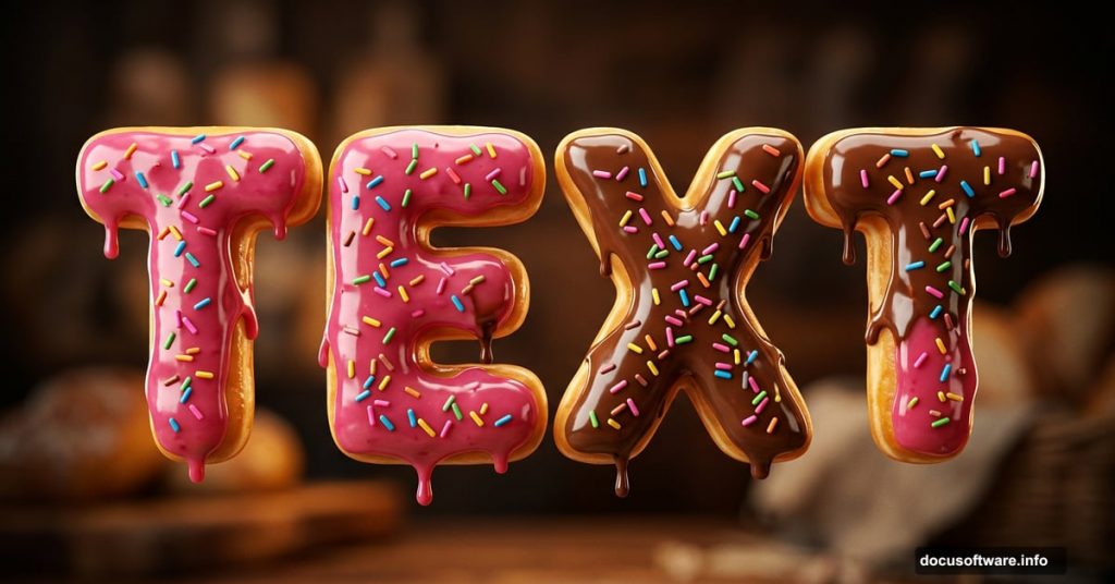
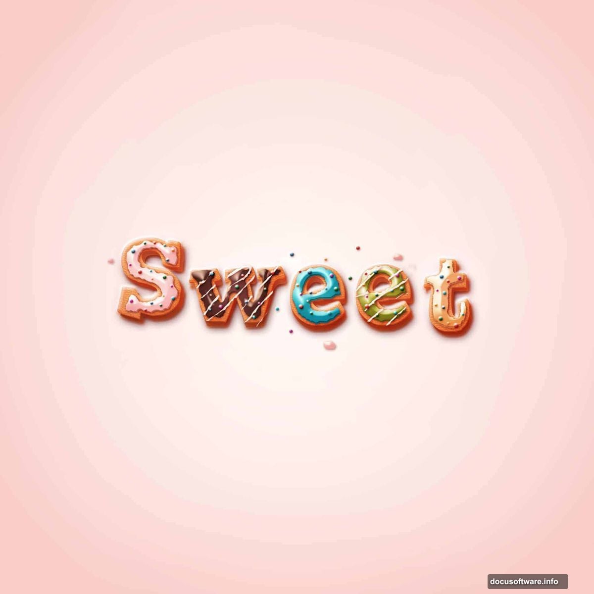
Ever looked at a design and thought, “wow, I want to eat that”? That’s exactly what this Photoshop tutorial delivers. We’re creating sweet, glazed donut-style text that looks so realistic it might actually make you hungry.
The best part? You don’t need to be a Photoshop expert. This technique uses layer styles, blending modes, and a few clever tricks that beginners can follow without breaking a sweat. Give yourself about 45 minutes and you’ll walk away with something genuinely impressive.
We’re working in Adobe Photoshop CS6, and you’ll want to grab the free Joint by Pizzadude font from dafont.com before starting. It’s the secret ingredient that gives the letters that chunky, bakery-style personality.
Setting Up Your Sugary Background
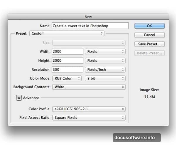
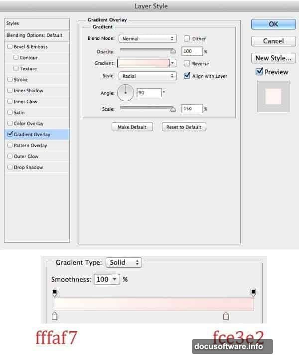
Start by opening a new file in Photoshop with your preferred canvas settings. Fill the background with any color you like, then double-click to open the Layer Style panel and apply a gradient overlay. This gives you that warm, moody backdrop that makes glazed text pop.
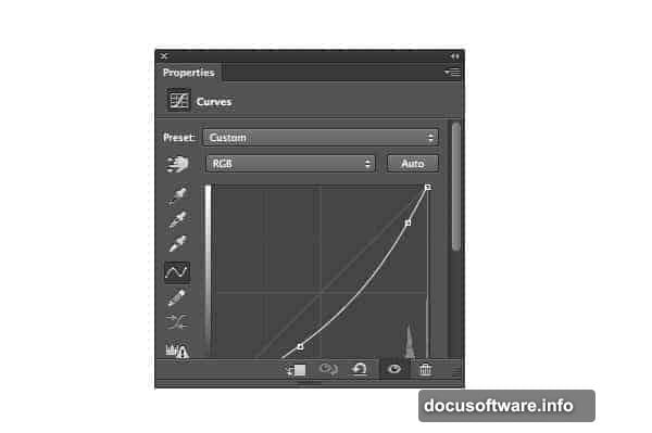
Next, create a new Curves adjustment layer. Grab a soft, large black brush set to 50% opacity and carefully erase the center of the canvas. This creates a subtle vignette effect, pulling focus toward your text. Think of it like the spotlight at a bakery display window.
Building the Text Base Layer by Layer
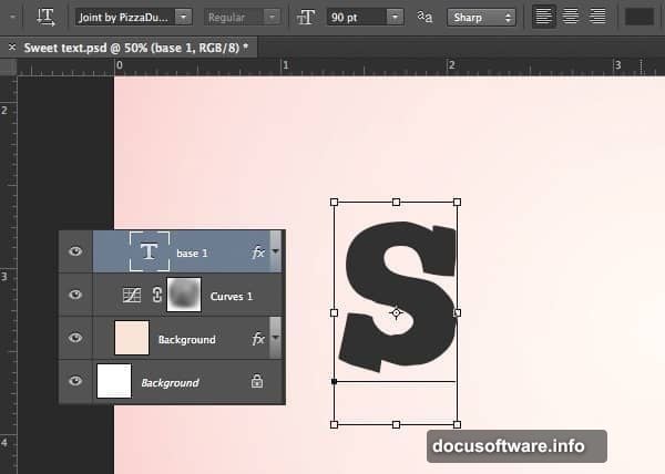
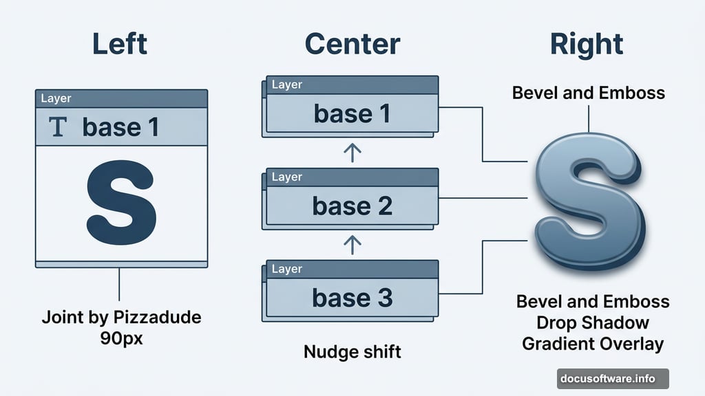
Create a new group and name it after your first letter. This keeps things organized, especially if you’re building a full word. Add your text using the Joint by Pizzadude font at 90px and name the layer “base 1.”
Now double-click that text layer to open Blending Options. Add a Drop Shadow, apply a Gradient Overlay, then configure the Bevel and Emboss settings. These three effects working together start building that dimensional, doughy look.
Duplicate “base 1” using Cmd+J and rename the copy “base 2.” Nudge it slightly upward. Then tweak the Drop Shadow, Gradient Overlay, and Bevel and Emboss settings on this new layer. The subtle positional shift combined with adjusted settings creates depth, almost like layers of dough stacking on top of each other.
Adding That Signature Donut Texture
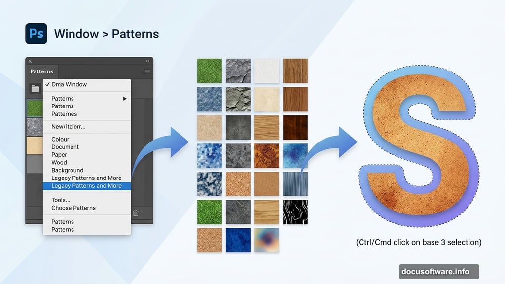
Duplicate “base 2” and rename it “base 3.” This time, adjust the Gradient Overlay slightly and then add a Pattern Overlay. The pattern overlay is what gives the donut its distinctive baked texture and warmth.
If you’re using a newer version of Photoshop and can’t find the right pattern, head to Window > Patterns, click the panel menu, and select “Legacy Patterns and More.” That unlocks the classic texture library that makes this effect work so beautifully.
Frosting the Letters
Here’s where things get really fun. Create a new layer and place it at the top of your layer stack. Hold Ctrl/Cmd and click on “base 3” to load its selection, then go to Select > Modify > Contract to shrink the selection slightly inward. Name this new layer “Cream S.”
Fill the frosting shape with any color you like. Then open Layer Style again and apply Drop Shadow, Gradient Overlay, Bevel and Emboss, and a Contour effect. These settings together create that thick, glossy icing look that makes glazed donuts so irresistible.
Real frosting is never perfectly smooth, and neither should yours be. Add a layer mask to the “Cream S” layer and use a brush to erase small sections along the edges. This irregular frosting edge is the detail that convinces people your text is edible.
Why Layer Organization Makes This Easier
Keeping each letter in its own named group pays off quickly. When you need to adjust the frosting on just one letter, or tweak the bevel depth on another, you know exactly where to look. Chaotic layer panels kill momentum fast, especially on multi-letter words.
Also, the step-by-step duplication approach, building from base 1 to base 2 to base 3, is a smart way to think about any realistic texture in Photoshop. Each layer adds one more dimension of depth without overwhelming your system or your eyes.
What to Do With This Effect
Once you’ve nailed the technique, the creative possibilities are genuinely exciting. Imagine a logo for a local bakery, a birthday card headline, or social media posts for a dessert brand. The frosting imperfections you deliberately paint in make it feel handcrafted rather than digital, and that authenticity is hard to fake with simpler effects.
You can swap the frosting color to match any brand palette. Pink glaze for a sweet shop, white for a wedding bakery vibe, chocolate brown for something richer. The base texture stays the same, but the whole mood shifts with one color change.
Try this effect once and you’ll find yourself thinking about how other food textures could become typography. Chocolate, crumbles, sprinkles. Photoshop’s layer style system is deep enough to go wherever your imagination takes it.