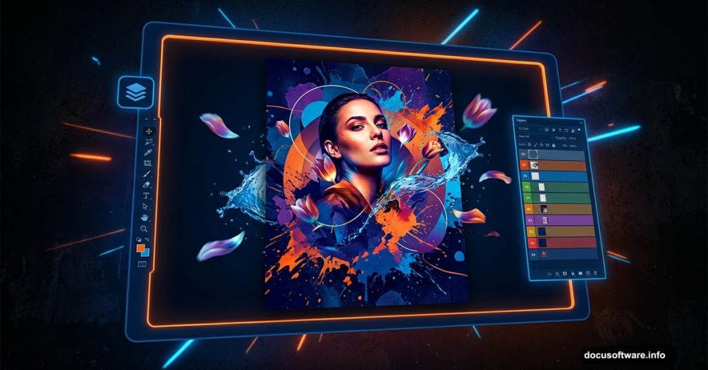
Creating a mixed media poster sounds intimidating at first. But once you break it down into manageable steps, the process becomes surprisingly fun and rewarding.
This tutorial walks you through building a futuristic composition that combines photos, custom shapes, brushes, and blending techniques. By the end, you’ll have a bold, layered poster that looks like it took a professional design team days to produce. Plus, you’ll pick up skills that transfer to almost every other Photoshop project you tackle.
Before diving in, gather these resources: a water splash photo, a male head portrait, paint splatter images, tulip petals, star and grunge brushes, patterned spheres, hot air balloons, a stag image, paint texture, a model photo, and flame images. Most of these are available free from SXC, Qbrushes, Media Militia, and DeviantArt.
Setting Up Your Document and Background Texture
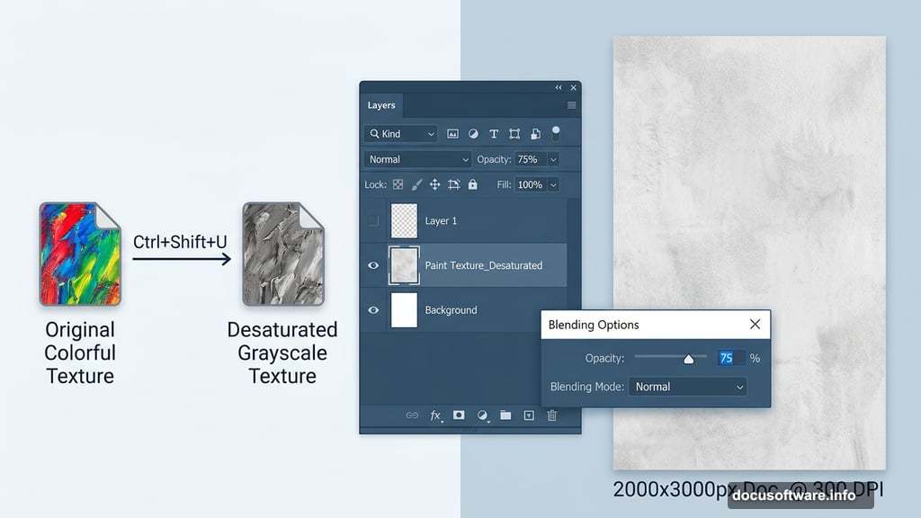
Start by creating a new blank document. The exact dimensions depend on your final output, but poster work typically benefits from something in the 2000 x 3000 pixel range at 300 DPI.
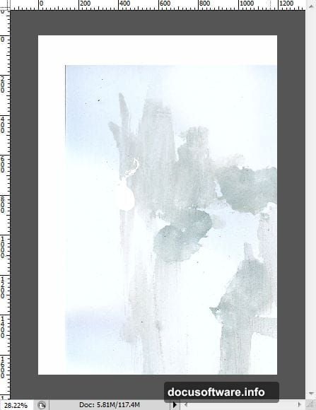
A plain white background kills the mood immediately. Instead, bring in your paint texture file and drag it directly into your composition. Then desaturate it using Ctrl+Shift+U to strip the color out. This gives you a neutral, textured base that adds visual interest without competing with your design elements.
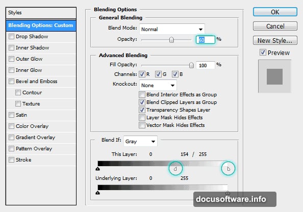
Resize the texture layer to fill the document. Then lower the layer opacity and experiment with blending modes to keep the texture subtle. Double-clicking the layer thumbnail opens the Blending Options dialog, where you can fine-tune exactly how the texture interacts with layers above it.
![A Photoshop workspace showing a desaturated paint texture applied as a subtle background layer for a mixed media poster project]
Building the Core Shape Structure
Here’s where things get interesting. The shapes you create now become the skeleton of your entire composition. Getting them right saves a lot of headaches later.
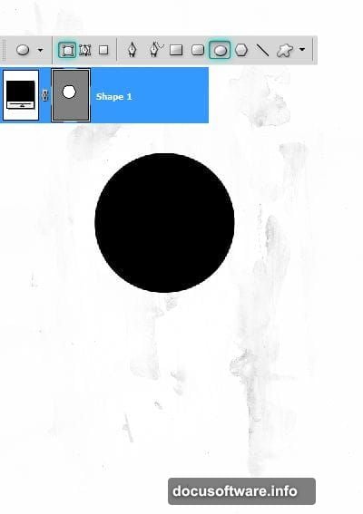
Set your foreground color to #000000. Select the Ellipse Tool and make sure Shape Layers is selected in the Options panel. Shape layers are your best friend for this kind of work because they stay crisp at any size and you can edit them freely without quality loss.
Draw a circle in the center of your document. This becomes your anchor point. Next, grab the Rectangle Tool and draw a rectangular shape nearby. Use the Direct Selection Tool to adjust the corners, then press Ctrl+T to rotate it exactly -45 degrees. The Info palette shows your precise rotation angle as you work.
Reposition the rotated shape so it intersects cleanly with your circle. Then duplicate the layer twice using Ctrl+J and stack the duplicates to build a geometric cluster. Mirror the process to construct the bottom portion of your design, creating visual symmetry that holds the composition together.
Creating the Circular Ring Elements
Circles with punched-out centers give the design that techy, futuristic quality. Here’s how to pull it off cleanly.
Create a new circle slightly outside your main central circle. Duplicate it and scale the copy up by about 145 percent. Hold Alt+Shift while scaling to keep the center point locked in place. This is one of those small habits that saves endless repositioning later.
Now for the punch-through effect. Click the Vector Mask thumbnail on your original circle layer. Copy the path with Ctrl+C, then paste it with Ctrl+V. Scale this pasted path down to 80 percent of its current size. With the inner circle selected, click the “Exclude Overlapping Shape Areas” button in the Options panel. Photoshop cuts a clean hole through the larger circle, creating a ring shape.
You probably don’t need the full ring visible in your composition. Add a layer mask to hide portions you don’t want showing. This gives you precise control over which arc of the ring contributes to the design.
![Close-up of Photoshop shape layers panel showing circular ring shapes with vector masks and exclude overlapping path options applied]
Expanding Your Shape Framework
Repeat the ring-building process with a larger circle that extends beyond your existing shapes. Duplicate the middle circle from your earlier work and position it below the other layers in the stack.
This layering approach builds depth into the design before you’ve added a single photo. Each shape layer sits independently, so you can reposition, rescale, or recolor any element without disrupting the others. Take advantage of that flexibility now while the composition is still clean.
Adding Photos and Blending Them In
Now the composition really comes to life. Bring in your male head portrait and position it within your circular framework. The shapes you built earlier should frame the head naturally.
Set the head layer’s blend mode to Multiply. This causes the lighter areas to become transparent, integrating the photo with your textured background. Duplicate the head layer and invert the copy using Ctrl+I. This creates a striking contrast effect between the two versions.
One common stumbling block here: the invert only works correctly if the duplicate layer’s blend mode is set back to Normal before you invert it. If both layers are on Multiply, the result looks much darker than intended. So reset the duplicate to Normal, apply the invert, then adjust its blend mode from there.
Layering Brushes, Splashes, and Organic Elements
This is where mixed media design earns its name. Your composition now needs organic, flowing elements to contrast with all that hard geometric structure.
Bring in your water splash image and position it near the central figure. Use a layer mask to isolate just the splash, removing the background. Set the blend mode to Screen to make the dark areas disappear, leaving only the splash itself floating in the composition.
Apply your grunge and star brushes on separate layers above the background but below your main focal elements. These brushes add texture and energy without overwhelming the cleaner design elements. Keep the brush layers at reduced opacity, somewhere between 20 and 40 percent, so they read as atmosphere rather than noise.
Add your tulip petals, hot air balloons, stag image, and flame elements the same way. Each gets its own layer. Each gets a blend mode that helps it integrate rather than sit on top. The stag and balloons work beautifully on Multiply or Overlay modes. The flames typically look best on Screen or Linear Dodge.
Bringing It All Together With Color
At this point your composition has structure, photography, and organic elements. Color treatment ties everything together.
Create a new layer at the top of your stack and fill it with a gradient that matches your intended color mood. Cooler blues and teals lean futuristic. Warmer oranges and reds push toward something more intense and dramatic. Set this gradient layer to Soft Light at around 30 to 50 percent opacity.
Add a Hue/Saturation adjustment layer above everything. Reduce overall saturation slightly to unify the colors across your many different source images. This single step often transforms a composition from feeling cluttered to feeling cohesive.
Finally, add a slight vignette by painting soft black around the edges of a new layer set to Multiply. This draws the eye toward your central elements and gives the poster a finished, polished quality.
Finishing Touches That Make a Real Difference
Small details separate good posters from great ones. Add your paint splatter elements near the edges of your composition for kinetic energy. Bring in the model photo if you want a second human element, blending it in with the same Multiply technique you used for the head.
Flatten a merged copy of your work by pressing Ctrl+Alt+Shift+E. This creates a stamp of your entire composition on a new layer. Apply a very subtle Unsharp Mask to this stamp layer to crisp up the overall image. Use a low Amount setting, around 50 percent, with a Radius of 1 pixel. This sharpening catches edge detail across the whole composition simultaneously.
Step back and look at the balance. Does one element compete too strongly with your focal point? Reduce its opacity. Does the composition feel too symmetrical and static? Nudge a few elements slightly off center. Does the background feel too dominant? Drop the texture layer opacity another 10 percent.
Mixed media design rewards patience and experimentation. The Photoshop skills you build here, including shape layer manipulation, blend modes, layer masking, and adjustment layers, show up in virtually every design project you’ll encounter going forward. Each poster you build makes the next one faster and more intuitive.
Give yourself permission to deviate from any tutorial, including this one. The best version of this poster is the one that looks distinctly like you made it.