Creating a dramatic photo manipulation feels intimidating at first. But break it down into steps, and the whole process becomes surprisingly manageable — even fun.
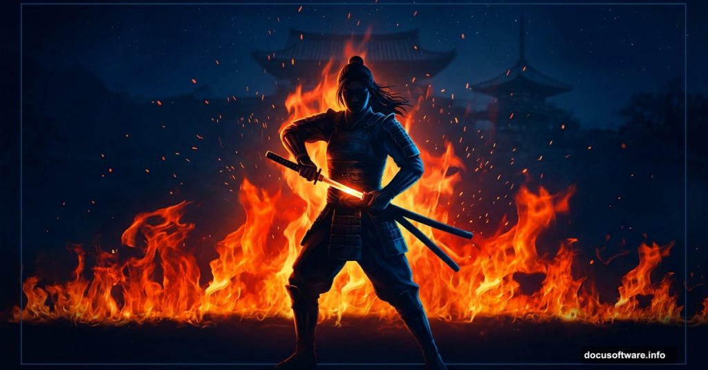
This tutorial walks you through building a stunning nighttime samurai scene featuring a warrior woman surrounded by fire and mood lighting. You’ll combine multiple stock photos, shape the light, add atmospheric color, and bring the whole composition together using Photoshop’s most powerful tools.
Ready to start? Here’s everything you need to know.
What You’ll Need Before Starting
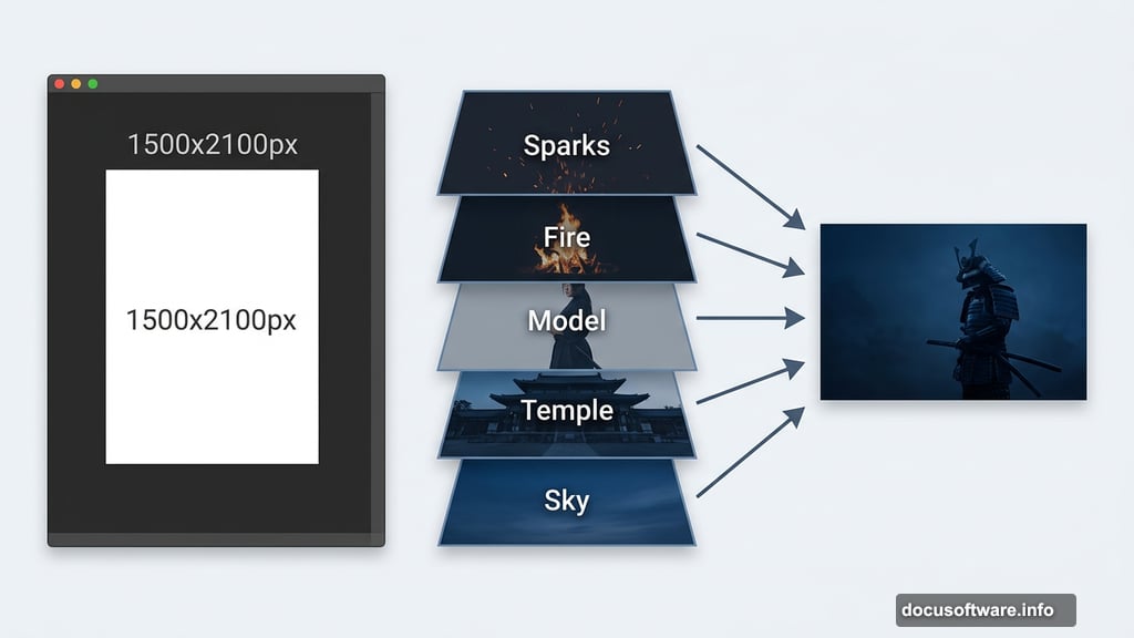
Gather your stock images first. The composition uses a dramatic sky, a temple, a female model, two fire images, sparks, and a light texture. Having everything ready before you open Photoshop saves a lot of back-and-forth later.
Set up your canvas at 1500×2100 pixels and fill it with white. This vertical format gives plenty of room for the full-body figure and the environmental elements above and below her.
Building the Nighttime Sky Background
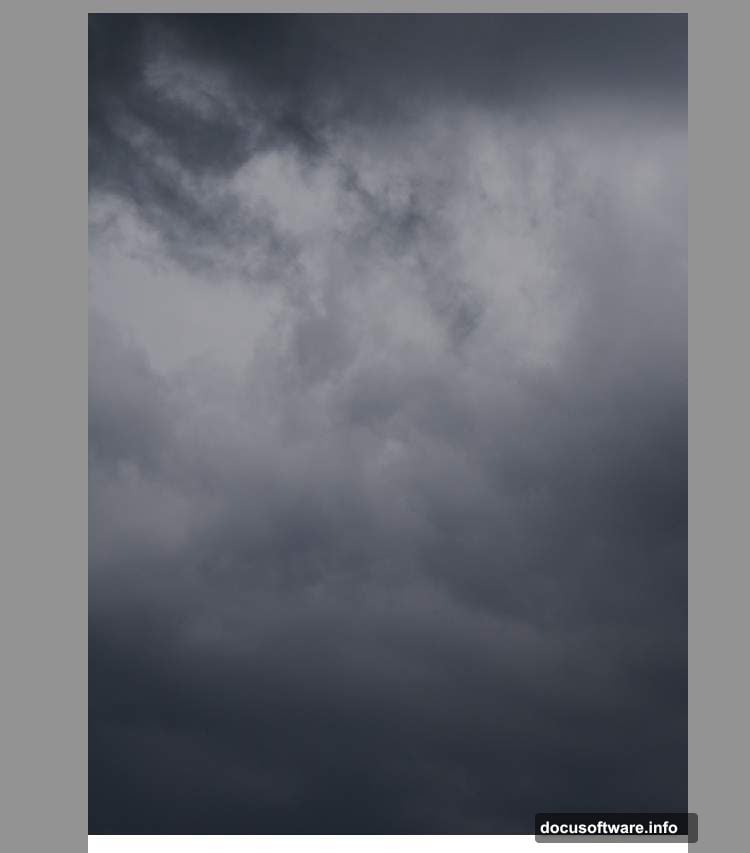
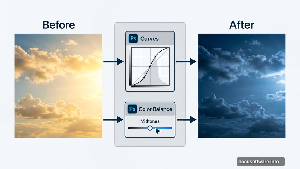
Open your sky image and drag it onto the canvas using the Move Tool (V). Place it in the upper half of the document. At this stage it probably looks too bright and too warm for a moody nighttime scene.
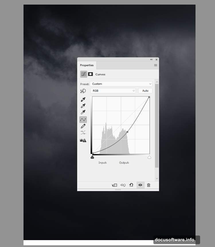
Fix that with a Curves adjustment layer. Drag the curve downward to darken the sky significantly. Then add a Color Balance adjustment layer and shift the Midtones toward blue. Together, these two adjustments transform a flat daytime sky into something that feels genuinely atmospheric and cold.
Adding the Temple With Depth and Color
Cut out the temple and position it in the top right corner of the canvas. Right now it sits at the same visual depth as everything else — and that’s a problem worth solving early.
Go to Filter > Blur > Gaussian Blur and set the radius to 8 pixels. This soft blur pushes the temple visually into the background, creating the sense that it sits far behind your main subject. That depth separation makes the whole scene feel more three-dimensional.
Next, add a Color Balance adjustment layer directly above the temple layer and set it as a Clipping Mask. Adjust the Midtones values until the temple’s color blends naturally with the dark blue sky behind it. You want the temple to feel like part of the environment, not a cutout pasted on top.
Placing and Preparing the Model
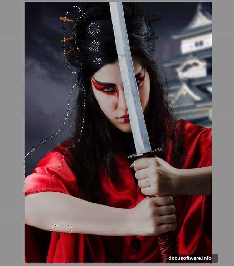
Isolate your model using whatever masking method you prefer — the Pen Tool, Select Subject, or manual masking all work fine here. Place her in the center of the foreground so she commands attention immediately.
Now comes the lighting work, which is where this composition really starts to come alive.
Shaping Light on the Figure
The scene’s main light source sits to the left of the model (from the viewer’s perspective). Your goal is to make the figure’s lighting match that intention realistically.
Create a Curves adjustment layer above the model layer and set it as a Clipping Mask. Pull the curve down to darken. Then grab a soft round brush with black paint and work on the layer mask — paint over the left side of the model to erase the darkening there. This reveals brighter tones on the side that faces your intended light source.
Add another Curves adjustment layer and pull the curve up this time to increase brightness. On this layer’s mask, paint black over the shadow areas so the brightening only affects the lit portions of the figure. This two-layer approach gives you precise control over where light falls.
Adjusting the Model’s Color Tone
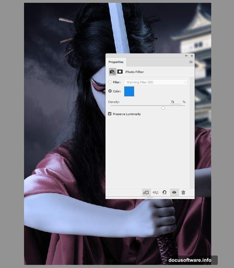
Fresh color photographs often look too saturated and warm when dropped into a moody composite. Two quick adjustments fix that.
First, add a Hue/Saturation adjustment layer clipped to the model and drop the Saturation value to -61. This pulls out most of the natural color without going fully desaturated. Then add a Photo Filter adjustment layer and pick the color #0185ec — a cool blue that pushes the model’s tones toward the cold, nighttime atmosphere you’ve established in the background.
Now the model starts to feel like she actually belongs in the scene rather than being photographed somewhere else entirely.
Setting Up the Dodge and Burn Foundation
Create a new layer above your current stack, change its blending mode to Overlay at 100%, and fill it with 50% gray. This is your non-destructive dodge and burn layer — a classic Photoshop technique that lets you paint light and shadow without permanently altering the pixels underneath.
On this layer, use the Dodge Tool to brighten areas where firelight would naturally hit, and the Burn Tool to deepen shadows on the opposite side. Painting light this way feels intuitive once you get going, and the results look far more convincing than simply using more adjustment layers.
Bringing in the Fire Elements
This is the moment the scene starts feeling genuinely dramatic. Fire images typically photograph against black backgrounds, which makes blending them into composites straightforward.
Place your first fire image into the composition and change its blending mode to Screen. Screen mode drops out all the dark tones and keeps only the bright, luminous fire itself. Resize and position it so the flames appear to rise around the model naturally.
Repeat the process with your second fire image, placing it slightly differently to build more visual complexity. Add layer masks to both fire layers and paint with a soft black brush to fade the edges where the fire meets the figure or the background. The goal is seamless integration, not obviously pasted-on flames.
Adding Sparks and Atmospheric Light
Sparks work exactly like fire — Screen blending mode, careful masking, thoughtful placement. Scatter them around the composition to suggest movement and energy. Concentrate them near the fire sources but let a few drift toward the edges for a sense of chaos.
For the light texture, place it above the sparks and experiment with blending modes like Screen or Add. Adjust the opacity until it adds a subtle glow to the atmosphere without overpowering your carefully built lighting. Sometimes a light texture at 20-30% opacity is all you need to unify the whole scene.
Final Color Grading
With all elements in place, it’s time to tie the whole composition together with color grading. Add a Curves adjustment layer at the very top of your stack — this one affects everything.
Create a subtle S-curve to add contrast. Then work the individual color channels: push the Blue channel up slightly in the shadows for a cool, cinematic feel. Pull the Red channel down just a touch to reinforce the blue-orange fire contrast that makes this kind of composition so visually striking.
Consider adding a Gradient Map adjustment layer at low opacity to further unify your color palette. A dark blue to warm orange gradient set to 10-15% opacity can beautifully pull together all the different light sources in the scene.
The difference between a good composite and a great one usually comes down to this final color pass. Take your time here — even small adjustments make a significant visual impact.
Building a complex photo manipulation like this teaches you something genuinely useful about how light works in photography and painting. Once you understand how to control light direction, color temperature, and atmospheric depth in Photoshop, you can apply those skills to almost any creative project you take on.