Creating eye-catching typographic art doesn’t have to be complicated. With a few smart techniques in Adobe Photoshop, you can build a vivid, colorful eagle photo manipulation that looks genuinely professional.
This tutorial walks through the approach developed by Edmar Cisneros, covering layer styles, painted color effects, and special lighting techniques. By the end, you’ll know exactly how to pull it all together from scratch.
Setting Up Your Canvas and Tetra Font Text
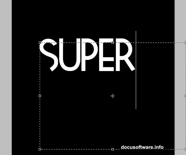
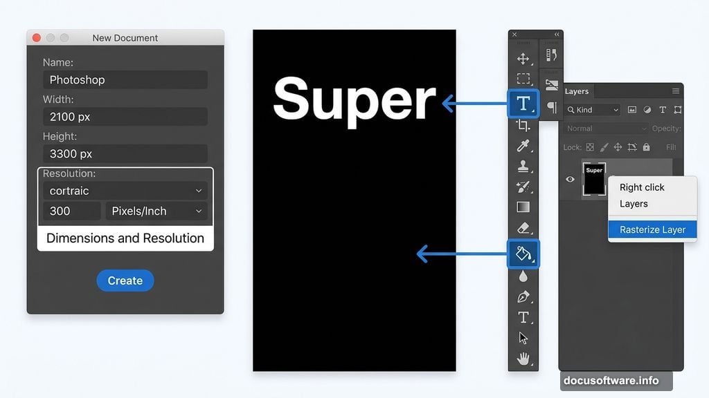
First things first: open Photoshop and create a new document. Set it to 2100 pixels wide by 3300 pixels high, with a resolution of 300 dpi. That size gives you enough room to work with fine details without things getting cramped.
Next, grab the Paint Bucket tool (G) and fill your background layer solid black. That dark base makes the colorful type treatment pop dramatically later on.
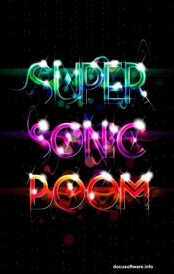
Now switch to the Type tool (T). Select the Tetra font and set your size to around 250pt or larger if you prefer. Type the word “Super” near the upper portion of your canvas. The Tetra font works beautifully here because of its distinctive geometric shapes, though any bold display font can work in a pinch.
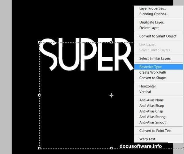
Once your text is placed, right-click the text layer and choose “Rasterize Layer.” This converts the live text into pixels so you can paint directly on it.
Painting Colorful Shading onto Your Letters
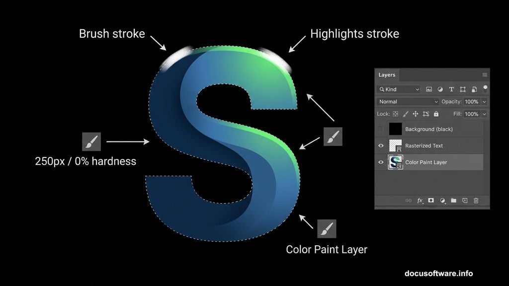
Here’s where the real fun begins. Create a brand new layer above your rasterized text.
Hold Ctrl and click your text layer thumbnail. This loads the letter shapes as an active selection. With that selection active, grab the Brush tool (B). You’re about to hand-paint the color treatment directly inside those letter boundaries.

For this piece, Cisneros chose a palette running from deep blues through to bright greens. Start by filling the selection with your mid-tone blue. Think of it as your color foundation.
Then switch to a soft brush with 0% hardness and a size around 250 pixels. Paint over the lower sections of the letters with your darkest blue to build natural-looking shadows. This shading step is what makes flat text suddenly feel three-dimensional.
Drop the brush size to about 150 pixels and pick your darkest green tone. Paint the lighter areas along the tops of the letters. The key trick here is leaving some of that blue peeking through underneath the green strokes. Those glimpses of the underlayer create organic depth.
Also try lowering your brush opacity to around 40%. Blending at lower opacity lets you layer colors smoothly rather than painting hard, obvious edges. Keep working progressively lighter greens in the same way, always preserving hints of the darker tones beneath.
Finally, grab a small white brush and add bright highlights to the very lightest edges of the letters. These small white touches make the letters look almost luminous against the black background.
Boosting Color Vibrancy with Brightness and Contrast
Once your painted color treatment feels right, go to Image > Adjustments > Brightness and Contrast. Nudge these sliders up slightly to make the colors really sing.
This step isn’t about drastic changes. A small bump in contrast tightens the tonal range and makes the blues and greens look richer and more saturated. Think of it as the final polish on your color work before moving into the more complex parts of the composition.
Resources You’ll Need
Before diving in, grab these two free resources:
- Tetra Font from Font Fabric — the geometric letterforms are what define the art style here
- Bokeh Textures from Photoshop Tutorials — these add atmospheric lighting depth to the finished piece
Both are free to download and make a noticeable difference in the final result.
Why This Technique Works So Well
The painted color approach here is clever because it mimics how concept artists shade illustrations by hand. Instead of relying on gradients or layer effects alone, you’re building color relationships manually inside each letterform. That gives the finished typography a painterly quality that purely mechanical tools can’t easily replicate.
Plus, working on a separate layer above the rasterized text means you can adjust or repaint any section without disturbing the letter shapes underneath. That kind of non-destructive workflow keeps your options open all the way to the final step.
This is the kind of technique that looks intimidating in the finished result but feels surprisingly approachable once you break it into these individual brushstroke decisions. Start with your darkest tones, work toward your highlights, and trust the blending process to do the heavy lifting.