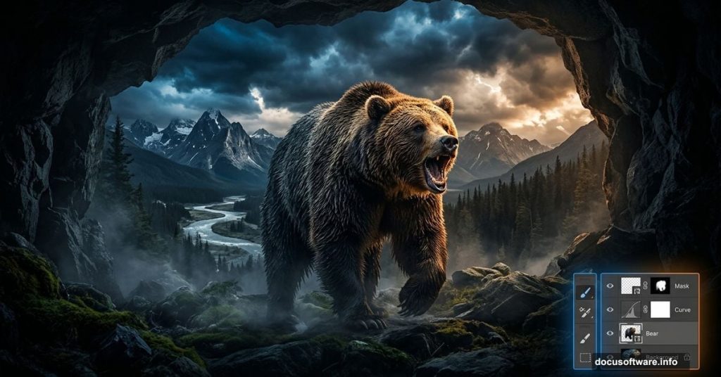
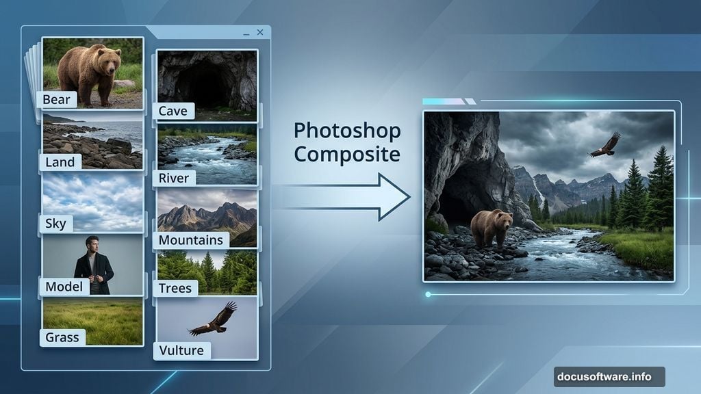
Photo manipulation is one of those Photoshop skills that feels like actual magic. You start with a handful of separate stock photos and end up with a rich, emotional scene that looks completely real.
This tutorial walks you through creating a moody “Hungry Bear” composite from scratch. You’ll work with multiple stock images, blend them naturally, handle lighting and color, and bring everything together into a cohesive piece. Whether you’re new to compositing or just looking to sharpen your skills, this project covers all the essentials.
What Stock Images You’ll Need First
Before opening Photoshop, gather your source files. This composite uses quite a few separate images, and having them all ready saves a ton of time later.
Here’s what the original tutorial uses:
- Model (TwilitesMuse)
- Cave (chocolateir-stock)
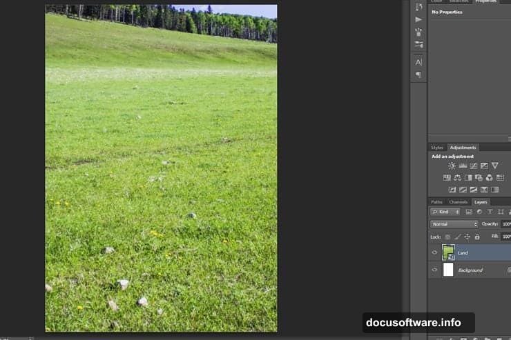
- Land (oddmountain)
- River (Burtn)
- Sky (Vividlight)
- Mountains (Burtn)
- Bear (aussiegal7)
- Tortoise (EveLivesey)
- Vulture (Momotte2stocks)
- Leaves (Meyiing)
- Trees (dbszabo1)
- Grass (zememz)
- Textures (smaragdistock, MoraNox-Stock, ClarabellafaireStock)
Note: Some of these DeviantArt stock links are older and may no longer be available. If a specific image is gone, search for similar free-use stock photos on sites like Unsplash, Pexels, or DeviantArt using the same keywords.
Setting Up Your Photoshop Canvas
Start fresh with a clean document. Go to File > New and set these dimensions:
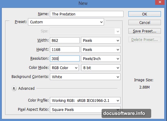
- Width: 862px
- Height: 1168px
- Resolution: 300 pixels/inch
Hit OK. This resolution gives you plenty of detail for a print-quality result, even though the pixel dimensions stay manageable.
Building the Base Landscape
Now comes the fun part. The scene builds from the ground up, layer by layer.
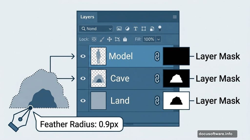
Place the Land stock first and name the layer “Land.” This forms your foundation. Next, place the Cave stock on top and name it “Cave.” Position it roughly where you want it to sit in the scene.
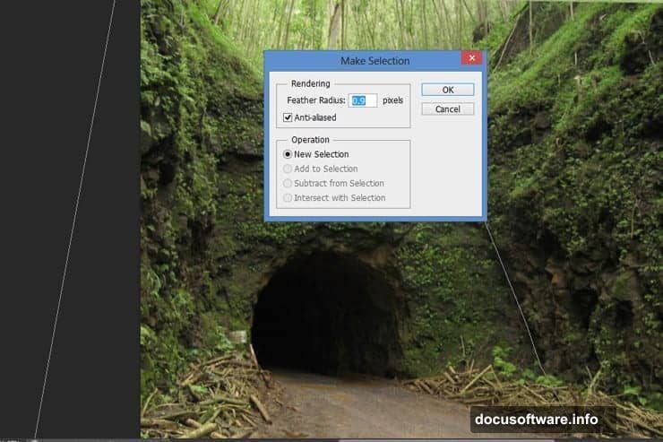
Here’s where layer masking becomes your best friend. The Pen Tool (P) lets you trace a precise path around the cave shape. Take your time here. A careful selection at this stage saves lots of cleanup work later.
Once your path is complete, right-click and choose Make Selection. Set the Feather Radius to 0.9 pixels. That tiny bit of feathering softens the edge just enough to avoid that “cut and paste” look that kills otherwise good composites.
Layer Masking and Blending Techniques
With your selection active, click Add Layer Mask at the bottom of the Layers panel. Or go to Layer > Layer Mask > Reveal Selection. The white area of the mask shows what’s visible. The black area hides it.
This is the core technique you’ll repeat throughout the whole project. So it’s worth getting comfortable with it now.
On the mask, grab a soft brush at about 145px with 50% hardness. Switch to black as your foreground color. Paint along the front edge of the cave to soften where it meets the land. This blends the cave into the scene rather than just sitting on top of it.
Adding Trees and Cave Vegetation
Open your Trees file and pick the best-looking tree from the options. Place it into your main design file and name the layer “Cave Curves.” Add a layer mask immediately.
Transform the tree layer to fit naturally around the cave opening. Then paint on the mask with a soft black brush to hide the parts that shouldn’t show. The goal is to make the trees look like they’re growing organically around and in front of the cave.
Repeat this process several times. Place multiple tree layers around the cave entrance and group them all together. Name the group “Cave’s Grass.” This keeps your Layers panel organized as things get complex.
Use the same masking technique with any other foliage and landscape elements. Consistency in approach means cleaner results across the whole scene.
Painting Out the Land Behind the Cave
Here’s a step many beginners miss. Add a layer mask to your “Land” layer. Then paint with a black brush over the areas that sit behind the cave.
This hides the land that logically shouldn’t be visible once the cave sits in front of it. It’s a subtle thing but makes the scene read as three-dimensional rather than flat.
Placing the River Layer
Place the River stock between the “Land” layer and “Cave” layer in your layer stack. This positioning matters. The river needs to appear behind the cave entrance but in front of the distant landscape.
Add a layer mask to the River layer and repeat the same process. Paint black over any areas that overlap where the cave sits. The river should flow naturally through the scene without awkward overlap artifacts.
Bringing in the Mountains and Sky
Place the Mountain stock and transform it to fill the upper background of your composition. Use the Quick Selection Tool to make a rough selection around the mountain shapes. This tool works well for landscapes where the sky and terrain have clear contrast between them.
Add a layer mask to the Mountains layer. Your selection automatically creates the mask, cutting the sky away from the mountains so you can replace it with your own sky stock later.
At this stage your scene is starting to take shape. You have a layered landscape with distinct foreground, midground, and background elements. Each sits on its own layer with a mask that lets you blend and adjust non-destructively.
The Real Secret: Adjustment Layers and Color Work
The technical compositing is only half the job. What separates a convincing photo manipulation from an obvious one is unified color and lighting.
Every stock photo comes from a different shoot with different lighting conditions. Your bear was photographed on a bright day. Your cave might have cooler, darker tones. Your sky has its own color cast. None of these naturally match each other.
Adjustment layers fix this. Use Curves adjustment layers clipped to individual layers to pull colors into a shared range. Add a Hue/Saturation layer to desaturate elements that feel too vibrant. Use Color Balance to push everything toward a consistent warm or cool mood.
Brush-based adjustments let you paint light and shadow locally. Create a new layer set to Overlay or Soft Light blend mode. Paint with white to add highlights and black to add shadows. This is how you make the bear look like it’s actually sitting in that cave light rather than pasted in from a different photo.
Textures and Final Atmosphere
The tutorial uses three separate texture files to add surface detail and atmosphere to the finished piece. Texture layers sit near the top of your layer stack, set to blend modes like Multiply, Screen, or Overlay at reduced opacity.
Multiply darkens the scene and adds grit. Screen brightens and can simulate fog or haze. Overlay does both simultaneously, boosting contrast while letting the underlying image show through.
Start with low opacity, around 10 to 20 percent, and increase until the texture adds feeling without overwhelming your subjects. Less is almost always more with texture overlays.
Photo manipulation at this level teaches you something important about Photoshop. The tools themselves are straightforward. The hard part is training your eye to see what each element needs to feel like it belongs in the same world as everything else. Color, light, edge quality, and texture all work together. Fix one and the others become more obvious.
The more composites you build, the faster that eye develops. Start with this project, then try replacing elements with your own stock choices and see how the techniques carry over.