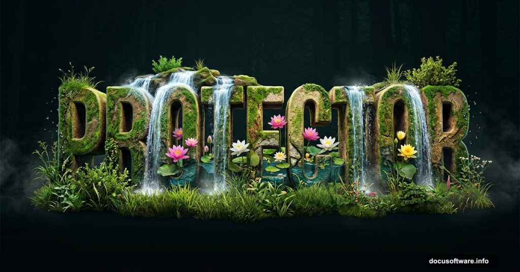
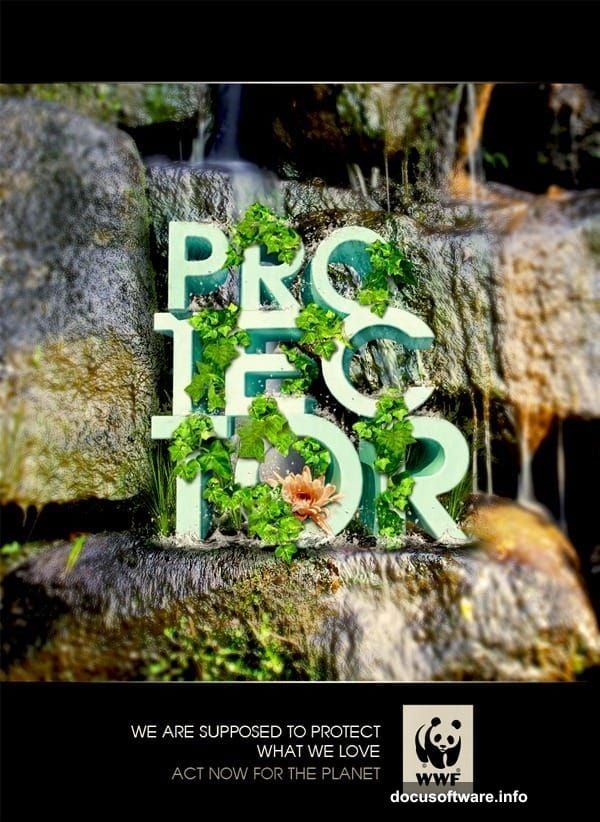
Ever looked at those stunning WWF posters where nature and typography blend together perfectly? That magical effect where grass, water, and flowers seem to grow right out of the letters? You can create that same look yourself, and it’s more approachable than it looks.
This walkthrough covers everything from building 3D text in SketchUp to compositing natural elements in Photoshop. Along the way, you’ll pick up some seriously useful layer management tricks that apply to all kinds of design work.
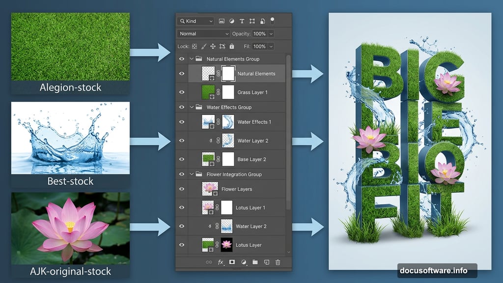
Before diving in, grab these free resources: a grass texture from Alegion-stock, a water splash from Best-stock, a lotus flower image from AJK-original-stock, plus floral frames and waterfall images from free sources online.
Building Your 3D Type in SketchUp
The first step might surprise you. We’re not starting in Photoshop at all.
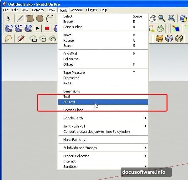
SketchUp Pro is a free 3D software from Google, and it’s perfect for generating dimensional type. Open it up, then head to Tools > 3D Text to get started.
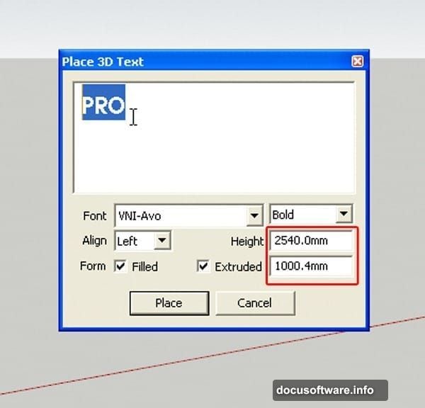
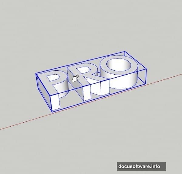
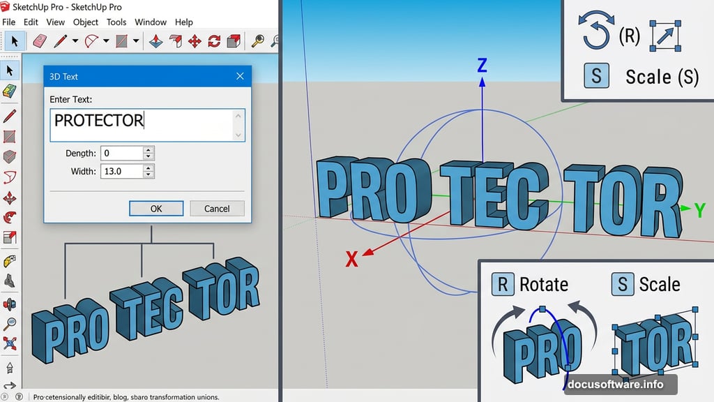
A dialogue box pops up right away. Type your text into the field. For this poster, we’re breaking the word “PROTECTOR” into three chunks: PRO, TEC, and TOR. This split approach gives you much more flexibility when arranging the composition later. Pick a bold, chunky font here. Thin fonts won’t hold up well once natural textures get applied. Set your height and extrusion depth to match the reference dimensions, then click Place or hit Enter.
Your 3D text block appears in the viewport. Navigation is pretty intuitive. Middle-click and drag to orbit around your text, and scroll the mouse wheel to zoom in and out. To move text around, just press M, click your object, and drag it where you want.
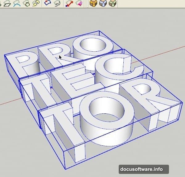
Repeat this process separately for TEC and TOR, arranging all three blocks next to each other so they read as one continuous word.
Rotating and Scaling the Text Blocks
Right now your letters are probably lying flat. Let’s stand them up properly.
Select all three text objects, then press R to grab the Rotate tool. Click on the side of your text, then drag along the blue axis. This tips the letters upright so they look natural and readable in your final composition.
Next, press S to access the Scale tool. Click and drag to push your letters into a thicker, more substantial shape. Thick letterforms hold texture details much better. Run through this scaling step for each of the three text blocks individually until they all feel solid and weighty.
Adding Rounded Corners With a Plugin
Sharp, computer-perfect corners would look out of place in a nature-themed design. Soft, organic edges feel much more natural.
Click on your PRO block and double-click to open it for editing. Double-click again until the whole object is covered in blue selection dots. Now activate the Round Corner plugin and adjust the settings to create a gentle, soft bevel on every edge. Hit Enter and wait a few seconds for the plugin to process.
The result looks instantly more organic. Run the same process on TEC and TOR. Then, using the Rotate tool one more time, nudge TEC slightly on the red axis. Just a small tilt creates a dynamic, lively feeling across the whole composition rather than everything sitting perfectly uniform.
Applying Base Color Before Rendering
Before exporting your 3D text into Photoshop, give the letters a base color.
Press M to open the Material dialogue. Choose a light cyan or any soft, pale hue you like. Click each text block to apply the color. You might wonder why not just use white. A subtle color hint actually produces better results in the final render. Pure white can flatten your image, while a gentle tint preserves depth and dimension that you’ll appreciate when blending textures on top.
Compositing Nature Textures in Photoshop
Now the real Photoshop work begins. Open your rendered 3D text export as your base layer.
Bring in your grass texture first. Position it over the lower portions of your letterforms and use a layer mask to blend the edges softly. The goal is to make it look like the grass is genuinely growing from the ground and wrapping around the base of your letters. Hard edges are the enemy here. Soft, feathered masks are your best friend.
The water splash image layers beautifully over the upper areas of the composition. Place it above your text layer, set the blending mode to Screen or Lighten, and adjust opacity until the splash feels like it’s flowing naturally through and around the letters rather than sitting awkwardly on top of them.
Your lotus flower adds the focal point that ties everything together. Position it where it draws the eye toward the center of the design. Use a combination of layer masks and the Pen tool to isolate it cleanly from its background before compositing.
Blending Everything Together Smoothly
The difference between an amateur composite and a convincing one usually comes down to one thing: consistent lighting.
Look at where the light source sits in each of your nature images. Adjust brightness and contrast on individual layers so all your elements feel lit from the same direction. A simple Curves adjustment layer clipped to each texture layer gives you fine control without permanently changing your source images.
Add the floral frames as decorative elements around the border of your composition. Set them to Multiply or Overlay blending mode so they integrate with whatever sits beneath them. The waterfall image works brilliantly as a subtle texture behind your main text blocks, giving depth to the background without competing for attention.
Finally, bring your overall color palette into harmony with a Hue/Saturation adjustment layer at the top of your stack. Pushing everything slightly toward the greens and teals reinforces that natural, earthy feeling throughout the whole poster.
The final result feels genuinely alive. Nature appears to grow from and around your typography, exactly like those WWF posters that inspired this whole project. Once you understand how these layer management techniques work together, you’ll find yourself reaching for them constantly in future design work.