Surreal art doesn’t require years of experience. With the right Photoshop techniques and a little inspiration, you can build a dreamlike Alice in Wonderland scene that looks genuinely stunning.
This tutorial walks you through the whole process. You’ll start with a moody sky, layer in whimsical props like teapots and flying cards, add a model, then finish everything with color grading and shadow work. The result is a rich, atmospheric matte painting with that signature storybook feel.
Plus, every technique you pick up here transfers directly to future photo manipulations and matte paintings. So let’s get into it.
What You’re Building
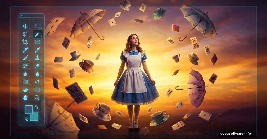
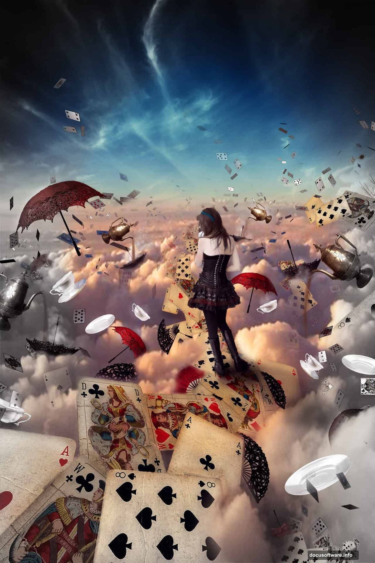
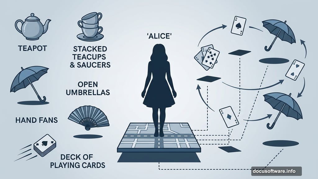
The final image features Alice standing on a surreal road map stage, surrounded by floating teacups, flying playing cards, umbrellas, and fans. A warm sunset sky anchors the whole scene. Realistic shadows and a bleak color tone tie everything together.
To follow along, you’ll need any version of Photoshop, your resource files, and honestly, a good mood helps too.
Here’s your resource list:
- Clouds
- Playing cards and flying cards
- Umbrellas and fans
- A model photo
- Cups and saucers
- A sunset sky
- A tea kettle
Setting Up Your Canvas
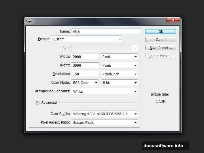
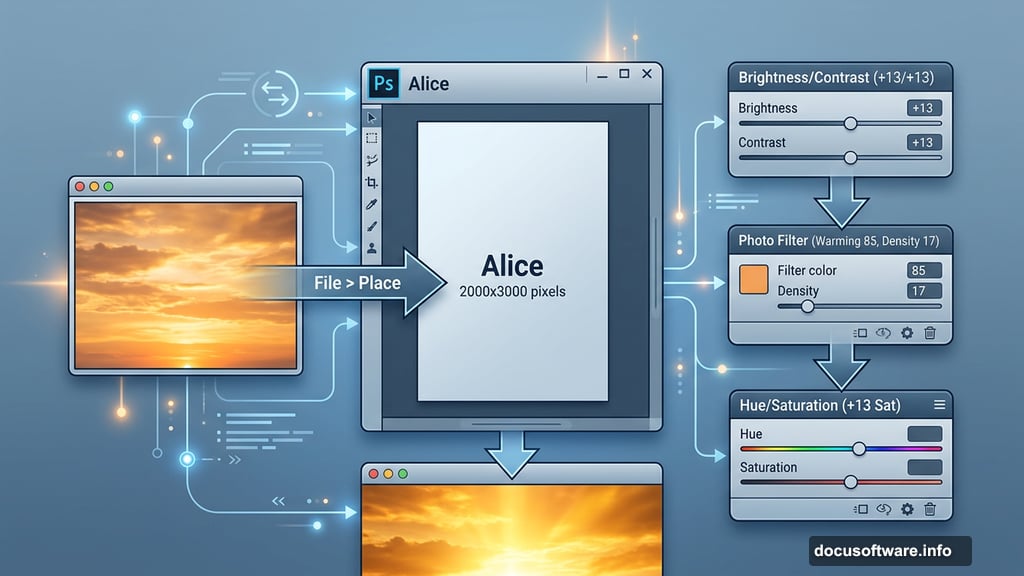
First, create your working document. Go to File > New or press Ctrl+N. Set the width to 2000 pixels and the height to 3000 pixels. This portrait orientation gives you plenty of vertical space to stack your scene elements.
Name the document “Alice” so it stays organized. A tidy file makes everything easier as layers pile up later.
Adding and Adjusting the Sky
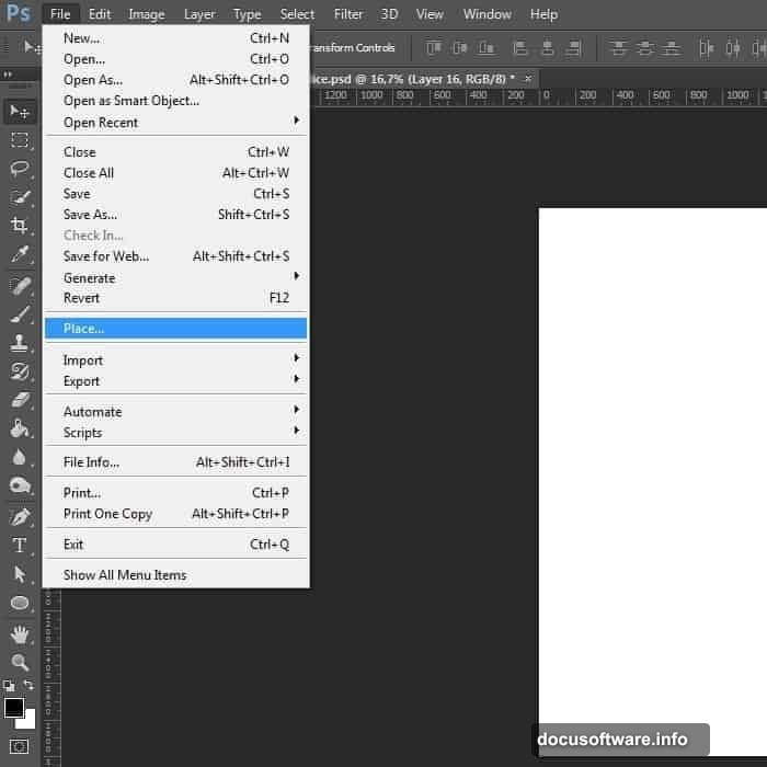
Now go to File > Place and bring in your sky image. Once it’s on the canvas, stretch it to fill the frame. Press Ctrl+T or go to Edit > Transform > Scale, then drag the corner handles outward until the sky covers the full document.
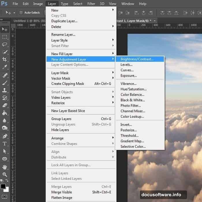
Next, you’ll brighten the sky and make those cloud edges really pop. Add an adjustment layer by going to Layer > New Adjustment Layer > Brightness/Contrast. Set Brightness to 13 and Contrast to 13. Subtle, but it makes a real difference.
Then add a Photo Filter adjustment layer. Choose Warming Filter (85) and set the Density to 17. This starts pushing the sky toward that golden sunset look.
Finally, add a Hue/Saturation adjustment layer. Bump Saturation to +13 and Lightness to +1. The sky now has a vivid, warm glow that feels otherworldly without looking overdone.
Why These Sky Adjustments Matter
Three separate adjustment layers might feel like overkill for a background. But each one does something different. Brightness/Contrast handles the structural punch. Photo Filter adds the warm color cast. Hue/Saturation amplifies the richness.
Stacking them this way also keeps everything editable. So if you decide later that the sky looks too orange or too bright, you can tweak each layer independently without redoing work.
That flexibility is one of the biggest skills you’ll take from this tutorial.
Building the Main Stage
With your sky locked in, start constructing the ground level. The road map element creates the “stage” Alice stands on. Place it into the document and use Free Transform to position and scale it so it reads as a flat surface extending into the background.
Pay attention to perspective here. The road map should feel like it recedes naturally into the distant sky. If the angles look off, the whole composition will feel flat.
Add a soft shadow beneath the road map where it meets the sky layer. This small detail sells the sense of depth more than almost anything else.
Placing the Props
Here’s where things get fun. Start adding your whimsical objects one by one. Teacups, saucers, the tea kettle, playing cards, umbrellas, and fans each go on their own layer.
For the flying cards, scatter them at different sizes and slight rotations. Cards in the foreground should appear larger. Cards near the horizon line should be smaller. That size variation creates a convincing sense of depth and movement.
The cups and saucers can stack or float. Varying their tilt angles keeps them from looking like they were copy-pasted from a product catalog.
One key tip: add a small, soft shadow beneath each floating object. It’s a tiny step that makes objects feel like they exist in the same space rather than floating in a void.
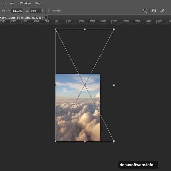
Getting the Clouds to Overlap the Cards
This is a clever technique worth highlighting separately. When clouds overlap props like the flying cards, it sells the sense that objects exist within the scene rather than sitting on top of it.
To do this, add a Layer Mask to your cards layer. Go to Layer > Layer Mask > Reveal All, or click the mask button at the bottom of the Layers panel. Then grab a soft round brush and paint black on the mask wherever clouds should appear in front of the cards.
The cloud layer shows through exactly where you painted. It takes maybe two minutes and makes the composition look significantly more professional.
Placing the Model
Add your model photo to the scene. Use Free Transform to scale her proportionally so she fits naturally within the environment. She should feel like she belongs in this world, not like a cutout dropped on top.
Cut out the model from her original background using your preferred method. The Pen Tool gives the cleanest edges on hair and clothing. The Select Subject tool works quickly for rough placement before you refine edges.
Once she’s isolated, match her lighting to the scene. The warm sunset sky means light is coming from above and slightly behind. So add a soft warm rim light on her edges and slightly darken the front-facing surfaces to maintain that consistency.
Realistic Shadows and Lighting
Shadows are where photo manipulation either convinces or falls apart. Every object touching the ground needs a shadow. Every floating object casts a soft shadow downward.
Create each shadow on a new layer. Set the blend mode to Multiply and the opacity somewhere between 40-70%. Use a very soft brush at low opacity and build the shadow gradually rather than painting it in one stroke.
Pay attention to shadow direction. Since the light source is the sunset sky, all shadows should fall in roughly the same direction. Inconsistent shadow angles immediately break the illusion.
For the model specifically, the area where her feet contact the map stage needs the most convincing shadow work. A soft, slightly darker patch under each foot goes a long way toward grounding her in the scene.
Color Grading the Final Image
With all elements placed and shadows sorted, it’s time for the overall color grade. This is what unifies every separate asset into a single coherent image.
Add a Color Lookup adjustment layer at the top of your layer stack. Experiment with different LUT options until you find one that enhances the bleak, dreamlike quality of the scene.
Then add a Curves adjustment layer. Slightly lift the shadow tones by pulling the bottom-left of the curve upward. This creates a faded, cinematic quality that suits the Wonderland theme perfectly.
Finally, add a gentle Vignette. Create a new layer, fill it with black, and use a large soft eraser to remove the center, leaving darker edges around the composition. Set this layer to Multiply at around 30-40% opacity. It naturally draws the eye toward Alice at the center of the frame.
A Few Things That Trip People Up
Working with smart objects saves you a lot of frustration. When you place an image using File > Place, Photoshop embeds it as a smart object. That means you can scale it up and down repeatedly without losing quality. Without smart objects, scaling an image back up after reducing it will make it look blocky and pixelated.
Also, always download resource images at the highest resolution available. Low-res stock photos fall apart the moment you stretch them to fit a 2000×3000 canvas. That pixelated result isn’t a Photoshop bug. It’s just the limits of a small source file.
Keep your layers organized as you go. Naming each layer and grouping related elements into folders keeps the document manageable when you’re deep into the work.
What Makes This Scene Feel Real
The honest answer is that it’s not any single technique. It’s the combination of consistent lighting, proportional scaling, overlapping elements, and unified color grading working together.
Any one of those things alone won’t make a believable scene. But when all of them work together, the viewer’s brain stops analyzing the separate parts and just accepts the image as a coherent world.
That’s the real skill this tutorial builds. Not just how to move layers around, but how to think about a scene as a unified composition rather than a stack of separate photos.
Take your time with each step. Spend extra time on the shadows and the color grade. Those two things, more than anything else, will determine whether your final image looks like a polished piece or a practice exercise. And when you’re done, you’ll have a genuinely impressive piece and a set of skills that carry forward into every manipulation you create from here.