
Want to create something visually stunning without spending hours wrestling with complex tools? This Photoshop tutorial walks you through building a textured hummingbird composition using blending options, layered textures, and smoke effects. The results look impressive, and the techniques are surprisingly approachable.
The best part? You’ll pick up skills that work far beyond this single project. Once you understand blending modes and texture layering, you can apply them to almost anything.
You’ll need Photoshop CS3 or newer to follow along.
Gather Your Resources First
Before opening Photoshop, round up your assets. Having everything ready saves a lot of back-and-forth later.

Here’s what you’ll need:
- A hummingbird photo from Shutterstock or any stock site. This is just for reference and won’t appear in your final piece.
- Smoke images available for free on sites like Free Stock Photo Exchange or DeviantArt.
- A concrete texture for the background. Free texture sites work just as well as premium ones.
- Metal textures from CGTextures, which offers excellent high-quality options.
- Bokeh textures in a color that complements your overall scheme.
Don’t stress too much about finding the exact resources. Similar textures from free sites produce equally great results.
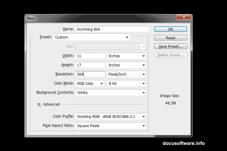
Set Up Your Document
Start by creating a new document. Jacob Pryor, who developed this technique, recommends working large with plenty of resolution. A bigger canvas gives you more flexibility when scaling the final image later.
That said, use whatever size runs smoothly on your machine. A composition that’s easy to work with beats a technically perfect setup that makes your computer crawl.
Build the Background with a Green Gradient
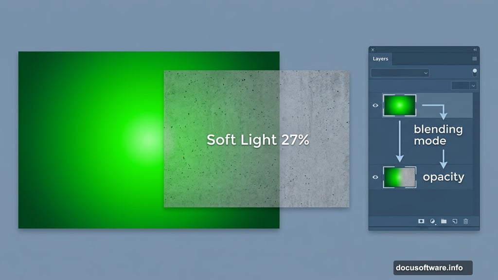
Create a new layer using Shift+Control+N on PC. Then apply a radial green gradient, running from light green (#14dc02) at the center to darker green (#008325) at the edges.
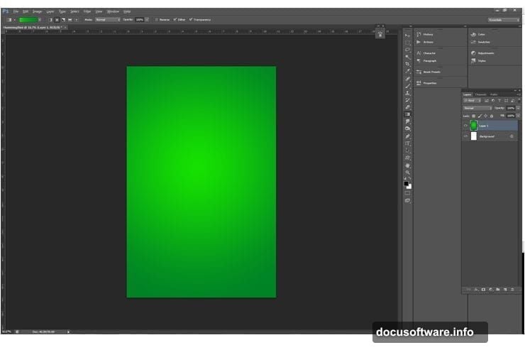
This might look underwhelming at first. But trust the process. When textures go on top later, this gradient quietly does important work. It keeps the viewer’s eye pulled toward the center where your subject lives, without creating a distracting background.
Subtle foundations make bold compositions work.
Layer Your Textures with Blending Modes
Now the fun begins. Bring in your concrete texture and convert it to a Smart Object. This matters because Smart Objects scale up and down without losing quality. So if you change your mind about sizing later, you’re covered.
Set the concrete texture’s blending mode to Soft Light and drop the opacity to 27%. Position it so it covers the entire canvas.
Next, bring in your remaining textures one by one. For each one, follow the same approach: experiment with blending modes and opacity until it looks right to you. Rotate through different options. Try Overlay, Multiply, and Screen modes at various opacity levels.
Remember the goal here. The background should add visual richness and texture, not compete with your bird for attention.
Tone Down and Organize
Once your textures are layered, apply a Black and White adjustment (Adjustments > Black and White, set to Auto). This tones down the background slightly, keeping things balanced.
When you’re happy with how everything looks, group your background layers together. Select them all by holding Shift and clicking each one, then press Control+G or navigate to Layer > Group Layers.
Here’s a neat organizational trick: right-click your group and assign a color code. It sounds like a small thing, but color-coded groups save serious time when your layer panel gets crowded.
Why Blending Modes Change Everything
If you’re newer to Photoshop, blending modes might feel mysterious. Think of them as instructions telling Photoshop how one layer should interact with the layers beneath it.
Soft Light, for instance, adds texture and contrast without dramatically shifting colors. Overlay creates more punch. Multiply darkens. Each mode produces a completely different look using the exact same image.
That’s why experimenting matters more than memorizing “correct” settings. Your textures, your colors, and your composition all interact uniquely. The settings that look great here might need adjusting for your specific assets.
Bringing in Bright Colors
One of the most useful techniques in this tutorial involves adding vibrant color to what would otherwise be a flat, muted piece. Layering bokeh textures with complementary blending modes creates those gorgeous glowing highlights you often see in professional photo manipulations.
The trick is matching your bokeh colors to your overall color scheme. If your gradient runs green, warm gold or teal bokeh creates a striking contrast. Cool blues feel more ethereal. Play with different combinations and see what clicks.
Tips for Beginners
A few things worth keeping in mind as you work through this.

First, save often and use Smart Objects wherever possible. This gives you freedom to experiment without worrying about permanently ruining anything.
Second, don’t copy these settings exactly. The specific opacity and blending mode values Jacob uses work for his particular textures and resolution. Your assets will likely need different settings. Use his numbers as a starting point, then trust your eyes.
Third, the grouping habit is worth developing early. Clean layer organization feels tedious when you’re excited to create, but it becomes genuinely valuable when you need to revisit or revise your work.
This tutorial covers just the background foundation. Subsequent steps build on these techniques to add the hummingbird silhouette and smoke effects, but the blending and texture skills you develop here carry through the entire piece.
Getting comfortable with these tools opens up a huge range of creative possibilities. Once layering textures and adjusting blending modes feels natural, you’ll start seeing how they apply to virtually every Photoshop project you tackle.