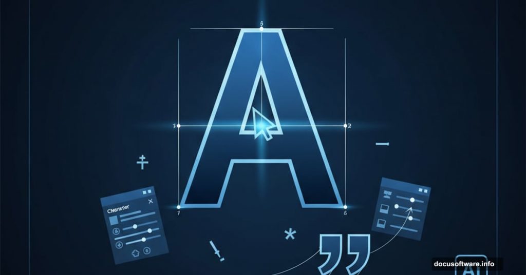
Typography can make or break your design. Get it right and your work looks polished and professional. Get it wrong and even the best graphics fall flat.
Illustrator packs serious power for working with type. Sure, it’s not your go-to for multi-page layouts. But for logos, posters, business cards, and vector text that moves between programs? Nothing beats it.
Most designers barely scratch the surface of Illustrator’s type tools. They stick with the basics and miss features that could save hours and elevate their work. Let’s fix that.
Optical Kerning Beats Auto Every Time
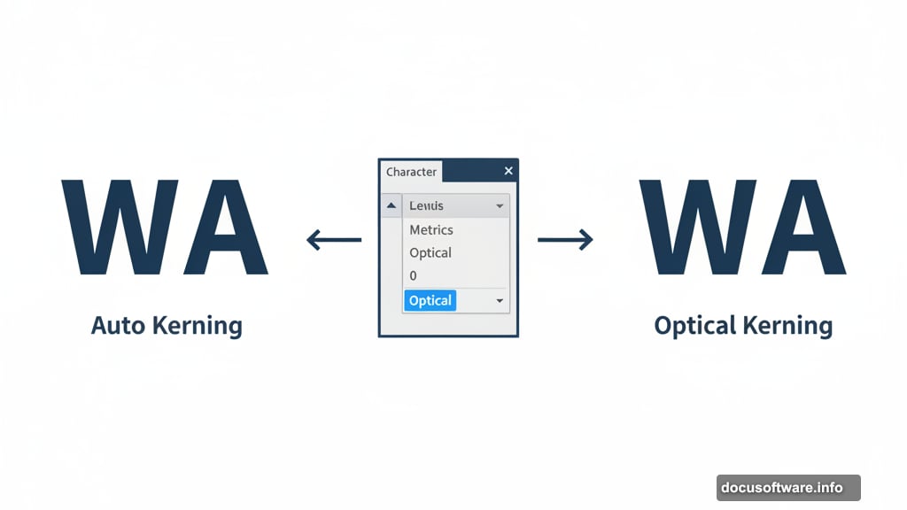
Kerning controls spacing between individual letters. Illustrator gives you three automatic options: Auto (also called Metric), Optical, and Metrics – Roman Only.
Auto kerning uses built-in kern pairs from the font itself. PostScript fonts ship with these pairs already defined. So Illustrator knows exactly how much space goes between “WA,” “LA,” “To,” and other common combinations.
But here’s the thing. Auto kerning only works well when your font has great built-in kerning. Plus, it completely fails when you mix multiple fonts in one design.
That’s where Optical kerning shines. Instead of relying on font data, it analyzes the actual shapes of your letters. Then it calculates spacing based on those shapes. This works brilliantly for mixed fonts or fonts with poor built-in kerning.
To switch to Optical, select your text first. Then open the Character palette from Window → Type → Character. Click the Kerning drop-down menu and choose Optical.
For maximum control, kern manually. Place your cursor between two letters. Then adjust the value in the Character palette. This takes more time but works best for headlines, logos, and other display type where every detail matters.
Want to speed things up? Use keyboard shortcuts. Alt/Option + left arrow decreases kerning. Alt/Option + right arrow increases it. Your fingers never leave the keyboard.
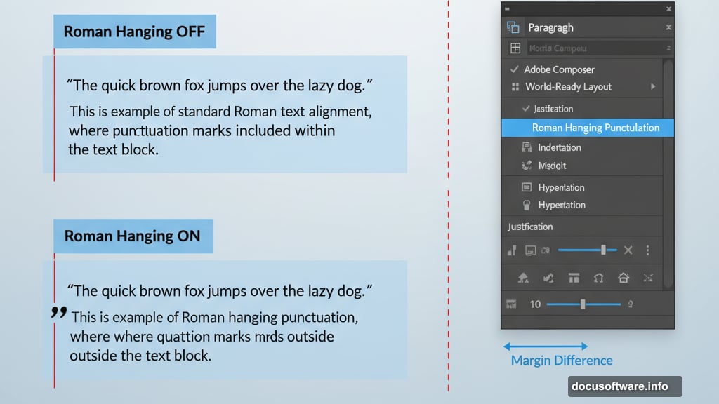
Roman Hanging Punctuation Makes Text Look Professional
This tiny feature separates amateur work from professional design. Yet most designers never touch it.
Roman hanging punctuation moves quotation marks outside your text margin. Without it, quotes sit flush with the text, creating an uneven edge. With it enabled, your text edge looks perfectly aligned.
The difference seems subtle. But it transforms your typography from sloppy to sophisticated.
Turn it on by opening the Paragraph tool panel. Click the arrow in the upper right corner. Then select Roman Hanging Punctuation from the drop-down menu.
You can apply this to entire text blocks at once. Just select all your text first before toggling the setting.
The Glyphs Panel Unlocks Hidden Characters
Every font contains way more characters than you see on your keyboard. Special symbols, alternate letters, old-style figures—they’re all hiding in the Glyphs panel.
Access it through Window → Type → Glyphs. The panel displays every character in your currently selected font. Hover over any glyph to see its Unicode name at the top of the panel.
To insert a glyph, simply double-click it. Illustrator drops it wherever your text cursor sits.
Switch between fonts using the drop-down boxes at the bottom of the panel. No need to close and reopen it constantly. The zoom buttons in the lower right let you preview glyphs larger or smaller.
Some characters include a small arrow in the corner. This signals alternate versions are available. Click and hold on these glyphs to reveal the alternates. Then drag to the one you want and release.
The Show menu at the top filters characters by type. Choose “Oldstyle Figures” to see only those numbers. This beats scrolling through hundreds of glyphs hunting for what you need.
Learn the Difference Between Hyphens and Dashes
Nothing screams “amateur” louder than using hyphens and dashes wrong. The rules are simple once you learn them.
A hyphen is shortest and lives next to the “+” key on your keyboard. It has three jobs. First, it splits words at the end of text lines. Second, it joins compound words like “fun-loving” and “anti-American.” Third, it connects two-word numbers such as forty-two.
An en dash shows spans of time or number ranges. Think 5–9, July–September, or 1:00–8:00. Find it in the Glyphs panel at Unicode U+2013.
An em dash is longest and shows breaks in thought. Like this—you get the idea—when you want to interrupt your sentence. Its Unicode is U+2014.
Memorize these rules. Use them consistently. Your clients may not consciously notice correct dash usage. But they’ll definitely spot mistakes.
Style Panels Save Time on Repetitive Text
Working with lots of text in Illustrator gets tedious fast. Unless you use Character Styles and Paragraph Styles panels.
These panels let you save font formatting as reusable presets. Set up your heading style once. Then apply it to every heading with a single click.
Find both panels under Window → Type. To create a style, first format some text exactly how you want it. Then open the Styles panel and click the arrow in the upper right corner.
Choose New Character Style or New Paragraph Style. Name your style something memorable and click OK. Now that style appears in your panel, ready to apply to other text.
To use a saved style, select text and click the style name in the panel. Boom. Instant formatting.
Need to change a style? Double-click it in the panel. Make your edits in the dialog box. Click OK and every piece of text using that style updates automatically.
Delete styles by dragging them to the Delete button in the panel’s bottom right corner. The text keeps its formatting but no longer links to the style.
Place Type on Any Path You Want
Text doesn’t have to sit in boring straight lines. Illustrator lets you wrap type around circles, curves, or custom paths.
For open paths (lines with start and end points), create your path first. Select the Type tool and hover over the path. Wait for the cursor to change into a Type on a Path icon with a line through it. Click once and start typing.
The stroke disappears and your text follows the path. Small white boxes appear at the start, end, and center. Drag these to adjust where text sits on the path.
To flip text under the path, go to Type → Type on a Path → Type on a Path Options. Check the Flip box and click OK. Or manually drag the center line to the opposite side of the path.
Closed paths like circles work similarly. But the start and end points live in the same spot since the path loops continuously. Click where you want text to start and begin typing.
Change any path after adding text by selecting it with the Direct Selection tool. Then reshape the path normally. Your text adjusts automatically.
Know When to Use Point Type vs Area Type
Illustrator offers two type modes that work completely differently. Understanding when to use each saves frustration.
Point type starts when you click once with the Type tool. It keeps going in one line forever unless you manually press Return. Perfect for headlines, logos, or short bits of text that need to stay on one line.
Area type fills a defined space. Click and drag with the Type tool to create a bounding box. Now text automatically wraps to fit inside that box. Use this for paragraphs and longer text blocks.
The big difference shows when you resize. Dragging handles on point type distorts the actual letters. Dragging handles on area type just reflows the text to fit the new box shape.
Point type also lacks the in and out ports that appear on area type containers. Those ports control text flow between linked containers.
Create Text Columns Without Leaving Illustrator
Need a two-column layout? Illustrator handles it natively without importing into InDesign.
Create an area type container first. Then go to Type → Area Type Options. The dialog box lets you divide your text into multiple rows and columns.
Change the Number setting under Columns to split your text vertically. The Span controls width of individual columns. The Gutter sets spacing between columns.
The same controls work for creating rows. Change the Number under Rows to split text horizontally.
Check the Fixed box to lock column width. Now resizing the container changes the number of columns instead of their width. Uncheck it and columns resize but their number stays constant.
When using both rows and columns, the Options section controls flow direction. By Rows reads left to right across the top row first. By Columns reads top to bottom down the left column first.
Link Text Containers to Flow Content
Sometimes one text box isn’t enough. Your text overflows and Illustrator shows a red box with a plus sign.
Click that plus sign with the Direct Selection tool. Your cursor changes to show a linked container icon. Click anywhere on the artboard and Illustrator creates another box the same size. Text automatically flows from the first box into the second.
Want a different size for the second box? After clicking the overflow indicator, drag on the artboard instead of just clicking. Create whatever size container you need. Text flows into it and wraps to fit.
This works for as many linked containers as you need. Each overflow indicator creates another link in the chain. Text flows through them in order.
Break links by clicking on a container with the Selection tool. Then click the in or out port and press Delete. The text stays but the link breaks.
Scale Area Type Boxes Precisely
Eyeballing the size of text containers leads to inconsistent results. Illustrator lets you scale them numerically instead.
Go to Type → Area Type Options and enter exact dimensions for width and height. Click OK and your container resizes to those specifications.
Or use Object → Transform → Scale for more options. Both methods change the text size along with the box.
To resize just the box without scaling text, grab a side with the Direct Selection tool. Then drag normally. The bounding box changes size but text stays the same.
This technique works best when you need multiple same-size text containers. Set dimensions once and replicate exactly.
Speed Up Your Workflow With Shortcuts
Keyboard shortcuts transform how fast you work in Illustrator. Memorize these to stop reaching for menus constantly.
Shift + Control/Command + O creates outlines from text. Essential before sending files to print or converting type to shapes.
Alt + Control/Command + I shows or hides invisible characters. Helpful for spotting extra spaces or line breaks causing problems.
Press T to select the Type tool instantly. No menu diving needed.
Control/Command + T opens the Character panel. Shift + Control/Command + T opens the Tabs panel. Alt + Control/Command + T opens the Paragraph panel.
Hold Shift while the Type tool is selected to switch between horizontal and vertical text orientation.
Press Escape while typing to exit the current text object and activate the Selection tool in one move.
These shortcuts become muscle memory with practice. Your hands stay on the keyboard and work flows faster.