
Creating digital art that combines typography with dramatic lighting effects sounds intimidating. But the process is surprisingly approachable once you break it down into clear stages.
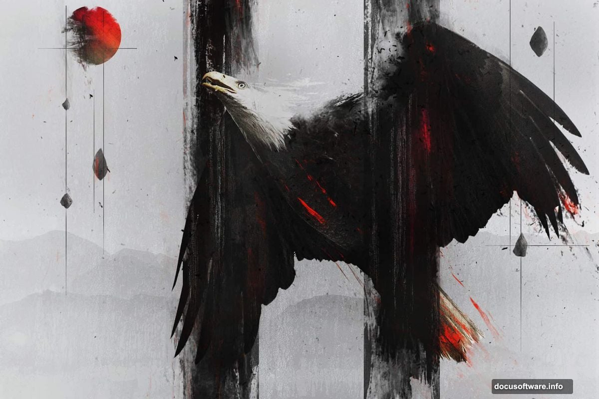
This tutorial walks you through building a colorful abstract eagle manipulation using Photoshop layer styles and special lighting effects. You’ll work with the Tetra font, bokeh textures, and a layered painting approach to create something genuinely eye-catching. Let’s get into it.
What You Need Before Starting
Grab two free resources before opening Photoshop. First, download the Tetra font from Font Fabric. Its geometric shapes work perfectly for this effect. Second, grab some bokeh texture images from the Photoshop Tutorials resource library. Both are free and worth bookmarking.
Also, make sure you’re comfortable with basic Photoshop tools. You’ll use the Brush, Type, and Bucket tools throughout. Nothing here requires advanced skills.
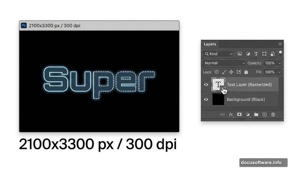
Document Setup and Black Background
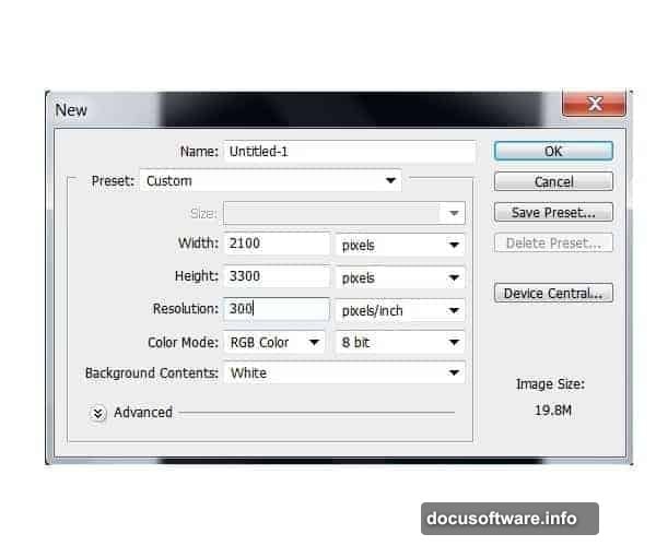
Start by creating a new Photoshop document. Set it to 2100 pixels wide and 3300 pixels high with a resolution of 300 dpi. That gives you enough canvas for sharp detail at print quality.
Next, grab the Paint Bucket tool (G) and fill your background layer with solid black. This dark base is essential. It makes the colorful lighting effects pop dramatically later. Think of it as your stage before the lights turn on.
Setting Up Your Typography Layer
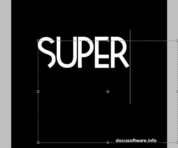
Select the Type tool (T) and choose the Tetra font at around 250 points. Type the word “Super” toward the upper portion of the canvas. You can go larger if your composition calls for it.
Tetra works beautifully here because of its bold geometric shapes. However, any strong display font will do if Tetra isn’t your style. The key is picking something with enough visual weight to carry the color treatment.
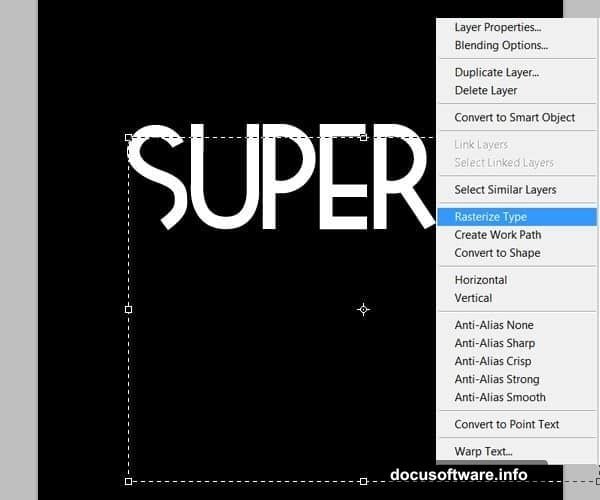
Once your text is positioned, right-click the text layer and select “Rasterize Layer.” This converts the live text into editable pixels. You won’t be able to retype it after this step, so double-check your spelling first.
Painting Colors Onto the Letters
Here’s where the real fun begins. Create a new empty layer above your rasterized text layer.
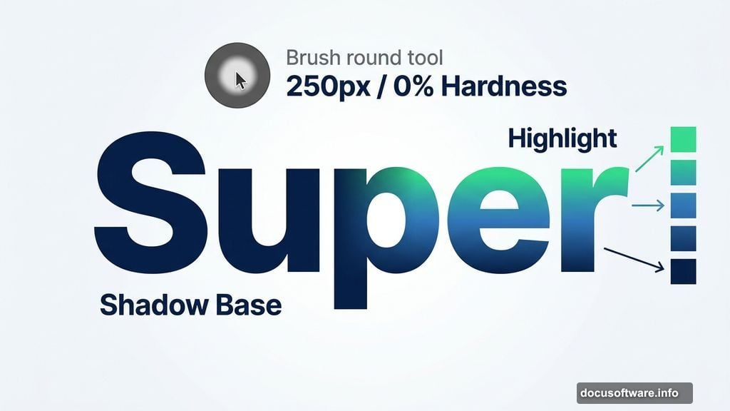
Hold Ctrl and click on the text layer thumbnail. This loads the letter shapes as an active selection. Now switch to the Brush tool (B). You’re about to paint color directly inside those letter outlines without going outside the edges.
For this first word, the color palette runs from deep blues at the bottom to bright greens toward the top. Start by filling the entire selection with a mid-range blue. Think of this as your base coat.
Building the Color Gradient Effect
Now set your brush to a soft round tip with 0% hardness and a size around 250 pixels. Paint the lower portions of the letters with a darker blue shade. This creates the shadow area and gives the letters a sense of depth.
Switch to a smaller brush, around 150 pixels, and pick your darkest green. Start painting toward the top edges of each letter. Don’t cover the blue completely. Leave traces of the blue showing through. That transition between colors is what creates the glow effect.
Drop your brush opacity to about 40%. This lets you blend the colors smoothly without harsh edges. Layer progressively lighter greens on top, always keeping hints of the previous shade visible underneath.
Finally, switch to white with a small soft brush and add bright highlights to the very top edges of the letters. These white touches sell the illusion of light hitting the type from above.
Adjusting Brightness and Contrast
Once you’re happy with the painted result, go to Image, then Adjustments, then Brightness and Contrast. Push these settings up slightly to make the colors more vibrant and punchy.
Don’t overdo it. A subtle bump adds energy without washing out your careful color work. The goal is making those blues and greens feel electric against the black background.
Why This Technique Works So Well
The layered painting approach gives you complete control over where light appears to hit. Plus, working inside a selection means you never paint outside the letterforms. So the edges stay crisp no matter how loosely you brush.
Also, using a single word like “Super” for practice lets you master the color blending before tackling more complex compositions. Once you nail the technique on simple letterforms, adding an eagle element feels much more manageable.
This kind of typographic illustration has real staying power in design portfolios. The combination of bold text, careful color gradients, and dramatic lighting creates something that genuinely looks like it took professional skill. And honestly? After a few attempts, it does.