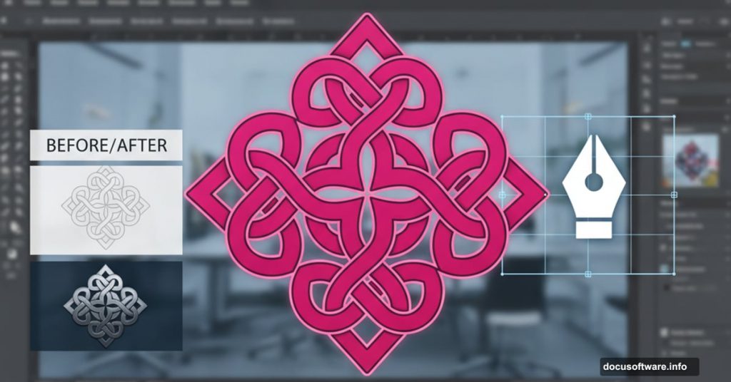
Want to design a Celtic knot logo that looks professionally textured? Most Illustrator tutorials skip the finishing details that make logos pop.
This guide walks you through creating an intricate Celtic knot design from scratch. Plus, you’ll learn texture techniques that work on any logo project. By the end, you’ll have a complete workflow for geometric logo design.
Let’s build something beautiful.
Set Up Your Illustrator Document Right
Start with a 2560x1440px canvas. This gives you plenty of room to work without performance lag.
Next, create two global color swatches. Global swatches let you change colors instantly across your entire design later. Trust me, you’ll thank yourself for this.
Make your first swatch R:255/G:0/B:122 for a vibrant pink. Then create a second swatch at R:40/G:95/B:0 for deep purple-blue. These colors will anchor your design palette.
Build the Foundation Shape
Here’s the smart approach: design one quadrant perfectly, then duplicate it. This prevents awkward shapes and keeps everything symmetrical.
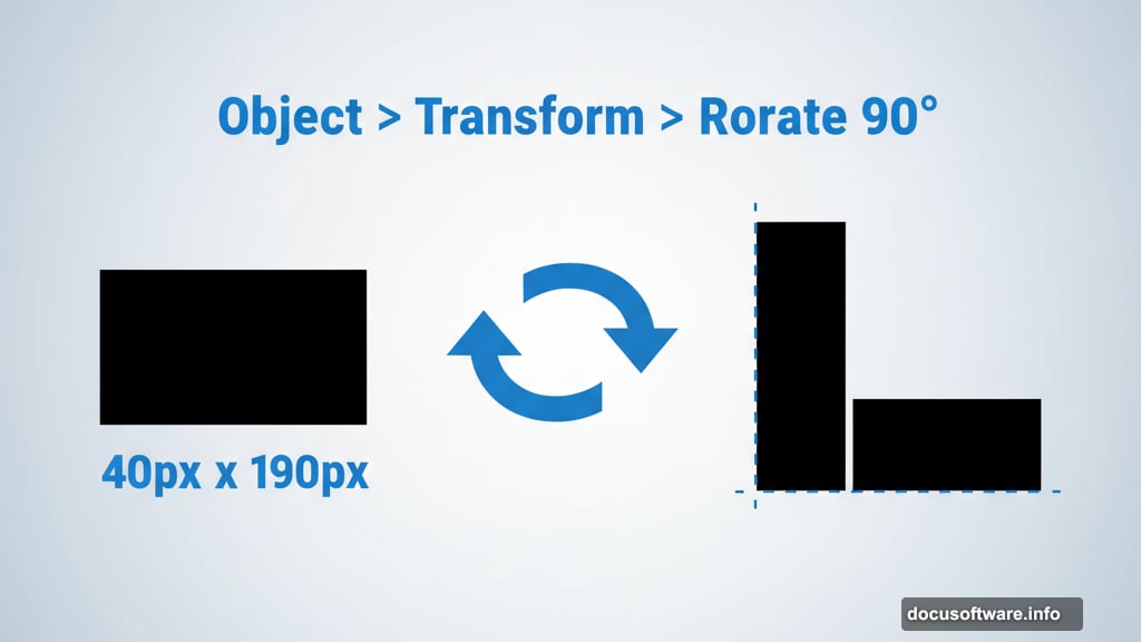
Grab the Rectangle tool and click once on your canvas. Create a rectangle exactly 40px wide by 190px tall. Fill it with black and remove the stroke completely.
Now select that rectangle and go Object > Transform > Rotate. Set the rotation to 90 degrees but hit “Copy” instead of OK. This creates a second shape rotated perfectly perpendicular.
Align Your Base Shapes

Drag a selection over both rectangles. Open the Align panel and look for the icon with a small key symbol in the “Align to” dropdown.
Click your vertical rectangle to make it the key object. Then use the alignment buttons to snap the left edges together and align the bottom edges. You now have a perfect “L” shape.
Create Multiple Copies Fast
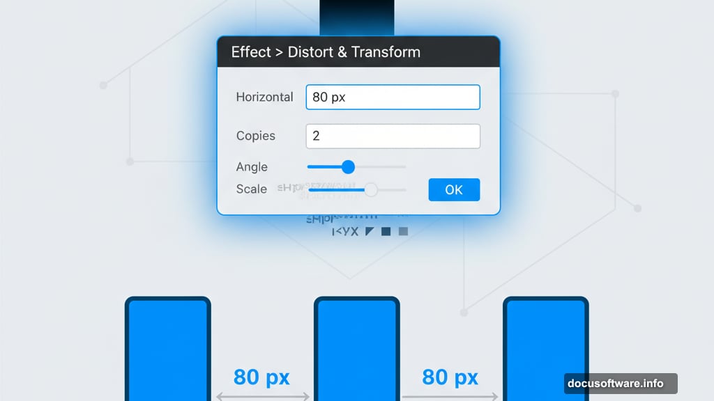
Select just the vertical rectangle again. Go Effect > Distort and Transform > Transform. Set horizontal movement to 80px and specify 2 copies. Leave everything else at zero.
This creates two additional vertical rectangles spaced perfectly across your horizontal base. Now select that vertical rectangle one more time and choose Object > Expand Appearance. This converts the effect into three separate, editable shapes.
Add Rounded Corners the Professional Way
Turn on Smart Guides first. Go View > Smart Guides to enable them. These guides help you snap objects precisely to important points.
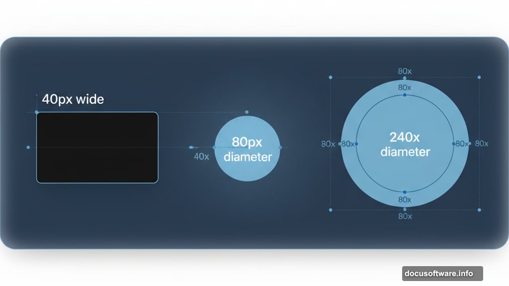
Grab the Ellipse tool and click once on your canvas. Create an 80x80px circle. Why 80? Because your rectangles are 40px wide, and an ellipse’s diameter equals twice its radius.
Drag this circle to the top-right corner of your rightmost vertical rectangle. Watch for the center point to snap into place. Smart Guides will show you when it clicks perfectly.
Build the Curved Sections
Create another ellipse, this time 240x240px. This represents a radius equal to two rectangle widths plus the gap between them.
Position this larger circle the same way—center point snapping to that top-right corner. With this ellipse selected, go Object > Path > Offset Path and enter -40px. This creates a smaller circle inside.

Select both circles and open the Pathfinder panel. Click the Subtract icon to punch out the middle. You now have a donut shape that will become part of your knot.
Make one more ellipse at 400x400px. Position it identically to the others. Repeat the offset path trick at -40px and use Pathfinder to create another ring shape.
Merge Shapes into a Knot
Select the smallest circle and the vertical rectangle it touches. Use Pathfinder to merge them into one shape.
Now comes the crucial part. Select everything except the bottom horizontal rectangle. Grab the Shape Builder tool from your toolbar.
Click and drag across the curved sections to join loops with their rectangles. Then hold Alt (Windows) or Option (Mac) and click the white spaces between your lines. This removes unwanted shapes Illustrator creates automatically.
Watch the video version if you need to see exactly which shapes to keep and which to clear. Visual reference helps tremendously here.
Group and Color Your Design
Select all your shapes and press Cmd+G (Mac) or Ctrl+G (Windows) to group them. Set your base color to the pink global swatch you created earlier.
Why use global colors? Because you can change the entire design’s color instantly by double-clicking the swatch later. This saves hours on client revisions.
Add Professional Texture and Shadows
Copy your grouped shape and go Edit > Paste in Front. This creates a duplicate directly on top. Change this copy to your purple swatch.
Open the Transparency panel and double-click the empty area next to your shape thumbnail. This adds a black mask that hides your purple layer completely.

Now here’s where texture magic happens. Draw a rectangle where you want shadow to appear. Fill it with a black-to-white gradient.
Go Effect > Texture > Grain. Set Intensity to 70 and Contrast to 40. This creates organic texture instead of smooth digital gradients.
Grab the Gradient tool and drag across your rectangle until the grainy shadow looks natural. The grain effect makes your shadow feel hand-crafted rather than computer-generated.
Fine-Tune Your Shadows
Add more rectangles filled with solid black for deeper shadows where needed. Just remember one critical rule: keep the bottom horizontal rectangle clear of textured shadows.
Why? This creates the optical illusion that your knot weaves over and under itself. Shadows everywhere flatten the design and kill that three-dimensional effect.
Group all your artwork together one final time. You’re now ready to duplicate this quadrant and complete your full Celtic knot logo.
Make This Technique Your Own
This workflow isn’t just for Celtic knots. The same approach works for any geometric logo design that needs professional polish.
The texture technique especially translates to countless projects. Grainy gradients add sophistication that flat colors can’t match. Plus, the Offset Path and Pathfinder combination opens up complex shape possibilities.
Experiment with different grain settings for your next project. Try varying Intensity between 40-90 and Contrast between 30-60. Each combination creates distinctly different textures.
Master these Illustrator fundamentals and you’ll design logos that look professionally finished instead of digitally sterile. The difference shows immediately in client presentations.
