Ever wanted to create one of those epic, cinematic fantasy scenes you see in movies and video games? The kind with brooding skies, ancient statues, and knights standing in swirling mist? Matte painting is the technique behind those stunning visuals. And the good news? You can build one yourself using Photoshop and a handful of free stock photos.
This tutorial walks you through the whole process. You’ll combine several images into one seamless scene, craft a realistic misty atmosphere, and fine-tune the mood using adjustment layers, curves, and color balance. No need to be a Photoshop expert. If you know your way around layers and masks, you’re ready to start.
What You’re Building
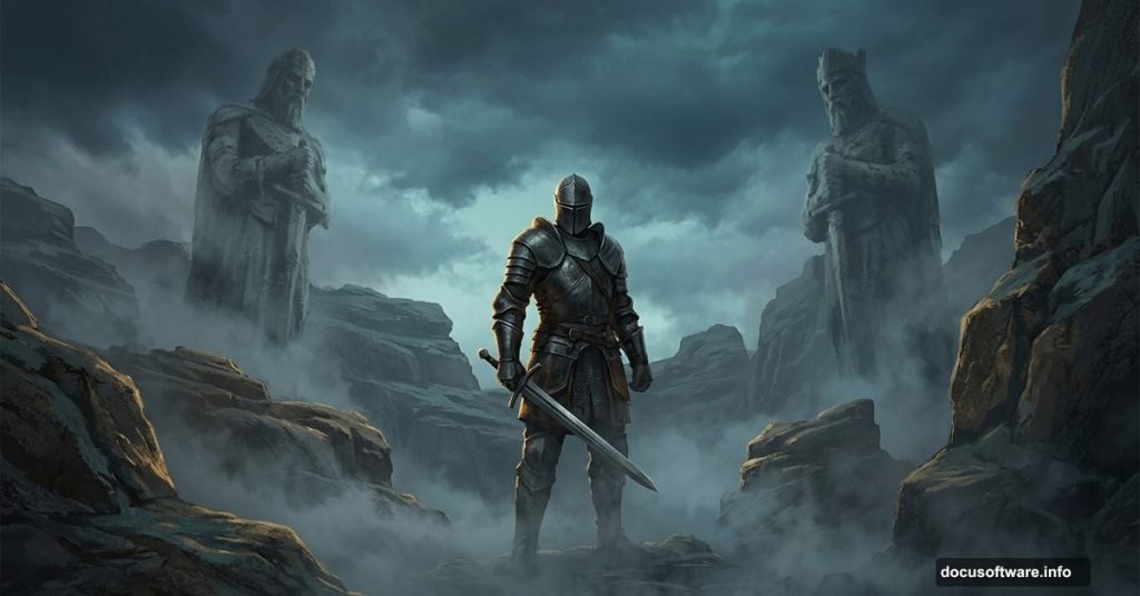
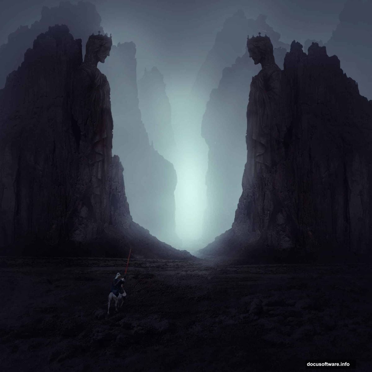
The final scene features a rocky landscape with layered stones on both sides, a central statue, and a knight standing guard in thick fog. The depth of field effect makes the rocks fade naturally into the background. Everything comes together through careful masking, opacity adjustments, and color grading.
You’ll need Photoshop CS2 or newer. That covers pretty much any version released in the last two decades, so you’re almost certainly good to go.
Stock Photos You’ll Need
Before starting, grab these images:
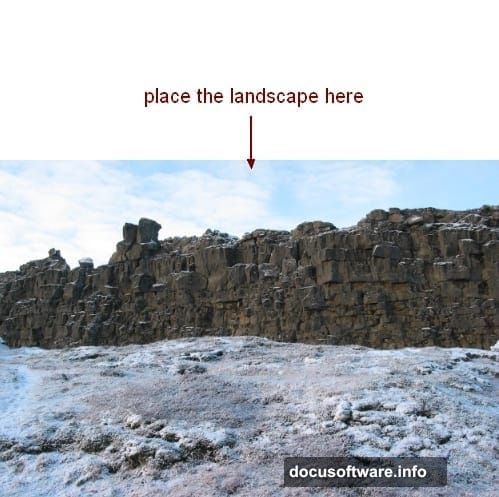
- Landscape (base ground image)
- Rock 1 (foreground rocks)
- Rocks 2 (mid-ground rocks)
- Rocks 3 (background rocks)
- Statue
- Knight
Having all your assets ready before you open Photoshop saves a lot of time. Plus, it lets you mentally visualize the composition before you start building it.
Setting Up Your Canvas
Create a new Photoshop document with your desired dimensions. A wider, cinematic ratio works beautifully for landscape matte paintings. Think 16:9 or similar proportions. Start with a white background.
Next, open your landscape image and drag it onto the canvas using the Move Tool (V). Position it so the ground fills the lower portion of the frame. Then add a layer mask to this layer. Use a soft black brush to erase the sky and any rocky upper areas, leaving only the clean ground visible. This becomes your foundation.
Grounding the Scene With Adjustment Layers
Raw stock photos rarely match each other straight out of the box. They need color correction and mood adjustments before they blend properly. Here’s how to handle the ground layer first.
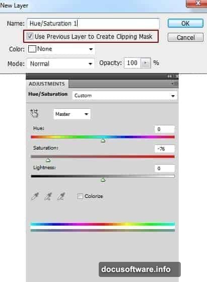
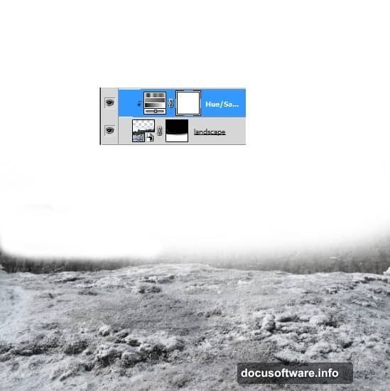
Add a Hue/Saturation adjustment layer via Layer > New Adjustment Layer > Hue/Saturation. Set it as a clipping mask so it only affects the ground beneath it. Pull the saturation down to desaturate the earth tones slightly. Then add a Color Balance adjustment layer to push some warm red tones into the ground. Finally, use a Curves layer to darken it down. These three adjustments together give the ground that cold, dramatic feel that sets the mood for everything else.
Building the Rocky Foreground
This is where the scene starts coming to life. Bring in your Rock 1 image and place it on the right side of the canvas. Remove the background using a layer mask, painting away anything that isn’t rock. Then duplicate that layer and flip it horizontally using Edit > Transform > Flip Horizontal. Move the flipped version to the left side. Now you have matching rocky formations framing both edges of the scene.
Group both rock layers together using Cmd/Ctrl+G. Change the group’s blending mode from Pass Through to Normal at 100%. This is important. It keeps any adjustment layers you add inside the group from affecting layers beneath it.
Desaturating and Darkening the Rocks
Add a Hue/Saturation adjustment layer inside the rocks group to strip out most of the color. These rocks should feel cold and grey, not warm and earthy. Then add a Curves adjustment layer to darken them further. Push the midtones and shadows down until the rocks feel heavy and ominous.
This is one of those small steps that makes a huge difference. Dark, desaturated rocks immediately signal “mysterious and foreboding” to the viewer. So spend a little time here getting the tone right.
Adding Depth With Mid-Ground Rocks
Here’s where the depth of field effect happens. Place your Rocks 2 image behind the Rock 1 group in the layer stack. Drop its opacity to 50%. This immediately pushes those rocks back in space. They feel farther away because they’re less visible.
Use a layer mask on this layer to clean up the hard edges and remove the rock on the right side. Blend the edges with a soft brush so everything feels like one continuous environment, not a collage of cut-out photos.
Placing the Statue and Knight
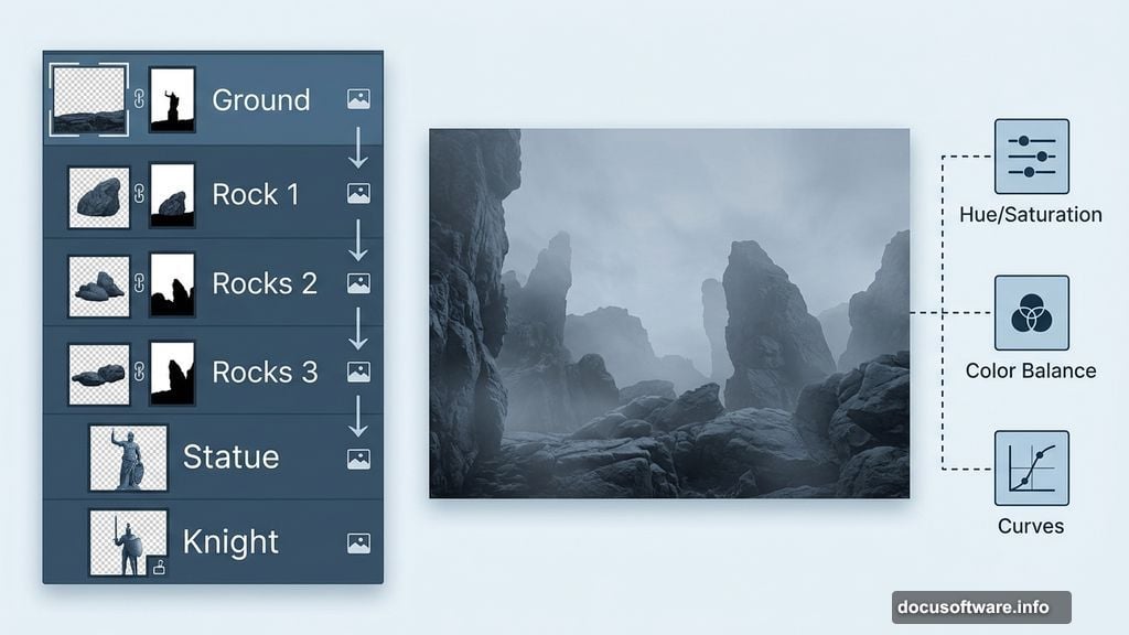
With your rocky environment established, bring in the statue and position it centrally in the scene. Blend it into the environment using a layer mask to soften the base and hide any harsh edges. Add adjustment layers clipped to the statue to match its color temperature and brightness to the surrounding rocks.
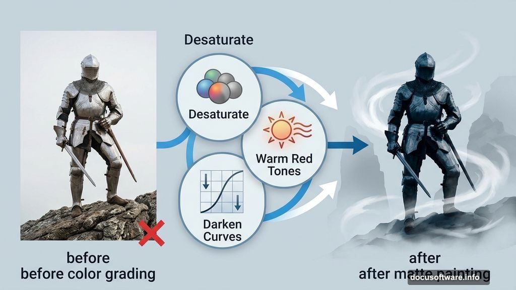
The knight goes in next. Same approach: mask away the background, use adjustment layers to match the lighting, and blend the feet into the ground so the character looks planted in the scene rather than floating above it. A soft dark brush on the layer mask around the base of the knight creates a natural shadow effect.
Creating the Misty Atmosphere
This step is genuinely satisfying. Add a solid color fill layer set to a cool, slightly bluish-grey tone. Change its blending mode to something like Screen or Soft Light and reduce the opacity until it creates a soft atmospheric haze across the scene.
The mist should feel denser in the background and lighter in the foreground. Use a gradient on the layer mask to achieve this. White at the back, fading to black at the front. This mimics how real atmospheric perspective works. Objects far away get hazy and washed out. Objects close up stay sharp and detailed.
Final Color Grading and Lighting
Now comes the polish. Add a final Curves adjustment layer at the very top of your layer stack. Use it to lift the shadows slightly and add a subtle S-curve for contrast. Then consider a Color Balance or Photo Filter adjustment to push the whole image toward a cool blue-green palette. Dark fantasy scenes typically lean cool. Warm accents can appear in specific areas like a glowing statue or torchlight, but the overall tone should feel cold and ancient.
If you want to push the drama further, paint subtle light sources manually on a new layer set to Screen mode. A soft glow behind the statue. Light catching the knight’s armor. These small lighting touches make the whole composition feel cinematic.
Matte painting is really about patience and observation. Every adjustment you make should serve the mood you’re building. Step back regularly, squint at the image, and ask whether it feels like a place you could step into. When the answer is yes, you’re done.