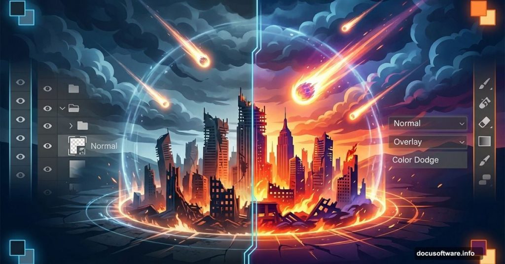
Building an apocalyptic sci-fi scene sounds complicated. But with the right techniques, you can pull off dramatic results in under an hour.
This Photoshop tutorial breaks down the process into simple steps. You’ll learn to blend images seamlessly, add meteor effects with brushes, and build atmospheric lighting that sells the destruction. No advanced masking required.
What You’ll Need Before Starting
Gather these resources first. Having everything ready prevents workflow interruptions.
Required images:
- Sky photo with dramatic clouds
- Urban cityscape shot
- Meteor brush pack
Photoshop version: CS6 or newer works fine. The techniques use basic tools available in most versions.
Skill level: Intermediate. You should know layer basics and transform tools. But advanced masking skills aren’t necessary for this project.
Build Your Base Canvas
Start by creating your document. A 600×900 pixel canvas works well for this composition. Portrait orientation gives you vertical space for falling meteors.
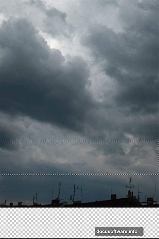
Drag your sky photo into the new document. Name this layer “SKY” immediately. Trust me on this one. Once you’ve got 20+ layers, finding unnamed layers becomes a nightmare.
Next comes a quick trick. Grab the Marquee Tool (M) and select the lower portion of the sky. Skip the rooftops completely. Copy this selection with Ctrl+C, then paste with Ctrl+V.
Place this new layer below your SKY layer. Name it “BACKGROUND.” Now activate Free Transform (Ctrl+T) and stretch the bottom edge down to fill your canvas. This creates a clean base layer without visible seams.
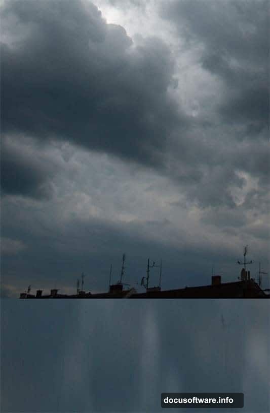
Remove Unwanted Details Fast
Create a new empty layer on top. Name it “RETOUCH.” This keeps your cleanup work separate from original images.
Select the Stamp Tool (S). Clone out any rooftops or unwanted elements from your sky photo. Work carefully around cloud edges. Sloppy cloning shows up badly in the final render.
Your background should now look clean. Just dramatic sky without distracting elements.
Add the Cityscape Without Complex Masking
Here’s where things get interesting. Most tutorials make you laboriously mask out cities. But there’s a faster way that looks just as good.
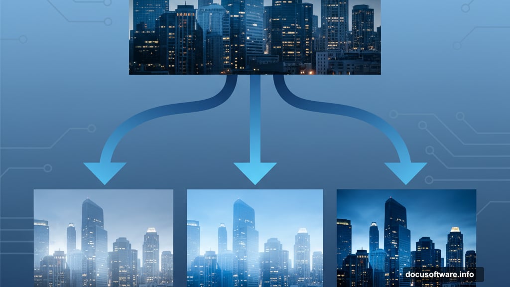
Drag your city photo into the composition. Place it on top of all layers and name it “CITY 1.” Then right-click and select Duplicate Layer. Name this copy “CITY 2” and keep it above everything.
You now have two identical city layers. Why? Because you’ll blend each differently to achieve seamless integration.
Make CITY 2 invisible by clicking the eye icon. You’ll work on CITY 1 first.
Blend the First City Layer
With CITY 1 selected, change the blend mode. Try Lighten, Screen, or Overlay. Each creates different atmospheric effects.
Lighten mode preserves bright areas while darkening shadows. This works well for misty, distant cities.
Screen mode brightens the entire image. Use this when you want the city to glow through haze.
Overlay mode increases contrast dramatically. Good for stark, high-contrast apocalyptic scenes.
Adjust the layer opacity after choosing your blend mode. Usually 60-80% looks natural. Full opacity often appears too harsh.
Blend the Second City Layer
Make CITY 2 visible again. This layer needs different treatment for depth.
Change this layer’s blend mode to Multiply or Darken. These modes emphasize shadows and dark areas. Combined with your first city layer, this creates realistic depth.
Lower the opacity on CITY 2 to around 30-50%. You want subtle reinforcement, not obvious doubling.
The two city layers working together create convincing atmospheric perspective. The technique avoids tedious masking while delivering professional results.
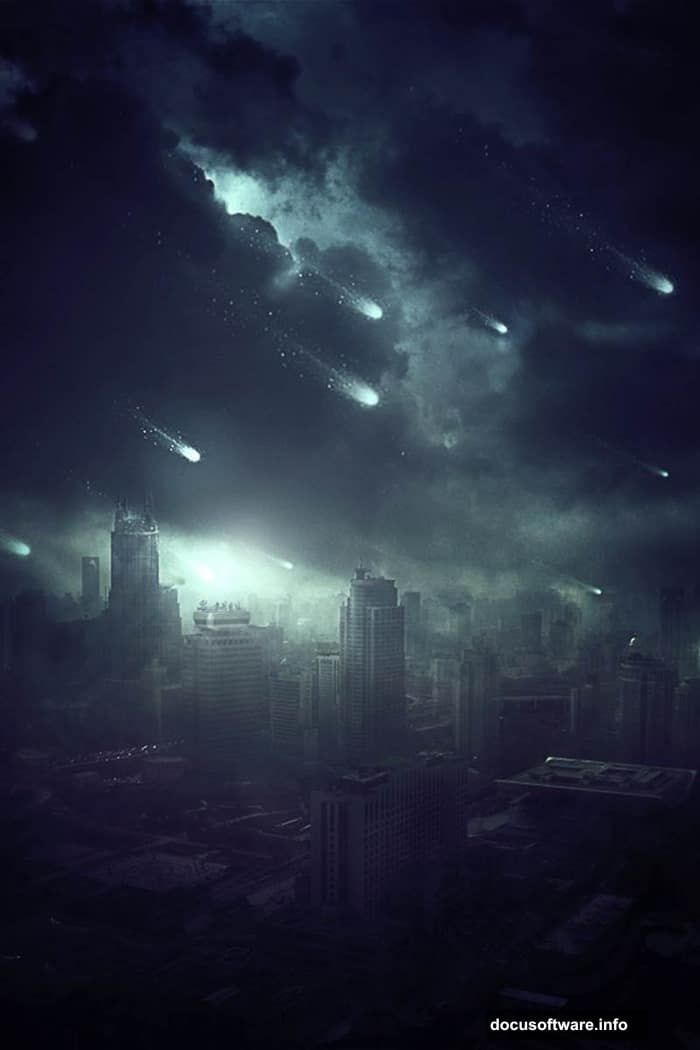
Add Meteor Brushes for Impact
Load your meteor brush pack into Photoshop. Create a new layer named “METEORS” on top of everything.
Select white as your foreground color. Pick a meteor brush and click once to place it. Don’t go crazy here. Three to five meteors look dramatic. Twenty meteors looks chaotic and fake.
Vary meteor sizes using bracket keys. Place larger meteors higher in the composition. Smaller ones lower down. This reinforces the sense of depth and distance.
Create Motion Blur on Meteors
Real meteors move fast. Static brush stamps look frozen and lifeless.
Select your METEORS layer. Go to Filter > Blur > Motion Blur. Set the angle to match your meteor trajectory. Usually 45-60 degrees works well for diagonal movement.
Adjust blur distance to around 50-100 pixels. Too little blur and meteors look static. Too much and they vanish into streaks.
Apply the blur. Your meteors now have convincing speed and energy.
Build Atmospheric Lighting
Lighting sells the apocalyptic mood. Without it, your scene looks flat and unconvincing.
Create a new layer named “ATMOSPHERE.” Set the blend mode to Overlay or Soft Light.
Grab a soft round brush at 0% hardness. Pick a warm orange color (#FF6B00 works well). Paint gently over areas where meteors would illuminate clouds. Use low opacity around 20-30% and build up gradually.
Add cooler blue tones (#0066CC) in shadow areas. This creates color contrast and visual interest.
The key? Subtlety. Heavy-handed lighting looks amateurish. Build up effects slowly across multiple brush strokes.
Add Ground Impact Glow
Meteors hitting the ground create intense light. Simulate this with strategic glow effects.
Create another layer named “IMPACT GLOW.” Set blend mode to Screen or Linear Dodge.
Use a large soft brush with bright orange or yellow. Paint single clicks at ground level where meteors would strike. Lower opacity to around 40-60%.
This creates bright hotspots that draw the eye and suggest ongoing destruction.
Enhance Color Grading
Your scene needs unified color treatment. Right now, different source images probably have mismatched tones.
Add a Color Balance adjustment layer on top. Shift midtones toward warmer oranges and yellows. Push shadows slightly toward blue for contrast.
Then add a Curves adjustment layer. Create a subtle S-curve to boost contrast. Raise highlights slightly and deepen shadows.
These adjustments tie everything together visually. The scene should now feel cohesive rather than assembled from random parts.
Add Final Sharpening
Zoom to 100% view. Your image might look slightly soft from all the blending and effects.
Flatten all layers into a new layer (Ctrl+Alt+Shift+E). Go to Filter > Sharpen > Unsharp Mask. Use these settings:
- Amount: 80-120%
- Radius: 1.0-1.5 pixels
- Threshold: 0 levels
Apply carefully. Over-sharpening creates ugly halos around edges. When in doubt, use less sharpening rather than more.
Why This Technique Works
The double-city-layer method saves massive time compared to precise masking. You get 90% of the quality in 10% of the time.
Meteor brushes beat hand-drawing effects every time. Why reinvent the wheel when quality resources exist?
Strategic lighting makes the biggest difference. Most beginners skip atmospheric glow and wonder why their work looks flat.
Common Mistakes to Avoid
Don’t use too many meteors. Less is more for dramatic impact.
Avoid harsh blend mode transitions. If edges look sharp and fake, lower opacity or add subtle layer masks.
Skip heavy-handed color grading. Apocalyptic doesn’t mean oversaturated orange and blue. Subtlety creates believability.
Never forget to name your layers. Future-you will thank present-you when making adjustments.
Take It Further
Try different sky photos for varied moods. Stormy clouds create different energy than clear sunset skies.
Experiment with city photos from different angles. Low-angle shots add drama. High-angle shots create scale.
Add foreground elements like destroyed buildings or debris. This builds additional depth layers.
Play with color treatments. Cool blue tones suggest nuclear winter. Warm oranges imply fire and destruction.
The techniques here create a solid foundation. But your creative choices make the image memorable.