Photoshop lets you blend reality with imagination in surprising ways. This tutorial shows you how to merge multiple images into a surreal scene that looks completely natural.
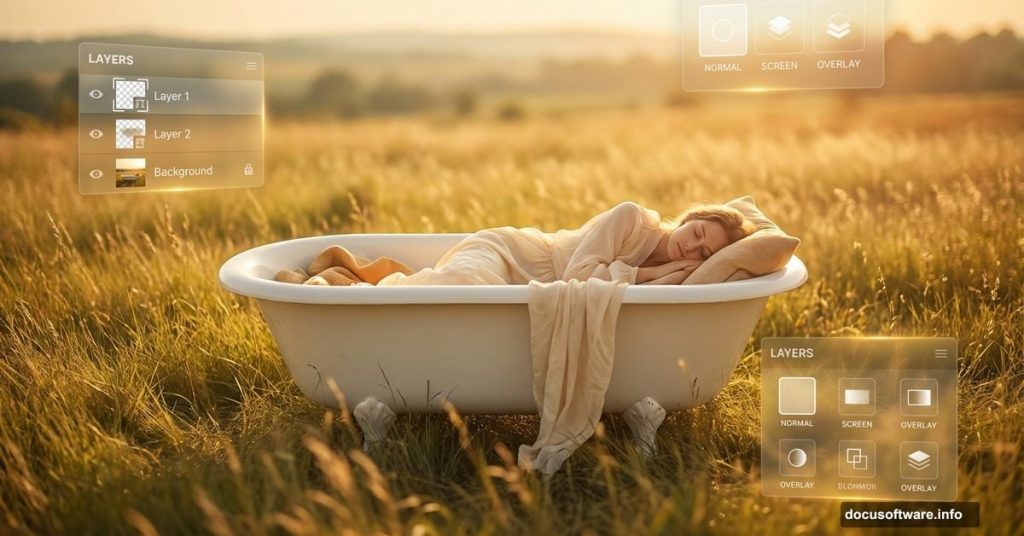
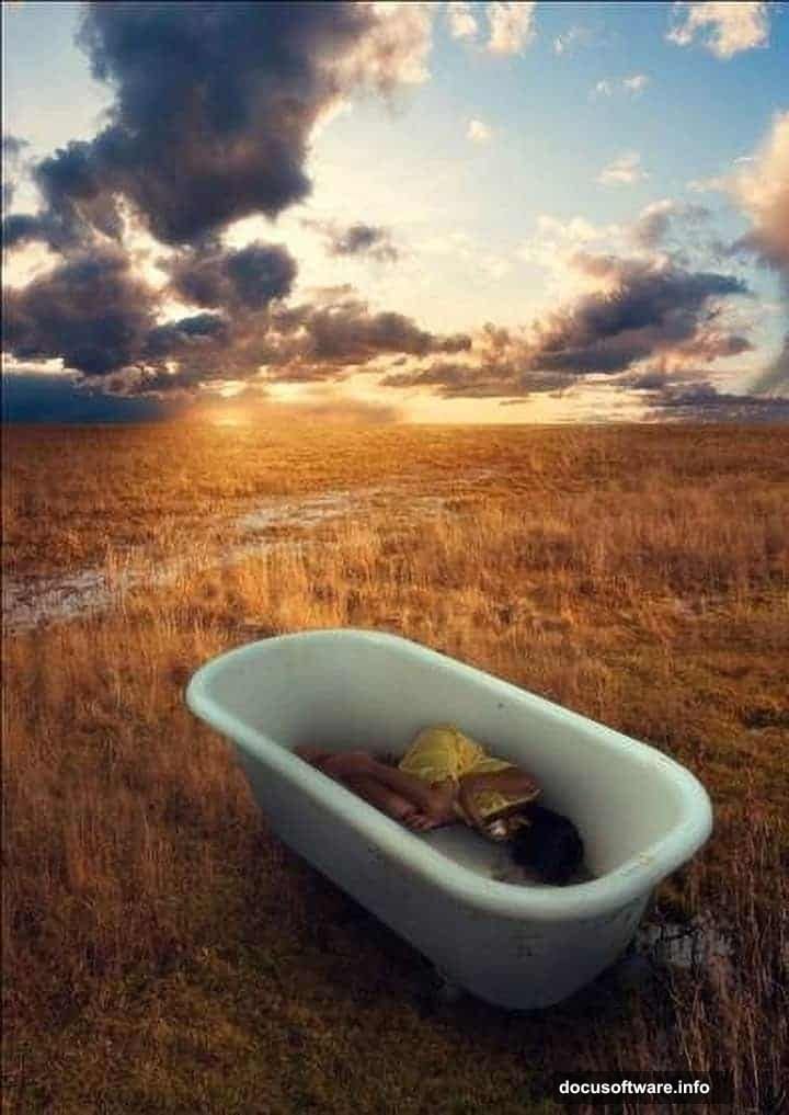
We’re building something unusual. A girl sleeping peacefully in an antique bathtub, sitting in the middle of a sunlit field. It sounds strange. But the final result looks hauntingly beautiful and totally believable.
You’ll learn several essential manipulation techniques along the way. Plus, these same skills work for dozens of other composite projects.
What You’ll Master in This Tutorial
Let’s break down the key skills you’re picking up today.
First, you’ll nail realistic lighting and shadows using basic brush tools. Most beginners struggle with this. They blend images that look flat because the lighting doesn’t match. We’re fixing that problem right from the start.
Next, you’ll learn perspective tricks that put viewers right into the scene. The angle makes them feel like they’re standing there, peeking at something private and peaceful. That emotional connection separates amateur work from professional compositions.
Finally, you’ll use selective blur and sharpening to create depth. Real cameras focus on specific areas while others blur naturally. We’re mimicking that effect to make digital composites look like single photographs.
Tools and Images You Need
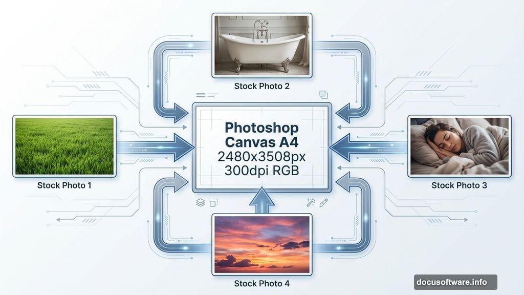
Before starting, grab these free stock photos. You’ll need four specific images for this project.
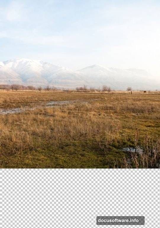
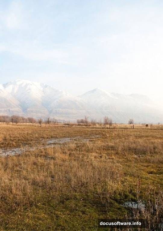
Download a landscape photo with an open field. The grass should look natural with interesting texture. Then find a dramatic sunset sky image. Look for warm colors that create that golden hour feeling.
You also need an antique bathtub photo. White porcelain works best because it reflects surrounding light realistically. Finally, get a stock image of a sleeping child or young person in a relaxed pose.
Make sure all your stock photos come from legitimate sources. Sites like Unsplash, Pexels, and DeviantArt’s stock section offer free options for practice projects.
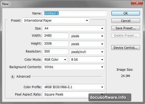
Setting Up Your Canvas
Start fresh with proper dimensions from the beginning. Open Photoshop and create a new file using these specific settings.
Set your canvas to A4 size at 2480 by 3508 pixels. Use 300 pixels per inch for print quality resolution. Even if you’re only sharing online, high resolution gives you editing flexibility later.
Choose RGB color mode at 8 bits. This standard setting works for nearly all digital projects. Set your background to white for now. We’ll replace it immediately anyway.
Building the Background Landscape
Now we’re creating the ground layer that anchors everything else.
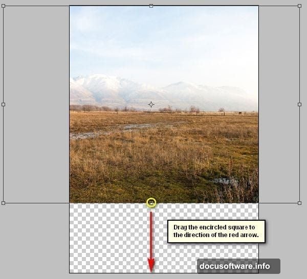
Open your field landscape stock photo. Activate the Move tool by pressing V on your keyboard. Click the landscape image and drag it directly onto your blank canvas.
Rename this layer “ground” immediately. Double-click where it says “Layer 1” in your layers panel. A text box appears letting you type the new name. Good layer organization prevents confusion later.
The landscape probably doesn’t fit your canvas perfectly yet. Press Ctrl/Cmd + T to activate Free Transform. Resize and reposition the image until it fills your canvas from edge to edge.
However, you’ll notice the horizon line looks tilted. Real landscapes sit level with gravity. So we need to fix that rotation issue next.
Correcting the Landscape Angle
Keep the Transform tool active for this adjustment.
Right-click anywhere on your canvas while Transform is still active. A contextual menu pops up with several options. Select “Rotate” from that menu.
Now you can freely rotate your landscape layer. Drag the corners until the horizon line runs perfectly horizontal. Use the gridlines as guides. They help you see when things align properly.
Press Enter to commit these transform changes. Your landscape should now look natural and level. This tiny detail makes a huge difference in believability.
Adding the Sunset Sky
A dramatic sky transforms ordinary composites into memorable images.
Open your sunset sky stock photo. Use the Move tool (V) again to drag this image onto your working canvas. Position it above your ground layer.
Create a new layer between your sky and ground if needed. Name this layer “sky blend” or something similar. This buffer layer gives you flexibility for adjustments.
You’ll likely need to blend where the sky meets your landscape. Use a soft brush with low opacity to paint a layer mask. This creates a gradual transition that looks natural rather than cut-and-pasted.
The sky colors should complement your ground colors. If they clash, adjust the sky’s Hue/Saturation (Ctrl/Cmd + U). Shift the hues slightly until warm tones throughout your image harmonize.
Placing the Antique Bathtub
This step establishes your focal point and creates the surreal element.
Open your bathtub stock image. Select just the tub itself using your preferred selection tool. The Pen tool works great for clean edges, though the Quick Selection tool works faster.
Once selected, copy and paste the bathtub onto your main canvas. Alternatively, drag it over with the Move tool after making your selection. Name this layer “bathtub” for easy reference.
Position the tub in your field. Place it slightly off-center for more interesting composition. The rule of thirds suggests putting focal points about one-third from edges rather than dead center.
Scale the bathtub to appropriate size using Free Transform (Ctrl/Cmd + T). Consider perspective here. Objects closer to viewers appear larger than distant objects. Your tub should look grounded in that field, not floating randomly.
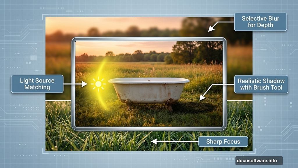
Matching Bathtub Lighting
The tub needs to match your landscape lighting or it looks pasted in.
Create a new layer directly above your bathtub layer. Right-click this new layer and choose “Create Clipping Mask.” Now anything you paint on this layer only affects the bathtub below it.
Select a soft brush and choose a warm orange color from your sunset sky. Lower your brush opacity to around 20-30%. Gently paint over the side of the tub facing your sunset.
This simulates reflected light from the environment. Real white objects pick up subtle color casts from nearby light sources. That’s what makes them look real rather than computer-generated.
Next, add shadows on the opposite side. Choose a cool, desaturated blue for shadow areas. Paint these with the same low-opacity brush technique. Shadows in natural light always have cool color temperatures compared to highlights.
Adding the Sleeping Figure
Now comes the emotional heart of your composition.
Open your stock photo of the sleeping person. Carefully select around the figure using the Pen tool or Quick Selection tool. Take your time here because rough selection edges ruin the effect.
Copy and paste the selected figure onto your canvas. Position them inside the bathtub in a natural, comfortable sleeping pose. Scale them appropriately using Free Transform.
The figure probably doesn’t match your scene’s lighting yet. Apply the same clipping mask technique you used for the bathtub. Paint warm highlights where light hits the figure and cool shadows on the opposite side.
Pay special attention to the face and hands. These draw viewer attention first, so lighting needs to look especially believable in these areas.
Creating Contact Shadows
Objects touching other objects always create contact shadows. Without them, things look like they’re floating.
Create another new layer set to Multiply blend mode. Name it “contact shadows.” Use a soft black brush at very low opacity.
Paint subtle shadows where the figure touches the bathtub. Also add shadows where the bathtub’s feet touch the ground. These should be darkest right at the contact point and fade out gradually.
Keep these shadows soft and subtle. Harsh shadows look fake. Real shadows diffuse and blur at their edges, especially in outdoor lighting.
Adjusting Overall Color Harmony
All your elements exist in the same world, so colors should feel unified.
Create a new adjustment layer above all your other layers. Go to Layer > New Adjustment Layer > Hue/Saturation. Slightly increase saturation by 10-15 points to make colors more vivid and dreamlike.
Next, add a Color Balance adjustment layer. Push colors slightly toward yellow/red in highlights and cyan/blue in shadows. This creates that golden hour warmth that makes photos feel magical.
Consider adding a subtle Photo Filter adjustment layer too. Choose a warming filter (85) at low opacity. This ties all your colors together into one cohesive palette.
Creating Depth with Selective Blur
Real cameras can’t keep everything perfectly sharp at once. We’re mimicking that effect to add realism.
Duplicate your entire composition by pressing Ctrl/Cmd + Alt/Opt + Shift + E. This creates a merged copy of all visible layers. Name this layer “depth blur.”
Go to Filter > Blur > Gaussian Blur. Apply a moderate blur of around 3-5 pixels. This might seem to ruin your image, but don’t worry.
Add a layer mask to your blurred layer. Paint with black on the mask to reveal sharp details in your focal areas. Keep the sleeping figure and parts of the bathtub sharp. Let distant landscape elements stay blurred.
This selective sharpness guides viewer eyes exactly where you want them to look. It also creates professional depth of field that separates good manipulations from great ones.
Final Sharpening for Impact
A touch of strategic sharpening adds polish to your final image.
Create one more merged layer using the same keyboard shortcut from before. This captures your entire composition including all adjustments.
Go to Filter > Sharpen > Unsharp Mask. Use these settings as a starting point: Amount 80%, Radius 1.0 pixels, Threshold 2 levels. Adjust based on your specific image needs.
Apply this sharpening selectively using a layer mask again. Focus sharpening on your main subject, the sleeping figure. Less important areas like background grass don’t need aggressive sharpening.
Too much sharpening creates ugly halos and artifacts. Use a light touch here. When in doubt, sharpen less rather than more.
Perfecting the Perspective
One final adjustment sells the “peeking from above” perspective.
The slight downward angle should make viewers feel taller than the bathtub. Check if this feeling comes through naturally or if adjustments help.
Sometimes adding slight vignetting around edges enhances this effect. Create a new layer filled with black. Add a layer mask and use a large, soft brush with low opacity to paint white in the center.
This darkens corners and edges slightly, focusing attention inward. It also adds that slightly voyeuristic quality that makes this composition emotionally engaging.
Why This Technique Matters
Learning photo manipulation isn’t just about creating fantasy scenes. These same skills transfer directly to practical work.
Photographers use these techniques to fix lighting issues in real shoots. Designers need them for advertising composites and product mockups. Understanding how light, shadow, and color work together improves everything you create.
Plus, surreal compositions like this one push your problem-solving skills. When images don’t naturally belong together, you learn to see what makes things look real or fake. That critical eye improves your entire creative process.
The technical steps matter, sure. But the real lesson is learning to see how light behaves. Once you understand that, you can create any reality you imagine.